Building a Consistent SharePoint List “Design System” with PnP Column Formatting Samples
The PnP List Formatting gallery is not just a collection of cool JSON snippets—it’s a pattern library you can standardize into a reusable UI design system for SharePoint/Microsoft Lists. The goal: make your lists look and behave consistently across sites, without SPFx, and without reinventing JSON every time. (PNP GitHub)
In this article, you’ll take 5 proven PnP patterns and refactor them into a consistent visual language:
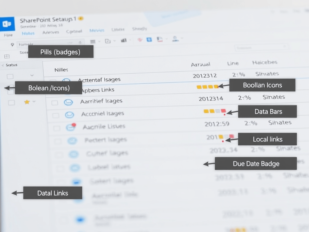
- Pills/badges for statuses
- Boolean icons (check/error)
- Data bars for numbers/percentages
- “Local links” that stay portable across sites
- A due-date badge that highlights overdue items
Everything here is grounded in Microsoft Learn’s formatting model (JSON renders UI only; data stays intact). (Microsoft Learn)
Why “design system” matters for list formatting
Most teams start with one formatted Status column, then copy/paste random JSON across lists. After a few months you end up with:
- different pill sizes in different lists
- inconsistent icon choices/colors
- broken links because someone hardcoded a tenant URL
- no “standard components” to reuse
The PnP repository already solved most of these problems—you just need to normalize the patterns and document your “approved components.” (PNP GitHub)
The foundation (what Microsoft Learn says formatting really is)
Column formatting is:
- a JSON description of elements (
elmType), attributes, styles, children - evaluated at render time for each row
- not changing underlying data (only presentation) (Microsoft Learn)
And the same syntax principles carry into view formatting (row layout) when you later decide to go beyond single columns. (Microsoft Learn)
Your “Formatting Design Tokens” (the rules we’ll enforce)
We’ll standardize these across all components:
Spacing & shape
- Pill padding:
2px 10px - Radius:
999px(true pill) - Font: weight 600
Icon sizing
- Use the default icon behavior (simple + readable)
- Keep icons as “support”, not the whole UI, unless it’s a boolean field
Severity classes (recommended approach)
- Prefer SharePoint’s built-in
sp-field-severity--*classes when possible (less custom CSS pain).
PnP uses these heavily for conditional visuals. (GitHub)
Portability
- Use
@currentWebfor links whenever you can (prevents hardcoding tenant/site URLs). (GitHub)
Step-by-step: how to apply each “component” in your list
For each component below, the apply flow is identical:
- Open your list
- Column header → Column settings
- Format this column
- Advanced mode
- Paste JSON
- Save
This is the standard workflow described in Microsoft’s guidance for column formatting. (Microsoft Learn)
Component 1 — Status Pill (Choice/Text)
What it solves
A Status column that instantly communicates meaning with consistent pill styling.
PnP inspiration
The PnP “conditional text formatting (severity)” sample applies sp-field-severity--good/low/warning/blocked based on text values. (GitHub)
Your standardized JSON
Edit the values (
Done,In Progress,Blocked,In Review) to match your org.
{ "$schema": "https://developer.microsoft.com/json-schemas/sp/v2/column-formatting.schema.json", "elmType": "span", "style": { "display": "inline-block", "padding": "2px 10px", "border-radius": "999px", "font-weight": "600", "line-height": "20px" }, "attributes": { "class": "=if(@currentField == 'Done','sp-field-severity--good', if(@currentField == 'In Progress','sp-field-severity--low', if(@currentField == 'In Review','sp-field-severity--warning', if(@currentField == 'Blocked','sp-field-severity--blocked','sp-field-severity--neutral'))))" }, "txtContent": "@currentField"}Why this is “design-system safe”
- Same pill geometry everywhere
- Uses standardized severity classes (consistent look across Microsoft UI) (GitHub)
Component 2 — Boolean Check / Error Badge (Yes/No)
What it solves
A Yes/No column that renders like a clean “state indicator” instead of True/False.
PnP inspiration
PnP’s yesno-checkmark-format uses icons + severity classes with logic for empty values too. (GitHub)
Your standardized JSON (clean icon-only indicator)
{ "$schema": "https://developer.microsoft.com/json-schemas/sp/v2/column-formatting.schema.json", "elmType": "div", "attributes": { "class": "=if(@currentField == '', 'sp-field-severity--blocked', if(@currentField, 'sp-field-severity--good', 'sp-field-severity--low')) + ' ms-fontColor-neutralSecondary'" }, "children": [ { "elmType": "span", "style": { "display": "inline-block", "padding": "0 4px" }, "attributes": { "iconName": "=if(@currentField == '', 'ErrorBadge', if(@currentField, 'CheckMark', ''))" } } ]}Why keep the “blank” case?
In real lists, null/empty values happen. This makes them visible without breaking the layout. (GitHub)
Component 3 — Data Bar for Numbers / Percent
What it solves
A numeric field that is visually readable at a glance (like progress, score, capacity).
PnP inspiration
PnP’s number-data-bar uses the sp-field-dataBars class and width logic based on @currentField. (GitHub)
Your standardized JSON (works great for 0–100)
{ "$schema": "https://developer.microsoft.com/json-schemas/sp/v2/column-formatting.schema.json", "elmType": "div", "attributes": { "class": "sp-field-dataBars" }, "style": { "box-sizing": "border-box", "padding": "0", "width": "100%" }, "children": [ { "elmType": "div", "style": { "box-sizing": "border-box", "height": "8px", "border-radius": "999px", "width": "=if(@currentField <= 0, '0%', if(@currentField >= 100, '100%', @currentField + '%'))" }, "attributes": { "class": "sp-field-severity--good" } }, { "elmType": "div", "style": { "margin-top": "4px", "font-size": "12px", "font-weight": "600" }, "txtContent": "=@currentField + '%'" } ]}What to change
- If your max is not 100, adapt the width formula (PnP explains the “boundary + multiplier” approach). (GitHub)
Component 4 — Portable “Local Link” Button (no hardcoded tenant)
What it solves
Links that work when the list is reused across sites and don’t break because of hardcoded URLs.
PnP inspiration
The text-local-link sample demonstrates using @currentWeb to build href safely and portably. (GitHub)
Your standardized JSON (button-like link)
Assumption: your column contains a relative path like
/Lists/ExampleList/AllItems.aspxor/SitePages/Home.aspx
{ "$schema": "https://developer.microsoft.com/json-schemas/sp/v2/column-formatting.schema.json", "elmType": "a", "style": { "display": "inline-block", "padding": "2px 10px", "border-radius": "999px", "font-weight": "600", "text-decoration": "none" }, "attributes": { "class": "sp-field-severity--low", "href": "=@currentWeb + @currentField", "target": "_blank" }, "children": [ { "elmType": "span", "attributes": { "iconName": "NavigateExternalInline" }, "style": { "margin-right": "6px" } }, { "elmType": "span", "txtContent": "Open" } ]}Why this matters
PnP explicitly calls out that @currentWeb is the key to reusable formats across locations. (GitHub)
Component 5 — Due Date Badge (Overdue / Today / Future)
What it solves
Dates are easy to ignore. This makes “overdue” visually impossible to miss, while keeping future dates calm.
Microsoft Learn anchor
All the conditional UI logic relies on the formatting syntax model (expressions, elements, and rendering). (Microsoft Learn)
Your standardized JSON
{ "$schema": "https://developer.microsoft.com/json-schemas/sp/v2/column-formatting.schema.json", "elmType": "span", "style": { "display": "inline-block", "padding": "2px 10px", "border-radius": "999px", "font-weight": "600" }, "attributes": { "class": "=if(@currentField <= @now, 'sp-field-severity--blocked', if(@currentField <= addDays(@now, 1), 'sp-field-severity--warning', 'sp-field-severity--neutral'))" }, "txtContent": "=toLocaleDateString(@currentField)"}Behavior
- Overdue (<= now): blocked (red)
- Due “today-ish”: warning (yellow)
- Future: neutral
Governance: how to keep your formatting maintainable
1) Create a “JSON Components” folder (your internal library)
Store:
- a
.jsonper component - a short README describing required column type and expected values
This mirrors how PnP structures samples (each sample has explanation + JSON). (PNP GitHub)
2) Prefer references over duplication (advanced)
Microsoft Learn documents advanced formatter reuse using columnFormatterReference, which is the next step when you want consistent formatting without copy/paste sprawl. (Microsoft Learn)
3) Decide when to “graduate” to view formatting
When you want row-level layouts (cards, multi-field blocks), view formatting is the next layer and uses the same conceptual approach. (Microsoft Learn)
Final table (implementation plan + technical map)
| Step | What you implement | Column type | Core technique | Source anchor |
|---|---|---|---|---|
| 1 | Status Pill | Choice/Text | sp-field-severity--* + consistent pill styles | PnP conditional severity sample (GitHub) |
| 2 | Boolean Check/Error | Yes/No | icons + severity classes + blank handling | PnP yes/no checkmark format (GitHub) |
| 3 | Data Bar (0–100) | Number/Percent | sp-field-dataBars + width expression | PnP number data bar README (GitHub) |
| 4 | Portable Local Link Button | Text (relative path) | @currentWeb + href | PnP local link guidance (GitHub) |
| 5 | Due Date Badge | Date/Time | conditional class based on time | Column formatting model & syntax (Microsoft Learn) |
| 6 | Standardize + reuse | All | document components, avoid hardcoding | PnP samples as pattern library (PNP GitHub) |
| 7 | Scale to full layouts | View (rows/cards) | same JSON model, row templates | View formatting guidance (Microsoft Learn) |
| 8 | Advanced reuse | Cross-columns/views | columnFormatterReference | Advanced formatting concepts (Microsoft Learn) |
 edvaldo b. guimarães filho