SharePoint Approval Status Hover Card (PnP Pattern) — A Publish-Ready Guide + Variations
This article shows how to implement the PnP “generic-approval-status-hover-card” pattern to transform SharePoint’s built-in Approval Status into a clean icon + label with a rich hover card (callout). Then we’ll build multiple variations you can copy/paste and adapt.
This is 100% SharePoint Column Formatting JSON (display-only). It does not modify item data—only how the field renders in the list view. (Microsoft Learn)
Why this pattern works so well
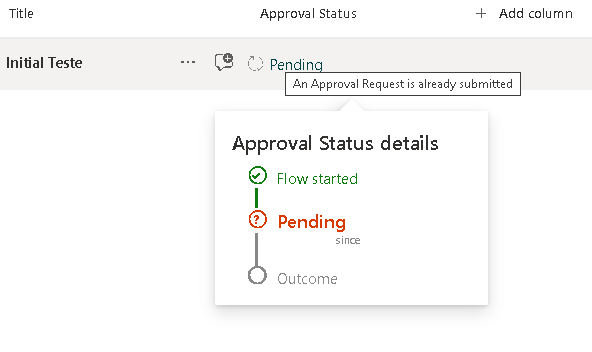
When you enable Content Approval in a list/library, SharePoint tracks an internal moderation state that formatting can read using:
[$_ModerationStatus](Draft / Pending / Approved / Rejected)
The PnP sample uses that value to:
- Render a smart status label in the cell.
- Show a custom “details” panel using
customCardPropson hover.
Microsoft documents custom hover cards via customCardProps + openOnEvent: "hover" and how to build the card markup with elmType, children, style, txtContent, and Excel-like expressions. (Microsoft Learn)
Prerequisites (don’t skip this)
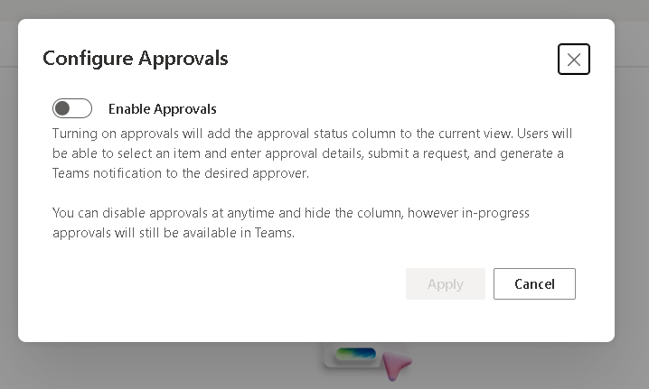
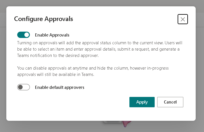
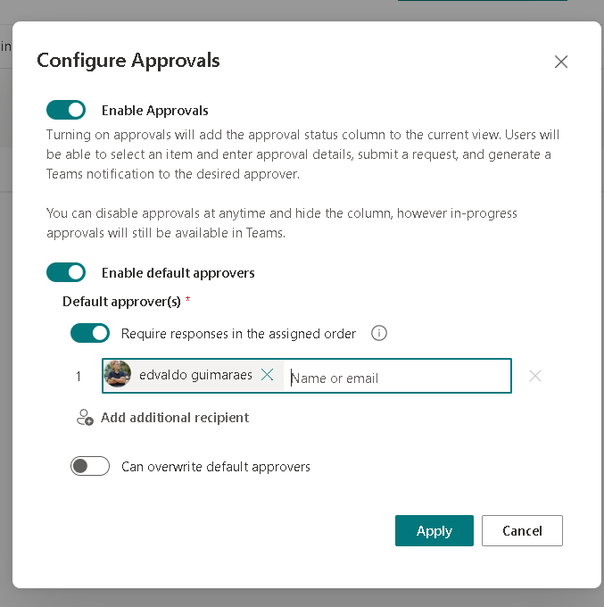
1) Turn on Content Approval
This pattern assumes your list/library is using approval (moderation). Without it, [$_ModerationStatus] will not behave as expected.
2) Make sure the right fields exist (and are usable in the view)
At minimum, you typically want:
- Approval Status → used as
[$_ModerationStatus] - Modified → used as
[$Modified]for “since” / “last updated” text
The PnP sample explicitly calls out Content Approval and depends on these columns for the experience. (Microsoft Adoption)
How the hover card works (the mental model)
In SharePoint column formatting, the cell is a JSON “tree”:
elmType: the HTML-like element (div,span, etc.)children: nested elementsattributes: things likeiconName,title,classstyle: inline stylestxtContent: text (supports expressions)
The hover card is attached via customCardProps:
customCardProps.formatter: the card body JSONopenOnEvent:"hover"or"click"directionalHint: where the callout opensisBeakVisible: callout pointer visibility
All of that is documented in Microsoft’s syntax reference. (Microsoft Learn)
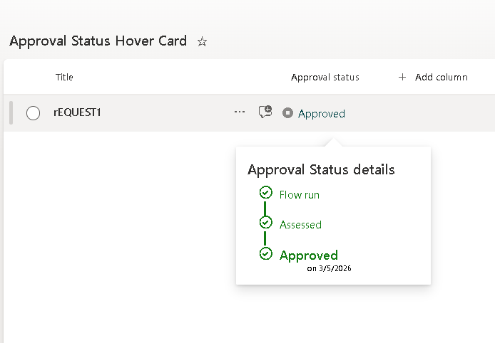
Baseline: Minimal “Approval Status + Hover Summary” (stable starting point)
This is the baseline I recommend you validate first. It keeps the hover card simple so you can confirm the mechanics, then expand safely.
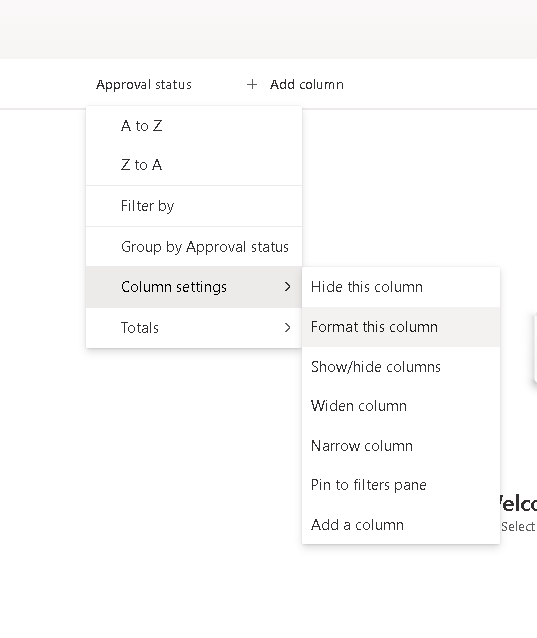
Apply this to the Approval Status column using Format this column → Advanced mode.
{ "$schema": "https://developer.microsoft.com/json-schemas/sp/v2/column-formatting.schema.json", "elmType": "div", "attributes": { "title": "='Approval: ' + [$_ModerationStatus]" }, "children": [ { "elmType": "span", "attributes": { "iconName": "=if([$_ModerationStatus]=='Draft','Flow',if([$_ModerationStatus]=='Pending','WorkFlow',if([$_ModerationStatus]=='Approved','StatusCircleCheckmark','StatusCircleBlock')))", "class": "='ms-fontColor-' + if([$_ModerationStatus]=='Approved','green',if([$_ModerationStatus]=='Pending','orange',if([$_ModerationStatus]=='Rejected','red','neutralSecondaryAlt')))" }, "style": { "padding-right": "6px" } }, { "elmType": "span", "txtContent": "=[$_ModerationStatus]" } ], "customCardProps": { "formatter": { "elmType": "div", "style": { "padding": "12px 14px", "width": "320px" }, "children": [ { "elmType": "div", "style": { "font-size": "16px", "font-weight": "600", "margin-bottom": "10px" }, "txtContent": "Approval details" }, { "elmType": "div", "style": { "font-size": "12px", "margin-bottom": "6px" }, "txtContent": "='Status: ' + [$_ModerationStatus]" }, { "elmType": "div", "style": { "font-size": "12px" }, "txtContent": "='Last update: ' + toLocaleDateString([$Modified])" } ] }, "openOnEvent": "hover", "directionalHint": "bottomCenter", "isBeakVisible": true }}Why this baseline is “safe”:
- It uses only documented building blocks (
customCardProps,toLocaleDateString, expressions). (Microsoft Learn) - It references only
[$_ModerationStatus]and[$Modified].
Variation 1: “Pending SLA” hover card (days pending)
If the item is Pending, show how many days it has been pending based on Modified. This uses @now math in milliseconds plus floor() and toString(), which are part of the formatting expression set. (Microsoft Learn)
{ "$schema": "https://developer.microsoft.com/json-schemas/sp/v2/column-formatting.schema.json", "elmType": "div", "children": [ { "elmType": "span", "attributes": { "iconName": "=if([$_ModerationStatus]=='Pending','Clock',if([$_ModerationStatus]=='Approved','StatusCircleCheckmark','CircleStopSolid'))", "class": "='ms-fontColor-' + if([$_ModerationStatus]=='Pending','orange',if([$_ModerationStatus]=='Approved','green','red'))" }, "style": { "padding-right": "6px" } }, { "elmType": "span", "txtContent": "=[$_ModerationStatus]" } ], "customCardProps": { "formatter": { "elmType": "div", "style": { "padding": "12px 14px", "width": "340px" }, "children": [ { "elmType": "div", "style": { "font-size": "16px", "font-weight": "600", "margin-bottom": "10px" }, "txtContent": "Approval SLA" }, { "elmType": "div", "style": { "font-size": "12px", "margin-bottom": "6px" }, "txtContent": "='Status: ' + [$_ModerationStatus]" }, { "elmType": "div", "style": { "font-size": "12px", "font-weight": "600" }, "attributes": { "class": "=if([$_ModerationStatus] != 'Pending','', if((@now - [$Modified]) > 432000000,'ms-fontColor-red', if((@now - [$Modified]) > 172800000,'ms-fontColor-orange','ms-fontColor-green')))" }, "txtContent": "=if([$_ModerationStatus] != 'Pending','Not pending','Pending for ' + toString(floor((@now - [$Modified]) / 86400000)) + ' day(s)')" }, { "elmType": "div", "style": { "font-size": "12px", "margin-top": "8px" }, "txtContent": "='Last updated: ' + toLocaleDateString([$Modified])" } ] }, "openOnEvent": "hover", "directionalHint": "bottomCenter", "isBeakVisible": true }}Variation 2: “Compact pill in the cell, rich hover card”
This makes the list view cleaner: the cell becomes a “pill badge”, while the hover card carries the full detail.
{ "$schema": "https://developer.microsoft.com/json-schemas/sp/v2/column-formatting.schema.json", "elmType": "div", "style": { "display": "inline-block", "padding": "2px 10px", "border-radius": "999px", "font-size": "12px", "font-weight": "600" }, "attributes": { "class": "=if([$_ModerationStatus]=='Approved','ms-bgColor-green ms-fontColor-white',if([$_ModerationStatus]=='Pending','ms-bgColor-yellow ms-fontColor-neutralPrimary',if([$_ModerationStatus]=='Rejected','ms-bgColor-red ms-fontColor-white','ms-bgColor-neutralLight ms-fontColor-neutralPrimary')))", "title": "='Approval: ' + [$_ModerationStatus]" }, "txtContent": "=[$_ModerationStatus]", "customCardProps": { "formatter": { "elmType": "div", "style": { "padding": "12px 14px", "width": "320px" }, "children": [ { "elmType": "div", "style": { "font-size": "16px", "font-weight": "600", "margin-bottom": "10px" }, "txtContent": "Approval Summary" }, { "elmType": "div", "style": { "font-size": "12px", "margin-bottom": "6px" }, "txtContent": "='Status: ' + [$_ModerationStatus]" }, { "elmType": "div", "style": { "font-size": "12px" }, "txtContent": "='Modified: ' + toLocaleString([$Modified])" } ] }, "openOnEvent": "hover", "directionalHint": "bottomCenter", "isBeakVisible": true }}Variation 3: “Outcome-focused messaging” (Approved vs Rejected vs Pending)
This variation is for teams that want the hover card to explain what to do next.
{ "$schema": "https://developer.microsoft.com/json-schemas/sp/v2/column-formatting.schema.json", "elmType": "div", "children": [ { "elmType": "span", "attributes": { "iconName": "=if([$_ModerationStatus]=='Approved','LikeSolid',if([$_ModerationStatus]=='Rejected','DislikeSolid','Sync'))", "class": "='ms-fontColor-' + if([$_ModerationStatus]=='Approved','green',if([$_ModerationStatus]=='Rejected','red','orange'))" }, "style": { "padding-right": "6px" } }, { "elmType": "span", "txtContent": "=[$_ModerationStatus]" } ], "customCardProps": { "formatter": { "elmType": "div", "style": { "padding": "12px 14px", "width": "360px" }, "children": [ { "elmType": "div", "style": { "font-size": "16px", "font-weight": "600", "margin-bottom": "10px" }, "txtContent": "Approval Outcome" }, { "elmType": "div", "style": { "font-size": "12px", "margin-bottom": "8px" }, "txtContent": "=if([$_ModerationStatus]=='Pending','Waiting for an approver decision.',if([$_ModerationStatus]=='Approved','Approved: this item passed moderation.','Rejected: update the content and resubmit for approval.'))" }, { "elmType": "div", "style": { "font-size": "12px" }, "txtContent": "='Last update: ' + toLocaleDateString([$Modified])" } ] }, "openOnEvent": "hover", "directionalHint": "bottomCenter", "isBeakVisible": true }}Debugging rules (the 90% fixes)
These come directly from how the syntax behaves:
- Expression errors are usually missing
)or quotes'...'inside=if(...). - Blank output often means a referenced field isn’t present or isn’t available in context.
- Validate with a minimal baseline first, then expand.
- Keep Microsoft Learn’s syntax reference open while editing expressions. (Microsoft Learn)
Microsoft Learn + PnP references (the sources you should keep bookmarked)
- Advanced formatting concepts (hover cards / callouts) (Microsoft Learn)
- Formatting syntax reference (customCardProps, expressions, functions) (Microsoft Learn)
- PnP sample gallery: Approval Status Hover Card (Microsoft Adoption)
- PnP List Formatting sample catalog (pnp.github.io)
Final Tables
Implementation Steps (copy/paste workflow)
| Step | Action | What you’re validating | Expected result |
|---|---|---|---|
| 1 | Enable Content Approval | Moderation exists | Approval Status behaves (Draft/Pending/Approved/Rejected) |
| 2 | Ensure Modified is available | Date output works | Hover shows “Last update” |
| 3 | Apply the Baseline JSON | Hover card plumbing | Icon + label + hover panel works |
| 4 | Switch to Variation 1 | Date math + SLA | Shows “Pending for X day(s)” |
| 5 | Switch to Variation 2 | Cleaner UI | Pill badge + rich hover |
| 6 | Switch to Variation 3 | Guidance messaging | Hover explains next steps |
JSON “Cheat Sheet” (what controls what)
| JSON Part | What it does | Key properties |
|---|---|---|
| Cell rendering | What you see in the list row | elmType, children, txtContent, attributes.iconName, attributes.class |
| Tooltip (simple hover text) | Browser-style title | attributes.title |
| Hover card | Callout panel content | customCardProps.formatter |
| Hover behavior | When/where it opens | openOnEvent, directionalHint, isBeakVisible |
| Date formatting | Friendly date display | toLocaleDateString(), toLocaleString() |
| SLA math | Age since Modified | @now, milliseconds math, floor(), toString() |
 edvaldo b. guimarães filho