
SharePoint “Quick Charts” Bar Chart in a Column (PnP Sample)
Render a live bar chart per list item using Column Formatting JSON + QuickChart.io (with 3 useful variations).
The PnP sample generic-quick-charts-bar-chart is a clever pattern: it uses SharePoint Column Formatting to render an <img> whose src is a QuickChart.io URL. That URL contains a Chart.js configuration (URL-encoded). The result is a bar chart that updates automatically as your numeric columns change—without SPFx, without Power BI, and without any deployment. (GitHub)
1) What you build (conceptually)
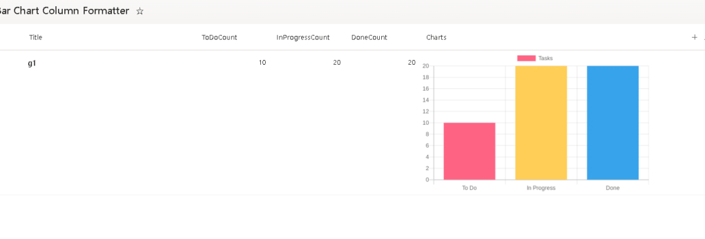
For each list item (row), SharePoint renders an image like:
- Bars = your counts (To Do / In Progress / Done)
- Labels = “To Do”, “In Progress”, “Done”
- Data =
[ToDoCount, InProgressCount, DoneCount] - Image sizing = fixed (e.g., 400×250)
- Rounded corners =
border-radius
This sample targets scenarios like project tracking, sprint tracking, ticket queues, etc. (GitHub)
2) Required list columns (View Requirements)
Create a list with these columns (internal names matter if you copy the JSON as-is): (GitHub)
| Internal Name | Type |
|---|---|
| Title | Single line of text |
| ToDoCount | Number |
| InProgressCount | Number |
| DoneCount | Number |
| Charts | Single line of text (the column where you apply the formatting) |
You can add more columns later, but these four numeric/text columns are the minimum for the base sample. (GitHub)
3) The original JSON (Base sample)
Here is the exact formatter: it renders an img and concatenates your numeric fields into the QuickChart URL. (GitHub)
{ "$schema": "https://developer.microsoft.com/json-schemas/sp/v2/column-formatting.schema.json", "elmType": "img", "attributes": { "src": "='https://quickchart.io/chart?c=%7Btype:%22bar%22,data:%7Blabels:%5B%22To%20Do%22,%22In%20Progress%22,%22Done%22%5D,datasets:%5B%7Blabel:%22Tasks%22,data:%5B' + [$ToDoCount] + ',' + [$InProgressCount] + ',' + [$DoneCount] + '%5D,backgroundColor:%5B%22%23FF6384%22,%22%23FFCE56%22,%22%2336A2EB%22%5D%7D%5D%7D%7D'", "alt": "Chart" }, "style": { "width": "400px", "height": "250px", "border-radius": "8px" }}Why this works
- Column formatting supports building HTML-like elements (
elmType) and setting attributes/styles. (Microsoft Learn) - The
srcexpression is just string concatenation; SharePoint evaluates[$ToDoCount], etc., per row. - QuickChart returns a PNG image for the chart configuration you pass in.
4) Security requirement (this is the #1 “it doesn’t work” cause)
The PnP readme calls this out as CRITICAL: you must allow quickchart.io in SharePoint’s HTML Field Security allowed domains, otherwise the image will be blocked by SharePoint’s security policies. (GitHub)
SharePoint Admin Center steps (high-level):
- Go to SharePoint Admin Center
- Settings → Advanced settings
- Find HTML Field Security
- Add
quickchart.ioto the allowed domains - Save (GitHub)
Governance tip: This is an external dependency. Treat it like any third-party endpoint you allow.
5) Step-by-step: Applying the formatter
Step 1 — Create the list + columns
- Create a list
- Add the numeric columns:
ToDoCount(Number)InProgressCount(Number)DoneCount(Number)
- Add a text column
Charts(Single line of text) (GitHub)
Step 2 — Add sample rows (so you can validate quickly)
Use a few rows like:
- 5 / 3 / 12
- 8 / 2 / 5
- 0 / 4 / 16 (GitHub)
Step 3 — Enable the allowed domain (Admin)
Add quickchart.io to HTML Field Security allowed domains. (GitHub)
Step 4 — Apply JSON to the Charts column
- In the list view, open the
Chartscolumn menu - Column settings → Format this column
- Paste the JSON
- Preview & Save (Microsoft Learn)
Step 5 — Validate behavior
- Change counts in a row
- Refresh the view
- Confirm the chart updates per row (it should, because the URL is computed per item)
6) Three variations (ready-to-paste JSON)
All variations keep the same structure (an <img> whose src is a QuickChart URL). You can publish these as “recipes” on your blog.
Variation 1 — Horizontal bar chart (better labels in tight spaces)
Change the chart type to horizontalBar (legacy) or use Chart.js v3+ style type:"bar" plus indexAxis:"y". QuickChart supports Chart.js configs; this is the modern approach.
{ "$schema": "https://developer.microsoft.com/json-schemas/sp/v2/column-formatting.schema.json", "elmType": "img", "attributes": { "src": "='https://quickchart.io/chart?c=%7Btype:%22bar%22,options:%7BindexAxis:%22y%22%7D,data:%7Blabels:%5B%22To%20Do%22,%22In%20Progress%22,%22Done%22%5D,datasets:%5B%7Blabel:%22Tasks%22,data:%5B' + [$ToDoCount] + ',' + [$InProgressCount] + ',' + [$DoneCount] + '%5D,backgroundColor:%5B%22%23FF6384%22,%22%23FFCE56%22,%22%2336A2EB%22%5D%7D%5D%7D%7D'", "alt": "Horizontal Chart" }, "style": { "width": "400px", "height": "250px", "border-radius": "8px" }}Why it’s useful: horizontal bars keep text readable when you later expand labels (“Blocked”, “Ready for QA”, etc.).
Variation 2 — Stacked bar (shows total + composition clearly)
This stacks the three statuses into a single bar. Great when you want “total tasks” visually obvious per row.
{ "$schema": "https://developer.microsoft.com/json-schemas/sp/v2/column-formatting.schema.json", "elmType": "img", "attributes": { "src": "='https://quickchart.io/chart?c=%7Btype:%22bar%22,options:%7Bscales:%7Bx:%7Bstacked:true%7D,y:%7Bstacked:true%7D%7D%7D,data:%7Blabels:%5B%22Tasks%22%5D,datasets:%5B%7Blabel:%22To%20Do%22,data:%5B' + [$ToDoCount] + '%5D,backgroundColor:%22%23FF6384%22%7D,%7Blabel:%22In%20Progress%22,data:%5B' + [$InProgressCount] + '%5D,backgroundColor:%22%23FFCE56%22%7D,%7Blabel:%22Done%22,data:%5B' + [$DoneCount] + '%5D,backgroundColor:%22%2336A2EB%22%7D%5D%7D%7D'", "alt": "Stacked Chart" }, "style": { "width": "400px", "height": "250px", "border-radius": "8px" }}Why it’s useful: in one glance you see total and composition.
Variation 3 — Dynamic size + stronger “card” look (bigger and cleaner)
This keeps the same base chart but changes the UI rendering for “dashboard feel”.
{ "$schema": "https://developer.microsoft.com/json-schemas/sp/v2/column-formatting.schema.json", "elmType": "div", "style": { "padding": "6px", "border-radius": "10px", "box-shadow": "0 1px 3px rgba(0,0,0,0.15)", "background-color": "white", "display": "inline-block" }, "children": [ { "elmType": "img", "attributes": { "src": "='https://quickchart.io/chart?c=%7Btype:%22bar%22,data:%7Blabels:%5B%22To%20Do%22,%22In%20Progress%22,%22Done%22%5D,datasets:%5B%7Blabel:%22Tasks%22,data:%5B' + [$ToDoCount] + ',' + [$InProgressCount] + ',' + [$DoneCount] + '%5D,backgroundColor:%5B%22%23FF6384%22,%22%23FFCE56%22,%22%2336A2EB%22%5D%7D%5D%7D%7D'", "alt": "Chart" }, "style": { "width": "500px", "height": "300px", "border-radius": "10px" } } ]}Why it’s useful: looks like a mini-report tile, and the larger image makes the chart easier to read.
7) Customization rules you should document in your blog
A) Colors must be URL-encoded
The sample uses:
- Red:
#FF6384→%23FF6384 - Yellow:
#FFCE56→%23FFCE56 - Blue:
#36A2EB→%2336A2EB(GitHub)
B) Labels are URL-encoded too
You’ll see %20 for spaces. If you change labels, encode them.
C) It’s an external dependency
The PnP sample explicitly lists limitations: internet dependency, external service dependency, and performance impact on large lists. (GitHub)
8) References and final checklist tables
Implementation checklist (do this in order)
| Step | Action | Notes |
|---|---|---|
| 1 | Create columns ToDoCount, InProgressCount, DoneCount, and Charts | Match internal names to avoid edits (GitHub) |
| 2 | Add a few test rows | Validate quickly (GitHub) |
| 3 | Allow quickchart.io in HTML Field Security | Required or images won’t render (GitHub) |
| 4 | Format the Charts column with JSON | Column formatting only affects display (Microsoft Learn) |
| 5 | Update counts and confirm charts refresh | URL is computed per row (GitHub) |
Technical reference table (what matters when you edit)
| Topic | What to change | Where |
|---|---|---|
| Chart type | type:"bar" / stacked / horizontal | Inside the c= config (GitHub) |
| Data binding | [$ToDoCount], [$InProgressCount], [$DoneCount] | src string concatenation (GitHub) |
| Colors | Replace %23FF6384, etc. | backgroundColor array (GitHub) |
| Size | style.width / style.height | JSON style block (GitHub) |
| Security | Allow domain quickchart.io | SharePoint Admin Center (GitHub) |
| JSON fundamentals | Column formatting schema + behavior | Microsoft Learn docs (Microsoft Learn) |
Core sources used
- PnP sample README + JSON (GitHub)
- Microsoft Learn: Column formatting + syntax reference (Microsoft Learn)
 edvaldo b. guimarães filho