App 01 — Hello React Fluent
Building the First Enterprise React Application with Vite, TypeScript, Fluent UI, and Modern React Architecture
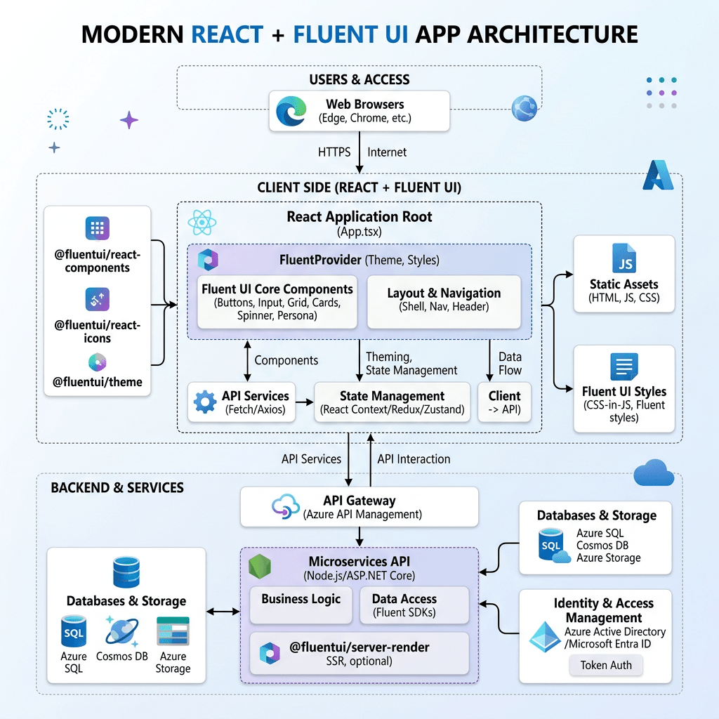
The first application of the 100 React + Fluent UI Apps Project is intentionally simple visually, but architecturally it introduces the entire foundation of modern React development. This application establishes the mental model that will support the remaining 99 apps in the roadmap. The project structure defines App 01 as Hello React Fluent, focused on JSX, components, Vite, Fluent UI, and declarative UI composition.
This article is intentionally exhaustive. The purpose is not simply to “make React work,” but to understand:
- what each command does
- how Vite works internally
- why React needs an entry point
- why Fluent UI requires a provider
- how JSX is transformed into UI
- how CSS controls layout
- why components matter
- how React renders the screen
- how TypeScript improves scalability
- how project structure influences architecture
By the end of this application, you should understand the complete flow from terminal command to rendered UI.
1. Understanding the Technology Stack
Before writing code, it is critical to understand the role of each technology.
| Technology | Purpose |
|---|---|
| Node.js | JavaScript runtime used to execute tooling |
| npm | Package manager |
| Vite | Development server and build tool |
| React | Declarative UI library |
| TypeScript | Static typing layer |
| Fluent UI | Microsoft enterprise component library |
| VS Code | Development environment |
Each tool solves a different problem.
React itself does NOT:
- compile TypeScript
- run a dev server
- build production files
- manage packages
That is why tools like Vite and npm are necessary.
2. Why Modern React Uses Vite
One of the most important concepts in modern frontend development is understanding why Vite became the standard development tool.
Historically, React projects used Create React App (CRA). However, modern JavaScript projects became increasingly large and slow to start. Vite solves this problem through native ES Modules.
Vite provides:
- instant startup
- extremely fast Hot Module Replacement
- optimized production builds
- TypeScript support
- modern React compatibility
- simpler configuration
When you save a file, Vite updates only the modified module instead of rebuilding the entire application.
This creates a dramatically faster developer experience.
3. Creating the Project Step by Step
Create the root folder
cd E:\EkisReactLabmkdir React-Fluent-100Appscd React-Fluent-100Apps
This creates the workspace for all 100 applications.
4. Creating App 01
npm create vite@latest bloco01-app01-hello-react-fluent -- --template react-ts
This command deserves detailed explanation.
5. Breaking Down the Vite Command
npm
npm is the Node Package Manager.
It:
- downloads packages
- manages dependencies
- executes scripts
create
This tells npm to execute a package creator.
vite@latest
Downloads the latest version of the Vite scaffolding tool.
bloco01-app01-hello-react-fluent
Defines the project folder name.
The final folder becomes:
React-Fluent-100Apps/ bloco01-app01-hello-react-fluent/
--
Separates npm arguments from Vite arguments.
--template react-ts
This is extremely important.
It tells Vite to create:
- React
- TypeScript
.tsxsupport- TypeScript configuration
Without this parameter, TypeScript would not be configured automatically.
6. Entering the Project
cd bloco01-app01-hello-react-fluent
7. Installing Dependencies
npm install
This downloads all project dependencies listed in:
package.json
The dependencies are stored in:
node_modules/
8. Installing Fluent UI
npm install @fluentui/react-components @fluentui/react-icons
This installs:
- Fluent UI React components
- Microsoft icons
These packages provide enterprise-grade UI controls.
9. Opening the Project in VS Code
code .
The . means:
current folder
VS Code opens the entire project workspace.
10. Running the Development Server
npm run dev
This executes the script defined in:
"scripts": { "dev": "vite"}
Vite starts the development server.
Usually:
http://localhost:5173
11. Initial Project Structure
After Vite creation:
src/ App.tsx main.tsx
We expand it into a scalable architecture:
src/ components/ data/ styles/ App.tsx main.tsx
Create folders:
mkdir src\componentsmkdir src\datamkdir src\styles
12. Why Project Structure Matters
React applications grow quickly.
Without organization:
- files become chaotic
- logic becomes mixed
- components become giant
- maintenance becomes difficult
The structure teaches:
- separation of concerns
- modularity
- scalability
13. Understanding main.tsx
File:
src/main.tsx
Code:
import React from "react";import ReactDOM from "react-dom/client";import { FluentProvider, webLightTheme,} from "@fluentui/react-components";import App from "./App";import "./styles/app.css";ReactDOM.createRoot(document.getElementById("root")!).render( <React.StrictMode> <FluentProvider theme={webLightTheme}> <App /> </FluentProvider> </React.StrictMode>);
This file is the application bootstrap.
14. ReactDOM.createRoot
ReactDOM.createRoot(document.getElementById("root")!)
This initializes React rendering.
React takes control of the DOM element:
<div id="root"></div>
inside index.html.
15. Why the ! Exists
document.getElementById("root")!
TypeScript normally says:
Maybe this element does not exist.
The ! means:
Trust me. It exists.
16. React.StrictMode
<React.StrictMode>
StrictMode helps detect:
- unsafe patterns
- invalid side effects
- deprecated APIs
- rendering mistakes
It only affects development.
17. FluentProvider
<FluentProvider theme={webLightTheme}>
This is one of the most important parts of Fluent UI.
Without it:
- components lose styling
- themes do not work
- design tokens are unavailable
The provider injects:
- colors
- typography
- spacing
- accessibility rules
- Microsoft design standards
18. webLightTheme
webLightTheme
This is Microsoft’s default Fluent UI web theme.
Future apps may use:
- dark mode
- custom themes
- dynamic themes
19. Importing CSS
import "./styles/app.css";
This imports the CSS file globally.
Without this line:
- custom styling would not load
20. Understanding App.tsx
File:
src/App.tsx
This is the root component.
21. The App Component
function App() {
React components are functions.
They:
- receive data
- return UI
This is the core React philosophy.
22. JSX Explained
return (
The component returns JSX.
JSX is NOT HTML.
JSX is:
- JavaScript syntax
- transformed by the compiler
- converted into React function calls
Example:
<Button>Hello</Button>
becomes internal JavaScript.
23. Understanding the Layout
<main className="app-shell">
Semantic HTML element representing the main content area.
24. Understanding CSS Flexbox
display: flex;justify-content: center;align-items: center;
This centers the layout.
| Property | Purpose |
|---|---|
| display:flex | Activates flexbox |
| justify-content | Horizontal alignment |
| align-items | Vertical alignment |
25. Understanding the Card Component
<Card className="info-card">
The Fluent UI Card component provides:
- enterprise styling
- spacing
- border radius
- accessibility
- layout consistency
Cards are heavily used in:
- dashboards
- portals
- analytics systems
- SharePoint-style interfaces
26. Understanding CardHeader
<CardHeader />
This organizes:
- icon
- title
- description
27. Understanding Fluent UI Icons
<Rocket24Regular />
This imports a Microsoft Fluent icon.
The number:
24
means:
24px size
28. Understanding Typography Components
Instead of:
<h1><p>
Fluent UI uses:
<Title1><Text><Body1>
Advantages:
- typography consistency
- enterprise scale system
- accessibility
- Microsoft visual identity
29. Understanding Props
Example:
<AppHeader appNumber={appInfo.appNumber}/>
Props are component inputs.
Props make components:
- reusable
- configurable
- modular
This is fundamental in React architecture.
30. Understanding .map()
technologies.map((technology) => (
Transforms arrays into UI.
This is how React renders dynamic collections.
31. Why React Needs Keys
key={technology}
React uses keys to identify elements efficiently.
Without keys:
- React rendering becomes inefficient
- warnings appear
32. Understanding CSS Completely
File:
src/styles/app.css
33. Universal Selector
* { box-sizing: border-box;}
Makes width calculations predictable.
34. Body Styling
body { margin: 0;}
Browsers add default margin automatically.
We remove it.
35. Segoe UI Font
font-family: "Segoe UI";
Segoe UI is Microsoft’s default typography.
36. Full Screen Height
min-height: 100vh;
vh means:
viewport height
100vh fills the screen vertically.
37. Padding
padding: 48px;
Creates internal spacing.
38. Gap
gap: 20px;
Adds spacing between flex children.
39. Why React Uses Component Composition
The app structure:
App ├── AppHeader └── InfoCard
This is composition.
React applications scale through composition.
40. Why This App Has No State Yet
This app intentionally avoids:
- useState
- useEffect
- APIs
Because React Learn teaches:
Do not introduce state or effects before necessary.
The UI is static.
Static UI does not need state.
41. Mental Model Introduced
This app teaches the correct React mindset.
React is NOT:
- manual DOM manipulation
- jQuery
- imperative UI programming
React IS:
- declarative rendering
- component composition
- state-driven UI
- predictable architecture
42. Final Result
The final result is:
- clean
- scalable
- enterprise-style
- Microsoft-inspired
- strongly typed
- modular
This app becomes the architectural foundation for:
- forms
- CRUD systems
- dashboards
- APIs
- enterprise applications
- SharePoint-style portals
Technical Summary
| Topic | Purpose |
|---|---|
| Vite | Fast React development |
| React | Declarative UI |
| JSX | UI syntax |
| TypeScript | Static typing |
| Fluent UI | Microsoft enterprise components |
| FluentProvider | Theme injection |
| Card | Enterprise visual container |
| Button | Primary action |
| Props | Component configuration |
| CSS Flexbox | Layout system |
| Composition | Scalable architecture |
Official Documentation
React
- React Learn
- Your First Component
- Writing Markup with JSX
- Passing Props to a Component
- Rendering Lists
 edvaldo b. guimarães filho