App 05: Building a Static Business Dashboard with React, TypeScript, Vite, and Fluent UI
App 05 is Static Business Dashboard, part of Block 1 of the 100 React + Fluent UI project. In the project roadmap, App 05 belongs to Block 1 — Fundamentals and UI, where the focus is JSX, components, props, lists, composition, and declarative UI structure.
1. What App 05 teaches
This app looks simple, but it introduces a very important React architecture pattern:
data -> typed model -> reusable component -> page composition -> final UI
The dashboard is not built by manually copying four cards inside App.tsx.
Instead, the project uses:
DashboardMetric.ts ↓dashboardMetrics.ts ↓MetricCard.tsx ↓App.tsx ↓main.tsx ↓Browser UI
This relationship between files is the most important lesson of App 05.
React is not only about putting JSX on the screen. React is about organizing UI as a composition of small, predictable pieces.
2. Project creation
PowerShell commands:
cd C:\ReactAppsnpm create vite@latest bloco01-app05-static-dashboard -- --template react-tscd bloco01-app05-static-dashboardnpm installnpm install @fluentui/react-components @fluentui/react-iconscode .
This creates a React + TypeScript project using Vite.
Vite gives us the development server, build system, and project structure. TypeScript gives type safety. Fluent UI gives Microsoft-style components such as Card, Button, Badge, Text, and typography components.
3. Folder structure
PowerShell commands:
New-Item -ItemType Directory -Force -Path src\componentsNew-Item -ItemType Directory -Force -Path src\dataNew-Item -ItemType Directory -Force -Path src\modelsNew-Item -ItemType Directory -Force -Path src\styles
Final structure:
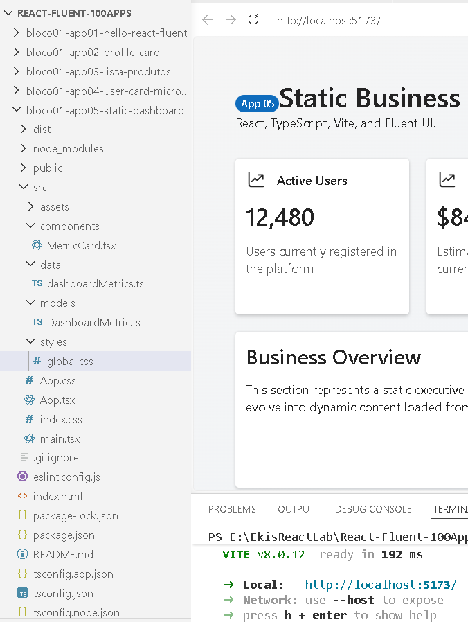
src/ components/ MetricCard.tsx data/ dashboardMetrics.ts models/ DashboardMetric.ts styles/ global.css App.tsx main.tsx
Each folder has a responsibility:
| Folder | Responsibility |
|---|---|
models | Defines the shape of the data |
data | Stores the dashboard information |
components | Stores reusable visual pieces |
styles | Stores CSS layout and visual rules |
App.tsx | Composes the page |
main.tsx | Starts React and applies Fluent UI theme |
This prevents the app from becoming a single giant file.
4. The model file: DashboardMetric.ts
export type DashboardMetric = { id: number; title: string; value: string; description: string;};
This file defines the contract for a dashboard metric.
It says that every metric must have:
| Property | Type | Meaning |
|---|---|---|
id | number | Unique identifier |
title | string | Card title |
value | string | Main KPI value |
description | string | Explanation text |
This is very important because TypeScript now protects the data structure.
For example, this would be valid:
{ id: 1, title: "Active Users", value: "12,480", description: "Users currently registered in the platform"}
But this would be wrong:
{ id: 1, name: "Active Users"}
Why? Because the model expects title, value, and description.
So the model file acts like a rulebook for the dashboard data.
5. The data file: dashboardMetrics.ts
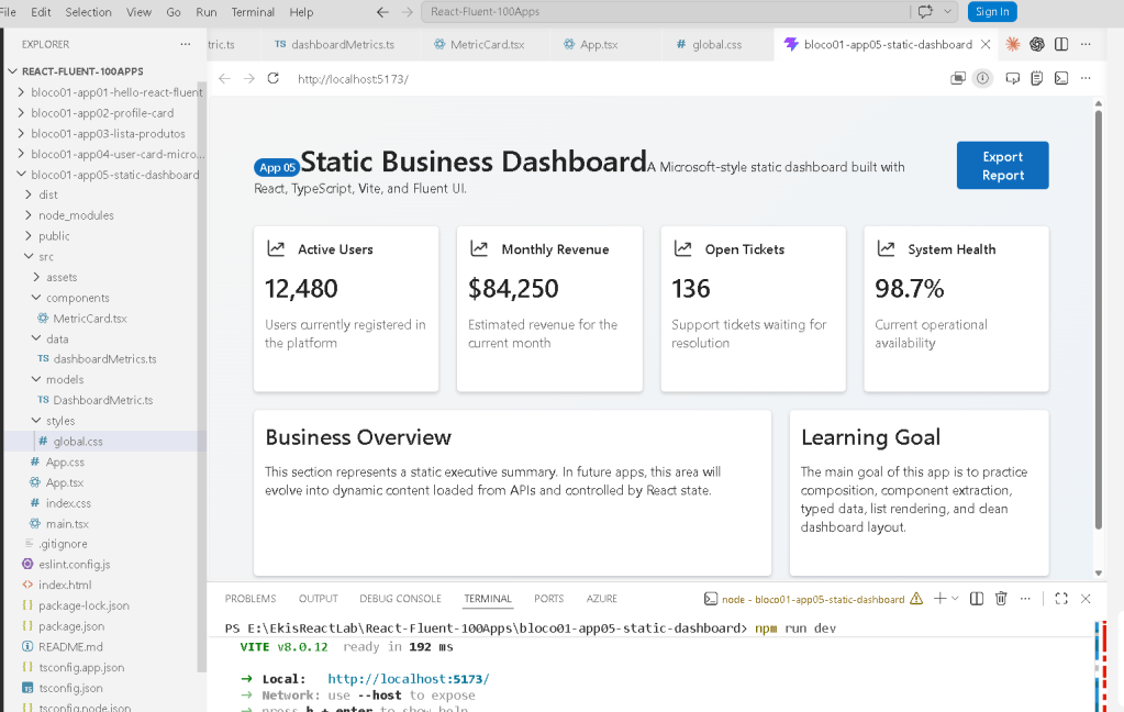
import type { DashboardMetric } from "../models/DashboardMetric";export const dashboardMetrics: DashboardMetric[] = [ { id: 1, title: "Active Users", value: "12,480", description: "Users currently registered in the platform", }, { id: 2, title: "Monthly Revenue", value: "$84,250", description: "Estimated revenue for the current month", }, { id: 3, title: "Open Tickets", value: "136", description: "Support tickets waiting for resolution", }, { id: 4, title: "System Health", value: "98.7%", description: "Current operational availability", },];
This file imports the type:
import type { DashboardMetric } from "../models/DashboardMetric";
The word type is important. It tells TypeScript:
This import is only used for typing.It does not need to exist in the final JavaScript bundle.
Then the data is exported:
export const dashboardMetrics: DashboardMetric[] = [...]
This means:
dashboardMetrics is an array of DashboardMetric objects.
So TypeScript knows that every item inside the array has:
idtitlevaluedescription
This is why, later in App.tsx, when we write:
dashboardMetrics.map((metric) => ...)
TypeScript understands that metric is a DashboardMetric.
That is why the metric parameter does not need manual typing.
6. The reusable component: MetricCard.tsx
import { Card, CardHeader, Text, Title2, Body1,} from "@fluentui/react-components";import { DataTrending24Regular } from "@fluentui/react-icons";import type { DashboardMetric } from "../models/DashboardMetric";type MetricCardProps = { metric: DashboardMetric;};export function MetricCard({ metric }: MetricCardProps) { return ( <Card className="metric-card"> <CardHeader image={<DataTrending24Regular />} header={<Text weight="semibold">{metric.title}</Text>} /> <Title2>{metric.value}</Title2> <Body1 className="metric-description"> {metric.description} </Body1> </Card> );}
This file is the visual card component.
It receives one prop:
metric
The prop type is defined here:
type MetricCardProps = { metric: DashboardMetric;};
This means the component expects this shape:
MetricCard receives: metric: id title value description
Then the component uses the received data:
{metric.title}{metric.value}{metric.description}
This is the key React concept:
The component does not own the data.The component receives data through props.The component renders UI based on those props.
That is why MetricCard is reusable.
It can render:
Active UsersMonthly RevenueOpen TicketsSystem Health
using the same component.
Without this component, you would probably repeat four cards manually in App.tsx.
That would be bad because the layout would become duplicated and harder to maintain.
7. The page file: App.tsx
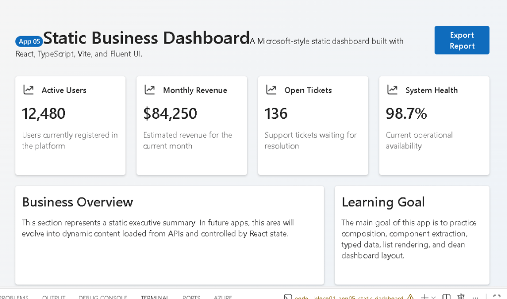
import { Badge, Button, Card, Text, Title1, Title3,} from "@fluentui/react-components";import { MetricCard } from "./components/MetricCard";import { dashboardMetrics } from "./data/dashboardMetrics";function App() { return ( <main className="page"> <section className="dashboard-shell"> <header className="dashboard-header"> <div> <Badge appearance="filled" color="brand"> App 05 </Badge> <Title1>Static Business Dashboard</Title1> <Text> A Microsoft-style static dashboard built with React, TypeScript, Vite, and Fluent UI. </Text> </div> <Button appearance="primary">Export Report</Button> </header> <section className="metrics-grid"> {dashboardMetrics.map((metric) => ( <MetricCard key={metric.id} metric={metric} /> ))} </section> <section className="content-grid"> <Card className="large-card"> <Title3>Business Overview</Title3> <Text> This section represents a static executive summary. In future apps, this area will evolve into dynamic content loaded from APIs and controlled by React state. </Text> </Card> <Card className="large-card"> <Title3>Learning Goal</Title3> <Text> The main goal of this app is to practice composition, component extraction, typed data, list rendering, and clean dashboard layout. </Text> </Card> </section> </section> </main> );}export default App;
App.tsx is the page composer.
It imports:
import { MetricCard } from "./components/MetricCard";
That gives the page access to the reusable card component.
It also imports:
import { dashboardMetrics } from "./data/dashboardMetrics";
That gives the page access to the array of metric data.
Then the most important line is:
{dashboardMetrics.map((metric) => ( <MetricCard key={metric.id} metric={metric} />))}
This line means:
For each item inside dashboardMetrics,create one MetricCard component,pass the current item as the metric prop,and use metric.id as the React key.
The flow is:
dashboardMetrics[0] -> MetricCard -> Active Users carddashboardMetrics[1] -> MetricCard -> Monthly Revenue carddashboardMetrics[2] -> MetricCard -> Open Tickets carddashboardMetrics[3] -> MetricCard -> System Health card
So the final four cards on the screen are generated from data.
That is not a black box.
The exact relationship is:
dashboardMetrics.ts provides the arrayApp.tsx loops through the arrayMetricCard.tsx renders each objectglobal.css controls the layoutFluent UI controls the visual style
8. Why key={metric.id} is important
React needs a key when rendering lists:
<MetricCard key={metric.id} metric={metric} />
The key helps React identify each item between renders.
Even though this app is static, this is still the correct habit.
Later, when you build apps with filters, delete buttons, search, sorting, or API data, keys become essential.
Bad:
<MetricCard metric={metric} />
Good:
<MetricCard key={metric.id} metric={metric} />
9. The entry point: main.tsx
import React from "react";import ReactDOM from "react-dom/client";import { FluentProvider, webLightTheme } from "@fluentui/react-components";import App from "./App";import "./styles/global.css";ReactDOM.createRoot(document.getElementById("root")!).render( <React.StrictMode> <FluentProvider theme={webLightTheme}> <App /> </FluentProvider> </React.StrictMode>);
This file starts the app.
The flow is:
main.tsx loads Reactmain.tsx loads FluentProvidermain.tsx loads Appmain.tsx loads global CSSReact renders App into the HTML root element
This line starts React:
ReactDOM.createRoot(document.getElementById("root")!)
The root element exists in index.html.
This part applies the Fluent UI theme:
<FluentProvider theme={webLightTheme}> <App /></FluentProvider>
Without FluentProvider, Fluent UI components would not receive the correct theme.
So the relationship is:
main.tsx wraps App with FluentProviderApp uses Fluent UI componentsFluentProvider gives them the Microsoft theme
This is why the dashboard has the Microsoft-style appearance.
10. The CSS file: global.css
* { box-sizing: border-box;}
This makes sizing more predictable.
body { margin: 0; font-family: "Segoe UI", Arial, sans-serif; background: #f5f5f5;}
This removes browser default margin and applies a Microsoft-like font.
.page { min-height: 100vh; padding: 48px; background: linear-gradient(135deg, #f5f5f5 0%, #eef3f8 100%);}
This controls the full page.
It gives:
full viewport heightexternal spacinglight dashboard background
.dashboard-shell { max-width: 1200px; margin: 0 auto;}
This centers the dashboard and prevents it from becoming too wide.
.dashboard-header { display: flex; justify-content: space-between; align-items: flex-start; gap: 24px; margin-bottom: 32px;}
This creates the top header layout.
Left side:
BadgeTitleDescription
Right side:
Export Report button
.metrics-grid { display: grid; grid-template-columns: repeat(4, 1fr); gap: 20px;}
This is what creates the four KPI cards in one row.
The CSS means:
Create 4 equal columns.Each column takes 1 fraction of the available width.Put 20px space between cards.
.content-grid { display: grid; grid-template-columns: 2fr 1fr; gap: 20px; margin-top: 20px;}
This creates the bottom section.
The first card is wider:
Business Overview = 2 partsLearning Goal = 1 part
That is why the bottom layout looks like a real dashboard.
11. Responsive behavior
@media (max-width: 900px) { .dashboard-header { flex-direction: column; } .metrics-grid { grid-template-columns: repeat(2, 1fr); } .content-grid { grid-template-columns: 1fr; }}
When the screen becomes smaller:
Header stacks verticallyMetric cards become 2 columnsBottom cards become 1 column
Then for mobile:
@media (max-width: 600px) { .page { padding: 24px; } .metrics-grid { grid-template-columns: 1fr; }}
Now the metric cards become one per row.
This is important because enterprise dashboards must work across different screen sizes.
12. Complete file relationship
This is the complete mental model:
1. DashboardMetric.ts Defines what a metric is.2. dashboardMetrics.ts Creates an array of metrics using that type.3. MetricCard.tsx Receives one metric and renders one card.4. App.tsx Imports the metric array. Loops over the array. Creates one MetricCard per item. Adds the dashboard header and bottom cards.5. global.css Controls spacing, grid, responsiveness, and page layout.6. main.tsx Starts React. Applies Fluent UI theme. Renders App into the browser.
This is the real architecture.
There is no magic.
Every piece has a responsibility.
13. Why this app does not use state
App 05 does not use:
useState
because nothing changes yet.
The dashboard is static.
The data is fixed.
The user does not interact with the cards.
So state would be unnecessary.
This is a very important React lesson:
Do not add state just because you are using React.Add state only when the UI must remember or react to changes.
State will appear later in the project.
14. Why this app does not use useEffect
App 05 also does not use:
useEffect
because the app is not synchronizing with an external system.
There is no:
API calltimerbrowser storageexternal eventsubscriptionDOM integration
So useEffect is unnecessary.
This is modern React thinking.
Many beginners use useEffect too early. This app correctly avoids that.
15. Final result explained
The final screen appears as a business dashboard because multiple layers work together:
| Layer | File | Result |
|---|---|---|
| Data model | DashboardMetric.ts | Defines the metric shape |
| Data source | dashboardMetrics.ts | Provides the dashboard values |
| UI component | MetricCard.tsx | Renders each KPI card |
| Page composition | App.tsx | Builds the dashboard screen |
| Theme provider | main.tsx | Applies Fluent UI theme |
| Layout styling | global.css | Creates grid, spacing, and responsive layout |
The dashboard is the result of file collaboration.
It is not a single isolated page.
That is the main architectural lesson.
16. Technical summary
| Concept | Explanation |
|---|---|
| Component | A reusable UI function |
| Props | Data passed into a component |
| TypeScript type | Contract that defines data shape |
| Array rendering | Creating UI from data with map() |
| React key | Unique identity for rendered list items |
| FluentProvider | Global Fluent UI theme wrapper |
| Card | Fluent UI container component |
| CSS Grid | Layout system for dashboard cards |
| Responsive design | Layout adapts to screen size |
| Static UI | No state because nothing changes |
| No effect | No external synchronization needed |
17. Official documentation
| Topic | Documentation |
|---|---|
| React Learn | https://react.dev/learn |
| Describing the UI | https://react.dev/learn/describing-the-ui |
| Your First Component | https://react.dev/learn/your-first-component |
| Passing Props | https://react.dev/learn/passing-props-to-a-component |
| Rendering Lists | https://react.dev/learn/rendering-lists |
| Keeping Components Pure | https://react.dev/learn/keeping-components-pure |
| You Might Not Need an Effect | https://react.dev/learn/you-might-not-need-an-effect |
| Fluent UI React | https://react.fluentui.dev |
| Vite Guide | https://vite.dev/guide |
| TypeScript Docs | https://www.typescriptlang.org/docs |
18. Current project position
| Block | App | Name | Status |
|---|---|---|---|
| Block 1 | 01 | Hello React Fluent | Completed |
| Block 1 | 02 | Profile Card | Completed |
| Block 1 | 03 | Product List | Completed |
| Block 1 | 04 | Microsoft Style User Card | Completed |
| Block 1 | 05 | Static Dashboard | Completed |
| Block 1 | 06 | Corporate Sidebar Menu | Next |
 edvaldo b. guimarães filho