
Building a Microsoft-Style User Card Application with React, TypeScript, Vite, and Fluent UI
Modern React development is not just about rendering HTML with JavaScript. Enterprise frontend applications require architecture, component composition, design systems, scalability, accessibility, and maintainability. One of the best ways to learn React correctly is by combining the official React mental model from React Learn with a professional UI framework such as Fluent UI.
This application, App 04 — Microsoft Style User Cards, continues the React learning journey by introducing:
- reusable components
- typed props
- component composition
- enterprise card layouts
- Avatar and Badge controls
- grid-based layouts
- separation of concerns
- data-driven rendering
- Fluent UI enterprise styling
Although visually simple, this project introduces some of the most important architectural principles in modern React.
Application Goal
The purpose of this application is to build reusable Microsoft-style user profile cards using:
- React
- TypeScript
- Fluent UI
- Vite
- component composition
- typed models
- reusable props
- declarative rendering
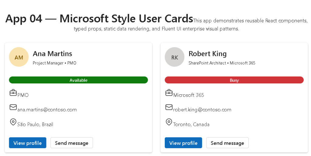
The final interface displays multiple employee cards similar to Microsoft 365, Teams, SharePoint, or enterprise dashboards.
Why This Application Matters
This app introduces one of the most important ideas in React:
UI should be composed from reusable components.
Instead of repeating HTML multiple times, React applications create reusable building blocks.
This is one of the core principles explained in:
The Microsoft User Card component is reusable because:
- the UI structure is defined once
- data is passed dynamically through props
- multiple cards can be rendered using different data
This architecture is fundamental in enterprise React applications.
Creating the Project
The project was created using Vite.
npm create vite@latest bloco01-app04-user-card-microsoft-style -- --template react-ts
This command creates:
- a React application
- TypeScript configuration
- Vite development server
- modern React tooling
- optimized build pipeline
The react-ts template enables TypeScript support from the beginning.
Installing Dependencies
After creating the project:
npm install
Then Fluent UI packages were installed:
npm install @fluentui/react-components @fluentui/react-icons
These packages provide:
- enterprise UI controls
- Microsoft design system
- accessibility support
- typography
- spacing
- icons
- themes
Understanding the Project Structure
The application follows a scalable architecture.
src/ components/ data/ models/ styles/
Each folder has a specific responsibility.
components/
Contains reusable UI elements.
In this app:
MicrosoftUserCard.tsx
Future enterprise applications may include:
- dashboards
- menus
- dialogs
- layouts
- navigation systems
- reusable forms
models/
Contains TypeScript types and interfaces.
export type UserCard = { id: number; fullName: string; jobTitle: string; department: string; email: string; location: string; status: "Available" | "Busy" | "Away" | "Offline"; initials: string;};
This structure defines the shape of user data.
TypeScript provides:
- autocomplete
- compile-time validation
- safer refactoring
- better maintainability
- enterprise scalability
Without TypeScript, many bugs would only appear during runtime.
data/
Contains mock or static data.
export const users: UserCard[] = [
This app uses static employee information.
Later projects may replace this with:
- REST APIs
- GraphQL
- databases
- Microsoft Graph
- SharePoint APIs
The important concept is:
React components should render based on data.
styles/
Contains CSS files.
Even with Fluent UI, enterprise applications still require:
- layout customization
- spacing
- responsive behavior
- page organization
Understanding main.tsx
The application starts in main.tsx.
import { FluentProvider, webLightTheme,} from "@fluentui/react-components";
This imports Fluent UI’s global theme system.
FluentProvider
One of the most important architectural concepts introduced in this application is:
<FluentProvider theme={webLightTheme}>
This activates Fluent UI globally.
Without this provider:
- components lose styling consistency
- typography becomes inconsistent
- themes do not work properly
FluentProvider injects:
- colors
- spacing
- typography
- Microsoft design rules
- accessibility behavior
The selected theme:
webLightTheme
matches Microsoft’s light design language.
Future applications may introduce:
- dark themes
- custom branding
- dynamic theme switching
Understanding the UserCard Type
The model:
export type UserCard = {
is extremely important architecturally.
It defines:
- what a user object must contain
- required fields
- allowed status values
This prevents invalid data structures.
For example:
status: "Available" | "Busy" | "Away" | "Offline";
creates a TypeScript union type.
This means the status can only contain:
- Available
- Busy
- Away
- Offline
This is much safer than plain strings.
Understanding Props
The component receives data through props.
type MicrosoftUserCardProps = { user: UserCard;};
This defines:
- the component expects a
user - the object must follow the
UserCardstructure
Then:
export function MicrosoftUserCard({ user }: MicrosoftUserCardProps)
destructures the prop.
This is one of the most important React concepts:
Components receive inputs through props.
React applications become scalable by passing data into reusable components.
Understanding the Card Component
The main container:
<Card className="user-card">
comes from Fluent UI.
The Card component already includes:
- padding
- shadows
- border radius
- spacing
- accessibility
- enterprise styling
This demonstrates why design systems matter.
Without Fluent UI, all these behaviors would need manual implementation.
Understanding Avatar
<Avatar name={user.fullName} initials={user.initials} color="colorful" size={56}/>
The Avatar component generates a Microsoft-style user identity UI.
It supports:
- initials
- profile images
- colors
- accessibility labels
- scalable sizes
This is heavily used in:
- Microsoft Teams
- Outlook
- SharePoint
- admin dashboards
Understanding CardHeader
<CardHeader
This organizes:
- avatar
- title
- description
The header section contains:
header={ <Text weight="semibold" size={500}>
and:
description={ <Caption1>
Fluent UI typography components provide:
- visual consistency
- accessibility
- Microsoft typography standards
Understanding the Badge Component
<Badge appearance="filled">
Badges are commonly used in enterprise applications for:
- status indicators
- labels
- categories
- alerts
- availability indicators
The app dynamically changes badge colors:
function getBadgeColor(status: UserCard["status"])
This introduces conditional rendering logic.
Conditional Logic in React
The function:
if (status === "Available") return "success";
demonstrates UI behavior derived from data.
This is one of React’s most important principles:
UI changes based on state or data.
Instead of manually changing HTML classes, React recalculates the UI automatically.
Understanding List Rendering
Inside App.tsx:
{users.map((user) => ( <MicrosoftUserCard key={user.id} user={user} />))}
This is one of the most important React patterns.
The map() function:
- loops through data
- creates components dynamically
- renders reusable UI blocks
This is called declarative rendering.
Instead of manually creating multiple cards, the UI derives from data automatically.
Why the key Prop Matters
key={user.id}
React requires keys for lists.
Keys help React:
- identify elements
- optimize rendering
- update efficiently
- avoid UI inconsistencies
This is explained in:
Understanding CSS Grid Layout
The layout uses CSS Grid:
.cards-grid { display: grid;}
and:
grid-template-columns: repeat(auto-fit, minmax(320px, 1fr));
This creates:
- responsive columns
- automatic resizing
- adaptive layouts
This is common in:
- dashboards
- admin portals
- analytics systems
- Microsoft-style enterprise applications
Understanding Flexbox Rows
The info rows:
.info-row { display: flex;}
align:
- icons
- text
- spacing
Flexbox is one of the most important layout systems in modern frontend development.
Why This Architecture Is Important
This application establishes several enterprise frontend concepts:
| Concept | Importance |
|---|---|
| Reusable components | Prevent duplicated UI |
| Props | Data-driven architecture |
| TypeScript models | Safer applications |
| Fluent UI | Enterprise consistency |
| Grid layouts | Responsive dashboards |
| Data rendering | Declarative UI |
| Component composition | Scalable architecture |
React Mental Model Introduced
This app reinforces the correct React mental model.
React is NOT:
- manual DOM manipulation
- jQuery
- imperative UI programming
React IS:
- component composition
- declarative rendering
- data-driven UI
- predictable rendering
This distinction is critical.
Why There Is No State Yet
This application intentionally avoids:
- useState
- useEffect
- API calls
Why?
Because the UI is static.
According to:
effects should only synchronize external systems.
Since this app only renders static data:
- state is unnecessary
- effects are unnecessary
This avoids one of the biggest beginner mistakes in React.
Final Result
The final application delivers:
- Microsoft-style cards
- reusable React components
- typed architecture
- responsive layout
- Fluent UI enterprise design
- scalable folder organization
This creates the foundation for future applications involving:
- state
- APIs
- dashboards
- forms
- authentication
- enterprise portals
Technical Summary
| Technology | Purpose |
|---|---|
| React | Declarative UI library |
| TypeScript | Static typing |
| Vite | Fast development tooling |
| Fluent UI | Microsoft design system |
| Avatar | User identity component |
| Badge | Status indicator |
| Card | Enterprise container |
| Props | Component inputs |
| CSS Grid | Responsive layouts |
| map() | Dynamic rendering |
Official Documentation
React
Fluent UI
Vite
TypeScript
Current Progress
| Block | App | Name | Status |
|---|---|---|---|
| Block 1 | 01 | Hello React Fluent | Completed |
| Block 1 | 02 | Profile Card | Completed |
| Block 1 | 03 | Product List | Completed |
| Block 1 | 04 | Microsoft Style User Cards | Current |
| Block 1 | 05 | Static Dashboard | Next |
 edvaldo b. guimarães filho