Building a Modern Profile Card with React, TypeScript, Vite, and Fluent UI
The second application in the “100 React + Fluent UI Apps” journey focuses on one of the most important concepts in modern React development: component composition with props. While the visual result may appear simple at first glance, this project introduces critical architectural ideas that form the foundation of scalable enterprise React applications.
This app, App 02 — Profile Card, expands upon the concepts introduced in App 01 and starts moving toward true reusable UI architecture. Instead of rendering static content directly inside a single component, the application now separates responsibilities into:
- reusable components
- typed models
- component props
- composable UI structures
- enterprise Fluent UI controls
The project follows the official React learning philosophy from:
The application also continues using:
- Vite
- React
- TypeScript
- Fluent UI
- Enterprise component architecture
as defined in the overall 100-app learning roadmap.
Application Goal
The goal of this project is to create a reusable enterprise-style Microsoft profile card containing:
- avatar
- name
- role
- department
- online status
- action buttons
The application visually resembles modern Microsoft 365 and enterprise dashboard interfaces.
More importantly, however, this app teaches:
- props
- reusable components
- separation of concerns
- TypeScript interfaces
- component composition
- React declarative architecture
Creating the Project
The project starts with Vite.
npm create vite@latest bloco01-app02-profile-card -- --template react-ts
This command creates:
- React application
- TypeScript configuration
- Vite tooling
- development scripts
- optimized build system
Then dependencies are installed:
npm install
Next, Fluent UI is added:
npm install @fluentui/react-components
Fluent UI provides Microsoft’s enterprise design system for React applications.
Project Structure
The application structure becomes:
src/ components/ models/ App.tsx main.tsx index.css
This organization already introduces a scalable enterprise architecture.
Understanding the Models Folder
One of the most important additions in this app is:
models/
Inside:
UserProfile.ts
This file contains:
export interface UserProfile { id: number; name: string; role: string; email: string; department: string; status: "Online" | "Busy" | "Offline";}
This introduces one of the biggest advantages of TypeScript:
- strongly typed application models
The interface defines the structure of the data used by the UI.
This means:
- safer code
- IntelliSense
- compile-time validation
- better maintainability
- fewer runtime bugs
Understanding TypeScript Interfaces
The interface keyword defines a contract.
interface UserProfile
This means:
Any object considered a UserProfile must contain these properties.
For example:
const user: UserProfile = { id: 1, name: "Edvaldo",};
would fail because properties are missing.
This is one of the biggest reasons enterprise applications prefer TypeScript.
Understanding Union Types
One particularly important line is:
status: "Online" | "Busy" | "Offline";
This is called a union type.
Instead of allowing any string:
status: string
the app restricts valid values.
This prevents invalid states like:
status: "Sleeping"
This technique greatly improves reliability in large applications.
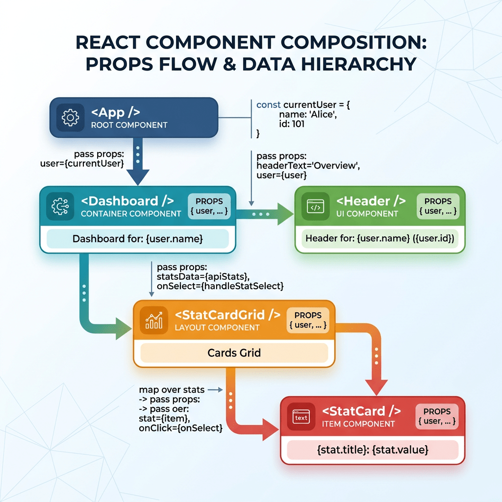
Understanding Component Architecture
The application now introduces a reusable component:
ProfileCard.tsx
This is extremely important because React applications scale through component composition.
Instead of writing everything inside App.tsx, the UI is divided into reusable blocks.
This is one of the central ideas of React Learn:
- small components
- isolated responsibilities
- composable UI
Understanding Props
The component receives data through props.
interface ProfileCardProps { user: UserProfile;}
This means the component expects:
- one prop
- named
user - following the
UserProfilestructure
Then:
export function ProfileCard({ user }: ProfileCardProps)
This is object destructuring.
Instead of:
props.user
the component directly extracts:
- user
from the props object.
Why Props Matter
Props are one of the core concepts of React.
Props allow:
- reusability
- configurability
- composition
- scalability
The component becomes reusable:
<ProfileCard user={user1} /><ProfileCard user={user2} /><ProfileCard user={user3} />
without changing internal logic.
This is fundamental in enterprise systems.
Understanding Fluent UI Components
The application imports several Fluent UI controls:
import { Avatar, Badge, Button, Card, CardHeader, Text,} from "@fluentui/react-components";
Each component solves complex UI problems automatically.
Avatar Component
<Avatar name={user.name} color="colorful" size={64}/>
This generates:
- initials
- sizing
- accessibility
- consistent styling
Fluent UI automatically derives initials from the user name.
For example:
Edvaldo Guimaraes
becomes:
EG
inside the avatar.
Card Component
The main container:
<Card>
provides:
- enterprise spacing
- borders
- elevation
- layout consistency
Cards are heavily used in:
- dashboards
- Microsoft 365 apps
- SharePoint
- admin systems
- portals
CardHeader
<CardHeader
This component standardizes:
- image placement
- title layout
- subtitle positioning
Without Fluent UI, this would require:
- manual flexbox
- spacing calculations
- alignment logic
Badge Component
The online status uses:
<Badge>
with conditional color logic:
color={ user.status === "Online" ? "success" : user.status === "Busy" ? "warning" : "subtle"}
This introduces one of the most important React concepts:
- conditional rendering logic
The UI changes dynamically according to data.
This is the true React mental model:
UI is a function of state and data.
Understanding Conditional Expressions
This syntax:
condition ? valueA : valueB
is called a ternary operator.
The component dynamically chooses:
- green
- yellow
- gray
depending on status.
This is declarative UI behavior.
Understanding the Buttons
<Button appearance="primary">
Fluent UI buttons already include:
- keyboard accessibility
- hover behavior
- focus management
- spacing
- enterprise styling
The appearance prop configures visual style.
Understanding App.tsx
The application root contains:
const user: UserProfile = {
This creates strongly typed application data.
Then:
<ProfileCard user={user} />
passes the object into the reusable component.
This architecture mirrors real enterprise applications:
- data layer
- model layer
- UI components
- composition
Understanding Type-Only Imports
One of the most important lessons introduced in this app is modern TypeScript import behavior.
The application uses:
import type { UserProfile }
instead of:
import { UserProfile }
because interfaces exist only during TypeScript compilation.
They do not exist at runtime JavaScript.
Modern Vite + TypeScript projects enforce this separation using:
verbatimModuleSyntax
This improves:
- tree shaking
- bundle optimization
- runtime cleanliness
This is a modern enterprise TypeScript practice.
Understanding CSS Organization
The app also introduces structured CSS.
.app-container { min-height: 100vh; display: flex; justify-content: center; align-items: center;}
This creates:
- full-screen layout
- horizontal centering
- vertical centering
The application uses Flexbox for layout alignment.
Why This App Matters
Although visually simple, this application introduces:
- reusable architecture
- component isolation
- typed models
- conditional rendering
- enterprise UI composition
- props
- modern TypeScript behavior
These concepts are foundational for:
- dashboards
- CRUD systems
- portals
- SharePoint interfaces
- admin panels
- enterprise applications
Without mastering props and component composition, advanced React becomes difficult.
React Mental Model Reinforced
This application reinforces the official React philosophy:
React is NOT:
- imperative DOM manipulation
- manual UI updates
- jQuery programming
React IS:
- declarative rendering
- component composition
- state-driven UI
- reusable architecture
Why There Is Still No useEffect
This project intentionally avoids:
- useEffect
- API calls
- state management
because the UI is purely derived from static data.
According to React Learn:
“You Might Not Need an Effect.”
This is extremely important because beginners often overuse effects unnecessarily.
Final Result
The final application delivers:
- Microsoft-style profile card
- reusable component architecture
- strongly typed models
- Fluent UI enterprise styling
- scalable React structure
while introducing the first true reusable React component of the 100-app roadmap.
Technical Summary
| Technology | Purpose |
|---|---|
| React | Declarative UI rendering |
| TypeScript | Strong typing |
| Vite | Modern build tooling |
| Fluent UI | Microsoft design system |
| Props | Component configuration |
| Interfaces | Typed models |
| Avatar | User visual identity |
| Badge | Dynamic status UI |
| Card | Enterprise layout container |
| Flexbox | Layout alignment |
Official Documentation
React
Fluent UI
TypeScript
Vite
Current Project Progress
BLOCO 1 — FUNDAMENTOS E UI✅ App01 — Hello React Fluent✅ App02 — Cartão de Perfil🔜 App03 — Lista de Produtos
 edvaldo b. guimarães filho