
Technical Blog Article — App 07: Building a Visual Task List with React, TypeScript, Vite, and Fluent UI
The seventh application in the React + Fluent UI roadmap is App 07 — Visual Task List. This project continues the first learning block focused on describing the UI, component composition, JSX, and declarative rendering. Unlike later applications, this app intentionally avoids state management and effects. Its primary purpose is to teach how React applications are built from reusable components and structured data.
According to the project roadmap, this app belongs to Block 1 — Fundamentals and UI and is associated with React’s concept of Keeping Components Pure.
This application simulates a small enterprise task board inspired by:
- Microsoft Planner
- Azure DevOps dashboards
- SharePoint task lists
- project management systems
- corporate portals
Even though the application is visually simple, architecturally it introduces several extremely important React concepts:
- reusable components
- component composition
- rendering lists with
map() - TypeScript models
- separation of data and UI
- declarative rendering
- pure components
- Fluent UI design system integration
The most important idea introduced here is:
React components should describe the UI from data.
Instead of manually building repeated HTML blocks, React converts structured data into reusable UI components.
1. Creating the Project
The project starts with Vite.
npm create vite@latest app07-visual-task-list -- --template react-ts
This command creates:
- a React application
- TypeScript configuration
- Vite build configuration
- development server setup
- JSX/TSX support
Then dependencies are installed:
npm install
Next, Fluent UI is added:
npm install @fluentui/react-components @fluentui/react-icons
This installs:
- Microsoft Fluent UI components
- Fluent UI SVG icon system
- typography system
- design tokens
- enterprise layout components
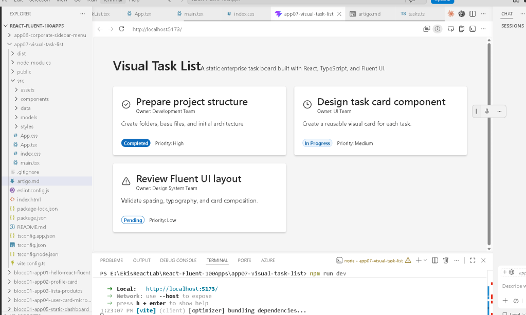
2. Final Folder Structure
The final project structure becomes:
app07-visual-task-list/ node_modules/ public/ src/ components/ TaskCard.tsx TaskList.tsx data/ tasks.ts models/ TaskItem.ts styles/ App.tsx index.css main.tsx index.html package.json vite.config.ts tsconfig.json
This architecture is important because React applications scale through separation of responsibilities.
Each folder has a clear role.
3. Understanding the Application Flow
The rendering flow of this app is:
index.html ↓main.tsx ↓App.tsx ↓TaskList.tsx ↓TaskCard.tsx
The data flow is:
tasks.ts ↓TaskList.tsx ↓TaskCard.tsx
This means:
- the data is separated from the UI
- components receive data through props
- React renders the UI declaratively
This architecture is one of the most important patterns in modern React.
4. How React Connects to HTML
The browser first loads:
index.html
Inside this file there is usually:
<div id="root"></div>
This div starts empty.
React later injects the application into this element.
The important connection happens in:
ReactDOM.createRoot( document.getElementById("root")!)
This line means:
Find the HTML element called "root"and mount the React application inside it.
So React does not replace HTML completely.
Instead:
- HTML provides the container
- React controls everything inside that container
5. Understanding main.tsx
The file:
src/main.tsx
is the React entry point.
import React from "react";import ReactDOM from "react-dom/client";import { FluentProvider, webLightTheme,} from "@fluentui/react-components";import App from "./App";ReactDOM.createRoot(document.getElementById("root")!).render( <React.StrictMode> <FluentProvider theme={webLightTheme}> <App /> </FluentProvider> </React.StrictMode>);
This file performs several critical tasks.
6. ReactDOM.createRoot
ReactDOM.createRoot(...)
This creates the React rendering root.
React now knows:
- where the application should be rendered
- which DOM element it controls
Older React versions used:
ReactDOM.render()
Modern React uses createRoot() because it supports:
- Concurrent Rendering
- modern React architecture
- future rendering optimizations
7. React.StrictMode
<React.StrictMode>
StrictMode helps React detect problems during development.
It warns about:
- unsafe rendering logic
- side effects
- deprecated APIs
- impure components
This matters because React expects components to behave like pure functions.
8. FluentProvider
<FluentProvider theme={webLightTheme}>
This activates the Fluent UI design system globally.
Without this provider:
- Fluent UI components lose theme information
- typography becomes inconsistent
- spacing rules disappear
- colors are not applied correctly
The provider injects:
- Microsoft typography
- theme colors
- spacing system
- accessibility behavior
- visual consistency
The theme used is:
webLightTheme
which is Microsoft’s default light theme.
9. Understanding App.tsx
The root component is:
function App() {
Inside it:
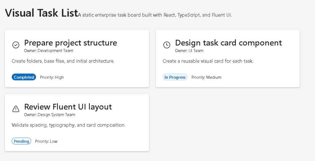
<main> <section> <Title1>Visual Task List</Title1> <Text> A static enterprise task board... </Text> <TaskList /> </section></main>
This file defines the global page layout.
Important concepts introduced here:
- semantic HTML
- composition
- layout structure
- reusable child components
10. Why <main> Matters
The app uses:
<main>
instead of a generic div.
This is important because semantic HTML improves:
- accessibility
- screen reader support
- document structure
- browser understanding
React applications should still follow good HTML practices.
React does not replace semantic HTML.
11. Why This App Has No State
One of the most important design decisions in this app is what it intentionally avoids.
This app contains:
- no
useState - no
useEffect - no API calls
- no event handling
Why?
Because this app is about:
- pure rendering
- component composition
- static UI generation
According to React Learn:
Components should stay pure whenever possible.
This app introduces the correct React mental model before interactivity is added later.
12. Understanding the Model Layer
The file:
src/models/TaskItem.ts
defines the TypeScript model.
export interface TaskItem { id: number; title: string; description: string; owner: string; status: TaskStatus; priority: "High" | "Medium" | "Low";}
This is extremely important architecturally.
The model defines:
- what a task looks like
- which properties exist
- which types are allowed
This gives:
- autocomplete
- type safety
- better refactoring
- clearer architecture
- fewer runtime bugs
13. TypeScript Union Types
The app also introduces:
type TaskStatus = | "Completed" | "In Progress" | "Pending";
This is called a union type.
It restricts allowed values.
Without TypeScript, someone could accidentally write:
status: "Doneeeee"
TypeScript prevents this mistake.
This is why TypeScript is extremely valuable in enterprise React applications.
14. Separating Data from UI
The file:
src/data/tasks.ts
contains task data.
export const tasks: TaskItem[] = [...]
This separation is critical.
Instead of hardcoding content directly inside components:
- data stays in data files
- components focus on rendering
This architecture scales much better.
Later, this same data layer could come from:
- APIs
- databases
- SharePoint
- Graph API
- REST services
15. Understanding TaskList.tsx
This component is responsible for rendering the entire task collection.
{tasks.map((task) => ( <TaskCard key={task.id} task={task} />))}
This is one of the most important React patterns.
React takes structured data and converts it into UI.
Conceptually:
Task object becomesTaskCard component
This is declarative rendering.
16. Why map() Is Fundamental in React
The JavaScript map() function transforms arrays.
React uses this heavily for list rendering.
Conceptually:
task 1 -> card 1task 2 -> card 2task 3 -> card 3
You are not manually creating DOM elements.
Instead, you describe:
For each task, render a TaskCard.
React handles the DOM updates automatically.
17. Why key={task.id} Matters
Every list item in React should have a stable key.
key={task.id}
Keys help React:
- track elements
- optimize updates
- avoid unnecessary re-renders
- identify which items changed
Without keys:
- React shows warnings
- rendering becomes less efficient
In dynamic lists this becomes even more important.
18. Understanding TaskCard.tsx
The TaskCard component receives one task:
interface TaskCardProps { task: TaskItem;}
This introduces another important React concept:
- props
Props are inputs passed into components.
This means the component becomes reusable.
Instead of writing three separate cards manually:
- one component
- many task objects
19. Component Purity
The TaskCard component is pure because:
- it receives props
- it returns JSX
- it does not mutate external data
- it does not produce side effects
Pure components are easier to:
- debug
- reuse
- scale
- test
This directly aligns with React Learn’s “Keeping Components Pure”.
20. Understanding Fluent UI Components
The app imports:
CardCardHeaderBadgeTextTitle3
These are enterprise-ready UI components from Fluent UI.
Instead of manually styling HTML:
- Fluent UI provides consistency
- accessibility
- typography
- Microsoft visual standards
21. Why Fluent UI Matters
Fluent UI automatically provides:
- keyboard navigation
- accessible focus states
- spacing consistency
- responsive typography
- enterprise design patterns
For example:
<Badge appearance="filled">
already includes:
- theme integration
- accessible styling
- consistent colors
- proper spacing
Without Fluent UI, all of this would require manual CSS.
22. Dynamic Icon Rendering
The app dynamically selects icons based on task status.
function getStatusIcon(status: TaskItem["status"])
This introduces conditional rendering logic.
If status is:
- Completed → check icon
- In Progress → clock icon
- Pending → warning icon
This is another important React principle:
UI should derive from data.
23. Understanding Conditional Rendering
Inside:
if (status === "Completed")
React decides which UI should appear.
This pattern becomes extremely important later for:
- loading states
- error states
- authentication
- role-based UI
- API responses
24. The Dashboard Grid Layout
The task list uses CSS Grid:
display: "grid",gridTemplateColumns: "repeat(auto-fit, minmax(280px, 1fr))",
This creates a responsive layout.
Meaning:
- cards automatically adjust to screen width
- each card has minimum width
- remaining space is distributed equally
This is commonly used in:
- dashboards
- analytics systems
- admin portals
- Microsoft-style layouts
25. Why This App Matters Architecturally
Even though the app is visually small, it introduces:
- React composition
- data-driven UI
- component reuse
- model separation
- TypeScript architecture
- declarative rendering
- enterprise UI standards
This foundation is critical before learning:
- state
- events
- effects
- APIs
- reducers
- context
- routing
Without mastering pure rendering first, advanced React becomes confusing.
26. React Mental Model Introduced
This app reinforces the correct React mental model:
React is NOT:
- manual DOM manipulation
- imperative UI programming
- jQuery-style updates
React IS:
- declarative rendering
- component composition
- UI generated from data
- predictable rendering
This distinction is fundamental.
27. PowerShell Commands Used
Create the project
npm create vite@latest app07-visual-task-list -- --template react-ts
Install dependencies
npm installnpm install @fluentui/react-components @fluentui/react-icons
Create folders
mkdir src\componentsmkdir src\datamkdir src\modelsmkdir src\styles
Run the development server
npm run dev
Validate production build
npm run build
Preview production build
npm run preview
Technical Summary
| Technology | Purpose |
|---|---|
| React | Declarative UI library |
| TypeScript | Static typing |
| Vite | Fast build tool and dev server |
| Fluent UI | Microsoft design system |
| JSX | Declarative UI syntax |
| TaskCard | Reusable UI component |
| TaskList | List rendering component |
map() | Data-to-UI transformation |
| Props | Component input system |
| CSS Grid | Responsive layout |
| Badge | Status visualization |
| Card | Enterprise content container |
Official Documentation
React
Fluent UI
Vite
TypeScript
Node.js
Current Project Progress
| Block | App | Name | Status |
|---|---|---|---|
| Block 1 | 01 | Hello React Fluent | Completed |
| Block 1 | 02 | Profile Card | Completed |
| Block 1 | 03 | Product List | Completed |
| Block 1 | 04 | Microsoft Style User Card | Completed |
| Block 1 | 05 | Static Dashboard | Completed |
| Block 1 | 06 | Corporate Sidebar Menu | Completed |
| Block 1 | 07 | Visual Task List | Current article completed |
| Block 1 | 08 | Timeline of Events | Next |
 edvaldo b. guimarães filho