Corporate Sidebar Menu with React, Vite, TypeScript, and Fluent UI
Introduction
In App 06 — Corporate Sidebar Menu, we move from small isolated UI examples into a more realistic enterprise layout. This application introduces one of the most common structures used in professional systems: a left sidebar navigation menu combined with a main content area.
This type of layout appears in:
- Microsoft 365 admin portals
- SharePoint-style intranets
- CRM systems
- ERP systems
- dashboard applications
- internal corporate portals
In the project roadmap, App 06 belongs to Block 1 — Fundamentals and UI, where the main objective is to understand React components, JSX, props, lists, layout composition, and declarative UI construction.
The goal of this article is not only to explain what the app does visually, but also to explain how React enters the HTML page, how main.tsx connects the application to the browser, how App.tsx becomes the root component, how child components are composed, and how Vite serves everything through a development web server.
1. The Final Folder Structure
Your project currently has this structure:
app06-corporate-sidebar-menu/ node_modules/ public/ src/ assets/ components/ DashboardContent.tsx MicrosoftUserCard.tsx Sidebar.tsx data/ navigationItems.ts styles/ App.css App.tsx index.css main.tsx .gitignore eslint.config.js index.html package-lock.json package.json README.md tsconfig.app.json tsconfig.json tsconfig.node.json vite.config.ts
This structure is important because a React application is not just one file. It is a composition of:
- HTML entry point
- TypeScript entry point
- React root component
- child components
- data files
- style files
- dependency files
- configuration files
- development server configuration
React does not replace HTML completely. Instead, React is mounted inside one HTML element. That HTML element usually has the id root.
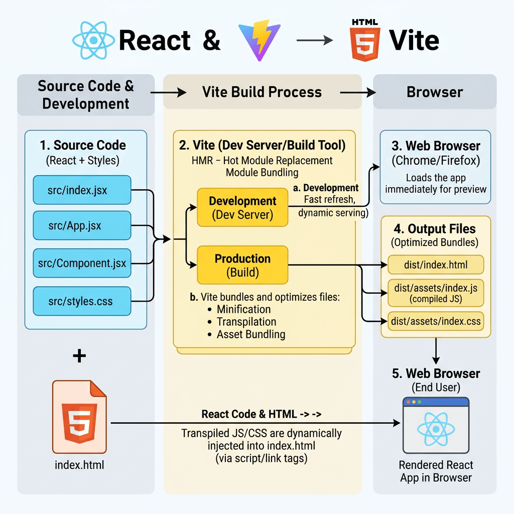
2. How React Becomes HTML in the Browser
A common beginner question is:
Where is the HTML?
In a Vite React project, the browser first receives the file:
index.html
Inside this file, there is normally a div like this:
<div id="root"></div>
This div is empty at first.
React later takes control of this element and injects the application interface into it.
The important idea is:
index.html contains <div id="root"></div>main.tsx finds that divReactDOM.createRoot(...) tells React where to render<App /> becomes the root React componentComponents return JSXJSX becomes JavaScript objectsReact converts those objects into real DOM nodesBrowser displays the final HTML interface
So React does not start from multiple HTML pages. Instead, it starts from one HTML shell and builds the interface dynamically inside the browser.
This is why React apps are often called single-page applications.
3. The Role of index.html
The file:
index.html
is the real browser entry point.
It usually contains something like:
<!doctype html>
<html lang="en">
  <head>
    <meta charset="UTF-8" />
    <meta name="viewport" content="width=device-width, initial-scale=1.0" />
    <title>app06-corporate-sidebar-menu</title>
  </head>
  <body>
    <div id="root"></div>
    /src/main.tsx
  </body>
</html>
The most important lines are:
<div id="root"></div>
and:
/src/main.tsx
The first line creates the container where React will live.
The second line tells the browser to load the React application entry file.
This means:
The browser loads index.htmlindex.html loads /src/main.tsxmain.tsx loads App.tsxApp.tsx loads Sidebar and DashboardContentReact renders everything inside #root
4. The Role of the Vite Web Server
When you run:
npm run dev
Vite starts a local development web server.
The server usually runs at:
http://localhost:5173/
Vite is responsible for:
- serving
index.html - loading TypeScript files
- compiling JSX
- resolving imports
- serving CSS
- serving assets
- refreshing the browser when files change
- providing Hot Module Replacement
This means you are not opening the HTML file directly from Windows Explorer.
You are opening it through a local development web server.
That is important because modern React projects use ES Modules, imports, TypeScript, JSX, and package dependencies. The browser needs Vite to process and serve these files correctly during development.
5. The Role of main.tsx
The file:
src/main.tsx
is the React entry point.
It usually looks like this:
import React from "react";import ReactDOM from "react-dom/client";import { FluentProvider, webLightTheme,} from "@fluentui/react-components";import App from "./App";ReactDOM.createRoot( document.getElementById("root")!).render( <React.StrictMode> <FluentProvider theme={webLightTheme}> <App /> </FluentProvider> </React.StrictMode>);
This file is extremely important.
It connects React to the HTML page.
5.1 Importing React
import React from "react";
This imports React itself.
React is the library responsible for creating and managing the component tree.
5.2 Importing ReactDOM
import ReactDOM from "react-dom/client";
React and ReactDOM are related but different.
React handles:
- components
- JSX
- state logic
- rendering model
ReactDOM handles:
- rendering React into the browser DOM
In simple terms:
React creates the UI description.ReactDOM places that UI into the browser.
5.3 Finding the HTML Root
document.getElementById("root")!
This line searches inside index.html for:
<div id="root"></div>
The exclamation mark:
!
is a TypeScript non-null assertion.
It means:
I am telling TypeScript that this element exists.
Without it, TypeScript may warn that getElementById("root") could return null.
5.4 Creating the React Root
ReactDOM.createRoot(...)
This creates the React rendering root.
React now knows:
This is the DOM element where the application will be rendered.
5.5 Rendering the App
.render( <React.StrictMode> <FluentProvider theme={webLightTheme}> <App /> </FluentProvider> </React.StrictMode>);
This tells React what component tree should be rendered.
The hierarchy is:
React.StrictMode FluentProvider App
So App is not alone. It is wrapped by two important providers.
6. What React.StrictMode Does
<React.StrictMode>
StrictMode helps detect problems during development.
It does not change the production UI.
It helps React warn you about:
- unsafe rendering patterns
- side effects in the wrong place
- deprecated APIs
- components that are not pure
This is important because React expects components to behave like pure functions:
same input = same output
That concept becomes more important later when we start using state and effects.
7. What FluentProvider Does
<FluentProvider theme={webLightTheme}>
This is the root provider for Fluent UI.
Fluent UI components need a provider so they can receive:
- theme colors
- typography tokens
- spacing rules
- design system values
- accessibility behavior
- Microsoft visual identity
Without FluentProvider, Fluent UI components may not look or behave as expected.
The theme used here is:
webLightTheme
This applies the standard Microsoft light theme.
Later in the project, this can evolve into:
- dark theme
- custom corporate theme
- theme switching
- user-selected appearance
8. The Role of App.tsx
The file:
src/App.tsx
is the root application component.
In this app, it imports the sidebar and the main dashboard content:
import { Sidebar } from "./components/Sidebar";import { DashboardContent } from "./components/DashboardContent";function App() { return ( <div style={{ display: "flex", minHeight: "100vh", }} > <Sidebar /> <DashboardContent /> </div> );}export default App;
This file defines the main layout of the application.
The important part is:
<Sidebar /><DashboardContent />
React allows you to create your own components and use them as if they were HTML tags.
But they are not native HTML tags.
They are functions that return JSX.
9. How App.tsx Becomes HTML
React does not directly write HTML strings manually.
Instead, this JSX:
<div> <Sidebar /> <DashboardContent /></div>
is compiled into JavaScript.
React then creates a virtual representation of the UI.
Then ReactDOM updates the real browser DOM.
The browser finally displays real HTML elements like:
<div> <div>Sidebar content...</div> <main>Dashboard content...</main></div>
So the flow is:
JSX becomes JavaScriptReact component tree becomes virtual UI descriptionReactDOM creates real DOM nodesBrowser displays HTML
10. Why App.tsx Uses Flexbox
The root div uses:
display: "flex"
This creates a horizontal layout.
The final structure becomes:
-------------------------------------------------| Sidebar | Dashboard Content || | || | |-------------------------------------------------
This is the classic enterprise layout.
The property:
minHeight: "100vh"
means:
The application should be at least the full height of the browser window.
100vh means 100% of the viewport height.
11. The Role of Sidebar.tsx
The file:
src/components/Sidebar.tsx
is responsible for the left navigation panel.
It imports Fluent UI components:
import { Button, Card, Text, Title2,} from "@fluentui/react-components";
It also imports icons:
import { Home24Regular, Folder24Regular, People24Regular, Document24Regular, Settings24Regular,} from "@fluentui/react-icons";
And it imports navigation data:
import { navigationItems,} from "../data/navigationItems";
This is important because the sidebar is not hardcoded manually item by item. It is generated from data.
12. The navigationItems.ts Data File
The file:
src/data/navigationItems.ts
contains structured data.
Example:
export interface NavigationItem { id: number; title: string;}export const navigationItems: NavigationItem[] = [ { id: 1, title: "Dashboard", }, { id: 2, title: "Projects", }, { id: 3, title: "Teams", }, { id: 4, title: "Reports", }, { id: 5, title: "Settings", },];
This file introduces a very important React concept:
The UI should be derived from data.
Instead of repeating buttons manually, React uses:
navigationItems.map(...)
This converts data into UI.
13. TypeScript Interface Explained
export interface NavigationItem { id: number; title: string;}
This defines the shape of each navigation item.
Each item must have:
id: numbertitle: string
This gives you:
- type safety
- autocomplete
- better refactoring
- fewer mistakes
- clearer architecture
If you accidentally write:
title: 123
TypeScript will warn you.
That is one of the reasons TypeScript is important in enterprise React projects.
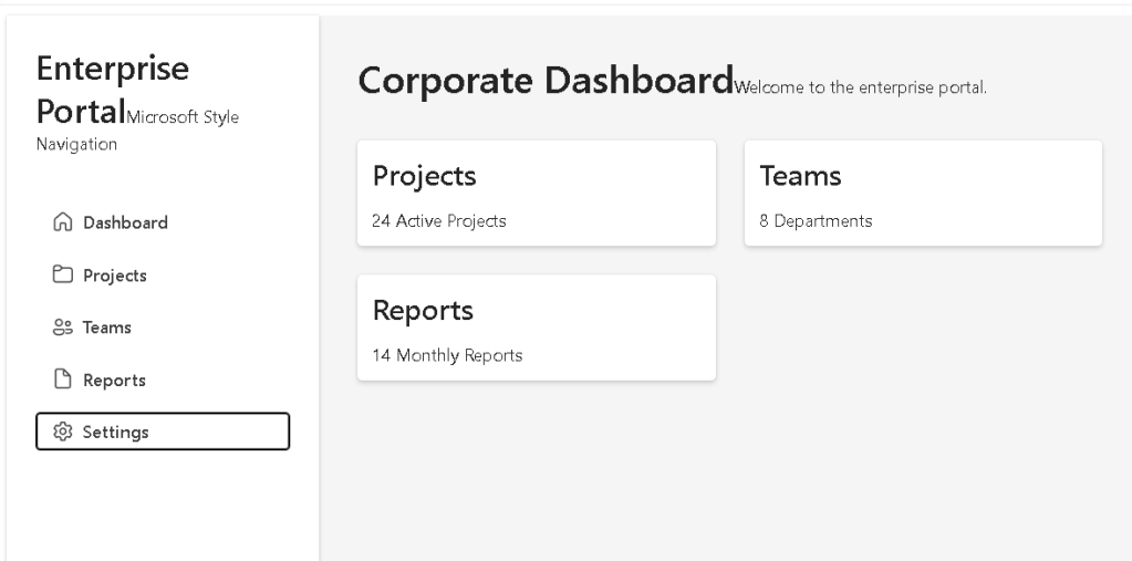
14. Rendering the Sidebar Menu
Inside Sidebar.tsx, the menu is rendered with:
{navigationItems.map((item, index) => ( <Button key={item.id} appearance="subtle" icon={icons[index]} style={{ justifyContent: "flex-start", }} > {item.title} </Button>))}
This is one of the most important parts of the app.
React takes this array:
DashboardProjectsTeamsReportsSettings
and turns it into a list of Fluent UI buttons.
15. Why map() Is Important in React
The map() function transforms one array into another array.
In this case, it transforms:
NavigationItem[]
into:
Button[]
Conceptually:
data item 1 -> button 1data item 2 -> button 2data item 3 -> button 3data item 4 -> button 4data item 5 -> button 5
This is declarative rendering.
You are not telling the browser manually:
create buttonappend buttoncreate another buttonappend another button
Instead, you describe what the UI should be:
For each navigation item, show a button.
React handles the DOM update.
16. Why key={item.id} Matters
key={item.id}
When React renders a list, each item needs a stable key.
The key helps React identify which item is which.
This matters especially when lists change.
For example, if later you add, remove, or reorder menu items, React uses the key to update the correct element.
Without keys, React may show warnings and may update the DOM less efficiently.
17. The Role of Fluent UI Card
In the sidebar, we use:
<Card>
The Card acts as the sidebar container.
Normally, a card is used for content blocks. Here, we are using it as a visual container for the navigation area.
The sidebar Card receives styles like:
width: "260px",minHeight: "100vh",borderRadius: "0",padding: "24px",display: "flex",flexDirection: "column",gap: "16px",boxSizing: "border-box",
Each style has a purpose.
width: "260px"
This defines a fixed sidebar width.
Enterprise sidebars often use a fixed width because navigation should remain stable.
minHeight: "100vh"
This makes the sidebar fill the height of the browser window.
borderRadius: "0"
Fluent UI Cards usually have rounded corners.
For a sidebar, we do not want rounded corners because the panel touches the edges of the screen.
padding: "24px"
This creates internal spacing.
Without padding, the content would touch the edges of the sidebar.
display: "flex"
This activates Flexbox inside the sidebar.
flexDirection: "column"
This stacks sidebar content vertically.
The layout becomes:
Brand/titleSubtitleNavigation buttons
gap: "16px"
This creates spacing between child elements.
boxSizing: "border-box"
This ensures that padding is included inside the width calculation.
Without it, the sidebar could become wider than expected.
18. The Role of Fluent UI Button
Each navigation item is rendered as:
<Button appearance="subtle">
The appearance="subtle" prop means the button looks like a navigation item rather than a strong primary action.
This is better for sidebar navigation because only major actions should use primary buttons.
The icon is passed with:
icon={icons[index]}
This shows a different icon for each menu item.
19. The Role of DashboardContent.tsx
The file:
src/components/DashboardContent.tsx
contains the main area of the app.
It usually contains:
import { Card, Text, Title1, Title3,} from "@fluentui/react-components";export function DashboardContent() { return ( <main style={{ flex: 1, padding: "32px", backgroundColor: "#f5f5f5", }} > <Title1> Corporate Dashboard </Title1> <Text> Welcome to the enterprise portal. </Text> <div style={{ display: "grid", gridTemplateColumns: "repeat(auto-fit, minmax(240px, 1fr))", gap: "24px", marginTop: "32px", }} > <Card> <Title3>Projects</Title3> <Text>24 Active Projects</Text> </Card> <Card> <Title3>Teams</Title3> <Text>8 Departments</Text> </Card> <Card> <Title3>Reports</Title3> <Text>14 Monthly Reports</Text> </Card> </div> </main> );}
This component represents the content area shown to the right of the sidebar.
20. Why main Is Used Here
<main>
The main HTML element is semantic.
It tells the browser and assistive technologies:
This is the main content of the page.
This is better than using only generic div elements everywhere.
Good React applications should still respect HTML semantics.
React does not replace good HTML practices.
21. Why flex: 1 Matters
flex: 1
This means:
Take all remaining horizontal space after the sidebar.
Since App.tsx uses:
display: "flex"
and the sidebar has:
width: "260px"
the content area gets the rest of the screen.
Conceptually:
Total screen width - 260px sidebar = content area
22. The Dashboard Grid
Inside the main content, we use:
display: "grid",gridTemplateColumns: "repeat(auto-fit, minmax(240px, 1fr))",gap: "24px",
This creates a responsive card grid.
The most important part is:
repeat(auto-fit, minmax(240px, 1fr))
This means:
Create as many columns as fit.Each column must be at least 240px.If there is extra space, distribute it equally.
This allows the dashboard cards to adjust automatically depending on screen size.
23. The Role of MicrosoftUserCard.tsx
You currently still have:
src/components/MicrosoftUserCard.tsx
This appears to be a component from App 04.
That is not necessarily a problem, but for App 06 it may be unused.
In a clean project, every file should have a purpose.
You have two options:
Option 1 — Keep it temporarily
This is fine while studying, especially if you want to reuse or compare previous components.
Option 2 — Remove it from App 06
If it is not used in App 06, you can remove it to keep the project clean.
PowerShell:
Remove-Item src\components\MicrosoftUserCard.tsx
But only do this if App.tsx or another component is not importing it.
24. The Role of App.css
The file:
src/App.css
is usually created by Vite.
In many beginner templates, it contains default styles for the sample app.
If your app is using inline styles and Fluent UI, this file may not be necessary yet.
However, later it can be used for:
- application-specific layout styles
- reusable CSS classes
- responsive rules
- custom visual adjustments
For example:
.app-shell { display: flex; min-height: 100vh;}
Then in React:
<div className="app-shell">
For now, inline styles are acceptable for learning because they keep the relationship between JSX and styling visible.
25. The Role of index.css
The file:
src/index.css
usually contains global CSS.
This is useful for:
- resetting body margin
- defining global font behavior
- setting background color
- controlling root dimensions
A typical global CSS file could contain:
body { margin: 0;}
This matters because browsers add default margin to the body.
If you do not remove it, your full-screen layout may have unwanted spacing around the edges.
For enterprise layouts, global margin should usually be removed.
26. The Role of styles/
You have:
src/styles/
This folder is currently prepared for future growth.
It can later contain:
src/styles/ layout.css theme.css dashboard.css
For now, it is okay if it is empty.
The important point is that the project is already prepared for a more professional structure.
27. The Role of assets/
The folder:
src/assets/
is used for files imported into React code.
Examples:
logo.svgbackground.pngicons/images/
If you import an image inside a component, it usually belongs in src/assets.
Example:
import logo from "./assets/logo.svg";
Files in src/assets are processed by Vite.
28. The Role of public/
The folder:
public/
is different from src/assets.
Files in public are served directly by Vite without being imported.
Examples:
public/favicon.icopublic/logo.pngpublic/static-file.json
If a file is in public/logo.png, you can reference it as:
/logo.png
Use public for static files that do not need to be processed by the bundler.
Use src/assets for assets imported by components.
29. The Role of node_modules/
The folder:
node_modules/
contains all installed dependencies.
It was created when you ran:
npm install
This folder contains packages such as:
- React
- ReactDOM
- Vite
- TypeScript
- Fluent UI
- Fluent UI icons
You should not manually edit files inside node_modules.
This folder is normally ignored by Git because it can be recreated from package.json.
30. The Role of package.json
The file:
package.json
is one of the most important files in the project.
It defines:
- project name
- scripts
- dependencies
- development dependencies
Example scripts:
{ "scripts": { "dev": "vite", "build": "tsc -b && vite build", "lint": "eslint .", "preview": "vite preview" }}
The most important scripts are:
npm run dev
Starts the development server.
npm run build
Creates the production build.
This is the equivalent of validating whether the app can be compiled for production.
npm run preview
Serves the production build locally for testing.
npm run lint
Runs ESLint to check code quality.
31. The Role of package-lock.json
The file:
package-lock.json
records the exact versions of installed packages.
This helps ensure that the project installs the same dependency tree on another machine.
You normally do not edit it manually.
It updates automatically when you run:
npm install
32. The Role of vite.config.ts
The file:
vite.config.ts
configures Vite.
A typical React Vite config looks like:
import { defineConfig } from "vite";import react from "@vitejs/plugin-react";export default defineConfig({ plugins: [react()],});
This tells Vite:
Use the React plugin.
The React plugin allows Vite to understand:
- JSX
- TSX
- React Fast Refresh
- modern React compilation behavior
33. The Role of tsconfig.json
The file:
tsconfig.json
is the main TypeScript configuration file.
It usually references other TypeScript config files.
Your project also has:
tsconfig.app.jsontsconfig.node.json
This separation exists because the application code and Node-based tooling have different TypeScript needs.
34. The Role of tsconfig.app.json
This config is usually responsible for TypeScript rules related to your React application.
It controls how TypeScript checks files like:
src/App.tsxsrc/main.tsxsrc/components/Sidebar.tsx
It may include strict options such as:
"strict": true
Strict mode is important because it helps catch problems early.
35. The Role of tsconfig.node.json
This config is usually used for Node-related files such as:
vite.config.ts
Why?
Because vite.config.ts runs in a Node environment, not directly in the browser.
So TypeScript separates browser app configuration from Node tooling configuration.
36. The Role of eslint.config.js
The file:
eslint.config.js
configures ESLint.
ESLint checks code quality and helps identify problems like:
- unused variables
- wrong hooks usage
- bad patterns
- inconsistent code
- possible bugs
For React projects, ESLint is very useful because it can warn when hooks are used incorrectly.
Even though App 06 does not use hooks yet, this will become more important in future apps.
37. The Role of .gitignore
The file:
.gitignore
tells Git which files and folders should not be committed.
It usually includes:
node_modulesdist.env
This is important because:
node_modulesis hugedistcan be regenerated.envmay contain secrets
38. The Role of README.md
The file:
README.md
should document the project.
For this app, it should explain:
- app name
- goal
- concepts learned
- commands
- folder structure
- official documentation
- what each component does
A good README makes the project easier to understand later.
39. The Role of DashboardContent.tsx, Sidebar.tsx, and App.tsx Together
The relationship between these files is:
main.tsx renders App.tsxApp.tsx defines the main layoutSidebar.tsx renders the left navigationDashboardContent.tsx renders the main page contentnavigationItems.ts provides data for Sidebar.tsx
Visual relationship:
index.html div#root React root from main.tsx App Sidebar DashboardContent
This is the core idea of React composition.
Each component has one responsibility.
40. React Component Responsibility
A good React component should answer:
What part of the UI am I responsible for?
In this app:
| File | Responsibility |
|---|---|
main.tsx | Mount React into HTML |
App.tsx | Compose the app layout |
Sidebar.tsx | Show navigation |
DashboardContent.tsx | Show dashboard content |
navigationItems.ts | Store navigation data |
index.html | Provide the HTML root |
index.css | Global CSS |
App.css | App-level CSS if needed |
vite.config.ts | Vite configuration |
package.json | Scripts and dependencies |
41. Why This App Is Important
This app is much more important than it looks.
It teaches the foundation of real React architecture:
HTML shell +React entry point +Root component +Child components +Data file +Design system +Local web server
This is how professional React apps are structured.
Later, this same structure can evolve into:
App Layout Sidebar Header PageContent Routes DashboardPage UsersPage ReportsPage
So App 06 prepares you for future apps involving:
- routing
- menus
- dashboards
- DataGrid
- API pages
- admin panels
- SharePoint-style layouts
42. PowerShell Commands Used in This App
Create the project
mkdir bloco01cd bloco01npm create vite@latest app06-corporate-sidebar-menu -- --template react-tscd app06-corporate-sidebar-menunpm install
Install Fluent UI
npm install @fluentui/react-components @fluentui/react-icons
Create folders
mkdir src\componentsmkdir src\datamkdir src\styles
Create files manually
New-Item src\components\Sidebar.tsx -ItemType FileNew-Item src\components\DashboardContent.tsx -ItemType FileNew-Item src\data\navigationItems.ts -ItemType File
Run the app
npm run dev
Validate production build
npm run build
Preview production build
npm run preview
Technical Summary
| Concept | Explanation |
|---|---|
index.html | Browser entry point |
div#root | HTML container where React is mounted |
main.tsx | React entry point |
ReactDOM.createRoot | Connects React to the browser DOM |
App.tsx | Root application component |
Sidebar.tsx | Left navigation component |
DashboardContent.tsx | Main content component |
navigationItems.ts | Data source for menu rendering |
| JSX | Syntax used to describe UI |
| ReactDOM | Converts React component tree into browser DOM |
| Vite | Development server and build tool |
| Fluent UI | Microsoft design system |
| TypeScript | Static typing |
| Flexbox | Horizontal layout |
| CSS Grid | Responsive dashboard card layout |
Official Documentation
| Topic | Link |
|---|---|
| React Learn | https://react.dev/learn |
| Describing the UI | https://react.dev/learn/describing-the-ui |
| Your First Component | https://react.dev/learn/your-first-component |
| Rendering Lists | https://react.dev/learn/rendering-lists |
| Conditional Rendering | https://react.dev/learn/conditional-rendering |
| Fluent UI React Components | https://developer.microsoft.com/en-us/fluentui#/controls/web |
| Vite Guide | https://vite.dev/guide/ |
| TypeScript Docs | https://www.typescriptlang.org/docs/ |
Current Project Progress
| Block | App | Name | Status |
|---|---|---|---|
| Block 1 | 01 | Hello React Fluent | Completed |
| Block 1 | 02 | Profile Card | Completed |
| Block 1 | 03 | Product List | Completed |
| Block 1 | 04 | Microsoft Style User Card | Completed |
| Block 1 | 05 | Static Dashboard | Completed |
| Block 1 | 06 | Corporate Sidebar Menu | Current article completed |
| Block 1 | 07 | Visual Task List | Next |
 edvaldo b. guimarães filho