
Building a Microsoft-Style Employee Table with React, Vite, TypeScript, and Fluent UI

App 09 — Employee Table is one of the most important foundational exercises in the React + Fluent UI roadmap because it introduces one of the most common enterprise UI patterns: the corporate data table.
Although visually simple, this application teaches several core concepts of modern React architecture:
- component composition
- declarative rendering
- rendering lists with
map() - TypeScript modeling
- reusable UI structures
- Fluent UI enterprise controls
- React rendering flow
- data-driven UI generation
This application belongs to Block 1 — Fundamentals and UI, where the focus is understanding how React builds interfaces declaratively before introducing interactivity and state management later in the roadmap. The official roadmap defines App 09 as “Employee Table / Tabela de Funcionários”, focused on tables and Microsoft-style layouts.
The application also continues reinforcing the React mental model introduced in previous apps:
UI = function(data)
Instead of manually creating DOM elements, React renders the UI from structured data models.
Why Enterprise Tables Matter
Tables are one of the most common UI structures in professional systems.
You find them everywhere:
- SharePoint lists
- Microsoft 365 admin portals
- ERP systems
- CRM systems
- HR systems
- inventory systems
- dashboards
- analytics platforms
A table is not just visual layout.
A professional enterprise table usually needs:
- strong data structure
- reusable row rendering
- scalable architecture
- accessibility
- responsive behavior
- consistent typography
- predictable rendering
This app introduces the architectural foundation required before moving into advanced DataGrid systems later in the project roadmap.
Creating the Project
The application starts with Vite.
PowerShell commands
cd C:\ReactAppsmkdir bloco01cd bloco01npm create vite@latest app09-employee-table -- --template react-tscd app09-employee-tablenpm install
This command creates:
- React project
- Vite configuration
- TypeScript support
- React entry point
- development server
- build system
Installing Fluent UI
Next, Fluent UI packages are installed.
npm install @fluentui/react-components @fluentui/react-icons
These packages provide Microsoft’s official enterprise UI system.
Fluent UI includes:
- typography
- tables
- cards
- buttons
- badges
- avatars
- dialogs
- layouts
- accessibility features
- design tokens
Without Fluent UI, the application would require large amounts of manual CSS and accessibility work.
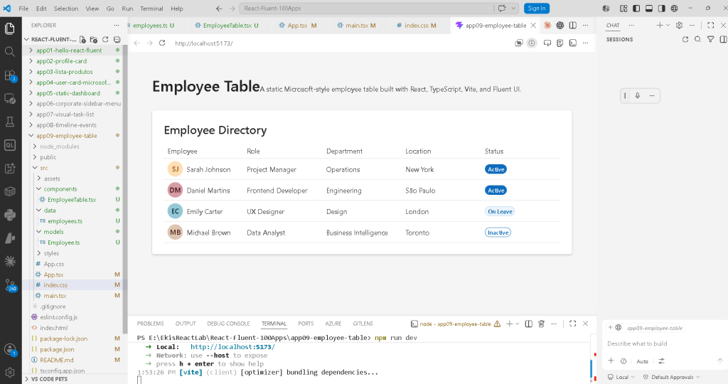
Creating the Folder Structure
mkdir src\componentsmkdir src\datamkdir src\modelsmkdir src\styles
This structure is important because React applications scale through organization.
Understanding the Architecture
The application structure becomes:
src/ components/ EmployeeTable.tsx data/ employees.ts models/ Employee.ts styles/ App.tsx main.tsx index.css
Each file has a responsibility.
| File | Responsibility |
|---|---|
main.tsx | Mount React into the browser |
App.tsx | Compose the page |
EmployeeTable.tsx | Render the table |
employees.ts | Provide employee data |
Employee.ts | Define TypeScript model |
index.css | Global CSS |
This separation is one of the core principles of scalable React architecture.
The React Rendering Flow
One of the most important things to understand is how React actually appears in the browser.
The flow is:
index.html contains div#rootmain.tsx mounts React into #rootApp.tsx becomes root componentEmployeeTable.tsx renders table structureemployees.ts provides dataReact converts JSX into DOMBrowser displays HTML
React does not replace HTML entirely.
Instead, React injects the application into:
<div id="root"></div>
inside index.html.
Understanding main.tsx
The file:
src/main.tsx
usually contains:
import React from "react";import ReactDOM from "react-dom/client";import { FluentProvider, webLightTheme,} from "@fluentui/react-components";import App from "./App";import "./index.css";ReactDOM.createRoot( document.getElementById("root")!).render( <React.StrictMode> <FluentProvider theme={webLightTheme}> <App /> </FluentProvider> </React.StrictMode>);
This file is the bridge between:
- browser
- React
- Fluent UI
- application components
Why ReactDOM.createRoot() Matters
ReactDOM.createRoot(...)
This creates the React rendering root.
React now controls the DOM element:
<div id="root"></div>
This enables:
- React rendering
- virtual DOM updates
- efficient re-rendering
- concurrent rendering architecture
Modern React applications always use createRoot().
Understanding FluentProvider
<FluentProvider theme={webLightTheme}>
This activates Fluent UI globally.
Without it:
- Fluent components lose styling
- typography becomes inconsistent
- themes do not work correctly
- Microsoft design tokens are unavailable
The provider injects:
- colors
- spacing
- typography
- accessibility rules
- visual identity
The selected theme:
webLightTheme
is Microsoft’s default light theme.
Understanding the Employee Model
The file:
src/models/Employee.ts
contains:
export type EmployeeStatus = | "Active" | "On Leave" | "Inactive";export interface Employee { id: number; name: string; role: string; department: string; location: string; status: EmployeeStatus;}
This is extremely important.
The interface defines the shape of the data.
Every employee object must contain:
- id
- name
- role
- department
- location
- status
This gives:
- type safety
- better autocomplete
- safer refactoring
- architecture clarity
- fewer runtime bugs
Why TypeScript Matters
Without TypeScript, you could accidentally write:
status: 123
TypeScript prevents this.
It ensures:
status must be:- Active- On Leave- Inactive
This becomes critical in enterprise systems where data structures grow large.
Understanding the Data File
The file:
src/data/employees.ts
contains:
export const employees: Employee[] = [
This creates a strongly typed array.
React applications often separate:
- data
- UI
- logic
This is a very important architectural concept.
The UI should not hardcode information directly inside components.
Instead:
data -> UI
Understanding Declarative Rendering
React is declarative.
That means:
Instead of manually saying:
create rowappend rowcreate cellappend cell
you describe what the UI should look like.
Example:
employees.map((employee) => ( <TableRow>
This means:
For each employee,render one table row.
React handles the DOM updates automatically.
Understanding EmployeeTable.tsx
The component imports Fluent UI controls:
import { Avatar, Badge, Card, Table, TableBody, TableCell, TableCellLayout, TableHeader, TableHeaderCell, TableRow, Title3,} from "@fluentui/react-components";
These are enterprise-grade UI components.
Instead of manually creating:
<table><tr><td>
we use Fluent UI abstractions.
This provides:
- accessibility
- consistent spacing
- Microsoft visual identity
- keyboard navigation
- enterprise styling
Why Card Is Used
The table is wrapped inside:
<Card>
The Card acts as a visual container.
It provides:
- padding
- elevation
- spacing
- visual grouping
This is common in enterprise dashboards.
Understanding Fluent UI Tables
The table structure is:
<Table> <TableHeader> <TableBody>
This is conceptually similar to HTML tables:
<table><thead><tbody>
But Fluent UI adds:
- styling
- accessibility
- consistent behavior
- enterprise design integration
Rendering the Header
<TableHeader> <TableRow>
The header defines the table columns.
Each column uses:
<TableHeaderCell>
This creates:
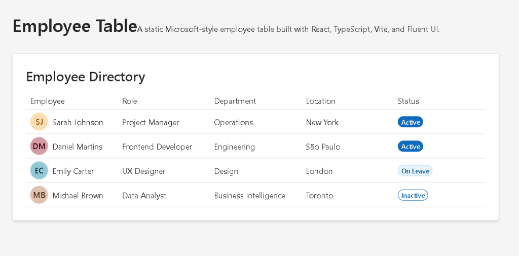
- Employee
- Role
- Department
- Location
- Status
Rendering the Employee Rows
The most important part:
{employees.map((employee) => (
This transforms data into UI.
Each employee becomes:
1 TableRow
This is one of React’s most important concepts.
Why key={employee.id} Matters
key={employee.id}
React requires stable keys when rendering lists.
Keys help React:
- identify elements
- update efficiently
- preserve rendering stability
Without keys, React may show warnings and behave inefficiently.
Understanding Avatar
<Avatar name={employee.name} color="colorful"/>
The Avatar component generates Microsoft-style profile visuals.
Fluent UI automatically creates:
- initials
- colors
- circular styling
- accessibility labels
This saves significant manual CSS work.
Understanding TableCellLayout
<TableCellLayout media={<Avatar />}>
This component combines:
- media
- text
- layout alignment
It creates the classic Microsoft-style table layout where the avatar appears beside the employee name.
Understanding Badge
<Badge appearance={getBadgeAppearance(employee.status)}>
Badges visually represent status.
This is common in:
- admin systems
- monitoring systems
- dashboards
- HR platforms
Conditional Rendering Logic
The function:
function getBadgeAppearance(status)
returns different visual styles depending on employee status.
Example:
if (status === "Active") { return "filled";}
This introduces conditional rendering logic.
The UI changes based on data.
Why This Is Important
This teaches a critical React principle:
UI derives from data.
The component does not manually decide colors visually.
Instead:
status value -> visual appearance
This makes the UI predictable and scalable.
Understanding App.tsx
The root component:
function App() {
renders:
<EmployeeTable />
This is composition.
React applications scale by combining components together.
The hierarchy becomes:
App EmployeeTable
Later apps will evolve into:
App Layout Sidebar Header EmployeeTable
Understanding the Layout
The page uses:
minHeight: "100vh"
This ensures full browser height.
And:
maxWidth: "1200px"margin: "0 auto"
This centers the content.
These are standard enterprise layout patterns.
Why No State Yet?
This app intentionally avoids:
useStateuseEffect- API calls
According to React Learn, effects should only synchronize with external systems.
Since this app is static:
- no effects are needed
- no state is needed
This reinforces an extremely important React principle:
Do not add state or effects unnecessarily.
The React Mental Model
This app reinforces the correct React mindset.
React is NOT:
- manually updating DOM nodes
- imperative programming
- jQuery-style manipulation
React IS:
- declarative UI
- component composition
- predictable rendering
- data-driven interfaces
Production Validation
To validate the app:
npm run build
This performs:
- TypeScript validation
- React compilation
- Vite production build
If the build succeeds, the application is production-ready.
Previewing the Production Build
npm run preview
This simulates the production deployment locally.
Technical Summary
| Technology | Purpose |
|---|---|
| React | Declarative UI rendering |
| TypeScript | Static typing |
| Vite | Development/build tooling |
| Fluent UI | Microsoft design system |
| JSX | UI syntax |
| Functional Components | Reusable UI units |
| Avatar | Employee profile visual |
| Badge | Status visualization |
| Table | Enterprise data layout |
| Card | Visual container |
map() | Declarative list rendering |
| Props | Component inputs |
| Interfaces | Data contracts |
Concepts Learned
| Concept | Explanation |
|---|---|
| Declarative Rendering | UI derived from data |
| Component Composition | UI built from reusable pieces |
| Type Modeling | Data shape definition |
| List Rendering | Rendering arrays into UI |
| Stable Keys | Efficient React updates |
| Enterprise Layout | Microsoft-style structure |
| Conditional Rendering | UI appearance based on data |
| Fluent UI Integration | Enterprise design system usage |
Official Documentation
React
Fluent UI
Vite
TypeScript
Complete Project Progress Table
| Block | App | Name | Main Concepts | Status |
|---|---|---|---|---|
| Block 1 | 01 | Hello React Fluent | JSX, FluentProvider, Components | Completed |
| Block 1 | 02 | Profile Card | Props, Composition, Avatar | Completed |
| Block 1 | 03 | Product List | map(), Rendering Lists | Completed |
| Block 1 | 04 | Microsoft Style User Card | Enterprise Cards, Typography | Completed |
| Block 1 | 05 | Static Dashboard | Layouts, Cards, Grids | Completed |
| Block 1 | 06 | Corporate Sidebar Menu | Flexbox, Navigation Layout | Completed |
| Block 1 | 07 | Visual Task List | Pure Components, Composition | Completed |
| Block 1 | 08 | Timeline of Events | Sequential Rendering, Timeline UI | Completed |
| Block 1 | 09 | Employee Table | Tables, Typed Data, Declarative Rendering | Current |
| Block 1 | 10 | Email List | Outlook-style Layouts | Next |
| Block 1 | 11 | Card Grid | Responsive Grids | Upcoming |
| Block 1 | 12 | Image Gallery | Image Rendering | Upcoming |
| Block 1 | 13 | Movie Catalog | Catalog UI | Upcoming |
| Block 1 | 14 | Football Teams List | Reusable Cards | Upcoming |
| Block 1 | 15 | News Portal | Complex Layouts | Upcoming |
| Block 1 | 16 | Static Financial Dashboard | KPI Panels | Upcoming |
| Block 1 | 17 | SharePoint Style Layout | Enterprise Layout | Upcoming |
| Block 1 | 18 | File Explorer | Explorer UI | Upcoming |
| Block 1 | 19 | Corporate Portal | Intranet Layout | Upcoming |
| Block 1 | 20 | Microsoft Landing Page | Advanced Composition | Upcoming |
 edvaldo b. guimarães filho