Technical Blog Article — App 11: Enterprise Grid of Cards with React, TypeScript, Vite, CSS Grid, and Fluent UI

App 11 — Grid of Cards — is one of the most important foundational applications in the entire React + Fluent UI learning roadmap because it introduces a layout pattern that appears everywhere in modern enterprise applications:
- dashboards
- analytics systems
- SharePoint-style portals
- Microsoft 365 admin centers
- CRM systems
- ERP applications
- Power BI-inspired interfaces
- management portals
- monitoring systems
Even though this application is still inside Block 1 — Fundamentals and UI, architecturally it represents a transition from “simple isolated components” into real enterprise UI composition.
The official project roadmap defines App 11 as:
“Grid de Cards / Dashboard em Grid / CSS Grid / Reutilização”
and connects it to React concepts such as:
- reusable components
- composition
- declarative rendering
- rendering lists
- structured UI organization
This application also introduces one of the most important frontend layout systems in modern web development:
CSS Grid
Combined with:
- React component composition
- TypeScript models
- Fluent UI enterprise controls
- Vite development architecture
the result becomes a professional Microsoft-style dashboard foundation.
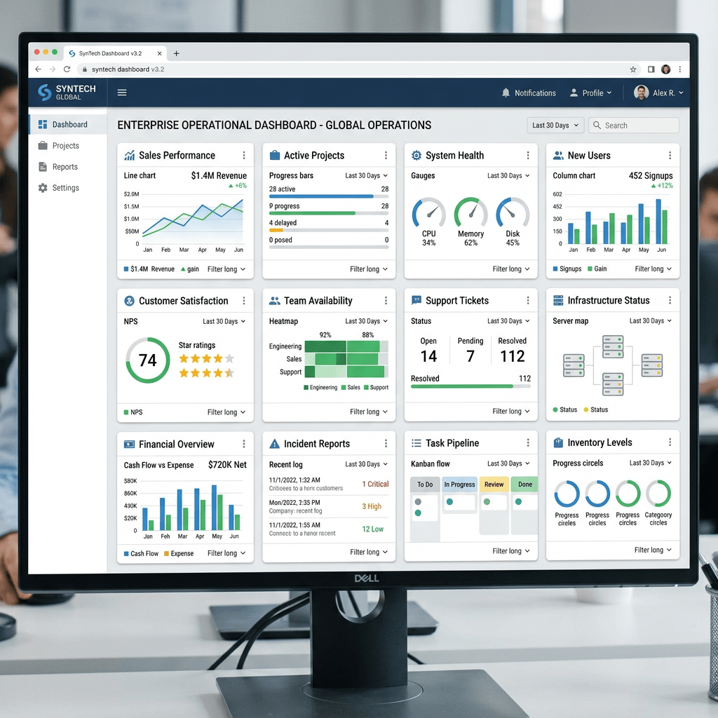
1. Why Enterprise Dashboards Use Card Grids
Modern enterprise applications rarely display information as plain text pages.
Instead, applications organize information into:
- visual containers
- responsive dashboards
- modular panels
- independent content blocks
This approach improves:
- readability
- scalability
- responsive behavior
- component reuse
- separation of concerns
One of the most common enterprise patterns is:
Dashboard composed of cards
Each card represents:
- one KPI
- one metric
- one report
- one entity
- one business domain
Examples:
| Card | Meaning |
|---|---|
| Active Projects | Delivery metrics |
| Open Tickets | Support metrics |
| Monthly Reports | Reporting metrics |
| Team Members | HR metrics |
| Pending Reviews | Governance metrics |
This is exactly the pattern introduced in App 11.
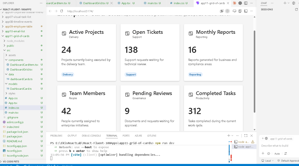
2. Project Creation
The project starts with Vite.
PowerShell commands
cd C:\ReactAppsmkdir bloco01cd bloco01npm create vite@latest app11-grid-of-cards -- --template react-tscd app11-grid-of-cardsnpm installnpm install @fluentui/react-components @fluentui/react-icons
3. Why We Use Vite
Vite is the modern React development environment.
Historically, React projects used:
- Create React App (CRA)
Modern React projects increasingly use:
- Vite
because Vite provides:
- faster startup
- instant Hot Module Replacement
- optimized builds
- native ES Modules
- better TypeScript integration
- simpler configuration
The official Vite documentation explains that Vite serves source code directly through modern browser module support instead of bundling the entire application before startup.
This dramatically improves development speed.
Official docs:
4. Why TypeScript Matters
The project uses:
react-ts
instead of plain JavaScript.
This enables TypeScript.
TypeScript is extremely important for enterprise React because it provides:
- static typing
- safer refactoring
- autocomplete
- architectural clarity
- improved scalability
- fewer runtime bugs
Large React applications without typing become difficult to maintain.
App 11 introduces a TypeScript model:
export interface DashboardCard
which defines the shape of the card data.
This is already a major architectural improvement over untyped JavaScript.
5. Final Project Structure
The application structure becomes:
src/ components/ DashboardCardItem.tsx DashboardGrid.tsx data/ dashboardCards.ts models/ DashboardCard.ts styles/ App.tsx main.tsx index.css
This structure matters enormously.
React applications scale through:
- composition
- separation of responsibility
- modular architecture
Each folder has a purpose.
6. The Role of models/
src/models/
contains TypeScript definitions.
This is critical because React enterprise applications must separate:
- data structure
from: - UI rendering
The file:
DashboardCard.ts
contains:
export interface DashboardCard { id: number; title: string; description: string; value: string; category: string;}
This defines the structure of a dashboard card.
Every card must contain:
- id
- title
- description
- value
- category
This prevents inconsistent data structures.
7. Understanding TypeScript Interfaces
The keyword:
interface
defines a contract.
Conceptually:
Every DashboardCard must follow this structure.
This improves:
- maintainability
- predictability
- scalability
If you accidentally create:
value: 123
instead of:
value: "123"
TypeScript warns you immediately.
This is one of the biggest reasons enterprise React projects use TypeScript.
8. The Role of data/
The folder:
src/data/
contains static mock data.
The file:
dashboardCards.ts
contains:
export const dashboardCards: DashboardCard[] = [...]
This is extremely important architecturally.
The UI does NOT hardcode information directly.
Instead:
Data drives UI
This is one of the core React mental models.
9. React’s Declarative Philosophy
React encourages declarative rendering.
Imperative thinking would look like:
Create cardAdd titleAdd descriptionCreate another cardAppend another card
React instead encourages:
For each dashboard item,render one card component.
This distinction is fundamental.
The UI becomes:
- predictable
- scalable
- reusable
10. Understanding the Static Dashboard Data
The app contains cards like:
{ id: 1, title: "Active Projects", value: "24", category: "Delivery"}
These simulate enterprise metrics.
In real applications, future apps may replace this static data with:
- APIs
- databases
- REST services
- Microsoft Graph
- SharePoint lists
- analytics services
But for now, static data is intentional because:
- the focus is UI composition
- not async state yet
This follows the React Learn progression correctly.
11. The Role of components/
The folder:
src/components/
contains reusable UI pieces.
This app contains:
DashboardCardItem.tsxDashboardGrid.tsx
Each component has one responsibility.
This is one of the most important React architecture rules.
12. Understanding DashboardCardItem.tsx
This component renders ONE card.
interface DashboardCardItemProps { card: DashboardCard;}
The component receives one prop:
card
This is component composition.
Instead of hardcoding:
- title
- description
- value
the component receives data dynamically.
13. Props in React
Props are inputs passed into components.
Conceptually:
Component +props=configurable UI
Without props, components would not be reusable.
This is one of the most important concepts in React Learn:
14. Fluent UI Card Component
The app uses:
<Card>
from Fluent UI.
This component provides:
- enterprise styling
- accessibility
- padding behavior
- typography consistency
- Microsoft design language
Without Fluent UI, all this styling would need manual implementation.
Official Fluent UI docs:
15. Understanding CardHeader
The component:
<CardHeader>
organizes:
- icon
- title
- subtitle
Example:
<CardHeader image={<Board24Regular />} header={<Title3>{card.title}</Title3>} description={<Caption1>{card.category}</Caption1>}/>
This already creates a Microsoft-style card layout.
16. Fluent UI Typography Components
Instead of raw HTML like:
<h1><p>
Fluent UI uses semantic typography components:
<Title1><Title3><Text><Body1><Caption1>
Benefits:
- consistent typography scale
- accessibility
- Microsoft design consistency
- enterprise UI alignment
17. Understanding Fluent UI Icons
The app imports:
Board24Regular
from:
@fluentui/react-icons
Fluent UI icons are:
- SVG-based
- scalable
- lightweight
- theme-aware
Enterprise applications heavily depend on icon systems.
18. Why the Component Uses Inline Styles
The card uses:
style={{ padding: "20px", minHeight: "180px",}}
For learning purposes, inline styles are useful because:
- they keep layout visible near JSX
- they reduce abstraction
- they help beginners understand relationships
Later apps may evolve into:
- CSS modules
- style systems
- design tokens
- Fluent UI theme customization
19. Understanding the Dashboard Value
This section:
<Text size={900} weight="semibold"> {card.value}</Text>
creates the large KPI number.
Enterprise dashboards frequently emphasize:
- metrics
- totals
- KPIs
- business indicators
The size={900} creates larger typography.
20. The Role of Badge
<Badge appearance="tint">
Badges are commonly used for:
- categories
- tags
- statuses
- priorities
- metadata
Fluent UI badges already include:
- spacing
- accessibility
- theme behavior
- enterprise styling
21. Understanding DashboardGrid.tsx
This component renders the grid itself.
<section style={{ display: "grid", gridTemplateColumns: "repeat(auto-fit, minmax(260px, 1fr))", gap: "20px", }}>
This is one of the most important sections in the app.
22. Understanding CSS Grid
CSS Grid is one of the most powerful layout systems in modern CSS.
Unlike Flexbox:
- Flexbox is one-dimensional
- Grid is two-dimensional
Grid controls:
- rows
- columns
simultaneously.
This makes it ideal for:
- dashboards
- galleries
- admin portals
- card layouts
23. Understanding display: grid
display: "grid"
activates the Grid layout engine.
Once Grid is active, the browser organizes children into rows and columns.
24. Understanding gridTemplateColumns
The most important line:
gridTemplateColumns: "repeat(auto-fit, minmax(260px, 1fr))"
This is an advanced modern CSS Grid pattern.
Let’s break it down.
25. Understanding repeat()
repeat(...)
means:
Repeat the column definition multiple times.
26. Understanding auto-fit
auto-fit
means:
Automatically create as many columns as fit on the screen.
This makes the layout responsive automatically.
27. Understanding minmax(260px, 1fr)
This means:
Each column:- must be at least 260px- may grow to fill available space
So:
- smaller screens show fewer columns
- larger screens show more columns
without media queries.
This is one of the most powerful features of CSS Grid.
28. Understanding gap
gap: "20px"
creates spacing between cards.
Without gap:
- cards would touch each other
- the layout would look crowded
29. Rendering the Cards with map()
The grid renders cards using:
dashboardCards.map((card) => ( <DashboardCardItem key={card.id} card={card} />))
This is declarative rendering.
React transforms:
- array of data
into: - array of UI components
30. Why key={card.id} Matters
Keys help React identify list items.
React uses keys to:
- track components
- optimize rendering
- update efficiently
Without keys:
- React shows warnings
- DOM updates become less predictable
31. Understanding Component Composition
The hierarchy is:
App DashboardGrid DashboardCardItem
This is composition.
Large React apps scale through:
- many small components
instead of: - one giant file
32. Understanding App.tsx
The root component:
function App() {
defines the page layout.
33. Why <main> Is Used
<main>
is semantic HTML.
It tells browsers and assistive technologies:
This is the primary page content.
Good React apps still use proper HTML semantics.
34. Understanding minHeight: "100vh"
minHeight: "100vh"
means:
Use the full browser height.
This creates a true dashboard feel.
35. Understanding maxWidth
maxWidth: "1200px"
prevents the content from becoming too wide.
Enterprise dashboards often constrain width for readability.
36. Why We Use margin: "0 auto"
margin: "0 auto"
centers the dashboard horizontally.
37. Understanding main.tsx
The file:
src/main.tsx
connects React to the browser.
38. ReactDOM.createRoot
ReactDOM.createRoot( document.getElementById("root")!)
This connects React to:
<div id="root"></div>
inside index.html.
39. Why FluentProvider Is Critical
<FluentProvider theme={webLightTheme}>
This activates:
- Fluent UI themes
- typography
- spacing
- Microsoft styling
- accessibility behavior
Without it, Fluent UI components would not render correctly.
40. Why No State Yet?
Notice this app intentionally does NOT use:
- useState
- useEffect
Why?
Because the focus is:
- layout
- composition
- rendering
- props
- reusable UI
According to React Learn:
Effects synchronize with external systems.
This app has no external synchronization yet.
So avoiding unnecessary effects is correct React architecture.
Official docs:
41. Production Validation
Run development mode:
npm run dev
Validate production build:
npm run build
Preview production build:
npm run preview
The build command is extremely important because it validates:
- TypeScript compilation
- JSX compilation
- dependency resolution
- production bundling
42. React Mental Model Introduced
This app reinforces the modern React mental model:
React is NOT:
- manually manipulating the DOM
- jQuery-style updates
- imperative rendering
React IS:
- declarative rendering
- component composition
- UI derived from data
- reusable architecture
43. Why This App Matters
App 11 becomes the architectural base for future apps involving:
- admin dashboards
- analytics
- DataGrid systems
- SharePoint-style portals
- CRM layouts
- KPI systems
- monitoring dashboards
This same structure later evolves into:
Dashboard Filters Charts KPI Cards DataGrid API Data
So even though this app is visually simple, it introduces real enterprise layout architecture.
Technical Summary
| Concept | Explanation |
|---|---|
| React Components | Reusable UI blocks |
| Props | Dynamic component inputs |
| TypeScript Interface | Data contract |
| Static Data | UI driven from data |
| CSS Grid | Responsive dashboard layout |
| Fluent UI | Microsoft enterprise design system |
| Card Component | Dashboard container |
| Badge | Metadata visualization |
map() | Declarative list rendering |
key | Stable React list identity |
| Vite | Development/build system |
| JSX | Declarative UI syntax |
FluentProvider | Global Fluent UI theme |
Official Documentation
React
- React Learn
- Rendering Lists
- Passing Props to a Component
- Describing the UI
- Keeping Components Pure
- You Might Not Need an Effect
Fluent UI
CSS Grid
Vite
TypeScript
Current Project Progress
| Block | App | Name | Status |
|---|---|---|---|
| Block 1 | 01 | Hello React Fluent | Completed |
| Block 1 | 02 | Profile Card | Completed |
| Block 1 | 03 | Product List | Completed |
| Block 1 | 04 | Microsoft Style User Card | Completed |
| Block 1 | 05 | Static Dashboard | Completed |
| Block 1 | 06 | Corporate Sidebar Menu | Completed |
| Block 1 | 07 | Visual Task List | Completed |
| Block 1 | 08 | Timeline of Events | Completed |
| Block 1 | 09 | Employee Table | Completed |
| Block 1 | 10 | Email List | Completed |
| Block 1 | 11 | Grid of Cards | Current |
| Block 1 | 12 | Image Gallery | Next |
 edvaldo b. guimarães filho