Building a Microsoft-Style Landing Page with React, Vite, TypeScript, and Fluent UI
Modern frontend applications are no longer simple collections of HTML pages connected with links and JavaScript snippets. Enterprise applications today require scalability, component architecture, design consistency, accessibility, maintainability, and structured rendering models. One of the most common real-world interfaces in modern frontend engineering is the landing page.
A landing page is often the first experience users have with a product, company, portal, SaaS platform, or enterprise application. Because of that, it must:
- communicate clearly
- scale visually
- remain responsive
- maintain design consistency
- support accessibility
- use reusable components
- follow a clean architectural structure
In App 20 — Landing Page Microsoft Style, we build a modern enterprise-style landing page using:
- React
- TypeScript
- Vite
- Fluent UI
This application concludes Block 1 — Fundamentals and UI, which focuses on the React Learn section “Describing the UI.” The roadmap defines App 20 specifically as Landing Page Microsoft Style, focused on advanced component composition and Microsoft-style visual organization.
The purpose of this app is not merely visual. Architecturally, it introduces:
- page composition
- reusable sections
- component hierarchy
- layout orchestration
- responsive grids
- data-driven rendering
- enterprise UI organization
- Fluent UI integration
This application represents the transition from isolated UI examples into complete page composition.
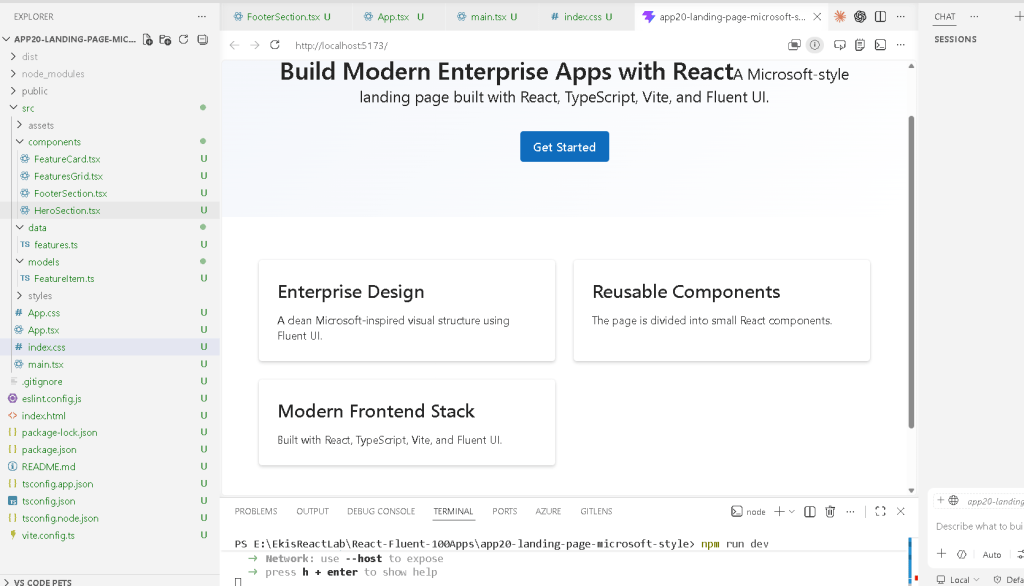
1. Creating the Project
The project starts with Vite.
Why Vite?
Modern React development requires:
- fast startup
- fast refresh
- optimized builds
- TypeScript support
- ES module support
- scalable tooling
Vite solves these problems efficiently.
PowerShell:
cd C:\ReactAppsmkdir bloco01cd bloco01npm create vite@latest app20-landing-page-microsoft-style -- --template react-ts
This command creates:
- a React application
- TypeScript configuration
- Vite configuration
- development scripts
- React entry structure
The template used is:
react-ts
which means:
- React
- TypeScript
- TSX support
Then install dependencies:
cd app20-landing-page-microsoft-stylenpm install
2. Installing Fluent UI
Next we install Fluent UI.
npm install @fluentui/react-components @fluentui/react-icons
Fluent UI is the official Microsoft design system for React applications.
It provides:
- enterprise visual consistency
- accessibility
- typography
- layout patterns
- themes
- reusable components
Without a design system, enterprise UI becomes inconsistent and difficult to maintain.
Fluent UI solves this problem.
Official documentation:
3. Creating the Folder Structure

PowerShell:
mkdir src\componentsmkdir src\datamkdir src\modelsmkdir src\styles
The project structure becomes:
src/ components/ data/ models/ styles/
This organization is extremely important.
React applications scale through:
- separation of responsibilities
- reusable components
- isolated logic
- isolated data
- isolated styling
4. Understanding the Final Architecture
The final architecture becomes:
main.tsx App.tsx HeroSection.tsx FeaturesGrid.tsx FeatureCard.tsx FooterSection.tsxfeatures.ts supplies data to FeaturesGrid
This is pure React composition.
Every component has one responsibility.
5. Understanding main.tsx
The file:
src/main.tsx
is the React entry point.
import React from "react";import ReactDOM from "react-dom/client";import { FluentProvider, webLightTheme,} from "@fluentui/react-components";import App from "./App";import "./index.css";ReactDOM.createRoot(document.getElementById("root")!).render( <React.StrictMode> <FluentProvider theme={webLightTheme}> <App /> </FluentProvider> </React.StrictMode>);
This file connects React to the HTML page.
6. How React Enters the Browser
Inside index.html, Vite creates:
<div id="root"></div>
Then main.tsx executes:
document.getElementById("root")
ReactDOM then mounts the React application inside that HTML element.
Flow:
index.html -> loads main.tsxmain.tsx -> renders App.tsxApp.tsx -> renders all componentsReactDOM -> converts JSX into real browser DOM
This is one of the most important concepts in React.
React is injected inside a single HTML root container.
7. The Role of FluentProvider
One of the most important parts is:
<FluentProvider theme={webLightTheme}>
This activates Fluent UI globally.
Without it:
- Fluent components lose theme behavior
- typography becomes inconsistent
- spacing tokens do not apply correctly
The provider injects:
- colors
- spacing
- typography
- accessibility rules
- Microsoft visual identity
8. Understanding App.tsx
App.tsx orchestrates the page.
import { HeroSection } from "./components/HeroSection";import { FeaturesGrid } from "./components/FeaturesGrid";import { FooterSection } from "./components/FooterSection";function App() { return ( <main> <HeroSection /> <FeaturesGrid /> <FooterSection /> </main> );}export default App;
This is extremely important architecturally.
App.tsx does not contain the entire UI.
Instead:
- it composes components together
- each component handles its own responsibility
This is proper React architecture.
9. Understanding React Composition
The page hierarchy becomes:
App HeroSection FeaturesGrid FeatureCard FeatureCard FeatureCard FooterSection
React applications are trees of components.
This is one of the core ideas of:
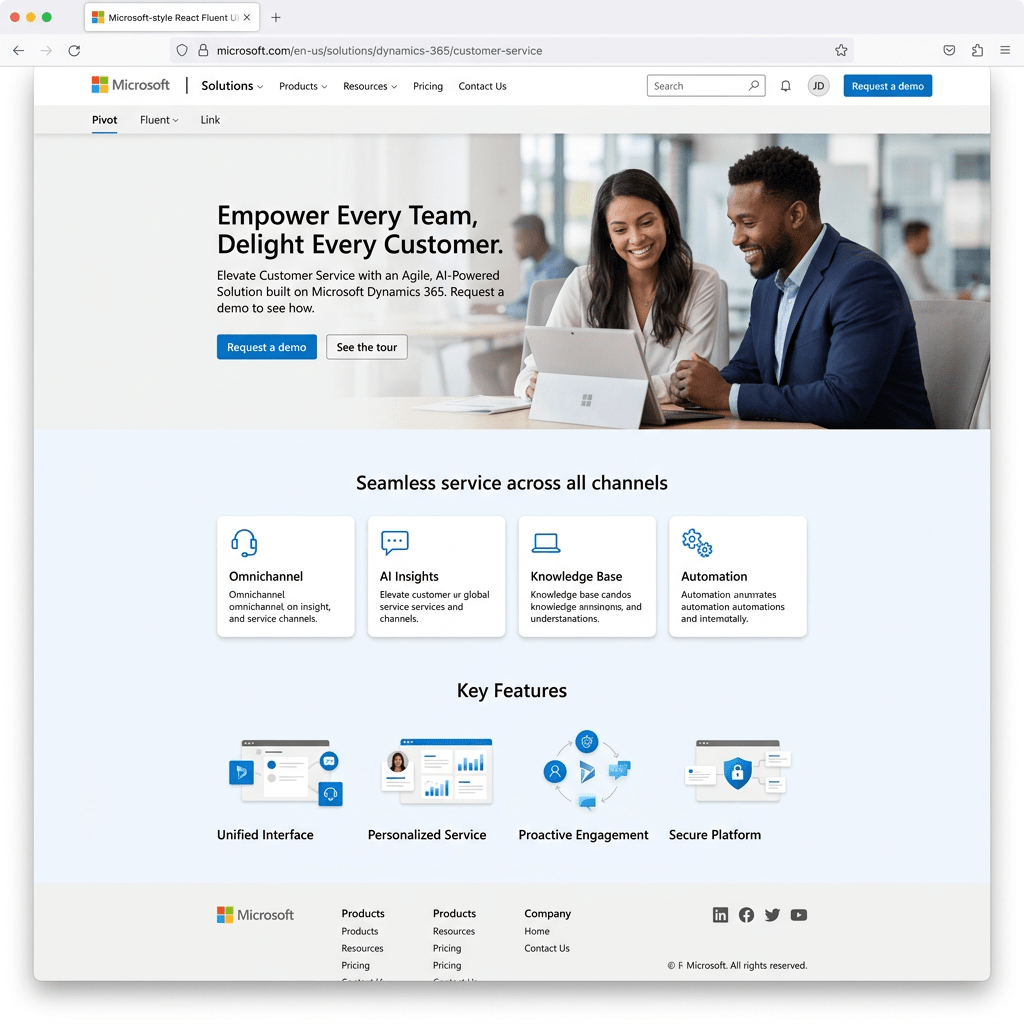
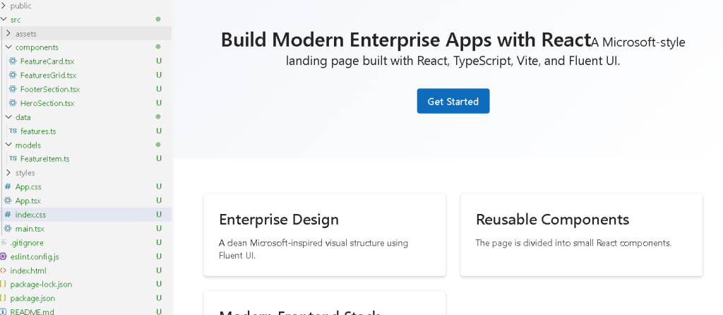
10. The Hero Section
The file:
src/components/HeroSection.tsx
creates the main banner.
<section style={{ padding: "72px 48px", background: "linear-gradient(135deg, #f3f6fb, #ffffff)", textAlign: "center", }}>
This section introduces:
- spacing
- visual hierarchy
- layout composition
- enterprise hero design
11. Understanding the Gradient Background
background: "linear-gradient(135deg, #f3f6fb, #ffffff)"
This creates a soft Microsoft-style gradient.
Why gradients matter:
- create visual depth
- improve modern appearance
- guide user focus
- improve visual hierarchy
Large enterprise landing pages frequently use subtle gradients.
12. Understanding Padding
padding: "72px 48px"
Padding creates internal spacing.
This means:
- 72px top/bottom
- 48px left/right
Without spacing, enterprise UI feels crowded.
Spacing is one of the most important design concepts in frontend engineering.
13. Typography with Fluent UI
Inside the hero section:
<Title1>
and:
<Text size={500}>
Fluent UI typography components replace raw HTML like:
<h1><p>
Advantages:
- consistent typography scale
- Microsoft visual identity
- accessibility
- predictable styling
14. The Primary Button
<Button appearance="primary" size="large">
This creates the main call-to-action button.
The prop:
appearance="primary"
tells Fluent UI:
- this is the main action
- emphasize visually
- use Microsoft primary color styling
The prop:
size="large"
increases button prominence.
This is important in landing pages because primary actions should visually stand out.
15. Understanding FeatureItem.ts
The file:
src/models/FeatureItem.ts
defines the data model.
export interface FeatureItem { id: number; title: string; description: string;}
This introduces TypeScript interfaces.
The interface defines the shape of the data.
Benefits:
- autocomplete
- type safety
- fewer bugs
- safer refactoring
- enterprise scalability
16. Understanding features.ts
The file:
src/data/features.ts
contains structured data.
export const features: FeatureItem[] = [
This means:
- the variable is an array
- each item follows the
FeatureIteminterface
This is one of the most important React concepts:
The UI should be derived from data.
17. Why Data Files Matter
Separating data from components improves:
- organization
- maintainability
- scalability
Instead of hardcoding UI repeatedly, components render dynamically from structured data.
This becomes critical later for:
- APIs
- dashboards
- DataGrid
- backend integration
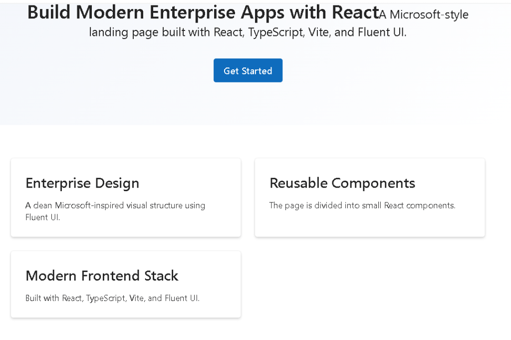
18. Understanding FeaturesGrid.tsx
This component renders the feature section.
{features.map((feature) => ( <FeatureCard key={feature.id} feature={feature} />))}
This is declarative rendering.
React transforms:
- data
into: - UI
19. Why map() Is Fundamental in React
The map() function converts arrays into component lists.
Conceptually:
feature data -> FeatureCardfeature data -> FeatureCardfeature data -> FeatureCard
This avoids:
- duplicated markup
- repetitive code
- manual UI creation
This is one of the most important ideas in:
20. Why key={feature.id} Matters
key={feature.id}
Keys help React identify items during rendering updates.
This becomes extremely important later when:
- items are reordered
- items are added
- items are removed
Stable keys improve rendering efficiency.
21. Understanding CSS Grid
Inside FeaturesGrid.tsx:
display: "grid",gridTemplateColumns: "repeat(auto-fit, minmax(260px, 1fr))",gap: "24px",
This creates a responsive grid.
The most important line is:
repeat(auto-fit, minmax(260px, 1fr))
Meaning:
Create as many columns as fit.Each column must be at least 260px.Distribute remaining space equally.
This creates responsive behavior automatically.
22. Why Responsive Layout Matters
Modern enterprise applications must work across:
- desktops
- laptops
- tablets
- ultrawide monitors
Responsive layouts adapt automatically.
Without responsive grids:
- cards overflow
- layouts break
- usability suffers
23. Understanding FeatureCard.tsx
This component is reusable.
interface FeatureCardProps { feature: FeatureItem;}
This defines component props.
Props are component inputs.
The component becomes configurable and reusable.
24. React Components as Functions
export function FeatureCard({ feature }: FeatureCardProps)
React components are functions that:
- receive props
- return JSX
This is the React mental model.
25. Understanding Fluent UI Card
<Card style={{ padding: "24px" }}>
Cards are common enterprise UI containers.
Used for:
- dashboards
- portals
- metrics
- feature sections
- SharePoint-style layouts
Cards provide:
- padding
- shadows
- borders
- visual separation
26. Understanding the Footer
The footer component:
<footer>
uses semantic HTML.
React does not replace HTML semantics.
Good React apps still use:
mainsectionheaderfooternav
This improves:
- accessibility
- SEO
- browser semantics
27. Why This App Is Architecturally Important
This app consolidates everything learned in Block 1:
- JSX
- components
- props
- composition
- rendering lists
- data-driven UI
- Fluent UI
- layout systems
- responsive design
This is the first app that truly resembles a professional landing page.
28. Why There Is No State Yet
Notice:
- no
useState - no
useEffect - no API calls
This is intentional.
According to:
you should first master:
- pure components
- declarative UI
- composition
before introducing:
- state
- interactivity
- effects
This prevents beginners from overusing effects unnecessarily.
29. The React Mental Model Reinforced
This app reinforces:
React IS:
- declarative UI
- composition
- reusable functions
- data-driven rendering
React is NOT:
- manually manipulating DOM
- imperative UI programming
- jQuery-style updates
This distinction is fundamental.
30. Validating the Application
Run development server:
npm run dev
Validate production build:
npm run build
Preview production build:
npm run preview
The build step is extremely important because it validates:
- TypeScript
- imports
- JSX compilation
- production bundling
Technical Summary
| Technology | Purpose |
|---|---|
| React | Declarative UI library |
| TypeScript | Static typing |
| Vite | Development server and build tool |
| Fluent UI | Microsoft design system |
| JSX | Declarative UI syntax |
| Functional Components | Reusable UI functions |
| Props | Component inputs |
| CSS Grid | Responsive layout |
| Card | Enterprise content container |
| map() | Dynamic rendering |
| FluentProvider | Global Microsoft theme provider |
Official Documentation
React
Fluent UI
Vite
TypeScript
Current Project Progress
| Block | App | Name | Status |
|---|---|---|---|
| Block 1 | 01 | Hello React Fluent | Completed |
| Block 1 | 02 | Profile Card | Completed |
| Block 1 | 03 | Product List | Completed |
| Block 1 | 04 | Microsoft Style User Card | Completed |
| Block 1 | 05 | Static Dashboard | Completed |
| Block 1 | 06 | Corporate Sidebar Menu | Completed |
| Block 1 | 07 | Visual Task List | Completed |
| Block 1 | 08 | Timeline Events | Completed |
| Block 1 | 09 | Employee Table | Completed |
| Block 1 | 10 | Email List | Completed |
| Block 1 | 11 | Grid of Cards | Completed |
| Block 1 | 12 | Image Gallery | Completed |
| Block 1 | 13 | Movie Catalog | Completed |
| Block 1 | 14 | Football Teams | Completed |
| Block 1 | 15 | News Page | Completed |
| Block 1 | 16 | Financial Dashboard | Completed |
| Block 1 | 17 | SharePoint Style Layout | Completed |
| Block 1 | 18 | File Explorer | Completed |
| Block 1 | 19 | Corporate Portal | Completed |
| Block 1 | 20 | Landing Page Microsoft Style | Current Article Completed |
 edvaldo b. guimarães filho