Building a Netflix-Style Movie Catalog with React, TypeScript, Vite, and Fluent UI
The thirteenth application in the 100 React + Fluent UI Apps roadmap is App 13 — Movie Catalog. This project introduces a Netflix-inspired catalog interface built with modern React architecture, TypeScript typing, Vite tooling, and Microsoft Fluent UI components.
Although visually simple, this application teaches one of the most important concepts in modern React development:
The interface should be derived from structured data.
This idea is central to the official React philosophy explained in React Learn — Thinking in React.
Instead of manually creating repeated HTML blocks, React applications transform data structures into visual interfaces using reusable components and declarative rendering.
This app continues the progression of Block 1 — Fundamentals and UI, where the goal is to deeply understand:
- JSX
- component composition
- props
- list rendering
- reusable UI structures
- declarative rendering
- TypeScript models
- enterprise UI standards
The roadmap defines App 13 as a Movie Catalog / Netflix-style catalog focused on Thinking in React and declarative architecture.
Why This App Matters

At first glance, the application appears to be only a list of movie cards.
However, architecturally, it introduces several important frontend engineering concepts:
- UI derived from arrays
- reusable card components
- separation between data and presentation
- TypeScript modeling
- Fluent UI enterprise components
- responsive grid layouts
- React composition
- pure rendering logic
This app is important because nearly every enterprise React application eventually becomes a variation of this architecture:
Data ->Reusable Components ->Rendered Lists ->Structured UI
Examples include:
- SharePoint portals
- Microsoft dashboards
- CRM systems
- ERP applications
- product catalogs
- streaming platforms
- reporting systems
- employee directories
Project Creation
The project starts with Vite.
PowerShell Commands
cd C:\ReactAppsmkdir bloco01cd bloco01npm create vite@latest app13-movie-catalog -- --template react-tscd app13-movie-catalognpm install
This creates a React + TypeScript project using Vite.
Why Vite Is Important
Vite is one of the most important modern frontend tools.
Traditional bundlers often require large startup times because they bundle the entire application before launching the dev server.
Vite works differently.
It uses:
- native ES modules
- ultra-fast startup
- instant Hot Module Replacement
- optimized production builds
Official documentation:
Installing Fluent UI
The next step is adding Microsoft Fluent UI.
npm install @fluentui/react-components @fluentui/react-icons
Fluent UI is Microsoft’s official React component library.
Official documentation:
Fluent UI provides:
- accessibility
- Microsoft design language
- enterprise spacing
- typography systems
- keyboard navigation
- theme support
- reusable enterprise controls
Instead of manually building every visual element with raw HTML and CSS, React applications assemble interfaces using standardized UI components.
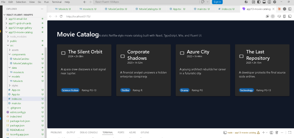
Final Folder Structure
The final project structure becomes:
app13-movie-catalog/ src/ components/ MovieCard.tsx MovieCatalog.tsx data/ movies.ts models/ Movie.ts styles/ App.tsx main.tsx index.css
This architecture is extremely important.
The project separates:
| Folder | Responsibility |
|---|---|
components/ | Reusable UI pieces |
data/ | Static data |
models/ | TypeScript contracts |
styles/ | Styling organization |
This separation becomes critical as applications grow.
Understanding the React Rendering Flow
One of the most important things to understand is how React becomes visible in the browser.
The flow is:
index.html ->main.tsx ->App.tsx ->MovieCatalog.tsx ->MovieCard.tsx ->Browser DOM
The Role of index.html
The browser first loads:
index.html
Inside it:
<div id="root"></div>
This empty div becomes the React mounting point.
Then:
/src/main.tsx
loads the React application.
Understanding main.tsx
The file:
ReactDOM.createRoot(document.getElementById("root")!)
connects React to the browser DOM.
Then React renders:
<FluentProvider theme={webDarkTheme}> <App /></FluentProvider>
This means:
- Fluent UI theme becomes global
- App becomes the root React component
- React controls everything inside
#root
Why FluentProvider Matters
Fluent UI components require:
<FluentProvider>
This injects:
- Microsoft design tokens
- colors
- typography
- spacing
- accessibility behavior
- dark/light themes
Without it, Fluent UI components would not render correctly.
Using webDarkTheme
This application uses:
webDarkTheme
instead of webLightTheme.
Why?
Because streaming applications usually use dark interfaces.
This immediately changes:
- background colors
- text colors
- borders
- Fluent component styling
without manually rewriting every component.
This demonstrates the power of design systems.
Understanding the TypeScript Model
The file:
src/models/Movie.ts
contains:
export interface Movie { id: number; title: string; genre: string; year: number; rating: string; duration: string; description: string;}
This defines the structure of a movie object.
This is critical because React applications become easier to maintain when data has predictable structure.
Benefits:
- autocomplete
- safer refactoring
- compile-time validation
- architectural clarity
If you accidentally write:
year: "2024"
instead of:
year: 2024
TypeScript warns you immediately.
The Role of movies.ts
The file:
src/data/movies.ts
contains static movie data.
Example:
export const movies: Movie[] = [
This introduces an extremely important React principle:
The UI should come from data.
Instead of manually creating cards one by one, the application uses an array.
This means:
Data drives the interface.
This is one of the most important frontend architecture concepts.
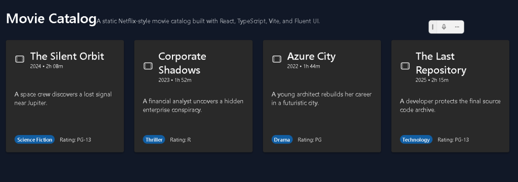
Understanding MovieCard.tsx
The file:
src/components/MovieCard.tsx
is responsible for rendering one movie.
This is componentization.
Instead of duplicating markup repeatedly, React creates reusable UI functions.
The component receives:
interface MovieCardProps { movie: Movie;}
This means:
The component receives one movie object as input.
React components behave like functions.
Input:
movie object
Output:
JSX UI
Why Props Matter
Props are one of the foundations of React.
The component receives:
task: Movie
and renders:
movie.titlemovie.genremovie.description
This makes components reusable.
The same component can render:
- movie 1
- movie 2
- movie 3
- movie 1000
without rewriting UI code.
Fluent UI Card Components
The application uses:
<Card><CardHeader><Badge><Title3><Text>
These components provide enterprise-ready behavior automatically.
For example:
<Card>
already includes:
- spacing
- border radius
- shadows
- accessible structure
- consistent Microsoft styling
Without Fluent UI, all of this would require custom CSS.
Understanding the Card Layout
Inside the card:
display: "flex",flexDirection: "column",justifyContent: "space-between",
This creates a vertical layout.
The structure becomes:
HeaderDescriptionMetadata
The card fills vertically and keeps spacing consistent.
Understanding MovieCatalog.tsx
This component renders all movies.
The key section is:
{movies.map((movie) => ( <MovieCard key={movie.id} movie={movie} />))}
This is declarative rendering.
React transforms:
Movie[]
into:
MovieCard[]
Conceptually:
Movie 1 -> Card 1Movie 2 -> Card 2Movie 3 -> Card 3Movie 4 -> Card 4
Why map() Is Fundamental in React
The map() function is one of the most important tools in React development.
It allows interfaces to be generated from arrays dynamically.
Instead of:
Create card manuallyCreate another card manuallyCreate another card manually
you declare:
For each movie, render a MovieCard.
This is declarative programming.
Why Keys Matter
React requires:
key={movie.id}
Keys help React identify list items efficiently.
Without keys:
- React may re-render inefficiently
- warnings appear
- DOM updates become less predictable
Keys are essential for scalable rendering.
Understanding the Responsive Grid
The catalog layout uses:
display: "grid",gridTemplateColumns: "repeat(auto-fit, minmax(260px, 1fr))",
This creates a responsive layout automatically.
Meaning:
Create as many columns as fit.Each column must be at least 260px.Expand columns equally when space exists.
This allows the UI to adapt to:
- desktops
- tablets
- smaller screens
without rewriting layouts.
The Role of App.tsx
App.tsx acts as the root visual layout.
It defines:
- page spacing
- background color
- content width
- main application structure
The dark background:
backgroundColor: "#111827"
creates the streaming-platform visual style.
Why the App Uses No State Yet
This app intentionally avoids:
useStateuseEffect- API calls
Why?
Because Block 1 focuses on:
- pure rendering
- declarative UI
- component structure
According to React Learn:
Components should remain pure whenever possible.
This app is static UI only.
Therefore:
- no state is needed
- no effects are needed
This is extremely important because beginners often overuse useEffect.
React Mental Model Introduced
This app reinforces the correct React mental model.
React is NOT:
- manual DOM manipulation
- jQuery-style updates
- imperative UI coding
React IS:
- declarative rendering
- component composition
- state-driven UI
- reusable architecture
This distinction is fundamental.
Production Validation
Run the development server:
npm run dev
Validate the production build:
npm run build
Preview the production build:
npm run preview
This is important because:
If the production build succeeds,the application is structurally valid.
Technical Summary
| Technology | Purpose |
|---|---|
| React | Declarative UI rendering |
| TypeScript | Strong typing |
| Vite | Modern build tool |
| Fluent UI | Microsoft design system |
| JSX | UI syntax |
| Props | Component inputs |
map() | Declarative list rendering |
| CSS Grid | Responsive layout |
Movie.ts | Data contract |
movies.ts | Static data source |
MovieCard.tsx | Reusable movie component |
MovieCatalog.tsx | Grid rendering |
App.tsx | Root layout |
Concepts Learned
| Concept | Explanation |
|---|---|
| Declarative UI | UI generated from data |
| Componentization | Reusable UI functions |
| Props | Data passed into components |
| TypeScript Models | Structured data contracts |
| Responsive Layout | Grid-based responsive UI |
| Pure Components | No side effects |
| Fluent UI | Enterprise Microsoft UI |
| JSX | Declarative component syntax |
Official Documentation
React
Fluent UI
Vite
TypeScript
Current Project Progress
| Block | App | Name | Status |
|---|---|---|---|
| Block 1 | 01 | Hello React Fluent | Completed |
| Block 1 | 02 | Profile Card | Completed |
| Block 1 | 03 | Product List | Completed |
| Block 1 | 04 | Microsoft Style User Card | Completed |
| Block 1 | 05 | Static Dashboard | Completed |
| Block 1 | 06 | Corporate Sidebar Menu | Completed |
| Block 1 | 07 | Visual Task List | Completed |
| Block 1 | 08 | Timeline Events | Completed |
| Block 1 | 09 | Employee Table | Completed |
| Block 1 | 10 | Email List | Completed |
| Block 1 | 11 | Grid of Cards | Completed |
| Block 1 | 12 | Image Gallery | Completed |
| Block 1 | 13 | Movie Catalog | Current |
| Block 1 | 14 | Football Teams List | Next |
 edvaldo b. guimarães filho