Building a SharePoint-Style Enterprise Portal with React, TypeScript, Vite, and Fluent UI

Modern enterprise portals are no longer simple collections of HTML pages linked together manually. Platforms like Microsoft SharePoint Online introduced a new way of thinking about business applications: componentized interfaces, reusable layouts, responsive dashboards, centralized navigation, and design systems that maintain consistency across large organizations.
In this project, App 17 — SharePoint Style Layout, we recreate the architectural foundations of a SharePoint-inspired intranet experience using:
This app is still part of Block 1 — Fundamentals and UI, meaning it intentionally avoids advanced state management, effects, API calls, reducers, and routing. Instead, the focus is on understanding:
- React composition
- layout architecture
- component hierarchy
- typed data
- declarative rendering
- enterprise UI organization
- Fluent UI integration
- reusable design patterns
Even though the portal is visually simple, architecturally it introduces many concepts that appear in real enterprise React systems.
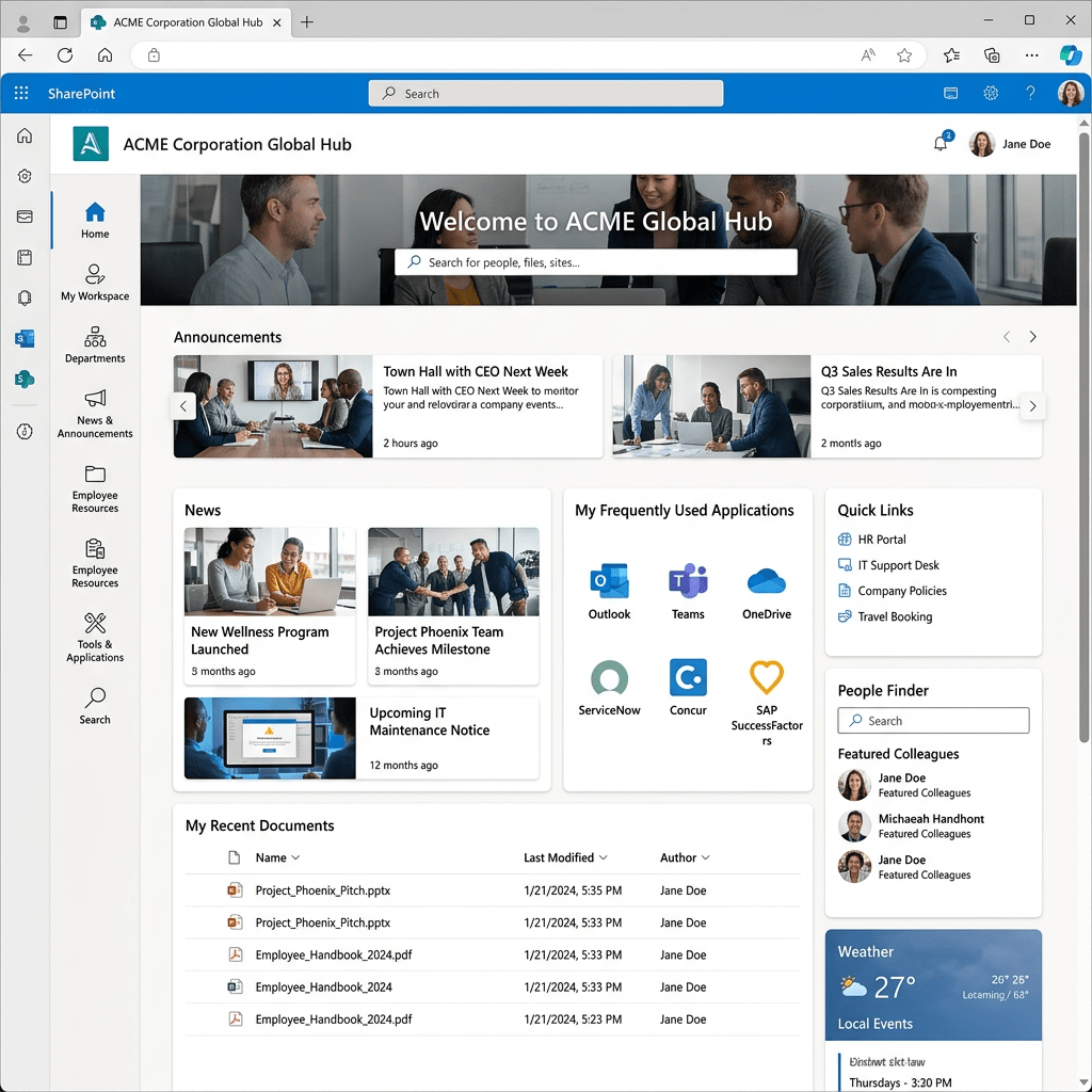
Why a SharePoint-Style Layout Matters
One of the biggest transitions in frontend development is moving from isolated widgets into complete application shells.
Earlier apps in the project focused on:
- cards
- lists
- grids
- static dashboards
- visual layouts
App 17 introduces something more important:
Application architecture
Instead of rendering only isolated components, we now organize the screen into major enterprise regions:
Top navigationLeft sidebarMain content areaHero bannerQuick linksNews feed
This is how real enterprise portals are structured.
Modern applications usually follow a shell-based architecture:
Application Shell ├── Header ├── Navigation ├── Content Area ├── Widgets └── Footer
This concept is extremely important because future apps involving:
- routing
- dashboards
- SharePoint-style portals
- admin centers
- CRM systems
- ERP systems
- analytics portals
will all reuse this structural pattern.
The Project Structure
The project structure became:
app17-sharepoint-layout/│├── public/├── src/│ ├── components/│ ├── data/│ ├── models/│ ├── styles/│ ├── App.tsx│ ├── main.tsx│ └── index.css│├── index.html├── package.json├── vite.config.ts├── tsconfig.json└── package-lock.json
This organization already resembles a professional React application.
Each folder has a responsibility.
Understanding the Role of Each Folder
components/
Contains reusable UI pieces.
In this app:
TopBar.tsxLeftNavigation.tsxHeroSection.tsxQuickLinks.tsxNewsSection.tsx
Each component represents one isolated responsibility.
This is one of React’s core architectural principles:
Break the UI into reusable components.
models/
Contains TypeScript interfaces and types.
This is important because enterprise systems require predictable data contracts.
Example:
export interface PortalLink { id: number; title: string; description: string;}
This guarantees:
- type safety
- IDE autocomplete
- safer refactoring
- more predictable architecture
data/
Stores mock or static data.
Instead of hardcoding UI repeatedly, React applications usually derive the UI from data structures.
Example:
export const portalLinks: PortalLink[] = [...]
Then React converts the data into UI using:
portalLinks.map(...)
This is declarative rendering.
styles/
Contains CSS files.
This app introduces a more professional separation between:
- React logic
- visual styling
Instead of placing all styles inline, we now use:
app.cssindex.css
This improves:
- readability
- maintainability
- scalability
How React Enters the Browser
One of the most important concepts to understand is:
React is not HTML.
The browser first loads:
index.html
Inside it:
<div id="root"></div>
This div is initially empty.
Then the browser loads:
/src/main.tsx
Now React starts executing.
The flow becomes:
Browser loads index.htmlindex.html loads main.tsxmain.tsx renders App.tsxApp.tsx renders all child componentsReactDOM updates the browser DOMBrowser displays the final UI
This is why React applications are often called:
Single Page Applications (SPA)
The UI is dynamically constructed inside the browser.
Understanding main.tsx
The file:
src/main.tsx
is the true React entry point.
ReactDOM.createRoot( document.getElementById("root")!).render( <React.StrictMode> <FluentProvider theme={webLightTheme}> <App /> </FluentProvider> </React.StrictMode>);
This file performs several critical tasks.
ReactDOM.createRoot
ReactDOM.createRoot(...)
This creates the React rendering engine.
Older React versions used:
ReactDOM.render()
Modern React uses createRoot() because it enables:
- concurrent rendering
- future optimizations
- improved scheduling
Finding the HTML Root
document.getElementById("root")
This locates:
<div id="root"></div>
inside index.html.
The ! tells TypeScript:
This element definitely exists.
React.StrictMode
<React.StrictMode>
StrictMode helps detect:
- side effects
- unsafe rendering
- deprecated APIs
- impure components
This is important because React expects components to behave as pure functions.
FluentProvider
<FluentProvider theme={webLightTheme}>
This enables Fluent UI globally.
Without it:
- Fluent UI components lose theme styling
- typography becomes inconsistent
- accessibility behavior may break
The provider injects:
- colors
- spacing
- typography
- accessibility tokens
- Microsoft design rules
Why Fluent UI Matters
Fluent UI is Microsoft’s official React design system.
It provides:
- enterprise components
- accessibility
- keyboard navigation
- responsive layouts
- Microsoft visual consistency
Instead of manually building controls with raw HTML and CSS, we compose applications using professional UI primitives.
Examples:
CardButtonToolbarAvatarBadgeText
This dramatically improves:
- productivity
- consistency
- accessibility
- maintainability
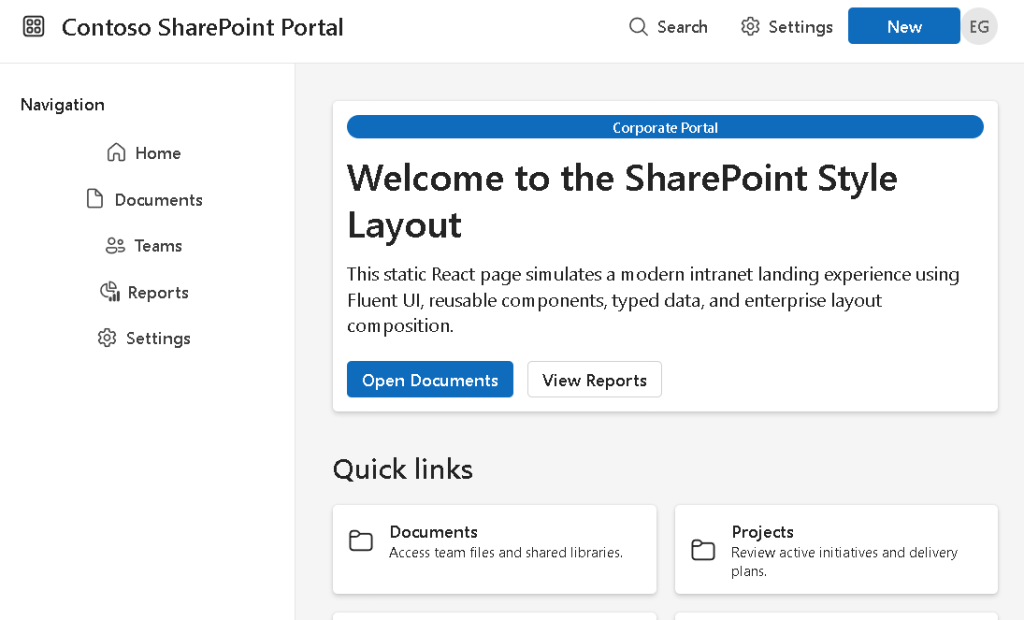
Understanding App.tsx
App.tsx is the root component.
function App() { return ( <div className="app-shell"> <TopBar /> <div className="page-layout"> <LeftNavigation /> <main className="main-content"> <HeroSection /> <QuickLinks /> <NewsSection /> </main> </div> </div> );}
This file demonstrates one of the most important React ideas:
Composition
Instead of writing one giant file, the application becomes a hierarchy of components.
Component Hierarchy
The hierarchy becomes:
App ├── TopBar ├── LeftNavigation └── Main Content ├── HeroSection ├── QuickLinks └── NewsSection
This mirrors real enterprise systems.
Each component has:
- one responsibility
- isolated JSX
- isolated styling
- reusable structure
Understanding the Application Shell
The class:
.app-shell
creates the outer structure of the portal.
.app-shell { min-height: 100vh;}
100vh means:
100% of the viewport height
The portal now occupies the entire browser window.
This is extremely common in:
- dashboards
- admin centers
- SharePoint portals
- Microsoft 365 interfaces
The Top Navigation Bar
The TopBar component simulates a SharePoint-style header.
It contains:
- brand area
- search button
- settings button
- avatar
- action button
The layout uses:
display: flex;justify-content: space-between;align-items: center;
This creates a professional horizontal toolbar.
Understanding Flexbox
Flexbox is one of the most important CSS layout systems.
In the top bar:
display: flex;
activates flex layout.
Then:
justify-content: space-between;
pushes content to opposite sides.
And:
align-items: center;
vertically centers everything.
This creates the classic enterprise toolbar layout.
The Sidebar Navigation
The sidebar is rendered by:
<LeftNavigation />
It contains navigation buttons generated from data.
This is extremely important.
Instead of manually repeating buttons:
<Button>Home</Button><Button>Documents</Button><Button>Reports</Button>
we use data:
navigationItems.map(...)
This means:
UI is derived from data
This is a foundational React principle.
Why map() Is So Important
map() transforms arrays into UI.
Example:
navigationItems.map((item) => ( <Button>{item.title}</Button>))
Conceptually:
data item -> UI component
This is declarative rendering.
React handles:
- DOM creation
- updates
- reconciliation
You only describe:
- what the UI should look like
Stable Keys in React
Each item uses:
key={item.id}
Keys help React identify elements efficiently.
Without keys:
- React shows warnings
- updates become less efficient
Keys are especially important when:
- items are added
- items are removed
- items are reordered
The Main Content Area
The main content uses:
flex: 1;
This means:
Take all remaining horizontal space
Since the sidebar has a fixed width:
width: 260px;
the main content automatically fills the rest of the screen.
This creates the classic:
Sidebar + Content
enterprise layout.
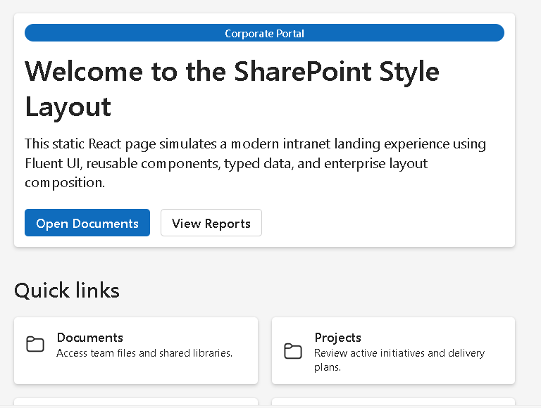
Hero Section
The hero section acts as a portal welcome banner.
It contains:
- title
- description
- badges
- action buttons
This pattern is extremely common in:
- SharePoint portals
- Microsoft admin pages
- dashboard landing pages
The component uses Fluent UI Card as a container.
Why Cards Matter in Enterprise UI
Cards are fundamental in enterprise design systems.
They provide:
- spacing
- elevation
- grouping
- visual separation
Modern dashboards often organize content into:
- cards
- tiles
- panels
This improves readability.
The Quick Links Section
The quick links section renders reusable cards from typed data.
portalLinks.map((link) => ( <Card key={link.id}>
This introduces:
- reusable data-driven rendering
- scalable layout generation
- separation between data and UI
Later, real applications may load this data from:
- APIs
- SharePoint lists
- databases
- Graph endpoints
The News Section
The news section simulates a corporate intranet feed.
This pattern appears constantly in:
- SharePoint Online
- intranet portals
- Microsoft Viva
- corporate dashboards
Each card contains:
- category badge
- title
- summary
- date
Again, the UI is generated from structured data.
Why There Is No State Yet
One of the best design decisions in this app is what we intentionally avoided.
There is:
- no
useState - no
useEffect - no API fetch
- no reducers
Why?
Because React Learn explains that components should first be understood as pure rendering functions.
This app focuses only on:
- composition
- rendering
- layout architecture
Adding state too early often creates confusion.
Understanding Pure Components
Each component behaves like:
input -> JSX output
No component modifies external data.
No side effects occur.
This aligns with:
Pure components are:
- predictable
- reusable
- easier to debug
CSS Grid in the Quick Links
The layout uses:
grid-template-columns: repeat(auto-fit, minmax(220px, 1fr));
This creates a responsive grid.
Meaning:
Create as many columns as possible.Each card must be at least 220px wide.Distribute remaining space equally.
This allows the layout to adapt automatically to screen size.
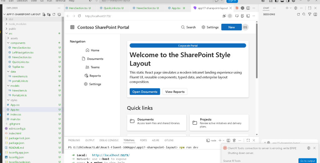
Why Vite Matters
Vite Guide powers the entire development experience.
When running:
npm run dev
Vite:
- starts the development server
- compiles TypeScript
- processes JSX
- serves assets
- enables Hot Module Replacement
The app becomes available at:
http://localhost:5173
Unlike older tools, Vite is extremely fast because it uses:
- native ES modules
- optimized dev server architecture
Understanding the Build Process
When you run:
npm run build
Vite creates the production bundle.
This validates:
- TypeScript
- imports
- JSX compilation
- dependency resolution
The final optimized files go into:
dist/
This is what would eventually be deployed.
PowerShell Commands Used
Create the project
cd C:\ReactAppsmkdir bloco01cd bloco01npm create vite@latest app17-sharepoint-layout -- --template react-tscd app17-sharepoint-layoutnpm install
Install Fluent UI
npm install @fluentui/react-components @fluentui/react-icons
Create folders
mkdir src\componentsmkdir src\datamkdir src\modelsmkdir src\styles
Create files
New-Item src\components\TopBar.tsx -ItemType FileNew-Item src\components\LeftNavigation.tsx -ItemType FileNew-Item src\components\HeroSection.tsx -ItemType FileNew-Item src\components\QuickLinks.tsx -ItemType FileNew-Item src\components\NewsSection.tsx -ItemType File
Run development server
npm run dev
Validate production build
npm run build
Preview production build
npm run preview
Technical Summary
| Technology | Purpose |
|---|---|
| React | Declarative UI rendering |
| TypeScript | Static typing |
| Vite | Fast development tooling |
| Fluent UI | Microsoft design system |
| JSX | Declarative UI syntax |
| Flexbox | Sidebar + header layout |
| CSS Grid | Responsive card layouts |
| Components | Reusable UI pieces |
map() | Data-driven rendering |
Card | Enterprise content container |
Toolbar | Microsoft-style top navigation |
Badge | Categorization labels |
Avatar | User identity representation |
Official Documentation
React
Fluent UI
Vite
TypeScript
Current Project Progress
| Block | App | Name | Status |
|---|---|---|---|
| Block 1 | 01 | Hello React Fluent | Completed |
| Block 1 | 02 | Profile Card | Completed |
| Block 1 | 03 | Product List | Completed |
| Block 1 | 04 | Microsoft Style User Card | Completed |
| Block 1 | 05 | Static Dashboard | Completed |
| Block 1 | 06 | Corporate Sidebar Menu | Completed |
| Block 1 | 07 | Visual Task List | Completed |
| Block 1 | 08 | Timeline of Events | Completed |
| Block 1 | 09 | Employee Table | Completed |
| Block 1 | 10 | Email List | Completed |
| Block 1 | 11 | Grid of Cards | Completed |
| Block 1 | 12 | Image Gallery | Completed |
| Block 1 | 13 | Movie Catalog | Completed |
| Block 1 | 14 | Football Teams List | Completed |
| Block 1 | 15 | News Page | Completed |
| Block 1 | 16 | Static Financial Dashboard | Completed |
| Block 1 | 17 | SharePoint Style Layout | Current |
| Block 1 | 18 | File Explorer | Next |
 edvaldo b. guimarães filho