Building a Static Financial Dashboard with React, Vite, TypeScript, and Fluent UI
Modern enterprise applications frequently start with dashboards. Before developers build APIs, authentication systems, dynamic filters, charts, or complex business logic, they first establish the visual architecture of the application.
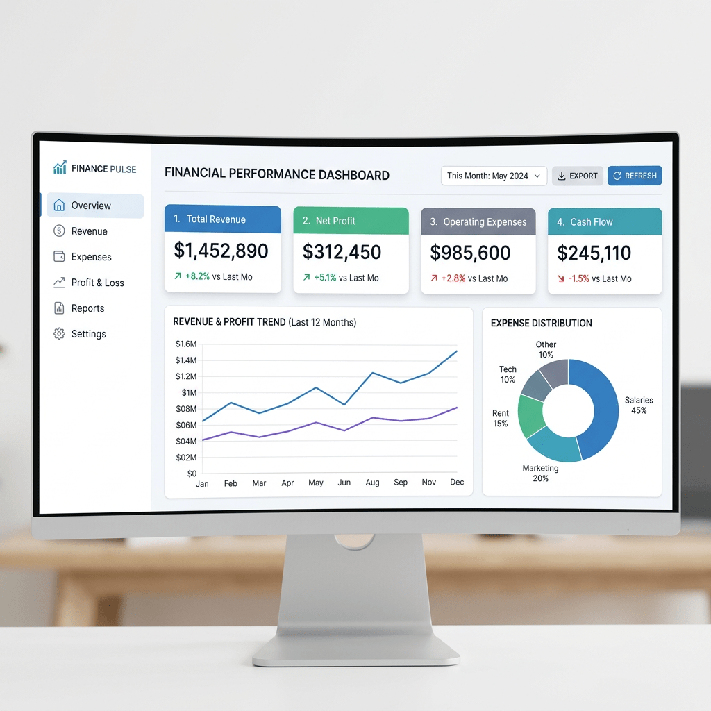
That is exactly the purpose of App 16 — Static Financial Dashboard.
This application introduces the architectural foundation of a corporate analytics interface using:
Even though the dashboard is static, this app is extremely important because it introduces:
- enterprise UI composition
- dashboard layouts
- metric cards
- responsive grids
- reusable components
- static data modeling
- React list rendering
- props-based architecture
- Fluent UI design system
- clean separation of concerns
This application also prepares the foundation for future enterprise systems such as:
- CRM dashboards
- ERP portals
- SharePoint-style portals
- analytics platforms
- financial systems
- administrative dashboards
- Power BI-inspired layouts

The roadmap defines App 16 specifically as:
“Dashboard Financeiro Estático / Dashboard corporativo / Fluent Cards, métricas.”
This app belongs to Block 1 — Fundamentals and UI, meaning the primary goal is still understanding declarative UI architecture rather than interactivity or API integration.
1. Creating the Project
The application starts with Vite.
Why Vite?
Historically, many React applications used Create React App (CRA). Modern React development increasingly prefers Vite because it provides:
- extremely fast startup
- instant Hot Module Replacement (HMR)
- modern ES Module architecture
- simplified configuration
- optimized builds
- improved developer experience
Create the project:
cd C:\ReactAppsmkdir bloco01cd bloco01npm create vite@latest app16-static-financial-dashboard -- --template react-ts
This command:
- creates the project folder
- configures React
- configures TypeScript
- configures Vite
- prepares the development environment
The template:
react-ts
means:
React + TypeScript
This is important because enterprise applications benefit enormously from TypeScript:
- type safety
- IDE autocomplete
- safer refactoring
- better architecture
- reduced runtime bugs
2. Installing Dependencies

Move into the project:
cd app16-static-financial-dashboard
Install dependencies:
npm install
Install Fluent UI:
npm install @fluentui/react-components @fluentui/react-icons
This installs:
- Fluent UI components
- Microsoft icons
- design system dependencies
3. Creating the Folder Structure
Professional React applications require organization.
Create folders:
mkdir src\componentsmkdir src\datamkdir src\modelsmkdir src\styles
Create files:
New-Item src\models\FinancialMetric.ts -ItemType FileNew-Item src\data\financialMetrics.ts -ItemType FileNew-Item src\components\MetricCard.tsx -ItemType FileNew-Item src\components\FinancialDashboard.tsx -ItemType File
The final structure becomes:
src/ components/ FinancialDashboard.tsx MetricCard.tsx data/ financialMetrics.ts models/ FinancialMetric.ts styles/ App.tsx main.tsx index.css
This separation is extremely important.
4. Understanding the Architectural Separation
Each folder has a responsibility.
| Folder | Responsibility |
|---|---|
components/ | UI building blocks |
data/ | Static or mock data |
models/ | TypeScript types/interfaces |
styles/ | CSS organization |
App.tsx | Root application layout |
main.tsx | React entry point |
React applications scale through composition and separation of concerns.
5. Understanding the Data Model
The file:
src/models/FinancialMetric.ts
contains the TypeScript model:
export interface FinancialMetric { id: number; title: string; value: string; description: string; trend: "Positive" | "Negative" | "Neutral";}
This interface defines the structure of each dashboard metric.
6. Why Interfaces Matter
This is one of the biggest advantages of TypeScript.
The interface guarantees that every metric object contains:
idtitlevaluedescriptiontrend
If you accidentally create invalid data:
title: 123
TypeScript warns immediately.
This prevents many runtime problems.
7. Understanding Union Types
This part is very important:
trend: "Positive" | "Negative" | "Neutral";
This is a TypeScript union type.
It means:
Only these three values are allowed.
This improves:
- safety
- autocomplete
- consistency
- maintainability
If you write:
trend: "Wrong"
TypeScript shows an error.
This is excellent for enterprise architecture.
8. The Static Data File
The file:
src/data/financialMetrics.ts
contains dashboard data:
export const financialMetrics: FinancialMetric[] = [
This creates an array of metrics.
Each metric represents a business KPI.
Example:
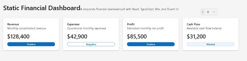
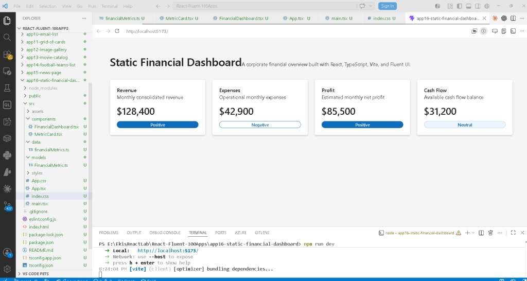
{ id: 1, title: "Revenue", value: "$128,400", description: "Monthly consolidated revenue", trend: "Positive",}
9. Why Static Data Is Important
This app intentionally uses static data.
Why?
Because React learning should happen progressively.
At this stage we are learning:
- composition
- props
- rendering
- component hierarchy
- UI structure
NOT:
- APIs
- async loading
- effects
- fetch logic
According to React Learn — You Might Not Need an Effect, effects should only synchronize with external systems.
This app has no external system yet.
Therefore:
No useEffect is necessary.
This is the correct React mental model.
10. The MetricCard Component
The most important UI component is:
src/components/MetricCard.tsx
This component renders a single financial KPI card.
11. Importing Fluent UI Components
import { Badge, Body1, Card, CardHeader, Text, Title2,} from "@fluentui/react-components";
This demonstrates a core enterprise React concept:
We compose interfaces using reusable components.
Instead of manually building HTML/CSS for everything, Fluent UI provides:
- typography
- spacing
- accessibility
- keyboard support
- enterprise styling
- Microsoft visual identity
12. Understanding the Card Component
<Card>
The Card component is one of the most common enterprise UI elements.
It is used for:
- dashboards
- KPIs
- reports
- analytics panels
- widgets
- SharePoint-style layouts
The Card already includes:
- padding behavior
- borders
- shadows
- consistent spacing
- accessibility support
13. Understanding Props
The component receives:
interface MetricCardProps { metric: FinancialMetric;}
Then:
export function MetricCard({ metric }: MetricCardProps)
This means the component receives data through props.
This is one of the core ideas of React:
Data flows downward through props.
14. React Component Purity
The component does not modify data.
It only:
Receives dataReturns JSX
This makes it a pure component.
React Learn strongly emphasizes pure components:
Pure components are:
- predictable
- reusable
- easier to debug
- easier to scale
15. Understanding the Trend Badge
This function:
function getBadgeAppearance(trend: FinancialMetric["trend"])
maps business data into UI appearance.
Conceptually:
Positive -> filledNegative -> outlineNeutral -> tint
This is declarative UI logic.
The UI derives from data.
16. Understanding Declarative Rendering
Notice this:
<Badge appearance={getBadgeAppearance(metric.trend)}>
We are not manually styling badges imperatively.
Instead:
Data determines UI appearance.
This is fundamental React architecture.
17. Understanding CardHeader
<CardHeader
This Fluent UI component organizes:
- title
- description
- optional media/icons
Instead of manually building layouts, Fluent UI encapsulates common enterprise patterns.
18. Typography Components
Instead of raw HTML:
<h2><p>
Fluent UI uses semantic typography:
<Title2><Text><Body1>
This guarantees:
- visual consistency
- accessibility
- Microsoft typography scale
- responsive behavior
19. The FinancialDashboard Component
The file:
src/components/FinancialDashboard.tsx
renders all dashboard cards.
20. Understanding List Rendering
This is the core logic:
{financialMetrics.map((metric) => ( <MetricCard key={metric.id} metric={metric} />))}
This is one of the most important React concepts.
React takes:
FinancialMetric[]
and transforms it into:
MetricCard[]
21. Why map() Is Fundamental
map() converts data into UI.
Conceptually:
metric 1 -> card 1metric 2 -> card 2metric 3 -> card 3metric 4 -> card 4
This is declarative rendering.
We describe:
For every metric, render a card.
React handles DOM creation automatically.
22. Understanding React Keys
key={metric.id}
Keys help React identify list elements efficiently.
This becomes critical when:
- items change
- items reorder
- items are removed
- items are updated
React uses keys during reconciliation.
Without keys, React warns because rendering becomes less predictable.
23. Understanding CSS Grid
The dashboard layout uses:
display: "grid"
and:
gridTemplateColumns: "repeat(auto-fit, minmax(240px, 1fr))"
This creates a responsive dashboard grid.
24. Understanding repeat(auto-fit, minmax())
This is extremely important.
repeat(auto-fit, minmax(240px, 1fr))
means:
Create as many columns as fit.Each column must be at least 240px.If extra space exists, distribute it equally.
This makes the dashboard responsive automatically.
25. The Root Application Component
The file:
src/App.tsx
defines the page structure.
<main> <section> <Title1 /> <Text /> <FinancialDashboard /> </section></main>
This shows component composition.
26. Understanding Component Composition
The hierarchy is:
App FinancialDashboard MetricCard
This is how React scales.
Large applications are built from smaller reusable pieces.
27. Why main Matters
<main>
This is semantic HTML.
It tells browsers and accessibility tools:
This is the main content of the page.
React does not replace good HTML practices.
28. Understanding main.tsx
The file:
src/main.tsx
connects React to the browser.
29. ReactDOM.createRoot
ReactDOM.createRoot(document.getElementById("root")!)
This tells React:
Render the app inside #root.
The HTML container comes from:
<div id="root"></div>
inside index.html.
30. Understanding FluentProvider
<FluentProvider theme={webLightTheme}>
This activates Fluent UI globally.
It injects:
- colors
- typography
- spacing
- accessibility rules
- Microsoft theme tokens
Without it, Fluent UI components would not render correctly.
31. Understanding React.StrictMode
<React.StrictMode>
StrictMode helps detect:
- unsafe patterns
- side effects
- deprecated APIs
- impure rendering
It improves code quality during development.
32. The Role of index.css
body { margin: 0;}
Browsers add default body margin.
Removing it is important for enterprise full-screen layouts.
33. Why Box Sizing Matters
* { box-sizing: border-box;}
This changes how width calculations work.
Without it:
padding increases total width
With border-box:
padding stays inside width
This simplifies layout calculations.
34. Running the Development Server
Start Vite:
npm run dev
Vite creates a local development server.
Usually:
http://localhost:5173
Vite handles:
- TypeScript compilation
- JSX transformation
- dependency resolution
- Hot Module Replacement
35. Validating Production Build
Very important:
npm run build
This validates production compilation.
It ensures:
- TypeScript correctness
- dependency resolution
- production bundling
36. Previewing Production
npm run preview
This serves the production build locally.
This simulates the deployed application.
37. React Mental Model Introduced
This app reinforces the correct React mindset.
React is NOT:
- manual DOM manipulation
- jQuery-style updates
- imperative rendering
React IS:
- declarative UI
- component composition
- UI derived from data
- predictable rendering
38. Why This App Is Important
This app establishes the foundation for future enterprise dashboards.
Later apps will evolve this into:
- real APIs
- charts
- filters
- pagination
- authentication
- reducers
- Context API
- global state
- analytics systems
Without mastering this static architecture first, advanced dashboards become much harder.
39. Technical Summary
| Technology | Purpose |
|---|---|
| React | Declarative UI library |
| TypeScript | Static typing |
| Vite | Development/build tool |
| Fluent UI | Microsoft design system |
| JSX | Declarative syntax |
| Components | Reusable UI blocks |
| Props | Data passed into components |
| CSS Grid | Responsive layout |
| Card | Dashboard container |
| Badge | Status visualization |
| map() | Data-to-UI rendering |
| Interfaces | Type safety |
| FluentProvider | Global Fluent theme |
40. Official Documentation
React
Fluent UI
Vite
TypeScript
Current Progress
| Block | App | Name | Status |
|---|---|---|---|
| Block 1 | 01 | Hello React Fluent | Completed |
| Block 1 | 02 | Profile Card | Completed |
| Block 1 | 03 | Product List | Completed |
| Block 1 | 04 | Microsoft Style User Card | Completed |
| Block 1 | 05 | Static Dashboard | Completed |
| Block 1 | 06 | Corporate Sidebar Menu | Completed |
| Block 1 | 07 | Visual Task List | Completed |
| Block 1 | 08 | Timeline Events | Completed |
| Block 1 | 09 | Employee Table | Completed |
| Block 1 | 10 | Email List | Completed |
| Block 1 | 11 | Grid of Cards | Completed |
| Block 1 | 12 | Image Gallery | Completed |
| Block 1 | 13 | Movie Catalog | Completed |
| Block 1 | 14 | Football Teams | Completed |
| Block 1 | 15 | News Page | Completed |
| Block 1 | 16 | Static Financial Dashboard | Current |
| Block 1 | 17 | SharePoint Layout | Next |
 edvaldo b. guimarães filho