

Building an Enterprise Image Gallery with React, Vite, TypeScript, and Fluent UI

App 12 — Image Gallery is one of the most important applications in the first block of the React learning roadmap because it introduces something fundamental to modern frontend engineering:
transforming structured data into visual UI components dynamically.
At first glance, this project appears simple. It shows cards with images, titles, descriptions, categories, and badges.
However, architecturally, this application introduces several critical React concepts:
- component composition
- list rendering with
map() - props
- conditional rendering
- reusable UI components
- responsive layouts
- Fluent UI enterprise components
- TypeScript models
- declarative UI generation
- separation of data and presentation
This app also helps establish the correct React mental model described in React Learn:
- the UI is generated from data
- components are reusable functions
- rendering is declarative
- the interface is not manually manipulated
- JSX describes what the UI should look like
This application belongs to Block 1 — Fundamentals and UI of the 100 React Apps roadmap.
The official learning concepts associated with this app are:
Why This App Matters
Before React, developers often created interfaces imperatively.
For example:
create divcreate imageappend imagecreate titleappend titlerepeat everything again
This approach becomes difficult to maintain when applications grow.
React changes this model completely.
Instead of manually manipulating the DOM, React allows you to describe the interface declaratively:
For each image in the gallery,render a GalleryCard component.
React then updates the DOM automatically.
This is one of the biggest conceptual shifts in modern frontend engineering.
The Goal of the App
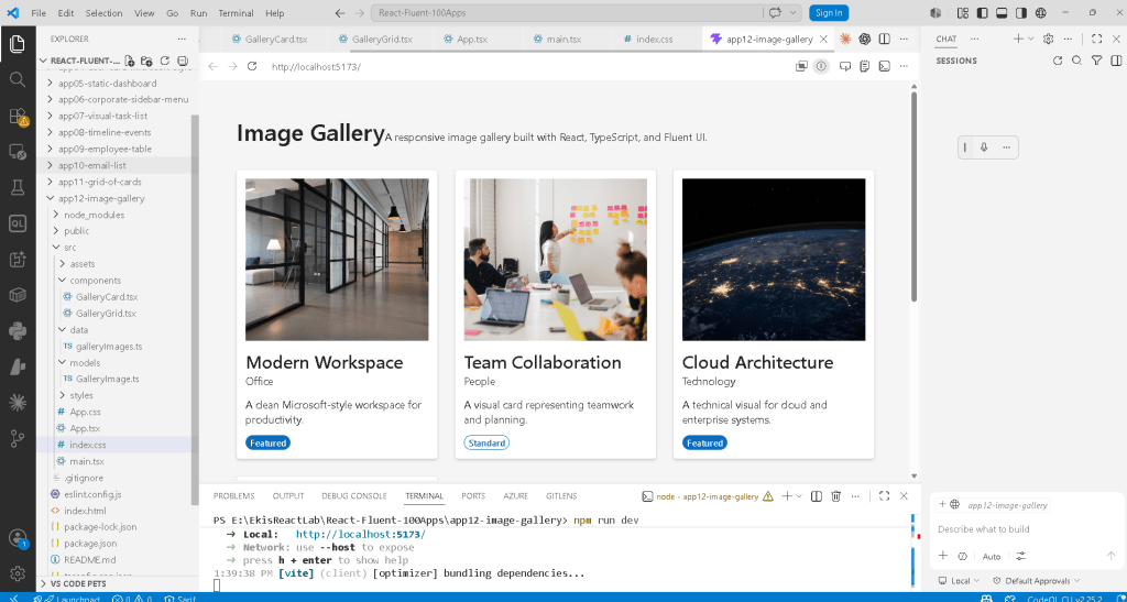
The Image Gallery app demonstrates how enterprise applications commonly organize visual data.
The gallery displays:
- image preview
- category
- description
- featured status
- responsive card layout
This same architecture can later evolve into:
- product catalogs
- SharePoint document previews
- media dashboards
- CRM image galleries
- corporate portals
- Power BI-inspired dashboards
- streaming platforms
- AI-generated media explorers
So even though this is a learning exercise, the architectural foundation is enterprise-grade.
Creating the Project
The project starts with Vite and TypeScript.
PowerShell:
cd C:\ReactAppsmkdir bloco01cd bloco01npm create vite@latest app12-image-gallery -- --template react-tscd app12-image-gallerynpm install
This command creates:
- React project
- TypeScript setup
- Vite configuration
- development server
- build pipeline
Installing Fluent UI
Next we install Fluent UI.
npm install @fluentui/react-components @fluentui/react-icons
Fluent UI is the official Microsoft React design system.
It provides:
- enterprise components
- accessibility
- typography
- spacing rules
- theme system
- Microsoft visual identity
Official documentation:
Creating the Folder Structure
PowerShell:
mkdir src\componentsmkdir src\datamkdir src\modelsmkdir src\styles
This structure is extremely important.
React applications scale through organization.
Understanding Each Folder
components/
Contains reusable UI building blocks.
Examples:
- cards
- menus
- headers
- dashboards
- forms
data/
Stores static or mock data.
Later apps may replace this with:
- APIs
- services
- fetch logic
- database responses
models/
Stores TypeScript interfaces and types.
This improves:
- maintainability
- architecture clarity
- refactoring
- type safety
styles/
Prepared for future CSS organization.
Even though this app uses mostly inline styles and Fluent UI, enterprise projects eventually centralize styling.
Creating the Files
PowerShell:
New-Item src\models\GalleryImage.ts -ItemType FileNew-Item src\data\galleryImages.ts -ItemType FileNew-Item src\components\GalleryCard.tsx -ItemType FileNew-Item src\components\GalleryGrid.tsx -ItemType File
Understanding the TypeScript Model
File:
src/models/GalleryImage.ts
Code:
export interface GalleryImage { id: number; title: string; category: string; description: string; imageUrl: string; featured: boolean;}
This file defines the structure of each image object.
This is critical because React applications often render large collections of structured data.
Instead of random objects, we define a strict contract.
Why TypeScript Interfaces Matter
Without TypeScript:
You may accidentally use:- wrong property names- wrong data types- missing fields
With TypeScript:
The IDE validates everything.
For example:
title: 123
would generate an error because title must be a string.
This is extremely important in enterprise applications.
Understanding the Data File
File:
src/data/galleryImages.ts
This file contains the actual gallery data.
Example:
export const galleryImages: GalleryImage[] = [
This means:
galleryImages is an array of GalleryImage objects.
Each object contains:
- id
- title
- category
- description
- image URL
- featured status
Why Data Is Separated from UI
This separation is one of the most important architectural principles in React.
Instead of hardcoding UI repeatedly:
<Card><Card><Card><Card>
we keep the data separate and let React generate the UI dynamically.
This creates:
- reusable architecture
- cleaner code
- scalable rendering
- easier maintenance
The GalleryCard Component
File:
src/components/GalleryCard.tsx
This component represents a single image card.
This is extremely important conceptually.
The component does NOT know about the entire gallery.
It only knows:
I render one image card.
This is component responsibility.
Importing Fluent UI Components
import { Badge, Body1, Card, CardFooter, CardHeader, Image, Text, Title3,} from "@fluentui/react-components";
This imports enterprise UI controls.
Instead of manually creating everything with raw HTML and CSS, Fluent UI already provides:
- accessible components
- Microsoft styling
- spacing rules
- typography
- responsive behavior
The Role of the Image Component
<Image src={...} alt={image.title} fit="cover"/>
The Fluent UI Image component handles:
- image rendering
- sizing
- accessibility
- object fitting
Why alt Matters
alt={image.title}
This is extremely important for accessibility.
Screen readers use the alt text to describe images.
Professional React applications must always consider accessibility.
Understanding fit="cover"
fit="cover"
This works similarly to CSS object-fit: cover.
It ensures the image fills the container proportionally.
Without this, images may stretch incorrectly.
The Card Component
<Card>
The Card is the visual container.
It groups:
- image
- title
- description
- badges
Cards are extremely common in enterprise UI.
Examples:
- dashboards
- SharePoint portals
- analytics apps
- admin centers
- Microsoft 365 panels
Understanding CardHeader
<CardHeader header={<Title3>{image.title}</Title3>} description={<Text>{image.category}</Text>}/>
This separates:
- title
- metadata
This creates clean enterprise UI organization.
Fluent UI Typography
Instead of raw HTML tags:
<h3><p>
Fluent UI provides semantic typography components:
<Title3><Text><Body1>
This guarantees:
- consistent font scale
- enterprise typography
- Microsoft visual standards
Understanding Props
The component receives:
interface GalleryCardProps { image: GalleryImage;}
and:
export function GalleryCard({ image }: GalleryCardProps)
This means:
The component receives an image object as input.
Props are one of the core React concepts.
React components behave like functions.
Input:
props
Output:
JSX
Understanding Conditional Rendering
Inside the component:
{image.featured ? ( <Badge appearance="filled" color="brand"> Featured </Badge>) : ( <Badge appearance="outline">Standard</Badge>)}
This is conditional rendering.
If the image is featured:
show a highlighted badge
Otherwise:
show a standard badge
Why Conditional Rendering Matters
Enterprise applications constantly show UI conditionally.
Examples:
- online/offline
- approved/rejected
- admin/user
- loading/error
- premium/free
React uses JavaScript conditions directly inside JSX.
This is much cleaner than manually hiding/showing DOM elements.
Understanding the GalleryGrid Component
File:
src/components/GalleryGrid.tsx
This component renders the entire gallery.
Rendering Lists with map()
{galleryImages.map((image) => ( <GalleryCard key={image.id} image={image} />))}
This is one of the most important lines in the entire application.
React takes the array:
galleryImages[]
and transforms it into:
GalleryCard[]
Conceptually:
data → UI
This is declarative rendering.
Why key={image.id} Matters
key={image.id}
Keys help React identify list items efficiently.
Without keys:
- React warns
- rendering becomes less efficient
- updates may behave incorrectly
Keys must be:
- stable
- unique
Using IDs is ideal.
Understanding CSS Grid
display: "grid",gridTemplateColumns: "repeat(auto-fit, minmax(260px, 1fr))",gap: "24px",
This creates a responsive gallery layout.
Understanding auto-fit
auto-fit
means:
Create as many columns as fit the available space.
Understanding minmax(260px, 1fr)
This means:
Each card:- minimum width = 260px- maximum width = proportional remaining space
This creates responsive behavior automatically.
Understanding App.tsx
File:
src/App.tsx
This is the root UI component.
It organizes the page structure.
Understanding <main>
<main>
This is semantic HTML.
It tells browsers and assistive technologies:
This is the main page content.
React should still follow good HTML practices.
Understanding the Layout Container
<section style={{ maxWidth: "1200px", margin: "0 auto" }}>
This creates a centered content area.
Why margin: "0 auto" Centers the Layout
In CSS:
left margin = autoright margin = auto
causes the container to center horizontally.
This is a classic web layout technique.
Understanding main.tsx
File:
src/main.tsx
This is the true React entry point.
ReactDOM.createRoot
ReactDOM.createRoot(document.getElementById("root")!)
This connects React to:
<div id="root"></div>
inside index.html.
Understanding FluentProvider
<FluentProvider theme={webLightTheme}>
This injects:
- theme
- typography
- spacing
- Fluent UI tokens
- Microsoft design system behavior
Without this provider, Fluent UI components would not render correctly.
Understanding React.StrictMode
<React.StrictMode>
StrictMode helps detect development issues.
Examples:
- unsafe rendering
- side effects
- deprecated APIs
It does not affect production behavior.
Understanding index.css
body { margin: 0;}
Browsers apply default margins automatically.
Removing the margin is critical for full-screen layouts.
The React Mental Model Introduced Here
This application reinforces one of the most important React concepts:
UI is derived from data.
You do NOT manually create cards repeatedly.
Instead:
Data array →map() →React components →DOM
This is the heart of React architecture.
Why There Is No useState Yet
This app intentionally avoids:
useStateuseEffect- API calls
Why?
Because this block focuses on:
- rendering
- composition
- declarative UI
- pure components
According to React Learn:
Components should remain pure whenever possible.
This app is purely visual.
No state is needed yet.
Enterprise Concepts Introduced
Even though this is a learning app, it already introduces enterprise architecture patterns:
| Concept | Enterprise relevance |
|---|---|
| Component reuse | Scalable UI |
| Data-driven rendering | APIs and dashboards |
| TypeScript models | Safer enterprise code |
| Responsive grid | Real corporate portals |
| Fluent UI | Microsoft ecosystem |
| Conditional rendering | Dynamic applications |
| Semantic HTML | Accessibility |
Full PowerShell Workflow
Create project
cd C:\ReactAppsmkdir bloco01cd bloco01npm create vite@latest app12-image-gallery -- --template react-tscd app12-image-gallery
Install dependencies
npm installnpm install @fluentui/react-components @fluentui/react-icons
Create folders
mkdir src\componentsmkdir src\datamkdir src\modelsmkdir src\styles
Create files
New-Item src\models\GalleryImage.ts -ItemType FileNew-Item src\data\galleryImages.ts -ItemType FileNew-Item src\components\GalleryCard.tsx -ItemType FileNew-Item src\components\GalleryGrid.tsx -ItemType File
Run development server
npm run dev
Validate production build
npm run build
Preview production build
npm run preview
Technical Summary
| Technology | Purpose |
|---|---|
| React | Declarative UI |
| TypeScript | Static typing |
| Vite | Fast development tooling |
| Fluent UI | Microsoft design system |
| JSX | Declarative syntax |
| Card | Visual content container |
| Image | Responsive media rendering |
| Badge | Status indicator |
| Props | Component inputs |
| map() | Data-to-UI transformation |
| Conditional rendering | Dynamic UI logic |
| CSS Grid | Responsive layouts |
Official Documentation
React
Fluent UI
Vite
TypeScript
Current Project Progress
| Block | App | Name | Status |
|---|---|---|---|
| Block 1 | 01 | Hello React Fluent | Completed |
| Block 1 | 02 | Profile Card | Completed |
| Block 1 | 03 | Product List | Completed |
| Block 1 | 04 | Microsoft Style User Card | Completed |
| Block 1 | 05 | Static Dashboard | Completed |
| Block 1 | 06 | Corporate Sidebar Menu | Completed |
| Block 1 | 07 | Visual Task List | Completed |
| Block 1 | 08 | Timeline of Events | Completed |
| Block 1 | 09 | Employee Table | Completed |
| Block 1 | 10 | Email List | Completed |
| Block 1 | 11 | Grid of Cards | Completed |
| Block 1 | 12 | Image Gallery | Current article completed |
| Block 1 | 13 | Movie Catalog | Next |
 edvaldo b. guimarães filho