
Technical Blog Article — App 15: Building an Enterprise News Portal with React, Vite, TypeScript, and Fluent UI
The fifteenth application in the React + Fluent UI learning roadmap is App 15 — News Page. This application introduces a very important step in frontend architecture evolution: moving from simple isolated components into a multi-section enterprise layout that resembles real-world corporate portals, intranet homepages, Microsoft-style dashboards, and editorial systems.
The project roadmap defines App 15 as:
“Página de Notícias / Portal de notícias / Layouts complexos”
and connects it directly to React’s “Describing the UI” mental model.
This app is important because it teaches how React applications are built through:
- layout composition
- reusable UI sections
- data-driven rendering
- component hierarchy
- responsive grid systems
- enterprise visual organization
Even though the application is still static and intentionally does not use state or effects yet, it introduces one of the most important ideas in modern React architecture:
Large interfaces are built by composing many smaller components.
The final application visually resembles:
- Microsoft corporate portals
- SharePoint news pages
- enterprise dashboards
- internal communication portals
- editorial homepage layouts
while internally teaching:
- React component decomposition
- TypeScript models
- props
- JSX composition
- responsive layouts
- Fluent UI enterprise design patterns
1. The Purpose of App 15 in the Learning Roadmap
The React + Fluent UI roadmap is divided into progressive blocks.
App 15 belongs to:
Block 1 — Fundamentals and UI
The objective of Block 1 is to master:
- JSX
- components
- props
- layout composition
- rendering lists
- declarative UI
- responsive structures
Before learning:
- state
- hooks
- effects
- APIs
you first need to understand:
- how React structures interfaces
- how components connect together
- how layouts scale
App 15 represents one of the first “real layout” applications in the roadmap.
Unlike App 01 or App 02, which focus on isolated components, App 15 teaches how an application becomes a complete portal structure.
2. Creating the Project
The application begins with Vite.
PowerShell Commands
cd C:\ReactAppsmkdir bloco01cd bloco01npm create vite@latest app15-news-page -- --template react-tscd app15-news-pagenpm install
This command creates a React + TypeScript project powered by Vite.
The template:
--template react-ts
is critical because it enables:
- TypeScript
- TSX
- React integration
- Vite configuration
- TypeScript compilation
from the beginning.
3. Installing Fluent UI
The project then installs Microsoft Fluent UI:
npm install @fluentui/react-components @fluentui/react-icons
Fluent UI is Microsoft’s enterprise React component library.
It provides:
- accessibility
- typography
- spacing systems
- enterprise visual consistency
- keyboard navigation
- Microsoft design language
Without Fluent UI, developers would manually create:
- buttons
- cards
- typography
- badges
- layouts
- accessibility behavior
Fluent UI dramatically accelerates professional UI development.
4. Creating the Folder Structure
The project then creates a scalable architecture:
mkdir src\componentsmkdir src\datamkdir src\modelsmkdir src\styles
This separation is extremely important.
5. Why Folder Organization Matters
React applications grow quickly.
A small app may start with:
- 3 components
- 1 data file
But enterprise applications may eventually contain:
- hundreds of components
- APIs
- services
- hooks
- models
- contexts
- reducers
Good architecture from the beginning prevents chaos later.
6. Understanding the Architecture
The project structure becomes:
src/ components/ data/ models/ styles/
Each folder has a specific responsibility.
7. The Role of models/
The folder:
src/models/
contains TypeScript contracts.
These contracts define:
- the structure of data
- object shapes
- typing rules
This app introduces:
NewsArticle.ts
8. Understanding NewsArticle.ts
export interface NewsArticle { id: number; title: string; summary: string; category: string; author: string; date: string; readTime: string;}
This interface defines the shape of every news article.
This means every article must contain:
| Property | Type |
|---|---|
| id | number |
| title | string |
| summary | string |
| category | string |
| author | string |
| date | string |
| readTime | string |
This gives:
- autocomplete
- safer refactoring
- better maintainability
- clearer architecture
- type validation
9. Why TypeScript Matters Here
Without TypeScript, developers could accidentally write:
title: 123
or:
author: false
TypeScript prevents invalid structures.
This is especially important in enterprise applications where:
- APIs evolve
- components grow
- multiple developers collaborate
10. The Role of data/
The folder:
src/data/
contains static data.
In this app:
newsArticles.ts
stores mock news data.
This introduces another important React concept:
The UI should be derived from data.
11. Understanding newsArticles.ts
export const newsArticles: NewsArticle[] = [
This file exports an array of articles.
Each object follows the NewsArticle interface.
Example:
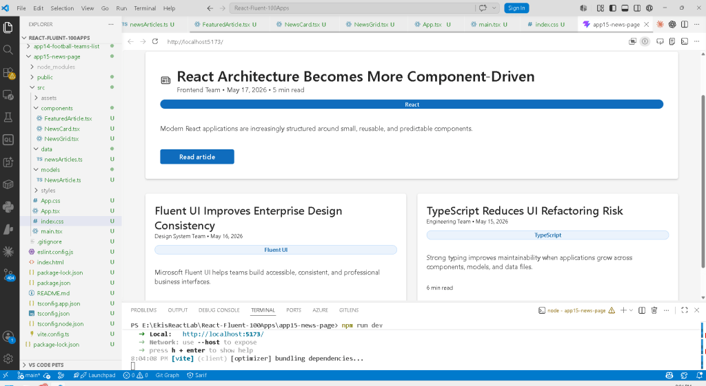
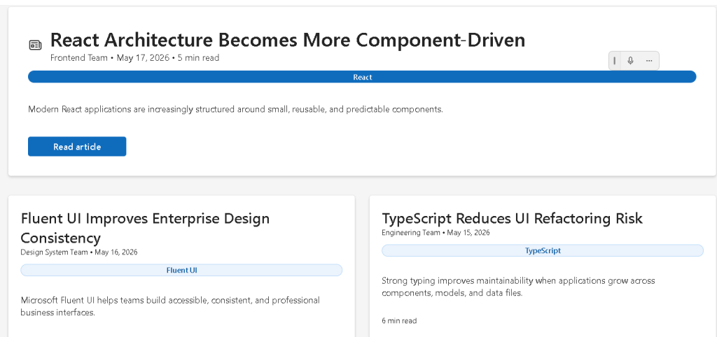
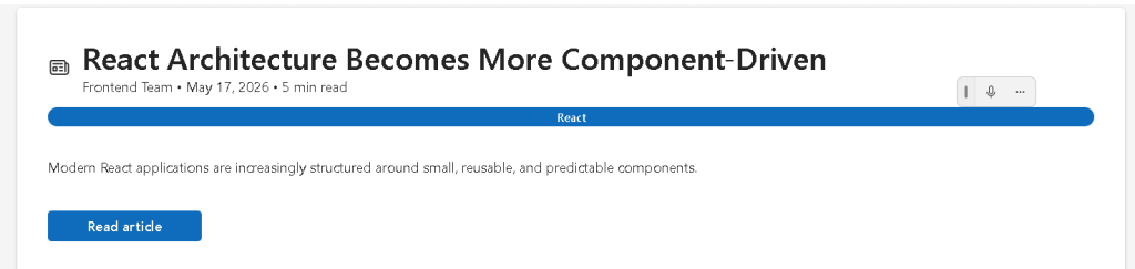
{ id: 1, title: "React Architecture Becomes More Component-Driven", summary: "Modern React applications are increasingly structured around small, reusable, and predictable components.", category: "React", author: "Frontend Team", date: "May 17, 2026", readTime: "5 min read",}
This data later becomes UI.
That is one of React’s core principles.
12. React’s Declarative Mental Model
Traditional imperative UI development often works like this:
Create elementAppend elementModify elementInsert content
React instead works declaratively:
Here is the data.Render the UI from that data.
This is fundamentally different.
13. The Component Hierarchy
This app introduces a multi-level component structure.
The hierarchy becomes:
App FeaturedArticle NewsGrid NewsCard
This is extremely important architecturally.
Each component has:
- one responsibility
- isolated rendering logic
- reusable structure
14. The Root Component — App.tsx
The application begins with:
function App() {
This is the root React component.
It composes the entire page.
15. Understanding Layout Composition
Inside App.tsx:
<FeaturedArticle article={featuredArticle} /><NewsGrid />
This is one of the most important concepts in React.
Components are composed together like building blocks.
16. React Components Are Functions
Every component in this app is simply a function.
Example:
export function NewsCard({ article }: NewsCardProps)
The function:
- receives props
- returns JSX
That is the foundation of React.
17. Understanding Props
The NewsCard component receives:
article
through props.
Props are:
- component inputs
- configuration values
- data passed from parent components
This allows components to become reusable.
18. The Featured Article Component
The component:
FeaturedArticle.tsx
represents the large hero news section.
This is similar to:
- homepage headlines
- SharePoint featured news
- Microsoft portal hero sections
19. Fluent UI Card Usage
The layout uses:
<Card>
Fluent UI Cards provide:
- spacing
- shadows
- borders
- visual grouping
- enterprise styling
This eliminates large amounts of manual CSS work.
20. Understanding CardHeader
<CardHeader
organizes:
- icon
- title
- metadata
This component dramatically simplifies UI composition.
21. Fluent UI Typography Components
Instead of raw HTML:
<h1><p>
Fluent UI provides:
<Title1><Text><Body1>
These components enforce:
- consistent typography scale
- accessibility
- Microsoft visual identity
22. Why Fluent UI Matters
Without Fluent UI, developers would manually manage:
- typography scales
- focus behavior
- spacing
- keyboard navigation
- hover states
- accessibility rules
Fluent UI abstracts this complexity.
23. Understanding the Badge Component
<Badge appearance="filled">
Badges are commonly used in:
- dashboards
- portals
- analytics systems
- category systems
The app uses them to display:
- React
- Fluent UI
- TypeScript
categories.
24. The “Read Article” Button
<Button appearance="primary">
The primary appearance activates Microsoft’s main action style.
This visually tells users:
This is the primary interaction.
25. The Role of NewsGrid.tsx
The component:
NewsGrid.tsx
renders secondary articles.
This component introduces:
articles.map(...)
which is one of the most important React patterns.
26. Understanding map()
The code:
secondaryArticles.map((article) => ( <NewsCard key={article.id} article={article} />))
transforms:
- article data
into: - React components
Conceptually:
data -> UI
This is React’s declarative rendering model.
27. Why key={article.id} Matters
Every list item in React needs a stable key.
key={article.id}
helps React identify:
- which item changed
- which item moved
- which item was removed
Without keys, React may:
- show warnings
- update inefficiently
28. The News Card Component
NewsCard.tsx renders individual news previews.
This is a reusable UI unit.
Reusable components are one of the biggest strengths of React.
29. Responsive Grid Layout
Inside NewsGrid.tsx:
display: "grid",gridTemplateColumns: "repeat(auto-fit, minmax(280px, 1fr))",
This creates a responsive layout.
30. Understanding CSS Grid
The expression:
repeat(auto-fit, minmax(280px, 1fr))
means:
Create as many columns as possible.Each column must be at least 280px.Distribute extra space equally.
This allows the layout to adapt automatically to screen size.
31. Why Responsive Layouts Matter
Enterprise applications must work across:
- laptops
- desktops
- ultrawide monitors
- tablets
Responsive design is not optional anymore.
32. Understanding the Root <main>
The app uses:
<main>
instead of a generic div.
This improves:
- semantics
- accessibility
- screen reader interpretation
Good React still depends on good HTML practices.
33. Why maxWidth Is Used
maxWidth: "1180px"
prevents content from stretching too much on large screens.
Enterprise portals commonly limit content width to improve readability.
34. Understanding margin: "0 auto"
margin: "0 auto"
centers the layout horizontally.
This is a classic CSS layout pattern.
35. Why No State Exists Yet
This app intentionally does NOT use:
useStateuseEffect
This is correct.
According to React Learn:
Effects synchronize with external systems.
This app is:
- static
- data-driven
- purely presentational
No effects are needed.
36. Avoiding Beginner Mistakes
Many beginners incorrectly add:
- unnecessary state
- unnecessary effects
to static UI.
This creates:
- complexity
- re-render problems
- confusing architecture
This app correctly avoids that.
37. Understanding main.tsx
The file:
src/main.tsx
connects React to the browser.
ReactDOM.createRoot( document.getElementById("root")!)
finds:
<div id="root"></div>
inside index.html.
React then renders the app inside that HTML element.
38. The Role of FluentProvider
<FluentProvider theme={webLightTheme}>
injects:
- colors
- typography
- design tokens
- Fluent UI theme values
globally into the application.
Without it, Fluent UI components would not render correctly.
39. The Role of Vite
Vite acts as:
- development server
- module resolver
- TypeScript compiler
- bundler
- hot reload engine
When you run:
npm run dev
Vite serves the app through:
http://localhost:5173
40. Production Validation
The app should always be validated with:
npm run build
This verifies:
- TypeScript correctness
- import validity
- production bundling
This is essential in professional React workflows.
41. PowerShell Commands Used
Create the project
cd C:\ReactAppsmkdir bloco01cd bloco01npm create vite@latest app15-news-page -- --template react-tscd app15-news-pagenpm install
Install Fluent UI
npm install @fluentui/react-components @fluentui/react-icons
Create folders
mkdir src\componentsmkdir src\datamkdir src\modelsmkdir src\styles
Create files
New-Item src\models\NewsArticle.ts -ItemType FileNew-Item src\data\newsArticles.ts -ItemType FileNew-Item src\components\FeaturedArticle.tsx -ItemType FileNew-Item src\components\NewsCard.tsx -ItemType FileNew-Item src\components\NewsGrid.tsx -ItemType File
Run the app
npm run dev
Validate production build
npm run build
Preview production build
npm run preview
42. Technical Summary
| Concept | Explanation |
|---|---|
| React | Declarative UI library |
| TypeScript | Static typing |
| Vite | Modern frontend tooling |
| Fluent UI | Microsoft enterprise design system |
| JSX | Declarative UI syntax |
| Props | Component inputs |
| Card | Visual content container |
| Grid Layout | Responsive content organization |
map() | Data-to-UI transformation |
| Component Composition | Building layouts from reusable pieces |
| TypeScript Interface | Data contract |
main.tsx | React entry point |
FluentProvider | Global Fluent UI theme provider |
| Responsive Layout | Adaptive enterprise UI |
Official Documentation
React
- React Learn
- Describing the UI
- Your First Component
- Passing Props to a Component
- Rendering Lists
- Keeping Components Pure
Fluent UI
Vite
TypeScript
Current Project Progress
| Block | App | Name | Status |
|---|---|---|---|
| Block 1 | 01 | Hello React Fluent | Completed |
| Block 1 | 02 | Profile Card | Completed |
| Block 1 | 03 | Product List | Completed |
| Block 1 | 04 | Microsoft Style User Card | Completed |
| Block 1 | 05 | Static Dashboard | Completed |
| Block 1 | 06 | Corporate Sidebar Menu | Completed |
| Block 1 | 07 | Visual Task List | Completed |
| Block 1 | 08 | Timeline Events | Completed |
| Block 1 | 09 | Employee Table | Completed |
| Block 1 | 10 | Email List | Completed |
| Block 1 | 11 | Grid of Cards | Completed |
| Block 1 | 12 | Image Gallery | Completed |
| Block 1 | 13 | Movie Catalog | Completed |
| Block 1 | 14 | Football Teams | Completed |
| Block 1 | 15 | News Page | Current |
| Block 1 | 16 | Static Financial Dashboard | Next |
 edvaldo b. guimarães filho