Building a Theme Toggle Application with React, TypeScript, Vite, and Fluent UI
Modern React applications are no longer static pages. One of the core ideas behind React is that the user interface changes dynamically according to application state. The moment developers begin working with state, they transition from simple component rendering into true interactive application development.

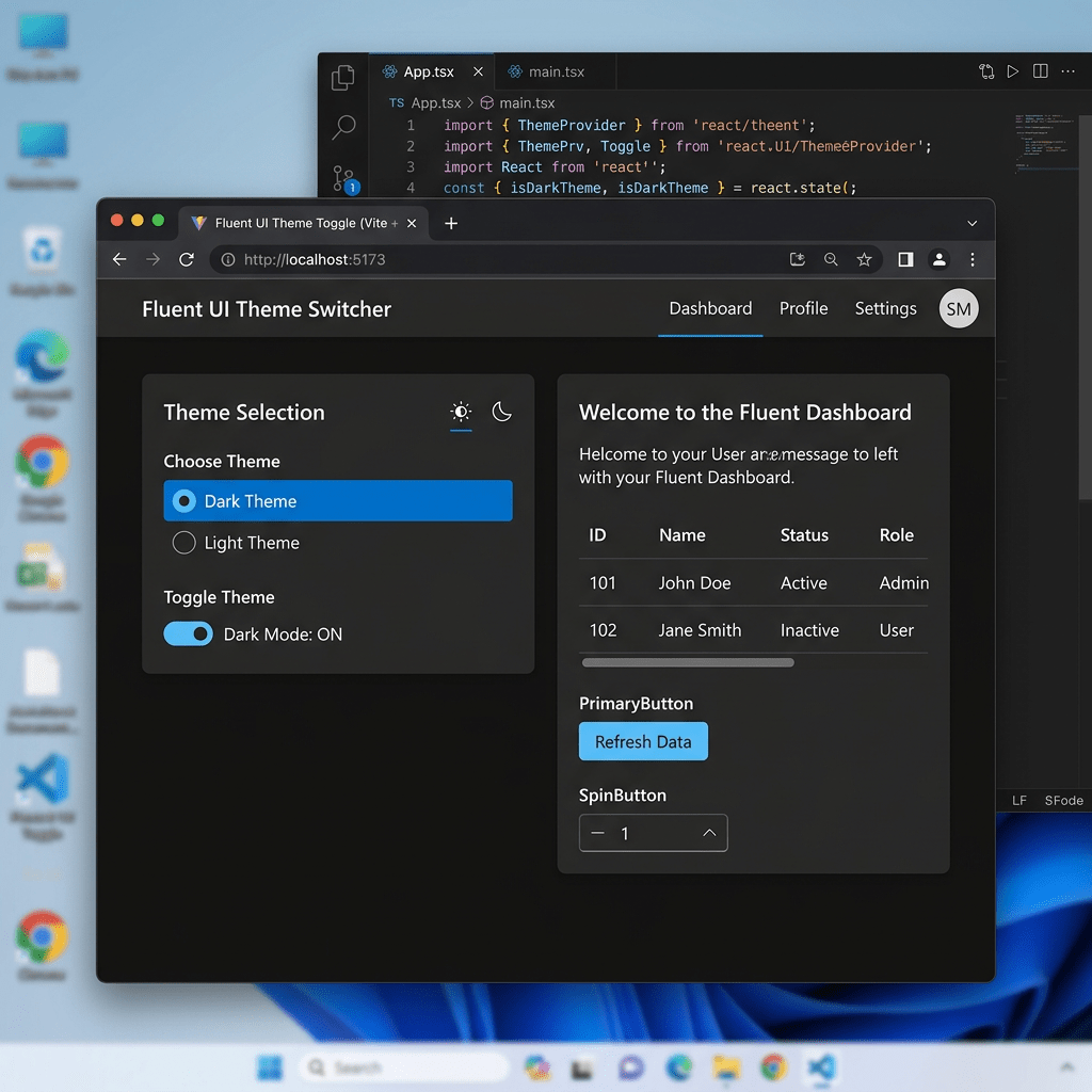
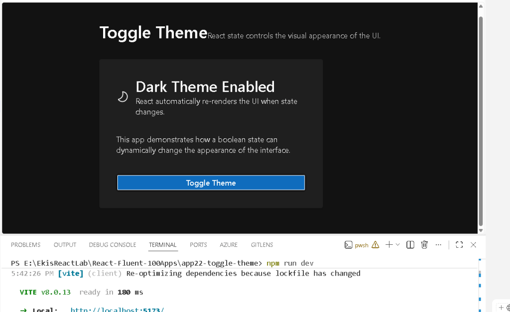
This is exactly the purpose of App 22 — Toggle Theme.
This application introduces one of the most important concepts in the entire React ecosystem:
The UI is a function of state.
Although visually simple, the Toggle Theme application demonstrates:
- React state management
- component memory
- automatic re-rendering
- event handling
- declarative rendering
- conditional UI
- Fluent UI integration
- enterprise-ready React architecture
The application belongs to Block 2 — Interactivity and State, which focuses on learning how React applications become dynamic through state and events. The roadmap defines App 22 as a “Toggle Theme” application focused on boolean state and interactive rendering.
This article explains not only how to build the application, but also how React internally handles rendering updates, state changes, and UI synchronization.
Why This App Is Extremely Important
Many beginners initially think React is mostly about components and JSX. However, components alone are not enough to build interactive applications.
Real applications require:
- changing interfaces
- responding to user actions
- preserving values
- re-rendering dynamically
- synchronizing UI with user behavior
The Toggle Theme app introduces the first truly dynamic behavior in the project roadmap.
This app demonstrates:
- how React stores values
- how components remember data
- how events trigger updates
- how the UI automatically changes
- how declarative rendering works
This is the foundation for:
- forms
- CRUD systems
- dashboards
- filters
- DataGrid systems
- enterprise portals
- API-driven interfaces
Without understanding state correctly, advanced React becomes extremely confusing.
The React Mental Model
One of the most important things React Learn teaches is:
React applications describe what the UI should look like for a given state.
This is fundamentally different from older imperative JavaScript approaches.
Traditional JavaScript often worked like this:
find buttonlisten for clickmanually edit backgroundmanually edit textmanually edit classes
React works differently:
change stateReact updates the UI automatically
This distinction is critical.
The developer does not manually manipulate the DOM directly.
Instead:
- state changes
- React re-renders
- the UI updates automatically
This is called declarative UI programming.
Creating the Project
The application starts with Vite.
Vite is one of the fastest modern frontend tooling systems and is now widely adopted for React development because of:
- fast startup
- instant hot reload
- native ES Modules
- optimized builds
- modern architecture
The project was created using:
cd C:\ReactAppsmkdir bloco02cd bloco02npm create vite@latest app22-toggle-theme -- --template react-ts
This command creates:
- a Vite project
- React integration
- TypeScript support
- development configuration
- production build configuration
Then dependencies are installed:
cd app22-toggle-themenpm install
Next, Fluent UI packages are added:
npm install @fluentui/react-components @fluentui/react-icons
Why Fluent UI Matters
The project uses Fluent UI because the entire roadmap is designed around enterprise Microsoft-style React development.
Fluent UI provides:
- accessibility
- enterprise design standards
- Microsoft visual consistency
- typography systems
- spacing systems
- theme integration
- reusable enterprise components
Instead of manually styling raw HTML buttons and cards, the application uses:
CardButtonTextTitle- Fluent icons
This dramatically improves consistency and scalability.
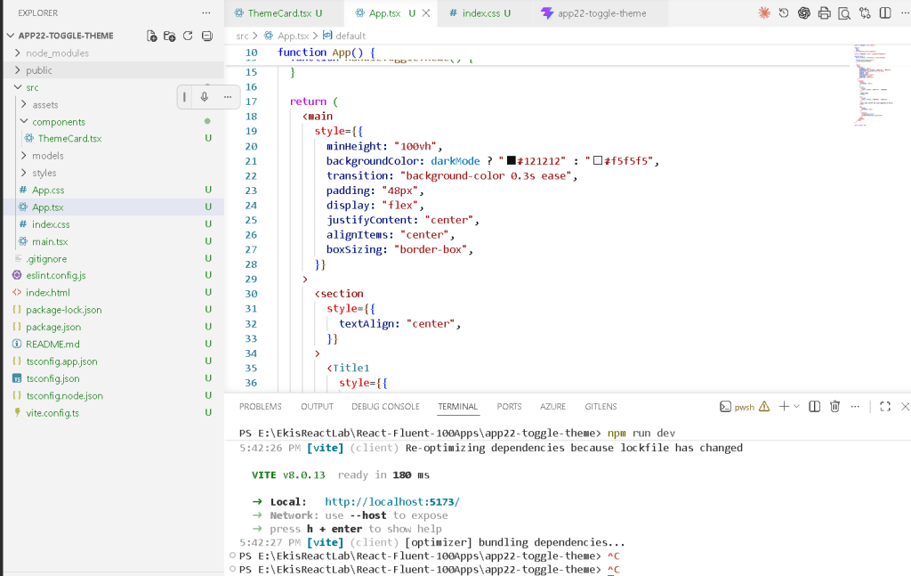
Project Structure
The application structure becomes:
src/ components/ ThemeCard.tsx styles/ theme.css App.tsx main.tsx index.css
Even small React apps benefit from structure.
This becomes extremely important later when applications evolve into:
- dashboards
- CRUD systems
- enterprise portals
- layered architectures
Understanding main.tsx
The file:
src/main.tsx
is the true React entry point.
import React from "react";import ReactDOM from "react-dom/client";import { FluentProvider, webLightTheme,} from "@fluentui/react-components";import App from "./App";ReactDOM.createRoot( document.getElementById("root")!).render( <React.StrictMode> <FluentProvider theme={webLightTheme}> <App /> </FluentProvider> </React.StrictMode>);
This file connects:
- React
- Fluent UI
- the browser DOM
- the application component tree
ReactDOM.createRoot
ReactDOM.createRoot( document.getElementById("root")!)
This tells React where the application should be rendered.
The HTML page contains:
<div id="root"></div>
React takes control of this container and injects the UI into it.
This is how React applications become visible in the browser.
React.StrictMode
<React.StrictMode>
StrictMode is a development-only helper.
It helps detect:
- unsafe rendering
- side effects
- deprecated patterns
- incorrect component behavior
Modern React strongly encourages pure rendering logic.
StrictMode helps developers follow that philosophy.
FluentProvider
One of the most important lines is:
<FluentProvider theme={webLightTheme}>
This activates Fluent UI globally.
Without FluentProvider:
- themes would not work
- typography would be inconsistent
- spacing would break
- Fluent components would lose design system behavior
The theme:
- colors
- typography
- spacing
- accessibility tokens
- visual consistency
are all injected through FluentProvider.
Understanding App.tsx
The real application logic starts in:
src/App.tsx
The most important line is:
const [darkMode, setDarkMode] = useState(false);
This introduces React state.
What Is State?
State is React’s memory system.
Without state:
- components forget values
- nothing changes dynamically
- the UI stays static
With state:
- values persist between renders
- the UI can react to changes
- applications become interactive
React Learn describes this perfectly:
“State is a component’s memory.”
Understanding useState
The syntax:
const [darkMode, setDarkMode] = useState(false);
uses JavaScript array destructuring.
Conceptually:
darkMode current valuesetDarkMode function that updates the value
Initial State
useState(false)
The initial value is:
false
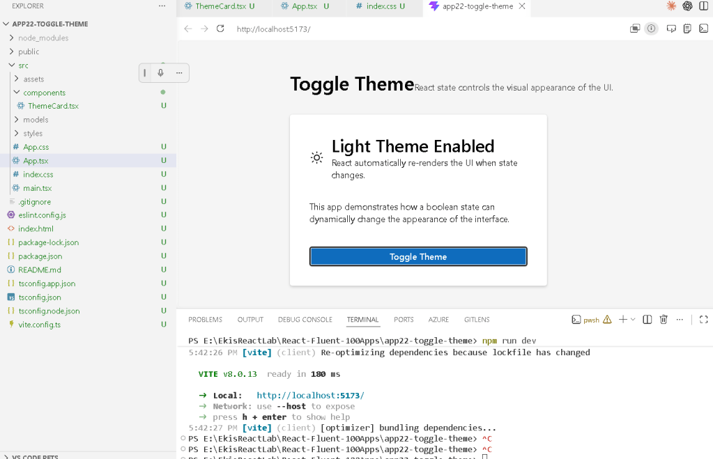
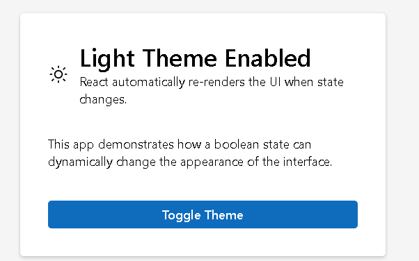
This means the application initially starts in light mode.
The Event Handler
The application contains:
function handleToggleTheme() { setDarkMode(!darkMode);}
This function executes when the button is clicked.
Understanding !darkMode
The operator:
!
means logical NOT.
Examples:
!false = true!true = false
Every click flips the value.
React Re-Rendering
This line is the core of the entire app:
setDarkMode(!darkMode);
When React sees this:
- state changes
- the component re-renders
- JSX recalculates
- React compares the new UI
- the DOM updates automatically
This is one of the most important React concepts.
The developer never manually edits the HTML directly.
React synchronizes the UI automatically.
Declarative Rendering
The application uses:
backgroundColor: darkMode ? "#121212" : "#f5f5f5"
This is declarative logic.
The code describes:
- what the UI should look like
- based on current state
React handles:
- rendering
- updating
- DOM synchronization
This is dramatically different from imperative JavaScript.
Conditional Rendering
The application heavily uses the ternary operator:
condition ? trueValue : falseValue
Examples:
darkMode ? "#ffffff" : "#000000"
and:
darkMode ? <WeatherMoon24Regular /> : <WeatherSunny24Regular />
This allows the UI to dynamically change according to state.
The Role of ThemeCard.tsx
The component:
ThemeCard.tsx
is responsible for the card UI.
It receives:
- current theme value
- toggle function
through props.
This demonstrates component composition.
The hierarchy becomes:
App ThemeCard
Understanding Props
The props interface:
interface ThemeCardProps { darkMode: boolean; onToggleTheme: () => void;}
defines:
- the data received
- the function received
Props make components:
- reusable
- configurable
- predictable
Why State Lives in the Parent Component
The state is stored in App.tsx.
This follows one of React’s most important architectural principles:
Keep shared state in the closest common parent.
This makes:
- logic centralized
- rendering predictable
- components reusable
The child component does not own the state.
It only receives:
- data
- behavior
from the parent.
Dynamic Styling
The app dynamically changes:
- background colors
- text colors
- icons
- labels
Examples:
backgroundColor: darkMode ? "#1f1f1f" : "#ffffff"
and:
color: darkMode ? "#ffffff" : "#000000"
This demonstrates how React can dynamically control styling through state.
Why No useEffect Exists
This app intentionally does not use:
useEffect()
Why?
Because:
- no API exists
- no external synchronization exists
- no side effects exist
According to React Learn:
Effects synchronize with external systems.
This application only updates internal UI state.
So useEffect would be unnecessary complexity.
This is actually a very important architectural lesson.
Fluent UI Components Used
| Component | Purpose |
|---|---|
Card | Main visual container |
CardHeader | Structured card header |
Button | Toggle action |
Title1 | Main page title |
Title2 | Card title |
Text | Supporting text |
Body1 | Body typography |
Fluent UI Icons
The app uses:
| Icon | Meaning |
|---|---|
WeatherSunny24Regular | Light mode |
WeatherMoon24Regular | Dark mode |
These icons visually reinforce state changes.
Architecture Introduced by This App
Even though visually small, this application introduces:
- React state
- component memory
- automatic rendering
- declarative UI
- dynamic styling
- event handling
- component composition
- parent-child architecture
- enterprise design systems
This becomes the foundation for:
- forms
- CRUD systems
- filters
- API dashboards
- admin portals
- enterprise React applications
Production Validation
One extremely important step is:
npm run build
This validates:
- TypeScript
- imports
- JSX
- Vite production compilation
Many beginners forget this step.
A React app that runs in development but fails in production is incomplete.
Previewing the Production Build
npm run preview
This serves the optimized production build locally.
This is important because:
- development mode differs from production mode
- Vite optimizations only appear in production builds
Technical Summary
| Concept | Explanation |
|---|---|
useState | Component memory |
| Boolean state | true/false logic |
| Event handling | UI interaction |
| Re-rendering | Automatic UI updates |
| Props | Parent-child communication |
| Conditional rendering | Dynamic JSX |
| Declarative UI | UI derived from state |
| Fluent UI | Microsoft design system |
| Functional components | Reusable UI architecture |
Official Documentation
React
- React Learn
- State: A Component’s Memory
- Responding to Events
- Reacting to Input with State
- Conditional Rendering
- Synchronizing with Effects
Fluent UI
Vite
TypeScript
Current Project Progress
| Block | App | Name | Status |
|---|---|---|---|
| Block 1 | 01 | Hello React Fluent | Completed |
| Block 1 | 02 | Profile Card | Completed |
| Block 1 | 03 | Product List | Completed |
| Block 1 | 04 | Microsoft Style User Card | Completed |
| Block 1 | 05 | Static Dashboard | Completed |
| Block 1 | 06 | Corporate Sidebar Menu | Completed |
| Block 1 | 07 | Visual Task List | Completed |
| Block 1 | 08 | Timeline of Events | Completed |
| Block 1 | 09 | Employee Table | Completed |
| Block 1 | 10 | Email List | Completed |
| Block 1 | 11 | Grid of Cards | Completed |
| Block 1 | 12 | Image Gallery | Completed |
| Block 1 | 13 | Movie Catalog | Completed |
| Block 1 | 14 | Football Teams List | Completed |
| Block 1 | 15 | News Page | Completed |
| Block 1 | 16 | Financial Dashboard | Completed |
| Block 1 | 17 | SharePoint Layout | Completed |
| Block 1 | 18 | File Explorer | Completed |
| Block 1 | 19 | Corporate Portal | Completed |
| Block 1 | 20 | Microsoft Style Landing Page | Completed |
| Block 2 | 21 | Modern Counter | Completed |
| Block 2 | 22 | Toggle Theme | Current |
| Block 2 | 23 | React Calculator | Next |
 edvaldo b. guimarães filho