

Technical Blog Article — App 29: Employee Search with React, TypeScript, Vite, and Fluent UI

App 29 — Employee Search is one of the most important applications in Block 2 — Interactivity and State because it introduces one of the core mental models of modern React:
UI derived from state
This application may look simple visually, but architecturally it teaches:
- controlled inputs
- state-driven rendering
- derived data
- filtering collections
- reusable component composition
- declarative rendering
- proper React state organization
- avoiding unnecessary
useEffect
The roadmap defines App 29 as:
“Employee Search / Pesquisa de Funcionários — Inputs + Filters”
and directly connects it to React’s concepts of:
- state sharing
- derived rendering
- component composition
- controlled forms
The application simulates a small enterprise employee directory similar to interfaces found in:
- Microsoft 365 admin centers
- SharePoint intranets
- HR systems
- CRM systems
- corporate dashboards
- internal employee portals
This app is extremely important because it represents the transition from:
- static UI
to: - dynamic UI driven by user interaction
The Main React Concept Introduced
Before App 29, most apps were primarily static visual composition.
Now React becomes interactive.
The most important architectural idea introduced here is:
The interface changes automatically when state changes.
This is the foundation of React.
The user types text into the search box.
That text updates React state.
React recalculates filtered employees.
React re-renders the list automatically.
No manual DOM manipulation happens.
Why This App Matters
This application introduces several professional frontend concepts simultaneously:
| Concept | Why It Matters |
|---|---|
| Controlled Input | Core React form pattern |
| State Management | UI driven by data |
| Derived Data | Avoid duplicated state |
| Filtering Collections | Common enterprise behavior |
| Component Composition | Scalable architecture |
| Fluent UI Forms | Enterprise UX patterns |
| TypeScript Models | Strong typing |
| Declarative Rendering | Modern React mental model |
This architecture appears everywhere in enterprise systems.
For example:
- employee search
- product search
- SharePoint document filters
- CRM customer lookup
- dashboard filtering
- report search
- admin panels
App 29 is the first true “search-driven UI” in the roadmap.
Creating the Project
The project begins with Vite.
PowerShell commands
cd C:\ReactAppsmkdir bloco02cd bloco02npm create vite@latest app29-employee-search -- --template react-tscd app29-employee-searchnpm install
Installing Fluent UI
npm install @fluentui/react-components @fluentui/react-icons
Fluent UI is the official Microsoft React design system.
It provides:
- accessibility
- typography
- spacing
- enterprise controls
- keyboard support
- consistent design language
Instead of manually building controls from scratch, we use professional reusable components.
Creating the Folder Structure
mkdir src\componentsmkdir src\datamkdir src\modelsmkdir src\styles
This architecture matters enormously.
Even small React apps should begin organized.
Why Folder Structure Matters
components/
Contains reusable UI pieces.
Examples:
- cards
- forms
- headers
- search bars
- lists
models/
Contains TypeScript interfaces and types.
This creates:
- strong typing
- predictable architecture
- safer refactoring
data/
Contains mock or static data.
Later this evolves into:
- APIs
- services
- REST calls
- repositories
styles/
Prepared for:
- layout styles
- responsive behavior
- themes
- reusable CSS
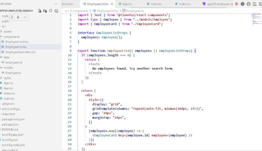
Understanding the Employee Model
File:
src/models/Employee.ts
Code:
export interface Employee { id: number; name: string; role: string; department: string; location: string; status: "Active" | "On Leave" | "Remote";}
This file introduces a critical enterprise concept:
TypeScript models
Why Models Matter
Enterprise applications deal with structured data.
An employee always has:
- name
- role
- department
- location
- status
The interface defines that structure.
Without models:
- bugs increase
- code becomes unclear
- refactoring becomes dangerous
TypeScript ensures consistency.
Understanding Literal Types
This part is especially important:
status: "Active" | "On Leave" | "Remote";
This is called a union literal type.
It means:
status can ONLY be:- Active- On Leave- Remote
If you accidentally write:
status: "Vacation"
TypeScript will show an error.
This prevents invalid states.
Understanding the Data Layer
File:
src/data/employees.ts
This file contains static employee data.
Example:
export const employees: Employee[] = [
The array type:
Employee[]
means:
This array contains Employee objects.
This gives:
- autocomplete
- validation
- safer filtering
- predictable rendering
Why Static Data Is Important First
Notice something important:
There is:
- no API
- no fetch
- no database
This is intentional.
React Learn strongly recommends understanding rendering and state before introducing effects and APIs.
The application focuses only on:
- rendering
- filtering
- component composition
This avoids unnecessary complexity.
Understanding Controlled Inputs
One of the most important React concepts appears in:
const [searchText, setSearchText] = useState("");
This creates component state.
Understanding useState
React state is component memory.
The syntax:
const [searchText, setSearchText] = useState("");
contains three parts.
1. searchText
The current state value.
Initially:
""
an empty string.
2. setSearchText
The state update function.
This tells React:
Update the value and re-render the UI.
3. useState("")
Creates state with initial value.
The Most Important React Flow in This App
This entire application works through this cycle:
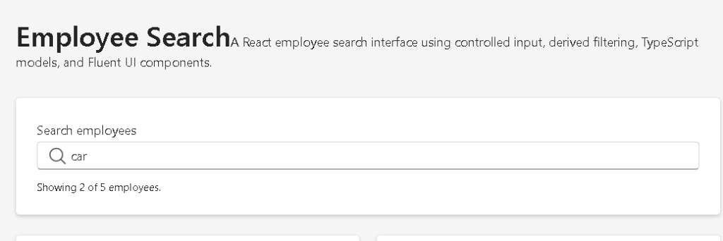
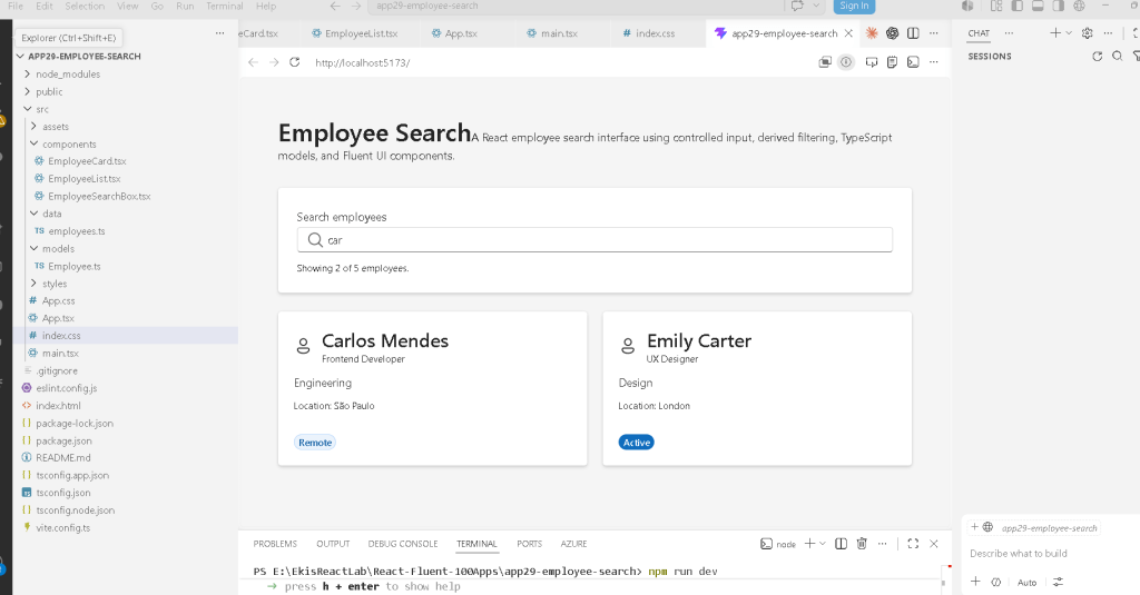
User types text ↓onChange fires ↓setSearchText updates state ↓React re-renders App ↓filteredEmployees recalculates ↓EmployeeList receives new data ↓UI updates automatically
This is the React mental model.
Understanding Controlled Inputs
The search box uses:
<Input value={searchText} onChange={(_, data) => onSearchTextChange(data.value)}/>
This is called a controlled component.
The input value is controlled by React state.
Why Controlled Inputs Matter
Without controlled inputs:
- React does not fully own the form state
- validation becomes harder
- synchronization becomes harder
Controlled inputs make the UI predictable.
React becomes the source of truth.
Understanding the Search Component
File:
EmployeeSearchBox.tsx
Props:
interface EmployeeSearchBoxProps { searchText: string; onSearchTextChange: (value: string) => void;}
This component does not own state.
That is extremely important.
Instead:
- App owns state
- SearchBox receives value + callback
This follows React’s architecture principles.
Why State Lives in App.tsx
React docs explain:
State should live in the closest common parent.
App.tsx owns:
- search input value
- filtered employees
because multiple components depend on it.
Understanding Derived Data
This is one of the most important concepts in the app:
const filteredEmployees = employees.filter(...)
This is derived state.
React Learn strongly recommends:
Do not duplicate state unnecessarily.
Notice:
We do NOT store:
- filteredEmployees in state
Instead:
- we calculate it from existing state
This is correct React architecture.
Why Derived State Matters
Bad approach:
const [filteredEmployees, setFilteredEmployees] = useState(...)
This duplicates data.
Duplicated state causes:
- synchronization bugs
- inconsistent UI
- harder debugging
Correct approach:
const filteredEmployees = employees.filter(...)
The filtered data is derived automatically.
Understanding the Filter Logic
The code:
const searchableText = ` ${employee.name} ${employee.role} ${employee.department} ${employee.location} ${employee.status}`.toLowerCase();
creates one searchable string.
Then:
return searchableText.includes(normalizedSearchText);
checks if the search text exists inside it.
Why .toLowerCase() Matters
This makes search case-insensitive.
Without it:
AnnaannaANNA
would behave differently.
This improves UX significantly.
Understanding trim()
searchText.toLowerCase().trim()
trim() removes extra spaces.
Example:
" anna "
becomes:
"anna"
This avoids accidental whitespace problems.
Understanding Declarative Rendering
React rendering here uses:
employees.map(...)
This is declarative UI generation.
You are not manually creating DOM elements.
Instead you describe:
For each employee, render an EmployeeCard.
React handles the DOM updates.
Understanding React Keys
key={employee.id}
Keys are critical in React lists.
React uses keys to:
- track elements
- optimize rendering
- correctly update changed items
Without keys:
- React warnings appear
- rendering becomes less efficient
Understanding the Employee Card
File:
EmployeeCard.tsx
This component is responsible for rendering one employee.
This separation is extremely important.
Why Small Components Matter
Instead of one giant file, React applications scale through composition.
The architecture becomes:
App EmployeeSearchBox EmployeeList EmployeeCard
Each component has one responsibility.
Understanding Fluent UI Cards
The card:
<Card>
acts as a visual enterprise container.
Cards are heavily used in:
- dashboards
- admin systems
- SharePoint layouts
- Microsoft portals
Fluent UI cards already include:
- spacing
- borders
- shadows
- accessibility behavior
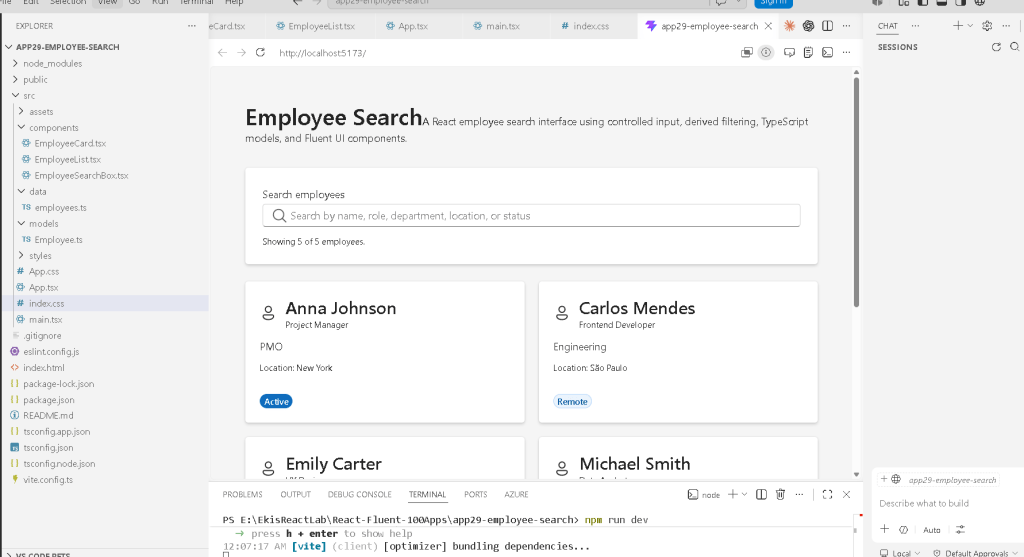
Understanding Badge Appearance
This logic:
function getBadgeAppearance(status: Employee["status"])
maps employee status into UI appearance.
Example:
| Status | Appearance |
|---|---|
| Active | filled |
| Remote | tint |
| On Leave | outline |
This separates:
- business logic
from: - rendering
That is good architecture.
Understanding Component Purity
Notice something important.
EmployeeCard:
- receives props
- returns JSX
It does not:
- modify external variables
- manipulate the DOM directly
- fetch data
- mutate state
This makes it a pure component.
React Learn strongly emphasizes pure rendering.
Why There Is No useEffect
This app intentionally avoids useEffect.
That is correct.
The app only:
- reacts to user input
- derives filtered data
No external synchronization exists.
According to React Learn:
“You Might Not Need an Effect.”
Filtering local data does NOT require effects.
This is one of the most important lessons in modern React.
Understanding the Main Layout
The app root uses:
<main>
This is semantic HTML.
It improves:
- accessibility
- screen readers
- document structure
React still benefits from proper HTML semantics.
Understanding the Responsive Grid
The employee list uses:
gridTemplateColumns: "repeat(auto-fit, minmax(260px, 1fr))"
This creates a responsive layout.
Meaning:
Create as many columns as fit.Each column must be at least 260px.Distribute extra space equally.
This allows responsive enterprise dashboards.
Understanding Fluent UI Inputs
The search box uses:
<Input />
This already includes:
- keyboard accessibility
- focus management
- Microsoft design
- proper spacing
- enterprise interaction behavior
Without Fluent UI, this would require manual implementation.
Understanding the Search Icon
contentBefore={<Search24Regular />}
Fluent UI icons are:
- SVG-based
- scalable
- theme-aware
- optimized
This creates enterprise-style visual search UX.
Understanding the App Architecture
The full architecture becomes:
main.tsx renders App.tsxApp.tsx owns search stateEmployeeSearchBox.tsx updates stateEmployeeList.tsx renders collectionEmployeeCard.tsx renders one employeeemployees.ts stores static dataEmployee.ts defines data shape
This is professional React structure.
Production Validation
Run development server
npm run dev
Validate production build
npm run build
This checks:
- TypeScript compilation
- JSX compilation
- production bundling
This is equivalent to validating enterprise deployment readiness.
Preview production build
npm run preview
This serves the optimized production bundle locally.
Technical Summary
| Concept | Purpose |
|---|---|
useState | Component memory |
| Controlled Input | React-controlled form |
| Derived Data | Avoid duplicated state |
filter() | Collection filtering |
map() | Declarative rendering |
| TypeScript Interface | Strong typing |
| Fluent UI | Enterprise components |
| Component Composition | Scalable architecture |
| Pure Components | Predictable rendering |
| Responsive Grid | Adaptive layout |
Official Documentation
React
- React Learn
- State: A Component’s Memory
- Rendering Lists
- Sharing State Between Components
- You Might Not Need an Effect
Fluent UI
Vite
TypeScript
Current Project Progress
| Block | App | Name | Status |
|---|---|---|---|
| Block 1 | 01 | Hello React Fluent | Completed |
| Block 1 | 02 | Profile Card | Completed |
| Block 1 | 03 | Product List | Completed |
| Block 1 | 04 | Microsoft Style User Card | Completed |
| Block 1 | 05 | Static Dashboard | Completed |
| Block 1 | 06 | Corporate Sidebar Menu | Completed |
| Block 1 | 07 | Visual Task List | Completed |
| Block 2 | 21 | Modern Counter | Completed |
| Block 2 | 22 | Toggle Theme | Completed |
| Block 2 | 23 | React Calculator | Completed |
| Block 2 | 24 | Login Form | Completed |
| Block 2 | 25 | User Registration | Completed |
| Block 2 | 26 | Complete ToDo List | Completed |
| Block 2 | 27 | Shopping List | Completed |
| Block 2 | 28 | Product Filter | Completed |
| Block 2 | 29 | Employee Search | Current |
| Block 2 | 30 | Shopping Cart | Next |
 edvaldo b. guimarães filho