Technical Blog Article — App 46: Enterprise DataGrid Catalog with React, TypeScript, Vite, and Fluent UI
Introduction
In App 46 — DataGrid Catalog, we build an enterprise product catalog using React, TypeScript, Vite, and Fluent UI DataGrid.
This app is important because many enterprise systems are based on structured data:
ProductsUsersTicketsDocumentsAudit logsOrdersTasksApprovals
A professional React developer must understand how to transform typed data into a clean enterprise table.
The core idea is:
Data→ typed model→ column definitions→ DataGrid rows→ enterprise UI
App 46 belongs to Block 3 — Professional Fluent UI, after Login, Corporate Form, Tabs, Dialogs, and Executive Dashboard. Now the focus is data presentation.
1. PowerShell Setup
Create the project:
cd C:\ReactAppsNew-Item bloco03 -ItemType Directorycd bloco03npm create vite@latest app46-datagrid-catalog -- --template react-tscd app46-datagrid-catalognpm installnpm install @fluentui/react-components @fluentui/react-icons
Create folders:
New-Item src\components -ItemType DirectoryNew-Item src\models -ItemType DirectoryNew-Item src\data -ItemType DirectoryNew-Item src\styles -ItemType Directory
Create files:
New-Item src\models\Product.ts -ItemType FileNew-Item src\data\products.ts -ItemType FileNew-Item src\components\ProductDataGrid.tsx -ItemType FileNew-Item artigo.md -ItemType File
2. Final Structure
app46-datagrid-catalog/ src/ components/ ProductDataGrid.tsx data/ products.ts models/ Product.ts styles/ App.tsx main.tsx index.css artigo.md
3. Product Model
src\models\Product.ts
export interface Product { id: number; name: string; category: string; price: number; stock: number; status: "Active" | "Inactive";}
This interface defines the shape of each row in the grid.
The important lesson is:
The DataGrid should not receive random objects.It should receive predictable typed data.
TypeScript helps prevent mistakes. If a product is missing name, price, or status, the editor warns immediately.
4. Product Data
src\data\products.ts
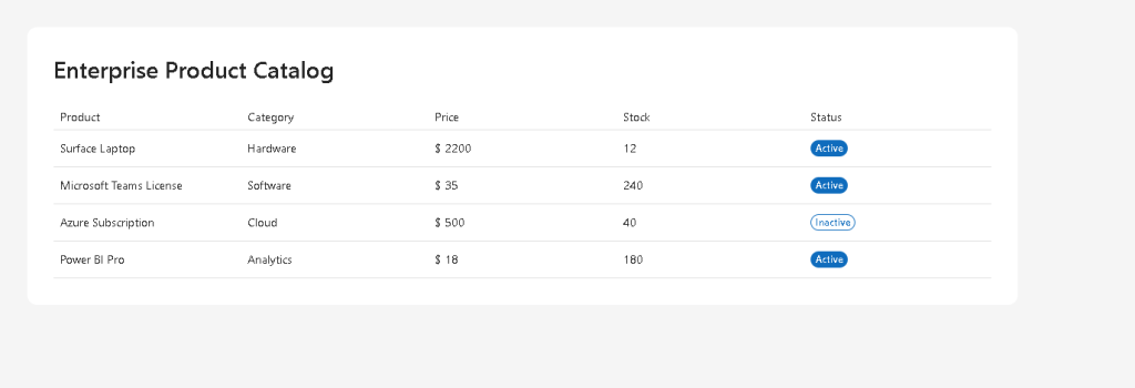
import type { Product } from "../models/Product";export const products: Product[] = [ { id: 1, name: "Surface Laptop", category: "Hardware", price: 2200, stock: 12, status: "Active", }, { id: 2, name: "Microsoft Teams License", category: "Software", price: 35, stock: 240, status: "Active", }, { id: 3, name: "Azure Subscription", category: "Cloud", price: 500, stock: 40, status: "Inactive", }, { id: 4, name: "Power BI Pro", category: "Analytics", price: 18, stock: 180, status: "Active", }, { id: 5, name: "SharePoint Storage Package", category: "Cloud", price: 120, stock: 75, status: "Active", },];
The array is the source of truth.
React does not manually create rows. The UI is derived from this data.
5. ProductDataGrid Component
src\components\ProductDataGrid.tsx
import { Badge, DataGrid, DataGridBody, DataGridCell, DataGridHeader, DataGridHeaderCell, DataGridRow, TableCellLayout, Title2,} from "@fluentui/react-components";import type { TableColumnDefinition } from "@fluentui/react-components";import { products } from "../data/products";import type { Product } from "../models/Product";const columns: TableColumnDefinition<Product>[] = [ { columnId: "name", compare: (a, b) => a.name.localeCompare(b.name), renderHeaderCell: () => "Product", renderCell: (item) => ( <TableCellLayout> {item.name} </TableCellLayout> ), }, { columnId: "category", compare: (a, b) => a.category.localeCompare(b.category), renderHeaderCell: () => "Category", renderCell: (item) => item.category, }, { columnId: "price", compare: (a, b) => a.price - b.price, renderHeaderCell: () => "Price", renderCell: (item) => `$ ${item.price}`, }, { columnId: "stock", compare: (a, b) => a.stock - b.stock, renderHeaderCell: () => "Stock", renderCell: (item) => item.stock, }, { columnId: "status", compare: (a, b) => a.status.localeCompare(b.status), renderHeaderCell: () => "Status", renderCell: (item) => ( <Badge appearance={item.status === "Active" ? "filled" : "outline"}> {item.status} </Badge> ), },];export function ProductDataGrid() { return ( <section style={{ display: "flex", flexDirection: "column", gap: "24px", }} > <Title2>Enterprise Product Catalog</Title2> <DataGrid items={products} columns={columns} sortable> <DataGridHeader> <DataGridRow> {({ renderHeaderCell }) => ( <DataGridHeaderCell> {renderHeaderCell()} </DataGridHeaderCell> )} </DataGridRow> </DataGridHeader> <DataGridBody<Product>> {({ item, rowId }) => ( <DataGridRow<Product> key={rowId}> {({ renderCell }) => ( <DataGridCell> {renderCell(item)} </DataGridCell> )} </DataGridRow> )} </DataGridBody> </DataGrid> </section> );}
6. Why compare Was Required
The TypeScript error happened because TableColumnDefinition<Product> requires a compare function.
This function tells the DataGrid how to sort each column.
Example:
compare: (a, b) => a.name.localeCompare(b.name)
For text, we use:
localeCompare()
For numbers, we use subtraction:
compare: (a, b) => a.price - b.price
This is why the corrected version works.
The lesson is:
If a Fluent UI column is sortable,the column must know how to compare two rows.
7. App Layout
src\App.tsx
import { FluentProvider, webLightTheme,} from "@fluentui/react-components";import { ProductDataGrid } from "./components/ProductDataGrid";function App() { return ( <FluentProvider theme={webLightTheme}> <main style={{ minHeight: "100vh", backgroundColor: "#f5f5f5", padding: "48px", boxSizing: "border-box", }} > <section style={{ maxWidth: "1200px", margin: "0 auto", backgroundColor: "white", padding: "32px", borderRadius: "12px", }} > <ProductDataGrid /> </section> </main> </FluentProvider> );}export default App;
FluentProvider applies the Microsoft Fluent UI theme to the whole application.
8. React Entry Point
src\main.tsx
import React from "react";import ReactDOM from "react-dom/client";import App from "./App";import "./index.css";ReactDOM.createRoot( document.getElementById("root")!).render( <React.StrictMode> <App /> </React.StrictMode>);
This connects React to the div#root inside index.html.
9. Global CSS
src\index.css
body { margin: 0; font-family: "Segoe UI", Arial, sans-serif;}* { box-sizing: border-box;}
This removes default browser spacing and applies a Microsoft-style font.
10. Run and Validate
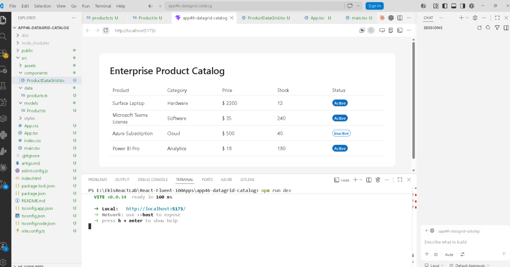
npm run buildnpm run dev
npm run build validates TypeScript and production compilation.
npm run dev starts the Vite development server.
11. Technical Summary
| Concept | Explanation |
|---|---|
| DataGrid | Fluent UI enterprise table component |
| Product interface | Defines the typed row model |
| products array | Static data source for the grid |
| columns | Defines how each column renders |
| compare | Defines how each column sorts |
| renderHeaderCell | Renders the column header |
| renderCell | Renders the cell content |
| Badge | Shows product status visually |
| TableCellLayout | Provides Fluent UI cell layout |
| FluentProvider | Applies Microsoft theme |
| TypeScript | Prevents invalid row structures |
12. Concept Table
| Concept | File | Purpose |
|---|---|---|
| Product model | src\models\Product.ts | Defines row data |
| Product data | src\data\products.ts | Provides catalog records |
| DataGrid | src\components\ProductDataGrid.tsx | Renders enterprise table |
| App shell | src\App.tsx | Provides page layout |
| React root | src\main.tsx | Mounts React |
| Global CSS | src\index.css | Resets default browser layout |
| Article | artigo.md | Technical blog documentation |
13. Official Documentation
| Topic | Link |
|---|---|
| React Learn | https://react.dev/learn |
| Rendering Lists | https://react.dev/learn/rendering-lists |
| Describing the UI | https://react.dev/learn/describing-the-ui |
| Fluent UI React Components | https://developer.microsoft.com/en-us/fluentui#/controls/web |
| Fluent UI DataGrid | https://developer.microsoft.com/en-us/fluentui#/controls/web/datagrid |
| Fluent UI Badge | https://developer.microsoft.com/en-us/fluentui#/controls/web/badge |
| Vite Guide | https://vite.dev/guide/ |
| TypeScript Docs | https://www.typescriptlang.org/docs/ |
14. Final Insight
The most important lesson from App 46 is:
Enterprise UI is data-driven.
You define:
- the data model
- the dataset
- the columns
- the rendering rules
React and Fluent UI render the final professional interface.
This pattern will return many times in future apps:
- user lists
- tickets
- approvals
- audit logs
- CRM records
- inventory systems
- dashboards
- SharePoint-inspired portals
Where We Are
| Block | App | Name | Status |
|---|---|---|---|
| Block 1 | 01–20 | Fundamentals and UI | Completed |
| Block 2 | 21–40 | Interactivity and State | Completed |
| Block 3 | 41 | Microsoft Style Login | Completed |
| Block 3 | 42 | Corporate Form | Completed |
| Block 3 | 43 | Tabs Navigation | Completed |
| Block 3 | 44 | Dialog Manager | Completed |
| Block 3 | 45 | Executive Dashboard | Completed |
| Block 3 | 46 | DataGrid Catalog | Current |
| Block 3 | 47 | Enterprise User List | Next |
 edvaldo b. guimarães filho