

Technical Blog Article — App 39: Team Manager with React, TypeScript, Fluent UI, and State Management
Introduction
In App 39 — Team Manager, we reach one of the most important moments of the React learning roadmap: managing collections of dynamic data using React state.
Up to this point in the project, many applications focused on:
- static rendering
- component composition
- layouts
- Fluent UI visual structure
- reusable cards
- declarative UI
Now the architecture starts becoming truly interactive.

This application introduces a lightweight enterprise-style management system capable of:
- rendering teams dynamically
- adding new teams
- managing collections with
useState - updating arrays immutably
- handling controlled forms
- composing multiple reusable components
This app simulates a simplified enterprise administration environment similar to:
- Microsoft Teams administration portals
- HR management systems
- SharePoint employee directories
- internal corporate dashboards
The roadmap defines App 39 as Team Manager, part of Block 2 — Interactivity and State.
The main learning objective is understanding how:
- React stores state
- state updates trigger rendering
- arrays are updated correctly
- forms synchronize with state
- components communicate through props
This app is foundational for future applications involving:
- CRUD systems
- reducers
- API synchronization
- enterprise dashboards
- Context API
- DataGrid applications
The React Mental Model Used in This App

The most important React concept reinforced here is:
UI = function(state)
This means the interface is derived from the current application state.
In traditional imperative programming, developers manually manipulate the DOM:
create elementappend elementupdate textremove node
React works differently.
Instead of manually changing the DOM, you change the state:
state changes→ React re-renders→ UI updates automatically
This is one of the most important conceptual transitions when learning React.
React Learn Concepts Used
This app strongly follows the official React documentation:
- React Learn
- State: A Component’s Memory
- Updating Arrays in State
- Choosing the State Structure
- Sharing State Between Components
- Rendering Lists
These sections are extremely important because this app combines all of them simultaneously.
Project Structure
The final architecture becomes:
app39-team-manager/│├── src/│ ├── components/│ │ ├── TeamCard.tsx│ │ ├── TeamList.tsx│ │ └── TeamForm.tsx│ ││ ├── data/│ │ └── initialTeams.ts│ ││ ├── models/│ │ └── Team.ts│ ││ ├── App.tsx│ ├── main.tsx│ └── index.css
This structure is important because enterprise React applications scale through separation of responsibilities.
Each file has a clear purpose:
| File | Responsibility |
|---|---|
Team.ts | Data model |
initialTeams.ts | Initial dataset |
TeamCard.tsx | Single team UI |
TeamList.tsx | Collection rendering |
TeamForm.tsx | Form management |
App.tsx | State orchestration |
main.tsx | React entry point |
This is how professional React architecture evolves.
Creating the Project
Create the project
mkdir bloco02cd bloco02npm create vite@latest app39-team-manager -- --template react-tscd app39-team-managernpm install
Installing Fluent UI
npm install @fluentui/react-components @fluentui/react-icons
Fluent UI provides:
- enterprise styling
- accessibility
- typography consistency
- keyboard navigation
- Microsoft design system integration
Official documentation:
Creating the Folder Structure
mkdir src\componentsmkdir src\datamkdir src\modelsmkdir src\styles
Creating the Files
New-Item src\models\Team.ts -ItemType FileNew-Item src\data\initialTeams.ts -ItemType FileNew-Item src\components\TeamCard.tsx -ItemType FileNew-Item src\components\TeamList.tsx -ItemType FileNew-Item src\components\TeamForm.tsx -ItemType FileNew-Item artigo.md -ItemType File
Understanding the Team Model
Team.ts
export interface Team { id: number; name: string; department: string; leader: string; members: number;}
This file introduces TypeScript modeling.
The interface defines the structure of the data.
Every team must contain:
- id
- name
- department
- leader
- members
This provides:
- static validation
- autocomplete
- safer architecture
- better maintainability
Without TypeScript, mistakes could happen silently.
For example:
members: "eight"
would be invalid because members must be a number.
Why Interfaces Matter
React applications become large quickly.
Interfaces help ensure consistency across:
- APIs
- forms
- components
- services
- reducers
In enterprise applications, TypeScript becomes extremely valuable.
Initial Static Data
initialTeams.ts
import type { Team } from "../models/Team";export const initialTeams: Team[] = [ { id: 1, name: "Frontend Team", department: "Engineering", leader: "Sophia Turner", members: 8, },];
This file separates data from UI.
That is architecturally important.
The component does not hardcode team information directly.
Instead:
- data lives in one file
- UI lives in another file
This separation improves:
- maintainability
- readability
- scalability
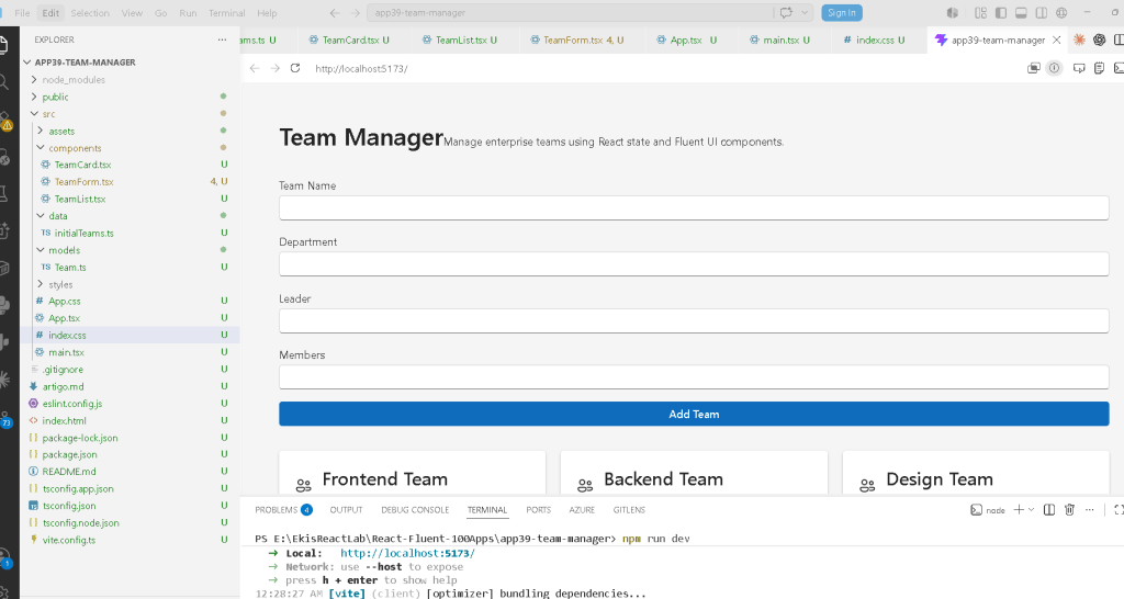
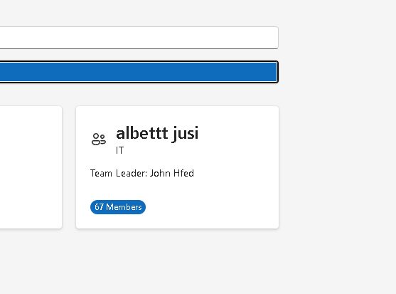
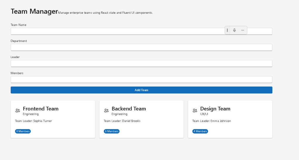
TeamCard Component
Responsibility
The TeamCard component is responsible for rendering one team visually.
This is a reusable presentation component.
It receives data through props:
<TeamCard team={team} />
This is one of the most important React ideas:
- components receive inputs
- components return UI
Why Props Matter
Props are how components communicate.
The TeamCard component does not know:
- where the data came from
- how state works
- how updates happen
It only receives a team object and renders it.
This separation is critical in React architecture.
Understanding Fluent UI Cards
The app uses:
<Card>
Fluent UI cards provide:
- enterprise spacing
- consistent padding
- typography alignment
- Microsoft styling
Without Fluent UI, all these styles would require manual implementation.
Rendering Lists with map()
The TeamList.tsx component contains:
teams.map((team) => ( <TeamCard key={team.id} team={team} />))
This is one of the most important patterns in React.
React transforms arrays into UI.
Conceptually:
data array→ component instances→ rendered interface
Why key Is Important
Each rendered item needs:
key={team.id}
The key helps React identify elements efficiently.
Without keys:
- React shows warnings
- rendering becomes less efficient
- updates may become unstable
Keys are especially important when:
- adding items
- removing items
- reordering lists
Introducing useState
The most important line in the entire app is:
const [teams, setTeams] = useState<Team[]>(initialTeams);
This introduces React state.
Understanding This Syntax
The structure:
const [value, setValue]
is array destructuring.
React returns:
- current state value
- update function
So:
teams
contains the current data.
And:
setTeams()
updates that state.
Why React Re-renders
When:
setTeams(...)
is called:
- state changes
- React schedules rendering
- components re-render
- UI updates automatically
This is the foundation of React interactivity.
Immutable State Updates
The app adds teams using:
setTeams([...teams, newTeam]);
This is critically important.
React state should never be mutated directly.
Wrong:
teams.push(newTeam);
Correct:
setTeams([...teams, newTeam]);
Why?
Because React detects changes through object references.
The spread operator:
[...teams, newTeam]
creates a brand new array.
This immutable update pattern is one of the most important React concepts.
Controlled Forms
The app introduces controlled inputs.
Example:
const [name, setName] = useState("");
The input becomes controlled because:
value={name}
and:
onChange={(e, data) => setName(data.value)}
Now React controls the form state.
The UI always reflects React state.
Why Controlled Inputs Matter
Controlled forms provide:
- validation
- synchronization
- predictability
- centralized data management
This becomes essential in:
- enterprise forms
- authentication systems
- CRUD apps
- APIs
- validation workflows
Component Composition
The component hierarchy becomes:
App├── TeamForm└── TeamList └── TeamCard
This composition model is the foundation of React architecture.
Each component has one responsibility.
Why This Architecture Scales
This separation allows future growth:
App Layout Sidebar Header TeamPage TeamFilters TeamTable TeamCard TeamDetails
Large React apps scale through composition.
Why There Is No useEffect Yet
This app intentionally avoids:
- API synchronization
- effects
- async behavior
According to React Learn:
Effects should synchronize with external systems.
This app only manages local UI state.
So useState is sufficient.
This is important because many beginners misuse useEffect.
Production Validation
Run development server
npm run dev
Validate production build
npm run build
This verifies:
- TypeScript compilation
- JSX compilation
- bundling
- production optimization
Preview production build
npm run preview
What This App Teaches
| Concept | Explanation |
|---|---|
useState | React component memory |
| Controlled Inputs | React-controlled forms |
| Immutable Updates | Arrays updated safely |
| Props | Component communication |
| List Rendering | Dynamic UI generation |
map() | Transform arrays into components |
| TypeScript Interfaces | Strong typing |
| Component Composition | Reusable architecture |
| Fluent UI | Enterprise Microsoft design |
| Derived UI | Interface generated from state |
Enterprise Concepts Introduced
This app prepares the foundation for:
- CRUD systems
- API-driven dashboards
- reducers
- Context API
- enterprise forms
- administration portals
- DataGrid systems
It is a transition point between:
- static UI
- real React applications
Technical Summary
| Technology | Purpose |
|---|---|
| React | Declarative UI |
| TypeScript | Static typing |
| Fluent UI | Enterprise UI system |
| Vite | Fast tooling |
| useState | State management |
| JSX | UI syntax |
| Props | Data communication |
| Arrays in State | Dynamic collections |
| Controlled Forms | Form synchronization |
Official Documentation
React
- React Learn
- State: A Component’s Memory
- Updating Arrays in State
- Choosing the State Structure
- Rendering Lists
Fluent UI
Vite
TypeScript
Current Project Progress
| Block | App | Name | Status |
|---|---|---|---|
| Block 1 | 01 | Hello React Fluent | Completed |
| Block 1 | 02 | Profile Card | Completed |
| Block 1 | 03 | Product List | Completed |
| Block 1 | 04 | Microsoft User Card | Completed |
| Block 1 | 05 | Static Dashboard | Completed |
| Block 1 | 06 | Corporate Sidebar Menu | Completed |
| Block 1 | 07 | Visual Task List | Completed |
| Block 1 | 08 | Timeline Events | Completed |
| Block 1 | 09 | Employee Table | Completed |
| Block 1 | 10 | Email List | Completed |
| Block 1 | 11 | Grid of Cards | Completed |
| Block 1 | 12 | Image Gallery | Completed |
| Block 1 | 13 | Movie Catalog | Completed |
| Block 1 | 14 | Football Teams | Completed |
| Block 1 | 15 | News Page | Completed |
| Block 1 | 16 | Financial Dashboard | Completed |
| Block 1 | 17 | SharePoint Layout | Completed |
| Block 1 | 18 | File Explorer | Completed |
| Block 1 | 19 | Corporate Portal | Completed |
| Block 1 | 20 | Landing Page Microsoft Style | Completed |
| Block 2 | 21 | Modern Counter | Completed |
| Block 2 | 22 | Toggle Theme | Completed |
| Block 2 | 23 | React Calculator | Completed |
| Block 2 | 24 | Login Form | Completed |
| Block 2 | 25 | User Registration | Completed |
| Block 2 | 26 | ToDo List | Completed |
| Block 2 | 27 | Shopping List | Completed |
| Block 2 | 28 | Product Filter | Completed |
| Block 2 | 29 | Employee Search | Completed |
| Block 2 | 30 | Shopping Cart | Completed |
| Block 2 | 31 | Grade Simulator | Completed |
| Block 2 | 32 | Inventory Control | Completed |
| Block 2 | 33 | Contact Agenda | Completed |
| Block 2 | 34 | Currency Converter | Completed |
| Block 2 | 35 | BMI Calculator | Completed |
| Block 2 | 36 | Installment Simulator | Completed |
| Block 2 | 37 | Voting Panel | Completed |
| Block 2 | 38 | Interactive Quiz | Completed |
| Block 2 | 39 | Team Manager | Current |
| Block 2 | 40 | Dynamic Dashboard | Next |
 edvaldo b. guimarães filho