Technical Blog Article — App 41: Microsoft Style Login with React, Fluent UI, TypeScript, and Vite
Modern enterprise applications almost always begin with one critical interface: authentication. Before users can access dashboards, administrative systems, SharePoint portals, CRMs, ERPs, analytics platforms, or Microsoft 365 environments, they first interact with a login screen. Because of this, authentication interfaces are among the most important UI patterns in frontend engineering.
In App 41 — Microsoft Style Login, we officially begin Block 3 of the ReactLab roadmap: Professional Fluent UI Applications. This block represents an important transition in the learning process. Until now, the project focused heavily on rendering, component composition, state fundamentals, and interactivity. Starting here, the focus evolves into enterprise architecture, Microsoft design patterns, Fluent UI ecosystems, and professional-grade layouts.
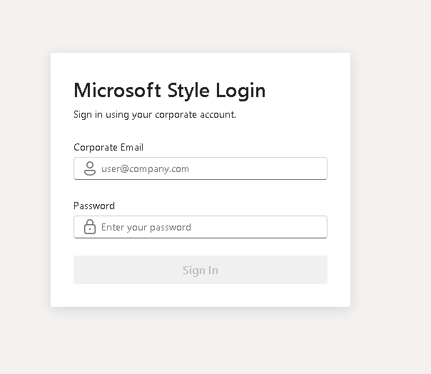
This application introduces:
- Microsoft-style form layouts
- Fluent UI enterprise components
- controlled React forms
- validation derived from state
- state-driven rendering
- professional spacing systems
- enterprise visual hierarchy
The objective of this app is intentionally architectural rather than security-focused. There is no backend, no JWT, no OAuth, no API integration, and no database. The goal is mastering the React mental model behind forms before later introducing real authentication systems.
This app continues following the official React philosophy defined in:
Creating the Project

The project begins using Vite with the React TypeScript template. Vite is currently one of the fastest and most modern frontend tooling systems available. Unlike older solutions such as Create React App, Vite uses native ES Modules during development, providing extremely fast startup and instant Hot Module Replacement.
Project creation:
mkdir bloco03cd bloco03npm create vite@latest app41-microsoft-style-login -- --template react-tscd app41-microsoft-style-loginnpm installnpm install @fluentui/react-components @fluentui/react-icons
The React TypeScript template is especially important because enterprise React applications should always use strong typing. TypeScript improves:
- maintainability
- scalability
- autocomplete
- refactoring safety
- architectural clarity
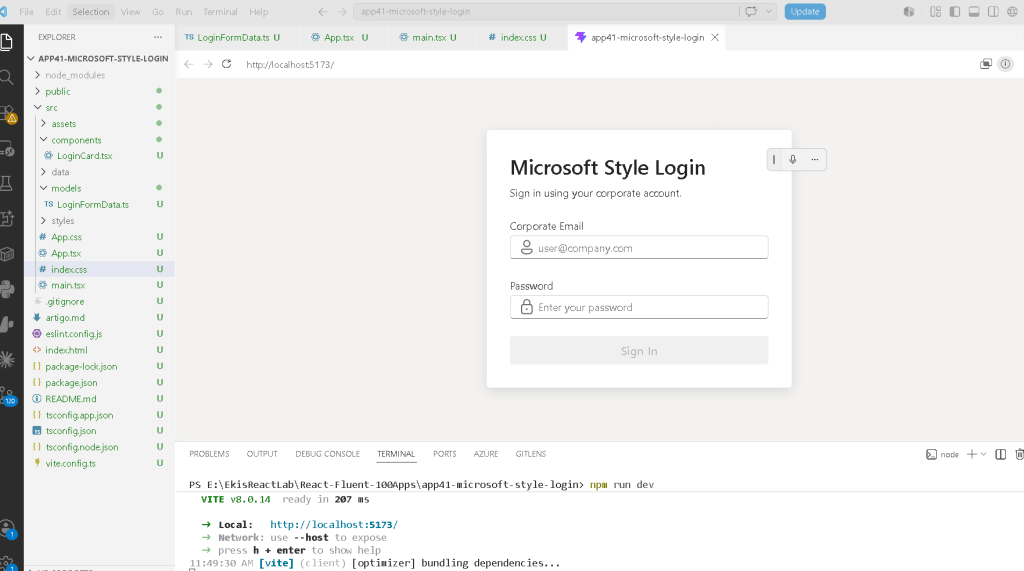
Creating the Folder Structure

Professional React applications should never place all logic inside one file. The project structure already begins introducing separation of responsibilities.
Folder creation:
mkdir src\componentsmkdir src\modelsmkdir src\datamkdir src\styles
File creation:
New-Item src\models\LoginFormData.ts -ItemType FileNew-Item src\components\LoginCard.tsx -ItemType FileNew-Item artigo.md -ItemType File
Final structure:
src/ components/ LoginCard.tsx models/ LoginFormData.ts data/ styles/ App.tsx main.tsx index.css
This organization becomes extremely important later when applications grow into enterprise architectures.
Understanding the Model Layer
The file:
src/models/LoginFormData.ts
contains:
export interface LoginFormData { email: string; password: string;}
This interface defines the shape of the login form state.
One of the most important concepts in enterprise React architecture is that state should always have predictable structure. Instead of allowing random or implicit objects, TypeScript defines exactly what the form must contain.
This interface guarantees:
- email exists
- password exists
- both are strings
Without TypeScript interfaces:
- state becomes unpredictable
- refactoring becomes dangerous
- applications become harder to scale
This is one of the reasons TypeScript dominates professional React ecosystems.
Understanding React State
Inside LoginCard.tsx, one of the most important constructions appears:
const [formData, setFormData] = useState<LoginFormData>(initialFormData);
This line introduces the core of React forms.
Breaking it apart:
| Part | Meaning |
|---|---|
formData | Current state value |
setFormData | Function used to update state |
useState() | React Hook that creates component memory |
<LoginFormData> | TypeScript typing for state |
initialFormData | Initial state values |
The initial object:
const initialFormData: LoginFormData = { email: "", password: "",};
represents the initial form state.
Why State Exists
Without state:
- the form would forget typed values
- React could not re-render dynamically
- the UI would reset constantly
State is React’s memory system.
This is one of the most important ideas in React:
- components re-render frequently
- local variables disappear after rendering
- state persists between renders
Official documentation:
Controlled Components
The inputs use:
value={formData.email}
combined with:
onChange={...}
This creates a controlled component.
In React, controlled components mean:
React state controls the input.
The browser input is no longer the source of truth.
Instead:
- React stores the value
- React updates the value
- React re-renders the interface
The rendering cycle becomes:
User types→ onChange fires→ state updates→ React re-renders→ UI updates automatically
This is the heart of React rendering architecture.
Official documentation:
Understanding Immutable Updates
One of the most important patterns in the app is:
setFormData({ ...formData, email: value,});
The spread operator:
...formData
copies existing properties.
Then:
email: value
updates only the email field.
Without the spread operator:
setFormData({ email: value});
React would replace the entire object and the password field would disappear.
This is immutable state updating.
React strongly encourages immutable patterns because:
- rendering becomes predictable
- debugging becomes easier
- state changes become traceable
Derived State
Another extremely important section is:
const isEmailValid = formData.email.includes("@");const isPasswordValid = formData.password.length >= 6;const isFormValid = isEmailValid && isPasswordValid;
Notice something critical:
isFormValid
is NOT stored inside state.
Instead, it is calculated from existing state.
This is called:
Derived State
This follows official React guidance:
Avoid redundant state.
Official documentation:
Why Derived State Is Better
Bad approach:
const [isFormValid, setIsFormValid]
Good approach:
const isFormValid = isEmailValid && isPasswordValid;
Why?
Because:
- fewer synchronization bugs
- simpler architecture
- cleaner rendering logic
- less duplicated state
React applications should derive values whenever possible.
Understanding Fluent UI
The application uses Fluent UI as its design system layer.
Main components:
- Card
- Input
- Field
- Button
- Text
- Typography components
Instead of manually styling HTML controls, Fluent UI provides:
- accessibility
- Microsoft styling
- keyboard navigation
- responsive behavior
- enterprise spacing
- design consistency
Official documentation:
Why Field Matters
The component:
<Field label="Corporate Email">
automatically handles:
- accessible labels
- spacing
- semantic structure
- enterprise form composition
This is significantly better than manually building labels with plain HTML.
Understanding Layout Composition
The login card uses Flexbox:
display: "flex"flexDirection: "column"gap: "24px"
This creates a vertical enterprise form structure:
TitleSubtitleEmailPasswordButtonFeedback Message
Professional UI composition is heavily based on:
- spacing
- alignment
- typography hierarchy
- predictable layout behavior
Why Flexbox Is Used in App.tsx
The root layout uses:
display: "flex"justifyContent: "center"alignItems: "center"
This centers the login interface both:
- horizontally
- vertically
This is extremely common in enterprise authentication pages because it creates:
- visual focus
- clean composition
- balanced UX
Understanding main.tsx
The file:
src/main.tsx
is the true React entry point.
It connects:
- React
- ReactDOM
- FluentProvider
- App.tsx
- the HTML root
The critical section is:
<FluentProvider theme={webLightTheme}>
This activates:
- Fluent UI theming
- Microsoft typography
- design tokens
- accessibility behavior
- component styling
- enterprise visual consistency
Without FluentProvider:
- Fluent UI components lose their theme system
Why There Is No useEffect
This app intentionally avoids useEffect.
There is:
- no API
- no timer
- no external synchronization
According to React Learn:
“You Might Not Need an Effect”
Effects should only synchronize with external systems.
This application only uses internal rendering logic.
Therefore:
useEffectwould be unnecessary- adding it would create poor React habits
Official documentation:
The React Mental Model in This App
This application reinforces the most important React idea:
UI = function(state)
The interface changes automatically according to:
- user input
- validation rules
- derived state
- conditional rendering
React is declarative.
You describe:
- what the UI should look like
React handles:
- rendering
- DOM updates
- synchronization
Running the Application
Development server:
npm run dev
Production validation:
npm run build
Production preview:
npm run preview
Technical Summary
| Concept | Explanation |
|---|---|
useState | React component memory |
| Controlled Inputs | React controls form fields |
| Derived State | Validation calculated from state |
| Spread Operator | Immutable object updates |
| Fluent UI Card | Enterprise container |
| Fluent UI Input | Microsoft-style input |
| Conditional Rendering | UI rendered based on state |
| Flexbox | Layout alignment |
| TypeScript Interface | Strongly typed form state |
| FluentProvider | Global Microsoft design system |
Official Documentation
React
- React Learn
- State: A Component’s Memory
- Reacting to Input with State
- Choosing the State Structure
- You Might Not Need an Effect
Fluent UI
Current Project Progress
| Block | App | Name | Status |
|---|---|---|---|
| Block 1 | 01 | Hello React Fluent | Completed |
| Block 1 | 02 | Profile Card | Completed |
| Block 1 | 03 | Product List | Completed |
| Block 1 | 04 | Microsoft Style User Card | Completed |
| Block 1 | 05 | Static Dashboard | Completed |
| Block 1 | 06 | Corporate Sidebar Menu | Completed |
| Block 1 | 07 | Visual Task List | Completed |
| Block 1 | 08 | Timeline Events | Completed |
| Block 1 | 09 | Employee Table | Completed |
| Block 1 | 10 | Email List | Completed |
| Block 1 | 11 | Grid of Cards | Completed |
| Block 1 | 12 | Image Gallery | Completed |
| Block 1 | 13 | Movie Catalog | Completed |
| Block 1 | 14 | Football Teams | Completed |
| Block 1 | 15 | News Page | Completed |
| Block 1 | 16 | Financial Dashboard | Completed |
| Block 1 | 17 | SharePoint Style Layout | Completed |
| Block 1 | 18 | File Explorer | Completed |
| Block 1 | 19 | Corporate Portal | Completed |
| Block 1 | 20 | Microsoft Style Landing Page | Completed |
| Block 2 | 21 | Modern Counter | Completed |
| Block 2 | 22 | Toggle Theme | Completed |
| Block 2 | 23 | React Calculator | Completed |
| Block 2 | 24 | Login Form | Completed |
| Block 2 | 25 | User Registration | Completed |
| Block 2 | 26 | Complete ToDo List | Completed |
| Block 2 | 27 | Shopping List | Completed |
| Block 2 | 28 | Product Filter | Completed |
| Block 2 | 29 | Employee Search | Completed |
| Block 2 | 30 | Shopping Cart | Completed |
| Block 2 | 31 | Grade Simulator | Completed |
| Block 2 | 32 | Inventory Control | Completed |
| Block 2 | 33 | Contact Agenda | Completed |
| Block 2 | 34 | Currency Converter | Completed |
| Block 2 | 35 | BMI Calculator | Completed |
| Block 2 | 36 | Installment Simulator | Completed |
| Block 2 | 37 | Voting Panel | Completed |
| Block 2 | 38 | Interactive Quiz | Completed |
| Block 2 | 39 | Team Manager | Completed |
| Block 2 | 40 | Dynamic Dashboard | Completed |
| Block 3 | 41 | Microsoft Style Login | Current |
| Block 3 | 42 | Corporate Form | Next |
Final Architectural Insight
This application may appear visually simple, but architecturally it introduces the foundation of enterprise React forms:
User Input→ React State→ Validation→ Derived UI→ Controlled Components→ Enterprise Rendering
Mastering this pattern is critical before moving into:
- API authentication
- reducers
- routing
- Context API
- enterprise dashboards
- advanced Fluent UI systems
- SharePoint-style enterprise portals
Because in React:
Forms are state.UI derives from state.React renders the result.
 edvaldo b. guimarães filho