Technical Blog Article — App 43: Enterprise Tabs Navigation System with React, Fluent UI, TypeScript, and Vite
Modern enterprise applications rarely display all information on a single screen. As systems grow, interfaces become more modular and organized into sections such as dashboards, reports, projects, settings, analytics, administration, and user management. One of the most common UI patterns used to organize these sections is the tabs navigation system.
Tabs are everywhere in professional software:
- Microsoft 365 admin portals
- SharePoint settings pages
- CRMs
- ERPs
- ticketing systems
- analytics dashboards
- developer tools
- enterprise management platforms
Because of this, App 43 is an extremely important milestone in the ReactLab roadmap. According to the project structure, App 43 officially introduces the Tabs Navigation System inside Block 3 — Professional Fluent UI Applications.
This app is not just about switching visible panels. Architecturally, it introduces several critical React concepts:
- state-driven navigation
- conditional rendering
- component composition
- enterprise UI organization
- derived UI from state
- Fluent UI
TabList - reusable page sections
- controlled navigation systems
The app also reinforces one of the most important React principles from React Learn:
UI = function(state)
The currently selected tab becomes application state. React automatically derives the visible interface from that state.
This is fundamentally different from older imperative approaches where developers manually showed or hid HTML elements using DOM manipulation.
In React:
- state changes
- React re-renders
- UI updates automatically
That is the React mental model.
Why Tabs Matter in Enterprise Architecture
Tabs solve a major UI problem:
How do we organize multiple sections inside the same screen?
Without tabs:
- screens become overloaded
- dashboards become confusing
- layouts become difficult to navigate
- user experience degrades
Tabs create:
- clear visual separation
- contextual navigation
- organized workflows
- modular UI architecture
Enterprise systems often contain:
- dashboards
- reports
- settings
- analytics
- project pages
- notifications
- integrations
Tabs allow all of these areas to coexist inside one consistent layout.
This is why Fluent UI includes professional tab components as part of the Microsoft design system:
Creating the Project
The application begins using Vite with the React TypeScript template.
Create the main folder
mkdir bloco03cd bloco03
Create the Vite project
npm create vite@latest app43-tabs-navigation-system -- --template react-ts
Enter the project
cd app43-tabs-navigation-system
Install dependencies
npm install
Install Fluent UI
npm install @fluentui/react-components @fluentui/react-icons
This installs:
- Fluent UI components
- Fluent UI icons
- Microsoft design system dependencies
Creating the Folder Structure
Professional React projects should never place everything inside App.tsx.
One of the major objectives of the ReactLab roadmap is learning architectural separation.
Create the folders:
mkdir src\componentsmkdir src\datamkdir src\modelsmkdir src\styles
Create the files:
New-Item src\models\TabItem.ts -ItemType FileNew-Item src\data\tabs.ts -ItemType FileNew-Item src\components\DashboardTab.tsx -ItemType FileNew-Item src\components\ProjectsTab.tsx -ItemType FileNew-Item src\components\ReportsTab.tsx -ItemType FileNew-Item src\components\SettingsTab.tsx -ItemType FileNew-Item src\components\TabsLayout.tsx -ItemType FileNew-Item artigo.md -ItemType File
Final Project Structure
src/ components/ DashboardTab.tsx ProjectsTab.tsx ReportsTab.tsx SettingsTab.tsx TabsLayout.tsx data/ tabs.ts models/ TabItem.ts styles/ App.tsx main.tsx index.css
This organization introduces separation of responsibilities.
| Folder | Responsibility |
|---|---|
components/ | UI building blocks |
data/ | Static application data |
models/ | TypeScript interfaces and types |
styles/ | Global or reusable CSS |
App.tsx | Root application layout |
main.tsx | React entry point |
This structure becomes critical later when applications scale.
Understanding the React Flow
One of the most important things to understand is how React reaches the browser.
The execution flow is:
index.html → loads main.tsxmain.tsx → renders App.tsxApp.tsx → renders TabsLayoutTabsLayout → renders TabList and content componentsReactDOM → updates the browser DOMBrowser → displays the final interface
This flow is the foundation of all React applications.
Understanding main.tsx
The file:
src/main.tsx
is the true React entry point.
import React from "react";import ReactDOM from "react-dom/client";import { FluentProvider, webLightTheme,} from "@fluentui/react-components";import App from "./App";import "./index.css";ReactDOM.createRoot( document.getElementById("root")!).render( <React.StrictMode> <FluentProvider theme={webLightTheme}> <App /> </FluentProvider> </React.StrictMode>);
This file performs several critical tasks:
- connects React to HTML
- activates Fluent UI
- injects the Microsoft design system
- renders the root application component
Understanding FluentProvider
This is one of the most important parts of the application:
<FluentProvider theme={webLightTheme}>
Fluent UI components require a provider because the provider injects:
- colors
- spacing tokens
- typography
- accessibility behavior
- design rules
- Microsoft styling
Without FluentProvider, Fluent UI components would lose their visual identity.
The selected theme:
webLightTheme
is Microsoft’s standard light enterprise theme.
Later apps may introduce:
- dark mode
- dynamic theme switching
- custom enterprise themes
Understanding the Model Layer
The file:
src/models/TabItem.ts
contains:
export interface TabItem { id: string; label: string;}
This interface defines the structure of each tab.
This introduces a critical enterprise concept:
Predictable state and predictable data structures.
TypeScript helps guarantee:
- architectural consistency
- safer refactoring
- autocomplete
- fewer bugs
- maintainability
Understanding the Data Layer
The file:
src/data/tabs.ts
contains:
import type { TabItem } from "../models/TabItem";export const tabs: TabItem[] = [ { id: "dashboard", label: "Dashboard", }, { id: "projects", label: "Projects", }, { id: "reports", label: "Reports", }, { id: "settings", label: "Settings", },];
This introduces one of the most important React concepts:
The UI should be derived from data.
Instead of manually writing tabs one by one, the application renders them dynamically using:
tabs.map(...)
This is declarative rendering.
Understanding Declarative Rendering
Old imperative thinking:
Create tab manuallyAttach event manuallyShow panel manuallyHide panel manually
React declarative thinking:
Describe what the UI should look like.React handles the DOM updates.
This distinction is one of the biggest mental shifts in React.
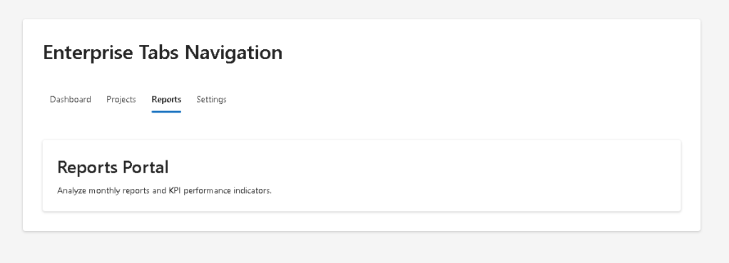
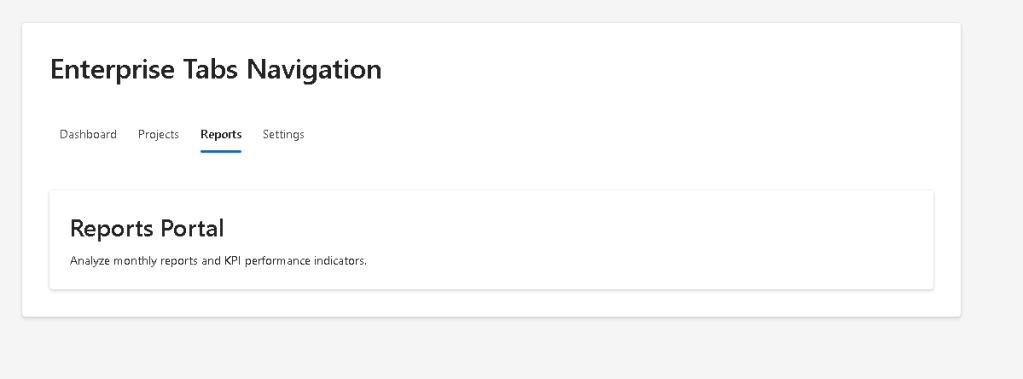
Understanding TabsLayout.tsx
The most important component in the application is:
src/components/TabsLayout.tsx
This component manages:
- navigation state
- tab rendering
- content rendering
- enterprise layout composition
Understanding React State
Inside the component:
const [selectedTab, setSelectedTab] = useState("dashboard");
This line introduces the navigation state.
Breaking it apart:
| Part | Meaning |
|---|---|
selectedTab | Current selected tab |
setSelectedTab | Function that updates state |
useState() | React Hook for component memory |
"dashboard" | Initial selected tab |
This is one of the core React ideas:
React components remember information using state.
Official documentation:
Why State Matters Here
Without state:
- React would not know which tab is active
- the UI could not re-render correctly
- navigation would not be dynamic
The selected tab is the source of truth for the visible interface.
Understanding TabList
The Fluent UI component:
<TabList>
creates enterprise-grade tab navigation.
Fluent UI automatically provides:
- keyboard navigation
- accessibility
- focus management
- Microsoft styling
- enterprise spacing
- responsive behavior
This is one of the biggest advantages of component libraries.
Without Fluent UI, all of this behavior would require manual implementation.
Official documentation:
Understanding onTabSelect
The component uses:
onTabSelect={handleTabSelect}
When the user clicks a tab:
- Fluent UI fires the event
- the handler receives the selected value
- state updates
- React re-renders
The flow becomes:
User clicks tab→ event fires→ setSelectedTab()→ state changes→ React re-renders→ correct content appears
This is the React rendering cycle.
Understanding Derived UI
One of the most important functions is:
function renderTabContent()
This function determines what component should appear.
if (selectedTab === "dashboard") { return <DashboardTab />;}
Notice something critical:
The UI is derived from state.
React is not manually hiding HTML elements.
Instead:
- state changes
- React calculates the correct UI
- React renders the correct component
This is the heart of React architecture.
Understanding Component Composition
The component hierarchy becomes:
App → TabsLayout → DashboardTab → ProjectsTab → ReportsTab → SettingsTab
Each component has one responsibility.
This is extremely important in professional React architecture.
Why Small Components Matter
Small components provide:
- easier debugging
- easier reuse
- better organization
- clearer architecture
- easier testing
React applications scale through composition.
Understanding the Content Components
Each tab content component is intentionally simple:
<Card> <Title2>Executive Dashboard</Title2> <Text> Welcome to the enterprise dashboard overview. </Text></Card>
This app focuses on:
- navigation architecture
- layout flow
- rendering behavior
Later apps will make these sections much more advanced.
Understanding Fluent UI Card
The Card component acts as an enterprise container.
Cards are heavily used in:
- dashboards
- analytics systems
- admin portals
- SharePoint layouts
- Microsoft enterprise applications
The card encapsulates:
- spacing
- padding
- shadows
- borders
- visual separation
Official documentation:
Understanding map()
The tabs are rendered with:
tabs.map((tab) => ( <Tab key={tab.id} value={tab.id} > {tab.label} </Tab>))
This transforms data into UI.
Conceptually:
Data→ React components→ Visual interface
This is one of the most repeated patterns in React development.
Why key Matters
key={tab.id}
Keys help React identify list items efficiently.
Without stable keys:
- React may re-render incorrectly
- performance can degrade
- warnings appear
Keys are essential for dynamic lists.
Official documentation:
Understanding App.tsx
The file:
src/App.tsx
creates the global page layout.
<main style={{ minHeight: "100vh", backgroundColor: "#f5f5f5", padding: "48px", display: "flex", justifyContent: "center", alignItems: "flex-start", }}>
This creates:
- centered layout
- enterprise spacing
- full viewport height
- dashboard-like composition
Why 100vh Matters
minHeight: "100vh"
This means:
Occupy the full browser viewport height.
This is common in enterprise layouts.
Why Flexbox Is Used
display: "flex"
Flexbox simplifies:
- alignment
- spacing
- responsive positioning
The layout becomes:
- horizontally centered
- vertically organized
Why There Is No useEffect
One of the best architectural decisions in this app is what we intentionally did NOT include.
There is:
- no API
- no timers
- no external synchronization
Therefore:
useEffect()
is unnecessary.
According to React Learn:
“You Might Not Need an Effect.”
Official documentation:
This app is pure rendering logic.
The React Mental Model in This App
This app reinforces the core React philosophy:
State changes→ React re-renders→ UI updates automatically
React is NOT:
- manual DOM manipulation
- jQuery-style updates
- imperative UI programming
React IS:
- declarative rendering
- component architecture
- state-driven UI
Running the Application
Start development server
npm run dev
Validate Production Build
npm run build
Preview Production Build
npm run preview
Technical Summary
| Concept | Explanation |
|---|---|
useState | Stores selected tab |
TabList | Enterprise tab navigation |
Tab | Individual navigation item |
| Derived UI | Content rendered from state |
map() | Data-driven rendering |
| Conditional Rendering | Dynamic content selection |
| Fluent UI | Microsoft design system |
| TypeScript Interface | Strong typing |
| Component Composition | Modular architecture |
| Declarative Rendering | React-driven UI updates |
Official Documentation
React
- React Learn
- State: A Component’s Memory
- Conditional Rendering
- Rendering Lists
- You Might Not Need an Effect
Fluent UI
Vite
TypeScript
Current Project Progress
| Block | App | Name | Status |
|---|---|---|---|
| Block 1 | 01 | Hello React Fluent | Completed |
| Block 1 | 02 | Profile Card | Completed |
| Block 1 | 03 | Product List | Completed |
| Block 1 | 04 | Microsoft Style User Card | Completed |
| Block 1 | 05 | Static Dashboard | Completed |
| Block 1 | 06 | Corporate Sidebar Menu | Completed |
| Block 1 | 07 | Visual Task List | Completed |
| Block 1 | 08 | Timeline Events | Completed |
| Block 1 | 09 | Employee Table | Completed |
| Block 1 | 10 | Email List | Completed |
| Block 1 | 11 | Grid of Cards | Completed |
| Block 1 | 12 | Image Gallery | Completed |
| Block 1 | 13 | Movie Catalog | Completed |
| Block 1 | 14 | Football Teams | Completed |
| Block 1 | 15 | News Page | Completed |
| Block 1 | 16 | Financial Dashboard | Completed |
| Block 1 | 17 | SharePoint Style Layout | Completed |
| Block 1 | 18 | File Explorer | Completed |
| Block 1 | 19 | Corporate Portal | Completed |
| Block 1 | 20 | Microsoft Style Landing Page | Completed |
| Block 2 | 21 | Modern Counter | Completed |
| Block 2 | 22 | Toggle Theme | Completed |
| Block 2 | 23 | React Calculator | Completed |
| Block 2 | 24 | Login Form | Completed |
| Block 2 | 25 | User Registration | Completed |
| Block 2 | 26 | Complete ToDo List | Completed |
| Block 2 | 27 | Shopping List | Completed |
| Block 2 | 28 | Product Filter | Completed |
| Block 2 | 29 | Employee Search | Completed |
| Block 2 | 30 | Shopping Cart | Completed |
| Block 2 | 31 | Grade Simulator | Completed |
| Block 2 | 32 | Inventory Control | Completed |
| Block 2 | 33 | Contact Agenda | Completed |
| Block 2 | 34 | Currency Converter | Completed |
| Block 2 | 35 | BMI Calculator | Completed |
| Block 2 | 36 | Installment Simulator | Completed |
| Block 2 | 37 | Voting Panel | Completed |
| Block 2 | 38 | Interactive Quiz | Completed |
| Block 2 | 39 | Team Manager | Completed |
| Block 2 | 40 | Dynamic Dashboard | Completed |
| Block 3 | 41 | Microsoft Style Login | Completed |
| Block 3 | 42 | Corporate Form | Completed |
| Block 3 | 43 | Tabs Navigation System | Current |
| Block 3 | 44 | Dialog Manager | Next |
 edvaldo b. guimarães filho