Technical Blog Article — App 44: Dialog Manager with React, TypeScript, Vite, and Fluent UI
Introduction
In App 44 — Dialog Manager, we build an enterprise-style modal dialog system using React, TypeScript, Vite, and Fluent UI. This app is part of Block 3 — Professional Fluent UI Applications, where the focus moves from basic rendering and state handling into professional Microsoft-style interface patterns.
A dialog is not just a visual popup. In enterprise applications, dialogs are used to guide decisions, confirm risky actions, display alerts, show workflow feedback, collect quick input, and protect users from accidental operations. You will see dialogs in Microsoft 365, SharePoint, Teams, admin portals, CRMs, ERPs, approval systems, ticket systems, dashboards, and configuration panels.
The main objective of this app is to understand that in React, dialog visibility must be controlled by state. We do not manually open and close DOM elements. We update state, React re-renders, and the dialog appears or disappears based on that state.
The core mental model is:
User action→ event handler→ state update→ React re-render→ dialog visibility changes
This is the React way.
1. What This App Teaches
This app teaches several important concepts:
| Concept | Meaning |
|---|---|
| Dialog state | The dialog is visible or hidden based on React state |
| Controlled component | The parent controls the dialog behavior |
| Callback props | Child components request state changes from the parent |
| TypeScript model | Dialog structure is typed and predictable |
| Fluent UI Dialog | Microsoft-style accessible modal component |
| Immutable updates | State objects are updated safely |
| Declarative rendering | UI is derived from state |
| Component composition | App is split into small focused components |
The key lesson is:
Visibility is state.Dialogs are UI derived from state.React controls the rendering.
2. Create the Project
Use PowerShell:
cd C:\ReactAppsNew-Item bloco03 -ItemType Directorycd bloco03npm create vite@latest app44-dialog-manager -- --template react-tscd app44-dialog-managernpm installnpm install @fluentui/react-components @fluentui/react-icons
Create folders:
New-Item src\components -ItemType DirectoryNew-Item src\models -ItemType DirectoryNew-Item src\data -ItemType DirectoryNew-Item src\styles -ItemType Directory
Create files:
New-Item src\models\DialogState.ts -ItemType FileNew-Item src\components\ActionPanel.tsx -ItemType FileNew-Item src\components\DialogManager.tsx -ItemType FileNew-Item artigo.md -ItemType File
3. Final Folder Structure
app44-dialog-manager/ src/ components/ ActionPanel.tsx DialogManager.tsx models/ DialogState.ts data/ styles/ App.tsx main.tsx index.css artigo.md package.json vite.config.ts tsconfig.json
This structure is important because each file has one responsibility:
| File | Responsibility |
|---|---|
DialogState.ts | Defines the dialog data model |
ActionPanel.tsx | Shows buttons that request dialogs |
DialogManager.tsx | Renders the Fluent UI dialog |
App.tsx | Owns the dialog state |
main.tsx | Mounts React into the HTML page |
index.css | Global CSS reset |
artigo.md | Technical blog article |
4. Create the Dialog Model
src\models\DialogState.ts
export type DialogType = | "success" | "warning" | "delete";export interface DialogState { open: boolean; type: DialogType; title: string; message: string;}
This file defines the shape of the dialog state.
The dialog needs to know:
| Property | Purpose |
|---|---|
open | Controls whether the dialog is visible |
type | Defines the kind of dialog |
title | Defines the dialog title |
message | Defines the body message |
This is better than creating many separate booleans like:
const [isDeleteOpen, setIsDeleteOpen] = useState(false);const [isWarningOpen, setIsWarningOpen] = useState(false);const [isSuccessOpen, setIsSuccessOpen] = useState(false);
That approach becomes hard to maintain.
A single typed object is cleaner:
const [dialogState, setDialogState] = useState<DialogState>(initialDialogState);
5. Create the Action Panel
src\components\ActionPanel.tsx
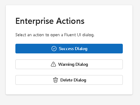
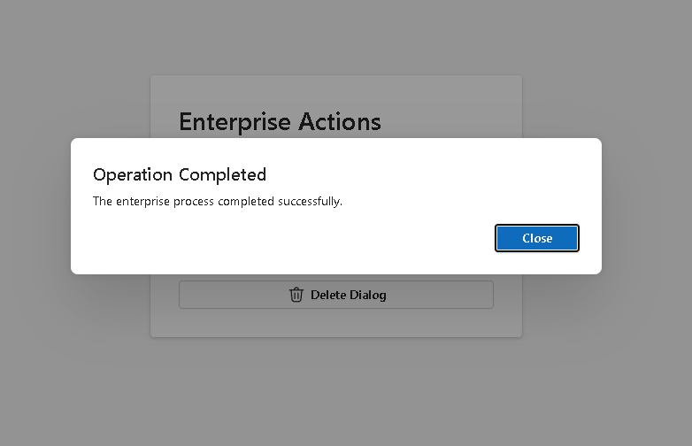
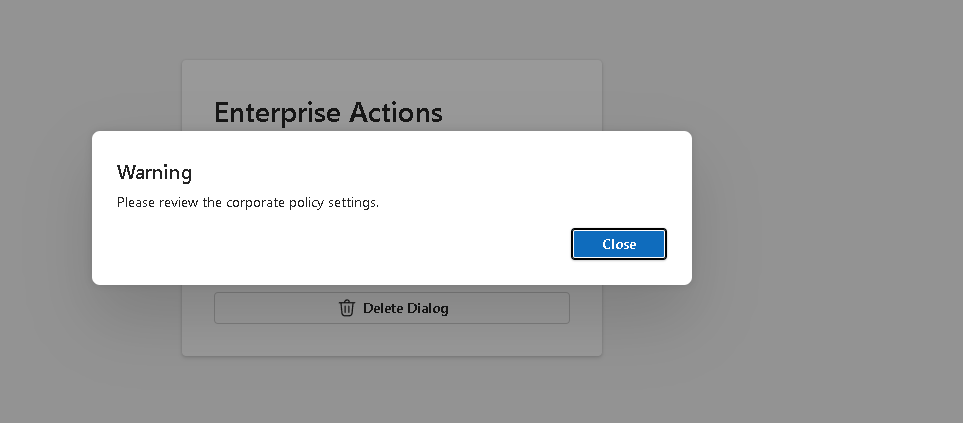
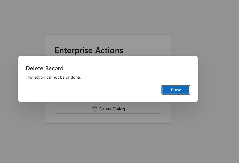
import { Button, Card, Text, Title2,} from "@fluentui/react-components";import { CheckmarkCircle24Regular, Delete24Regular, Warning24Regular,} from "@fluentui/react-icons";import type { DialogState } from "../models/DialogState";interface ActionPanelProps { onOpenDialog: (dialog: DialogState) => void;}export function ActionPanel({ onOpenDialog,}: ActionPanelProps) { return ( <Card style={{ padding: "32px", display: "flex", flexDirection: "column", gap: "20px", }} > <Title2>Enterprise Actions</Title2> <Text> Select an action to open a Fluent UI dialog. </Text> <Button appearance="primary" icon={<CheckmarkCircle24Regular />} onClick={() => onOpenDialog({ open: true, type: "success", title: "Operation Completed", message: "The enterprise process completed successfully.", }) } > Success Dialog </Button> <Button appearance="secondary" icon={<Warning24Regular />} onClick={() => onOpenDialog({ open: true, type: "warning", title: "Warning", message: "Please review the corporate policy settings before continuing.", }) } > Warning Dialog </Button> <Button appearance="outline" icon={<Delete24Regular />} onClick={() => onOpenDialog({ open: true, type: "delete", title: "Delete Record", message: "This action cannot be undone. Confirm before deleting the record.", }) } > Delete Dialog </Button> </Card> );}
Explanation
ActionPanel does not own the dialog state. It only receives a function:
onOpenDialog: (dialog: DialogState) => void;
This means:
ActionPanel asks the parent to open a dialog.App owns the state.DialogManager displays the state.
This is a very important React pattern.
The child component should not directly control global application behavior. It should communicate intent upward through callback props.
6. Create the Dialog Manager
src\components\DialogManager.tsx
import { Button, Dialog, DialogActions, DialogBody, DialogContent, DialogSurface, DialogTitle, Text,} from "@fluentui/react-components";import type { DialogState } from "../models/DialogState";interface DialogManagerProps { dialogState: DialogState; onClose: () => void;}export function DialogManager({ dialogState, onClose,}: DialogManagerProps) { return ( <Dialog open={dialogState.open}> <DialogSurface> <DialogBody> <DialogTitle> {dialogState.title} </DialogTitle> <DialogContent> <Text> {dialogState.message} </Text> </DialogContent> <DialogActions> <Button appearance="primary" onClick={onClose} > Close </Button> </DialogActions> </DialogBody> </DialogSurface> </Dialog> );}
Explanation
The key line is:
<Dialog open={dialogState.open}>
This means the dialog is controlled.
When dialogState.open is true, the dialog appears.
When dialogState.open is false, the dialog disappears.
The UI is not manually manipulated. React renders the correct result from state.
7. Fluent UI Dialog Structure
Fluent UI dialogs use this structure:
Dialog DialogSurface DialogBody DialogTitle DialogContent DialogActions
Each part has a clear responsibility:
| Component | Purpose |
|---|---|
Dialog | Controls the dialog container |
DialogSurface | Provides the modal visual surface |
DialogBody | Groups title, content, and actions |
DialogTitle | Displays the title |
DialogContent | Displays the body content |
DialogActions | Contains buttons/actions |
This structured approach matters because enterprise dialogs must support accessibility, keyboard navigation, focus management, and consistent design.
8. Create the Root App
src\App.tsx
import { useState } from "react";import { FluentProvider, webLightTheme,} from "@fluentui/react-components";import { ActionPanel } from "./components/ActionPanel";import { DialogManager } from "./components/DialogManager";import type { DialogState } from "./models/DialogState";const initialDialogState: DialogState = { open: false, type: "success", title: "", message: "",};function App() { const [dialogState, setDialogState] = useState<DialogState>(initialDialogState); function handleCloseDialog() { setDialogState({ ...dialogState, open: false, }); } return ( <FluentProvider theme={webLightTheme}> <main style={{ minHeight: "100vh", display: "flex", justifyContent: "center", alignItems: "center", backgroundColor: "#f5f5f5", padding: "32px", boxSizing: "border-box", }} > <section style={{ width: "420px", }} > <ActionPanel onOpenDialog={setDialogState} /> <DialogManager dialogState={dialogState} onClose={handleCloseDialog} /> </section> </main> </FluentProvider> );}export default App;
9. Understanding useState
This line is the heart of the app:
const [dialogState, setDialogState] = useState<DialogState>(initialDialogState);
It creates component memory.
| Part | Meaning |
|---|---|
dialogState | Current dialog data |
setDialogState | Function used to update dialog data |
useState | React Hook for local state |
<DialogState> | TypeScript typing |
initialDialogState | Initial value |
The initial state says:
The dialog starts closed.
10. Understanding the Open Flow
When the user clicks Success Dialog, this runs:
onOpenDialog({ open: true, type: "success", title: "Operation Completed", message: "The enterprise process completed successfully.",})
That updates the parent state.
Then:
React re-renders AppDialogManager receives new propsDialog open becomes trueFluent UI displays the dialog
This is declarative UI.
11. Understanding the Close Flow
When the user clicks Close, this runs:
handleCloseDialog()
The function updates state:
setDialogState({ ...dialogState, open: false,});
The spread operator keeps the existing title, message, and type, but changes open.
This is an immutable update.
React expects state to be treated as immutable because predictable state updates make rendering safer and easier to debug.
12. Why We Do Not Use useEffect
This app does not need useEffect.
There is no:
- API request
- browser event subscription
- timer
- localStorage synchronization
- external system
The dialog is purely controlled by user interaction and React state.
So the correct solution is:
useState, not useEffect.
This is extremely important.
A common beginner mistake is using useEffect for everything. But in React, effects are for synchronizing with external systems. Internal UI state should normally be handled directly with state and event handlers.
13. Create main.tsx
src\main.tsx
import React from "react";import ReactDOM from "react-dom/client";import App from "./App";import "./index.css";ReactDOM.createRoot( document.getElementById("root")!).render( <React.StrictMode> <App /> </React.StrictMode>);
This file connects React to the browser.
The flow is:
index.html→ loads main.tsx→ main.tsx renders App→ App renders ActionPanel and DialogManager
14. Create index.css
src\index.css
body { margin: 0; font-family: "Segoe UI", Arial, sans-serif;}* { box-sizing: border-box;}
This removes the browser default margin and applies a Microsoft-style font.
15. Run the App
Development:
npm run dev
Production build:
npm run build
Preview production build:
npm run preview
16. Complete Rendering Flow
main.tsx renders AppApp owns dialogStateActionPanel receives setDialogState as onOpenDialogUser clicks a button ActionPanel calls onOpenDialogApp state changes React re-rendersDialogManager receives dialogStateFluent UI Dialog opens or closes based on dialogState.open
This is the full architecture.
17. Technical Summary
| Concept | Explanation |
|---|---|
useState | Stores dialog visibility and content |
DialogState | TypeScript model for modal state |
ActionPanel | Sends dialog open requests |
DialogManager | Renders the Fluent UI dialog |
| Callback props | Allow child-to-parent communication |
| Controlled dialog | Dialog visibility comes from React state |
| Immutable update | State object copied before changing open |
| Fluent UI Dialog | Accessible Microsoft-style modal |
No useEffect | Internal UI behavior does not require effects |
| Composition | Small components working together |
18. Concept Table
| Concept | File | Why It Matters |
|---|---|---|
| Dialog model | DialogState.ts | Keeps dialog state typed |
| Parent state | App.tsx | Centralizes modal control |
| Callback prop | ActionPanel.tsx | Child requests parent update |
| Controlled modal | DialogManager.tsx | UI follows state |
| Fluent UI | DialogManager.tsx | Provides enterprise dialog structure |
| TypeScript | All files | Prevents shape errors |
| React rendering | App.tsx | State changes trigger UI updates |
| Styling | Inline + index.css | Keeps layout simple and visible |
19. Official Documentation
| Topic | Documentation |
|---|---|
| React Learn | https://react.dev/learn |
| State: A Component’s Memory | https://react.dev/learn/state-a-components-memory |
| Sharing State Between Components | https://react.dev/learn/sharing-state-between-components |
| Updating Objects in State | https://react.dev/learn/updating-objects-in-state |
| You Might Not Need an Effect | https://react.dev/learn/you-might-not-need-an-effect |
| Fluent UI React Components | https://developer.microsoft.com/en-us/fluentui#/controls/web |
| Fluent UI Dialog | https://developer.microsoft.com/en-us/fluentui#/controls/web/dialog |
| Vite Guide | https://vite.dev/guide/ |
| TypeScript Docs | https://www.typescriptlang.org/docs/ |
20. Final Didactic Insight
The most important lesson from App 44 is that a dialog is not a separate imperative object that we manually show or hide.
In React, a dialog is just UI derived from state.
The correct mental model is:
State says open = true→ React shows the dialogState says open = false→ React hides the dialog
This same pattern will appear again in:
- confirmation forms
- delete records
- approval workflows
- edit forms
- user management
- ticket systems
- CRM panels
- SharePoint-style enterprise interfaces
Mastering dialogs now prepares you for larger Fluent UI applications.
Current Project Progress
| Block | App | Name | Status |
|---|---|---|---|
| Block 1 | 01 | Hello React Fluent | Completed |
| Block 1 | 02 | Profile Card | Completed |
| Block 1 | 03 | Product List | Completed |
| Block 1 | 04 | Microsoft Style User Card | Completed |
| Block 1 | 05 | Static Dashboard | Completed |
| Block 1 | 06 | Corporate Sidebar Menu | Completed |
| Block 1 | 07 | Visual Task List | Completed |
| Block 1 | 08 | Timeline Events | Completed |
| Block 1 | 09 | Employee Table | Completed |
| Block 1 | 10 | Email List | Completed |
| Block 1 | 11 | Grid of Cards | Completed |
| Block 1 | 12 | Image Gallery | Completed |
| Block 1 | 13 | Movie Catalog | Completed |
| Block 1 | 14 | Football Teams | Completed |
| Block 1 | 15 | News Page | Completed |
| Block 1 | 16 | Financial Dashboard | Completed |
| Block 1 | 17 | SharePoint Style Layout | Completed |
| Block 1 | 18 | File Explorer | Completed |
| Block 1 | 19 | Corporate Portal | Completed |
| Block 1 | 20 | Microsoft Style Landing Page | Completed |
| Block 2 | 21 | Modern Counter | Completed |
| Block 2 | 22 | Toggle Theme | Completed |
| Block 2 | 23 | React Calculator | Completed |
| Block 2 | 24 | Login Form | Completed |
| Block 2 | 25 | User Registration | Completed |
| Block 2 | 26 | Complete ToDo List | Completed |
| Block 2 | 27 | Shopping List | Completed |
| Block 2 | 28 | Product Filter | Completed |
| Block 2 | 29 | Employee Search | Completed |
| Block 2 | 30 | Shopping Cart | Completed |
| Block 2 | 31 | Grade Simulator | Completed |
| Block 2 | 32 | Inventory Control | Completed |
| Block 2 | 33 | Contact Agenda | Completed |
| Block 2 | 34 | Currency Converter | Completed |
| Block 2 | 35 | BMI Calculator | Completed |
| Block 2 | 36 | Installment Simulator | Completed |
| Block 2 | 37 | Voting Panel | Completed |
| Block 2 | 38 | Interactive Quiz | Completed |
| Block 2 | 39 | Team Manager | Completed |
| Block 2 | 40 | Dynamic Dashboard | Completed |
| Block 3 | 41 | Microsoft Style Login | Completed |
| Block 3 | 42 | Corporate Form | Completed |
| Block 3 | 43 | Tabs Navigation | Completed |
| Block 3 | 44 | Dialog Manager | Current |
| Block 3 | 45 | Executive Dashboard | Next |
 edvaldo b. guimarães filho