
Technical Blog Article — App 45: Executive Dashboard with React, TypeScript, Vite, and Fluent UI
Introduction
In App 45 — Executive Dashboard, we continue Block 3 of the ReactLab roadmap: Professional Fluent UI Applications. This block focuses on transforming basic React knowledge into enterprise-grade interface architecture using Microsoft’s Fluent UI ecosystem. According to the project roadmap, App 45 introduces enterprise dashboard composition using cards, KPI panels, responsive layout systems, and Microsoft-style visual hierarchy.
Dashboards are among the most important UI patterns in modern enterprise applications. They appear in:
- administrative portals
- SharePoint dashboards
- CRM systems
- ERP systems
- Power BI inspired interfaces
- analytics platforms
- ticket systems
- monitoring panels
- Microsoft 365 admin experiences
An executive dashboard is not just a group of cards on the screen. Architecturally, a dashboard is:
- a composition of reusable UI components
- a visual representation of business state
- a hierarchy of information
- a layout system designed for readability
- a scalable structure for future API integration
This application intentionally begins as a static dashboard because React applications should evolve progressively. Before introducing:
- APIs
- asynchronous data
- effects
- caching
- reducers
- Context API
the developer must first understand:
- component composition
- layout architecture
- typed data modeling
- declarative rendering
- Fluent UI design systems
The React mental model remains:
Data→ React Components→ JSX→ Declarative UI→ Enterprise Dashboard
This app follows the official philosophy defined in:
1. What This App Teaches
| Concept | Meaning |
|---|---|
| Dashboard composition | Multiple components forming one enterprise UI |
| KPI cards | Visual metric representation |
| Typed models | Predictable dashboard data |
| Fluent UI Cards | Microsoft-style containers |
| Grid layout | Responsive enterprise structure |
| Component reuse | One card component reused multiple times |
| Declarative rendering | UI generated from data |
| Static architecture first | Building layout before introducing APIs |
The most important lesson is:
Enterprise dashboards are compositions of reusable components.
2. Create the Project
cd C:\ReactAppsNew-Item bloco03 -ItemType Directorycd bloco03npm create vite@latest app45-executive-dashboard -- --template react-tscd app45-executive-dashboardnpm installnpm install @fluentui/react-components @fluentui/react-icons
Create folders:
New-Item src\components -ItemType DirectoryNew-Item src\models -ItemType DirectoryNew-Item src\data -ItemType DirectoryNew-Item src\styles -ItemType Directory
Create files:
New-Item src\models\ExecutiveMetric.ts -ItemType FileNew-Item src\data\executiveMetrics.ts -ItemType FileNew-Item src\components\MetricCard.tsx -ItemType FileNew-Item src\components\ExecutiveDashboard.tsx -ItemType FileNew-Item artigo.md -ItemType File
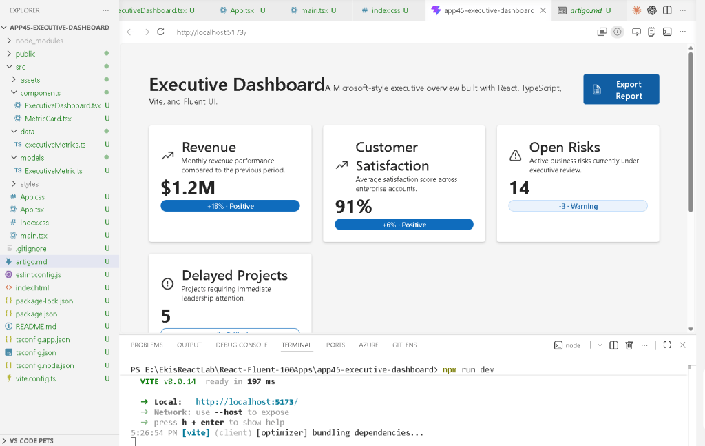
3. Final Folder Structure
app45-executive-dashboard/ src/ components/ ExecutiveDashboard.tsx MetricCard.tsx data/ executiveMetrics.ts models/ ExecutiveMetric.ts styles/ App.tsx main.tsx index.css artigo.md
This structure is already preparing the project for future scaling.
| Folder | Responsibility |
|---|---|
components/ | Reusable visual blocks |
models/ | TypeScript contracts |
data/ | Dashboard data source |
styles/ | Global/custom styling |
App.tsx | Root composition |
main.tsx | React entry point |
This follows the architecture philosophy described in the ReactLab project structure.
4. Create the Model
src\models\ExecutiveMetric.ts
export interface ExecutiveMetric { id: number; title: string; value: string; variation: string; status: "Positive" | "Warning" | "Critical"; description: string;}
This interface defines the shape of every dashboard metric.
Without TypeScript, dashboard data becomes unpredictable.
The interface guarantees:
- every metric has an id
- every metric has a title
- every metric has a value
- status can only be:
- Positive
- Warning
- Critical
This is important because enterprise applications require predictable architecture.
5. Create the Data Layer
src\data\executiveMetrics.ts
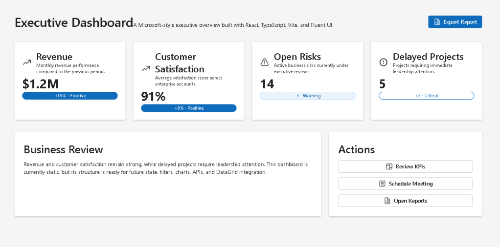
import type { ExecutiveMetric } from "../models/ExecutiveMetric";export const executiveMetrics: ExecutiveMetric[] = [ { id: 1, title: "Revenue", value: "$1.2M", variation: "+18%", status: "Positive", description: "Monthly revenue performance.", }, { id: 2, title: "Customer Satisfaction", value: "91%", variation: "+6%", status: "Positive", description: "Enterprise customer satisfaction score.", }, { id: 3, title: "Open Risks", value: "14", variation: "-3", status: "Warning", description: "Business risks under review.", }, { id: 4, title: "Delayed Projects", value: "5", variation: "+2", status: "Critical", description: "Projects requiring leadership attention.", },];
This file introduces an extremely important React concept:
The UI is generated from data.
Instead of manually creating four separate cards, we create one reusable component and render it from an array.
This is declarative rendering.
6. Create the Metric Card Component
src\components\MetricCard.tsx
import { Badge, Body1, Card, CardHeader, Caption1, Title3,} from "@fluentui/react-components";import { ArrowTrending24Regular, Warning24Regular, ErrorCircle24Regular,} from "@fluentui/react-icons";import type { ExecutiveMetric } from "../models/ExecutiveMetric";interface MetricCardProps { metric: ExecutiveMetric;}function getIcon(status: ExecutiveMetric["status"]) { if (status === "Positive") { return <ArrowTrending24Regular />; } if (status === "Warning") { return <Warning24Regular />; } return <ErrorCircle24Regular />;}export function MetricCard({ metric,}: MetricCardProps) { return ( <Card style={{ padding: "24px", minHeight: "200px", }} > <CardHeader image={getIcon(metric.status)} header={<Title3>{metric.title}</Title3>} description={ <Caption1> {metric.description} </Caption1> } /> <Body1 style={{ fontSize: "32px", fontWeight: 700, }} > {metric.value} </Body1> <Badge appearance="filled"> {metric.variation} </Badge> </Card> );}
7. Understanding Component Reuse
This component is reusable.
Instead of:
RevenueCardCustomerCardRiskCardProjectCard
we create:
MetricCard
and reuse it multiple times.
This is one of the core React ideas:
Reusable UI components.
The component receives props:
metric: ExecutiveMetric;
Props are component inputs.
The component becomes dynamic because the data changes.
8. Understanding Conditional Rendering
The function:
getIcon(status)
returns different icons depending on metric status.
This is conditional rendering.
Positive→ Trending iconWarning→ Warning iconCritical→ Error icon
React components can dynamically render different UI according to data.
9. Create the Dashboard Component
src\components\ExecutiveDashboard.tsx
import { Button, Card, Text, Title1, Title2,} from "@fluentui/react-components";import { Board24Regular, DocumentBulletList24Regular,} from "@fluentui/react-icons";import { executiveMetrics } from "../data/executiveMetrics";import { MetricCard } from "./MetricCard";export function ExecutiveDashboard() { return ( <main style={{ minHeight: "100vh", backgroundColor: "#f5f5f5", padding: "48px", boxSizing: "border-box", }} > <section style={{ maxWidth: "1200px", margin: "0 auto", }} > <div style={{ display: "flex", justifyContent: "space-between", alignItems: "center", marginBottom: "32px", }} > <div> <Title1> Executive Dashboard </Title1> <Text> Enterprise KPI overview using Fluent UI. </Text> </div> <Button appearance="primary" icon={<DocumentBulletList24Regular />} > Export Report </Button> </div> <div style={{ display: "grid", gridTemplateColumns: "repeat(auto-fit, minmax(240px, 1fr))", gap: "20px", }} > {executiveMetrics.map((metric) => ( <MetricCard key={metric.id} metric={metric} /> ))} </div> <Card style={{ marginTop: "32px", padding: "24px", }} > <Title2> Business Summary </Title2> <Text> Revenue performance remains positive, while delayed projects require immediate executive review. </Text> </Card> </section> </main> );}
10. Understanding map()
This line is critical:
executiveMetrics.map((metric) => ( <MetricCard key={metric.id} metric={metric} />))
React transforms data into UI.
Conceptually:
Metric data→ React component→ Rendered dashboard card
This is declarative rendering.
We are not manually creating DOM nodes.
We describe the relationship:
For each metric,render a MetricCard.
React handles the DOM updates.
11. Why key={metric.id} Matters
React requires stable keys for lists.
key={metric.id}
helps React identify elements efficiently.
Without keys:
- React may render inefficiently
- warnings appear
- updates become harder to track
Keys are essential for list rendering.
Official documentation:
12. Understanding the Dashboard Grid
The dashboard uses CSS Grid:
display: "grid",gridTemplateColumns: "repeat(auto-fit, minmax(240px, 1fr))",
This creates a responsive layout.
Meaning:
Create as many columns as possible.Each column must be at least 240px.Distribute extra space equally.
This is common in:
- admin dashboards
- Power BI layouts
- analytics systems
- SharePoint webparts
- enterprise portals
13. Why Fluent UI Matters Here
Fluent UI provides:
- enterprise spacing
- accessibility
- keyboard navigation
- Microsoft typography
- consistent visual hierarchy
- theme support
Instead of building dashboards manually, Fluent UI gives production-ready enterprise components.
Main components used:
- Card
- Badge
- Button
- Title
- Text
- CardHeader
Official documentation:
14. Create App.tsx
src\App.tsx
import { ExecutiveDashboard } from "./components/ExecutiveDashboard";function App() { return <ExecutiveDashboard />;}export default App;
This file acts as the root composition component.
15. Create main.tsx
src\main.tsx
import React from "react";import ReactDOM from "react-dom/client";import { FluentProvider, webLightTheme,} from "@fluentui/react-components";import App from "./App";import "./index.css";ReactDOM.createRoot( document.getElementById("root")!).render( <React.StrictMode> <FluentProvider theme={webLightTheme}> <App /> </FluentProvider> </React.StrictMode>);
This file:
- mounts React
- activates Fluent UI
- applies Microsoft theming
- connects React to the browser DOM
16. Create index.css
src\index.css
body { margin: 0; font-family: "Segoe UI", Arial, sans-serif;}* { box-sizing: border-box;}
This removes default browser spacing and applies Microsoft typography.
17. Why This App Uses No State
This app intentionally avoids:
useStateuseEffect
Why?
Because the dashboard is currently static.
According to React philosophy:
Do not add state until state is necessary.
The UI is entirely derived from static data.
This is correct React architecture.
Later versions may introduce:
- APIs
- filters
- sorting
- live updates
- loading states
- reducers
But first we master layout composition.
18. Complete Rendering Flow
main.tsx renders AppApp renders ExecutiveDashboardExecutiveDashboard maps executiveMetricsMetricCard renders each KPI cardFluent UI styles enterprise componentsReactDOM updates browser DOM
19. Technical Summary
| Concept | Explanation |
|---|---|
| Dashboard composition | Multiple components form one UI |
| TypeScript interface | Defines metric structure |
| Data-driven rendering | UI generated from arrays |
| Fluent UI Cards | Enterprise containers |
| React props | Dynamic component input |
| CSS Grid | Responsive dashboard layout |
| Conditional rendering | Different icons by status |
| Declarative UI | React derives UI from data |
| Component reuse | One component reused many times |
| FluentProvider | Activates Microsoft theming |
20. Concept Table
| Concept | File | Why It Matters |
|---|---|---|
| Metric model | ExecutiveMetric.ts | Predictable data |
| Dashboard data | executiveMetrics.ts | Centralized data source |
| Reusable card | MetricCard.tsx | Component reuse |
| Grid layout | ExecutiveDashboard.tsx | Enterprise responsive structure |
| Fluent UI | Multiple files | Microsoft visual identity |
| React composition | App.tsx | Small focused components |
| Declarative rendering | map() | UI generated from data |
21. Official Documentation
| Topic | Documentation |
|---|---|
| React Learn | React Learn |
| Thinking in React | Thinking in React |
| Rendering Lists | Rendering Lists |
| Keeping Components Pure | Keeping Components Pure |
| Fluent UI Components | Fluent UI React Components |
| Fluent UI Card | Fluent UI Card |
| Vite Guide | Vite Guide |
| TypeScript Docs | TypeScript Docs |
22. Final Architectural Insight
This app introduces one of the most important enterprise frontend patterns:
Data→ Reusable components→ Responsive layout→ Executive dashboard
Modern dashboards are not handcrafted HTML pages.
They are:
- data-driven
- component-based
- declarative
- reusable
- scalable
Mastering this structure prepares you for:
- analytics systems
- admin portals
- DataGrid apps
- SharePoint dashboards
- Power BI inspired layouts
- enterprise React architecture
Because in React:
Dashboards are compositions.Components are reusable.UI derives from data.
Current Project Progress
| Block | App | Name | Status |
|---|---|---|---|
| Block 1 | 01 | Hello React Fluent | Completed |
| Block 1 | 02 | Profile Card | Completed |
| Block 1 | 03 | Product List | Completed |
| Block 1 | 04 | Microsoft Style User Card | Completed |
| Block 1 | 05 | Static Dashboard | Completed |
| Block 1 | 06 | Corporate Sidebar Menu | Completed |
| Block 1 | 07 | Visual Task List | Completed |
| Block 1 | 08 | Timeline Events | Completed |
| Block 1 | 09 | Employee Table | Completed |
| Block 1 | 10 | Email List | Completed |
| Block 1 | 11 | Grid of Cards | Completed |
| Block 1 | 12 | Image Gallery | Completed |
| Block 1 | 13 | Movie Catalog | Completed |
| Block 1 | 14 | Football Teams | Completed |
| Block 1 | 15 | News Page | Completed |
| Block 1 | 16 | Financial Dashboard | Completed |
| Block 1 | 17 | SharePoint Style Layout | Completed |
| Block 1 | 18 | File Explorer | Completed |
| Block 1 | 19 | Corporate Portal | Completed |
| Block 1 | 20 | Microsoft Style Landing Page | Completed |
| Block 2 | 21 | Modern Counter | Completed |
| Block 2 | 22 | Toggle Theme | Completed |
| Block 2 | 23 | React Calculator | Completed |
| Block 2 | 24 | Login Form | Completed |
| Block 2 | 25 | User Registration | Completed |
| Block 2 | 26 | Complete ToDo List | Completed |
| Block 2 | 27 | Shopping List | Completed |
| Block 2 | 28 | Product Filter | Completed |
| Block 2 | 29 | Employee Search | Completed |
| Block 2 | 30 | Shopping Cart | Completed |
| Block 2 | 31 | Grade Simulator | Completed |
| Block 2 | 32 | Inventory Control | Completed |
| Block 2 | 33 | Contact Agenda | Completed |
| Block 2 | 34 | Currency Converter | Completed |
| Block 2 | 35 | BMI Calculator | Completed |
| Block 2 | 36 | Installment Simulator | Completed |
| Block 2 | 37 | Voting Panel | Completed |
| Block 2 | 38 | Interactive Quiz | Completed |
| Block 2 | 39 | Team Manager | Completed |
| Block 2 | 40 | Dynamic Dashboard | Completed |
| Block 3 | 41 | Microsoft Style Login | Completed |
| Block 3 | 42 | Corporate Form | Completed |
| Block 3 | 43 | Tabs Navigation | Completed |
| Block 3 | 44 | Dialog Manager | Completed |
| Block 3 | 45 | Executive Dashboard | Current |
| Block 3 | 46 | DataGrid Catalog | Next |
 edvaldo b. guimarães filho