
Technical Blog Article — App 47: Enterprise User List with React, TypeScript, Fluent UI, and Vite
Introduction
In modern enterprise systems, one of the most common interface patterns is the user directory. Corporate portals, Microsoft 365 admin centers, SharePoint intranets, CRM systems, ERP platforms, analytics dashboards, approval systems, and collaboration environments all need some form of user visualization.
In App 47 — Enterprise User List, we build a professional Microsoft-style user directory using:
- React
- TypeScript
- Vite
- Fluent UI
This app belongs to Block 3 — Professional Fluent UI Applications, where the learning focus shifts from basic rendering into enterprise-grade UI architecture and Microsoft design patterns.
The objective of this application is not CRUD yet. There is:
- no API
- no database
- no authentication
- no backend
- no real persistence
The purpose is architectural.
This app teaches:
- enterprise card layouts
- Avatar rendering
- Badge systems
- typed user models
- reusable UI composition
- React list rendering
- Fluent UI enterprise components
- data-driven rendering
This application also reinforces one of the most important React concepts:
UI should be derived from data.
Instead of manually creating user cards one by one, React dynamically renders the interface from structured user data.
That mental model is fundamental for enterprise React applications.
1. What This App Teaches
| Concept | Why It Matters |
|---|---|
| TypeScript interfaces | Strongly typed architecture |
| Static data rendering | UI derived from data |
| Reusable components | Scalable architecture |
| Fluent UI Avatar | Enterprise user identity |
| Fluent UI Badge | Visual metadata |
| Card composition | Microsoft-style UI |
React map() rendering | Dynamic rendering |
| Component hierarchy | Structured UI architecture |
| Flex/Grid layouts | Responsive enterprise UI |
| Pure components | Predictable rendering |
This app is heavily aligned with:
2. Create the Project
Create the solution folder
cd C:\ReactAppsNew-Item bloco03 -ItemType Directorycd bloco03
Create the Vite project
npm create vite@latest app47-enterprise-user-list -- --template react-ts
Enter the project folder
cd app47-enterprise-user-list
Install dependencies
npm install
Install Fluent UI
npm install @fluentui/react-components @fluentui/react-icons
3. Create the Folder Structure
New-Item src\components -ItemType DirectoryNew-Item src\models -ItemType DirectoryNew-Item src\data -ItemType DirectoryNew-Item src\styles -ItemType Directory
Create files
New-Item src\models\EnterpriseUser.ts -ItemType FileNew-Item src\data\users.ts -ItemType FileNew-Item src\components\UserCard.tsx -ItemType FileNew-Item src\components\UserList.tsx -ItemType FileNew-Item artigo.md -ItemType File
4. Final Folder Structure
app47-enterprise-user-list/ src/ components/ UserCard.tsx UserList.tsx data/ users.ts models/ EnterpriseUser.ts styles/ App.tsx main.tsx index.css artigo.md package.json vite.config.ts tsconfig.json
This structure matters because professional React applications separate:
- UI
- data
- models
- architecture responsibilities
5. Create the TypeScript Model
src\models\EnterpriseUser.ts
export type UserStatus = | "Available" | "Busy" | "Offline";export interface EnterpriseUser { id: number; name: string; role: string; department: string; email: string; status: UserStatus;}
6. Why the Model Layer Matters
This file defines the shape of the application data.
Each user must contain:
| Property | Type |
|---|---|
id | number |
name | string |
role | string |
department | string |
email | string |
status | union type |
The union type:
type UserStatus = | "Available" | "Busy" | "Offline";
is especially important because it restricts allowed values.
Without it, someone could accidentally write:
status: "banana"
TypeScript prevents that.
This improves:
- maintainability
- autocomplete
- refactoring
- architecture clarity
- enterprise scalability
7. Create the Data Source
src\data\users.ts
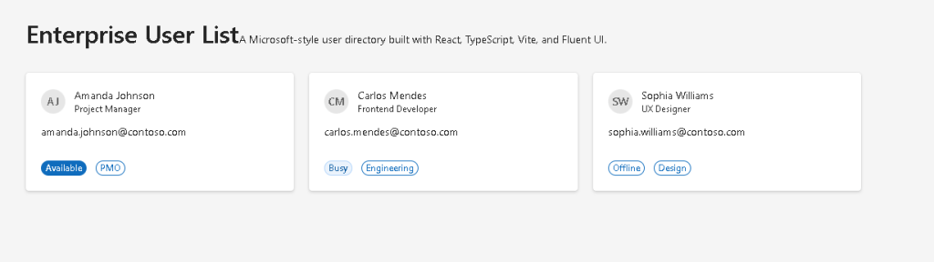
import type { EnterpriseUser } from "../models/EnterpriseUser";export const users: EnterpriseUser[] = [ { id: 1, name: "Amanda Johnson", role: "Project Manager", department: "PMO", email: "amanda.johnson@contoso.com", status: "Available", }, { id: 2, name: "Carlos Mendes", role: "Frontend Developer", department: "Engineering", email: "carlos.mendes@contoso.com", status: "Busy", }, { id: 3, name: "Sophia Williams", role: "UX Designer", department: "Design", email: "sophia.williams@contoso.com", status: "Offline", },];
8. Why Data Files Matter
This file introduces one of the most important React ideas:
The UI should be generated from data.
The application does NOT manually create:
- User 1 card
- User 2 card
- User 3 card
Instead:
- data exists
- React renders UI from the data
This is declarative rendering.
9. Create the User Card Component
src\components\UserCard.tsx
import { Avatar, Badge, Body1, Card, CardHeader, Caption1, Text,} from "@fluentui/react-components";import type { EnterpriseUser } from "../models/EnterpriseUser";interface UserCardProps { user: EnterpriseUser;}function getBadgeAppearance( status: EnterpriseUser["status"]) { if (status === "Available") { return "filled" as const; } if (status === "Busy") { return "tint" as const; } return "outline" as const;}export function UserCard({ user,}: UserCardProps) { return ( <Card style={{ padding: "20px", width: "100%", }} > <CardHeader image={<Avatar name={user.name} />} header={<Body1>{user.name}</Body1>} description={<Caption1>{user.role}</Caption1>} /> <Text>{user.email}</Text> <div style={{ display: "flex", gap: "12px", marginTop: "16px", alignItems: "center", flexWrap: "wrap", }} > <Badge appearance={getBadgeAppearance(user.status)}> {user.status} </Badge> <Badge appearance="outline"> {user.department} </Badge> </div> </Card> );}
10. Understanding React Component Props
This component receives:
interface UserCardProps { user: EnterpriseUser;}
This means the component expects:
- one prop
- named
user - following the
EnterpriseUserinterface
This is critical because React components should be reusable.
Instead of hardcoding user data, the component becomes configurable.
11. Understanding Fluent UI Avatar
The line:
<Avatar name={user.name} />
creates a Microsoft-style user avatar.
Fluent UI automatically:
- generates initials
- applies enterprise styling
- handles accessibility
- handles alignment
- handles typography
Without Fluent UI, this would require much more manual implementation.
Official documentation:
12. Understanding Badge Appearance
The function:
function getBadgeAppearance(...)
maps user status into visual styles.
Conceptually:
| Status | Appearance |
|---|---|
| Available | Filled |
| Busy | Tint |
| Offline | Outline |
This is a common enterprise UI pattern:
- visual metadata
- quick status recognition
- color-based information hierarchy
13. Understanding as const
This syntax:
return "filled" as const;
tells TypeScript:
This exact literal value should be preserved.
Without it, TypeScript might widen the type to generic string.
This is a subtle but important TypeScript detail.
14. Create the User List Component
src\components\UserList.tsx
import { users } from "../data/users";import { UserCard } from "./UserCard";export function UserList() { return ( <div style={{ display: "grid", gridTemplateColumns: "repeat(auto-fit, minmax(280px, 1fr))", gap: "20px", marginTop: "32px", }} > {users.map((user) => ( <UserCard key={user.id} user={user} /> ))} </div> );}
15. Understanding React map()
This is one of the most important React concepts:
users.map((user) => ...)
React takes the array:
User 1User 2User 3
and transforms it into:
UserCard 1UserCard 2UserCard 3
This is declarative rendering.
You describe:
- what should exist
React handles:
- DOM creation
- rendering
- updates
16. Why key={user.id} Matters
Every React list needs stable keys.
key={user.id}
helps React:
- track elements
- optimize rendering
- update efficiently
Without keys:
- React shows warnings
- rendering becomes less predictable
Keys are fundamental in dynamic lists.
Official documentation:
17. Understanding CSS Grid
The layout uses:
display: "grid"
combined with:
gridTemplateColumns: "repeat(auto-fit, minmax(280px, 1fr))"
This creates a responsive enterprise card layout.
Meaning:
| Part | Meaning |
|---|---|
repeat() | Repeat columns automatically |
auto-fit | Fit as many columns as possible |
minmax(280px, 1fr) | Minimum width 280px, flexible growth |
This allows the UI to adapt automatically to screen size.
18. Create App.tsx
src\App.tsx
import { Text, Title1,} from "@fluentui/react-components";import { UserList } from "./components/UserList";function App() { return ( <main style={{ minHeight: "100vh", backgroundColor: "#f5f5f5", padding: "48px", boxSizing: "border-box", }} > <section style={{ maxWidth: "1100px", margin: "0 auto", }} > <Title1> Enterprise User List </Title1> <Text> A Microsoft-style user directory built with React, TypeScript, Vite, and Fluent UI. </Text> <UserList /> </section> </main> );}export default App;
19. Understanding Component Composition
The hierarchy is:
App UserList UserCard
This is React composition.
Each component has one responsibility:
| Component | Responsibility |
|---|---|
App | Page layout |
UserList | Render collection |
UserCard | Render one user |
This separation is extremely important in enterprise applications.
20. Create main.tsx
src\main.tsx
import React from "react";import ReactDOM from "react-dom/client";import { FluentProvider, webLightTheme,} from "@fluentui/react-components";import App from "./App";import "./index.css";ReactDOM.createRoot( document.getElementById("root")!).render( <React.StrictMode> <FluentProvider theme={webLightTheme}> <App /> </FluentProvider> </React.StrictMode>);
21. Why FluentProvider Matters
<FluentProvider theme={webLightTheme}>
activates:
- Microsoft typography
- spacing system
- Fluent UI theme tokens
- accessibility behavior
- enterprise visual consistency
Without it, Fluent UI components lose their styling system.
22. Create index.css
src\index.css
body { margin: 0; font-family: "Segoe UI", Arial, sans-serif;}* { box-sizing: border-box;}
This removes browser default spacing and applies Microsoft-style typography.
23. Run the Application
Development
npm run dev
Production validation
npm run build
Production preview
npm run preview
24. Complete Rendering Flow
main.tsx renders AppApp renders UserListUserList maps users arrayReact creates UserCard componentsUserCard renders Avatar, Badge, and enterprise layoutBrowser displays Microsoft-style user directory
25. Why This App Matters
This app introduces one of the most important enterprise frontend patterns:
Structured data→ reusable card component→ dynamic rendering→ responsive layout→ enterprise UI
This same architecture later evolves into:
- admin panels
- CRM systems
- SharePoint-style directories
- Microsoft 365 dashboards
- ticket systems
- analytics portals
- approval workflows
26. Technical Summary
| Concept | Explanation |
|---|---|
| TypeScript interface | Strongly typed user model |
| React props | Component configuration |
map() rendering | Dynamic UI generation |
| Fluent UI Avatar | Enterprise user identity |
| Fluent UI Badge | Status metadata |
| CSS Grid | Responsive layout |
| Component composition | Scalable architecture |
| Pure components | Predictable rendering |
| Declarative UI | UI derived from data |
| FluentProvider | Microsoft design system |
27. Concept Table
| Concept | File | Purpose |
|---|---|---|
| User model | EnterpriseUser.ts | Defines data structure |
| Static data | users.ts | Provides user collection |
| Reusable card | UserCard.tsx | Displays one user |
| Dynamic rendering | UserList.tsx | Renders all users |
| Layout | App.tsx | Creates page structure |
| FluentProvider | main.tsx | Activates Fluent UI theme |
| Global CSS | index.css | Removes default browser spacing |
28. Official Documentation
React
- React Learn
- Your First Component
- Passing Props to a Component
- Rendering Lists
- Keeping Components Pure
Fluent UI
Tooling
29. Final Architectural Insight
This app may appear visually simple, but architecturally it introduces the foundation of enterprise directory systems:
Typed data→ reusable components→ dynamic rendering→ responsive layout→ enterprise UI composition
The most important React lesson is:
The UI is not manually created.The UI is rendered from data.
That mental model is the foundation of modern React architecture.
Current Project Progress
| Block | App | Name | Status |
|---|---|---|---|
| Block 1 | 01 | Hello React Fluent | Completed |
| Block 1 | 02 | Profile Card | Completed |
| Block 1 | 03 | Product List | Completed |
| Block 1 | 04 | Microsoft Style User Card | Completed |
| Block 1 | 05 | Static Dashboard | Completed |
| Block 1 | 06 | Corporate Sidebar Menu | Completed |
| Block 1 | 07 | Visual Task List | Completed |
| Block 1 | 08 | Timeline Events | Completed |
| Block 1 | 09 | Employee Table | Completed |
| Block 1 | 10 | Email List | Completed |
| Block 1 | 11 | Grid of Cards | Completed |
| Block 1 | 12 | Image Gallery | Completed |
| Block 1 | 13 | Movie Catalog | Completed |
| Block 1 | 14 | Football Teams | Completed |
| Block 1 | 15 | News Page | Completed |
| Block 1 | 16 | Financial Dashboard | Completed |
| Block 1 | 17 | SharePoint Style Layout | Completed |
| Block 1 | 18 | File Explorer | Completed |
| Block 1 | 19 | Corporate Portal | Completed |
| Block 1 | 20 | Microsoft Style Landing Page | Completed |
| Block 2 | 21 | Modern Counter | Completed |
| Block 2 | 22 | Toggle Theme | Completed |
| Block 2 | 23 | React Calculator | Completed |
| Block 2 | 24 | Login Form | Completed |
| Block 2 | 25 | User Registration | Completed |
| Block 2 | 26 | Complete ToDo List | Completed |
| Block 2 | 27 | Shopping List | Completed |
| Block 2 | 28 | Product Filter | Completed |
| Block 2 | 29 | Employee Search | Completed |
| Block 2 | 30 | Shopping Cart | Completed |
| Block 2 | 31 | Grade Simulator | Completed |
| Block 2 | 32 | Inventory Control | Completed |
| Block 2 | 33 | Contact Agenda | Completed |
| Block 2 | 34 | Currency Converter | Completed |
| Block 2 | 35 | BMI Calculator | Completed |
| Block 2 | 36 | Installment Simulator | Completed |
| Block 2 | 37 | Voting Panel | Completed |
| Block 2 | 38 | Interactive Quiz | Completed |
| Block 2 | 39 | Team Manager | Completed |
| Block 2 | 40 | Dynamic Dashboard | Completed |
| Block 3 | 41 | Microsoft Style Login | Completed |
| Block 3 | 42 | Corporate Form | Completed |
| Block 3 | 43 | Tabs Navigation | Completed |
| Block 3 | 44 | Dialog Manager | Completed |
| Block 3 | 45 | Executive Dashboard | Completed |
| Block 3 | 46 | DataGrid Catalog | Completed |
| Block 3 | 47 | Enterprise User List | Current |
| Block 3 | 48 | Navigable Sidebar | Next |
 edvaldo b. guimarães filho