Technical Blog Article — App 48: Navigable Sidebar with React, TypeScript, Fluent UI, and Vite
Introduction
In modern enterprise applications, navigation is one of the most important architectural elements. Before users interact with dashboards, reports, CRM systems, SharePoint portals, ticket systems, analytics pages, or administrative panels, they first interact with navigation.
This is why sidebar layouts are extremely common in professional React applications.
In App 48 — Navigable Sidebar, we build a Microsoft-style enterprise navigation system using:
- React
- TypeScript
- Vite
- Fluent UI
- React state
- component composition
- declarative rendering
This application belongs to Block 3 — Fluent UI Professional Applications, where the focus evolves from simple UI rendering into enterprise layout architecture and Microsoft-style component systems.
The app introduces:
- dynamic navigation rendering
- controlled selection state
- enterprise sidebar layouts
- Fluent UI navigation buttons
- TypeScript-driven UI architecture
- state-driven content rendering
- reusable layout composition
Most importantly, this app reinforces one of the most important React concepts:
UI is derived from state.
The selected menu item exists in React state, and the visible content automatically changes according to that state.
1. What This App Teaches
This app introduces several critical React architecture concepts.
| Concept | Purpose |
|---|---|
useState | Stores the selected navigation item |
map() rendering | Converts data into navigation buttons |
| TypeScript interfaces | Defines predictable navigation structure |
| Component composition | Splits layout into focused components |
| Fluent UI Buttons | Creates enterprise navigation UI |
| Conditional appearance | Highlights active navigation item |
| Derived UI | Content changes according to state |
| Flexbox layout | Creates sidebar + content layout |
The central mental model is:
Navigation selection→ React state changes→ React re-renders→ UI updates automatically
This is declarative rendering.
2. Create the Project
PowerShell commands:
cd C:\ReactAppsNew-Item bloco03 -ItemType Directorycd bloco03npm create vite@latest app48-navigable-sidebar -- --template react-tscd app48-navigable-sidebarnpm installnpm install @fluentui/react-components @fluentui/react-icons
Create folders:
New-Item src\components -ItemType DirectoryNew-Item src\models -ItemType DirectoryNew-Item src\data -ItemType DirectoryNew-Item src\styles -ItemType Directory
Create files:
New-Item src\models\NavigationItem.ts -ItemType FileNew-Item src\data\navigationItems.ts -ItemType FileNew-Item src\components\Sidebar.tsx -ItemType FileNew-Item src\components\PageContent.tsx -ItemType FileNew-Item artigo.md -ItemType File
3. Final Folder Structure
app48-navigable-sidebar/ src/ components/ Sidebar.tsx PageContent.tsx data/ navigationItems.ts models/ NavigationItem.ts styles/ App.tsx main.tsx index.css artigo.md package.json vite.config.ts
This structure is important because enterprise React applications must separate responsibilities clearly.
| File | Responsibility |
|---|---|
NavigationItem.ts | Defines navigation data structure |
navigationItems.ts | Stores navigation data |
Sidebar.tsx | Renders navigation menu |
PageContent.tsx | Renders current selected page |
App.tsx | Owns navigation state |
main.tsx | Connects React to the browser |
index.css | Global CSS reset |
4. Understanding the Navigation Model
src\models\NavigationItem.ts
export type NavigationIconKey = | "dashboard" | "users" | "documents" | "analytics" | "settings";export interface NavigationItem { id: string; label: string; description: string; iconKey: NavigationIconKey;}
This file defines the structure of each navigation item.
Each item contains:
| Property | Purpose |
|---|---|
id | Unique identifier |
label | Navigation button text |
description | Main content description |
iconKey | Determines which icon to render |
This is important because enterprise React applications should avoid unstructured objects.
TypeScript guarantees:
- predictable architecture
- safer refactoring
- autocomplete
- compile-time validation
5. Why navigationItems.ts Uses .ts Instead of .tsx
One extremely important correction in this app is:
navigationItems.ts
instead of:
navigationItems.tsx
Why?
Because this file stores only data.
It does NOT contain JSX.
Correct architecture:
| File Type | Purpose |
|---|---|
.ts | Data, types, interfaces |
.tsx | React components with JSX |
This is critical in React + TypeScript projects.
6. Understanding Navigation Data
src\data\navigationItems.ts
import type { NavigationItem } from "../models/NavigationItem";
The file exports:
export const navigationItems: NavigationItem[]
This creates a typed array.
Example item:
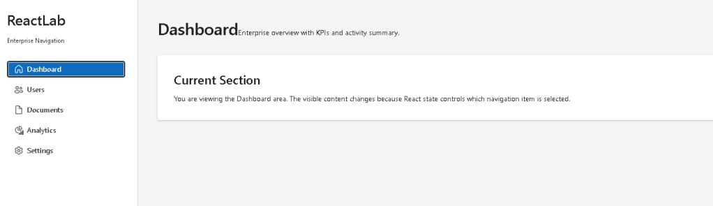
{ id: "dashboard", label: "Dashboard", description: "Enterprise overview with KPIs and activity summary.", iconKey: "dashboard",}
This follows one of the most important React principles:
The UI should be derived from data.
Instead of manually creating navigation buttons one by one, React converts data into UI.
7. Understanding Sidebar.tsx
The sidebar component is responsible for rendering navigation.
Imports:
import { Button, Card, Text, Title2,} from "@fluentui/react-components";
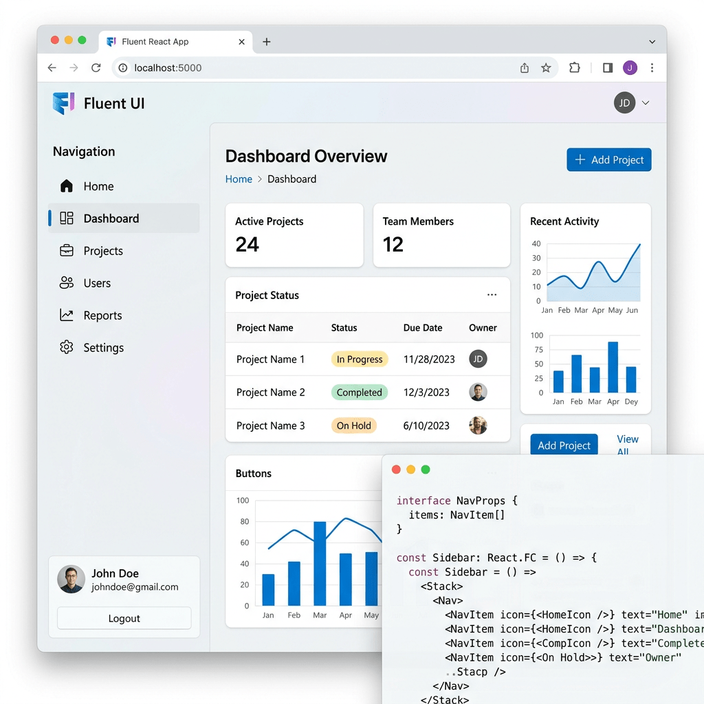
This app uses Fluent UI as the Microsoft enterprise design system.
Fluent UI provides:
- accessibility
- keyboard navigation
- enterprise styling
- typography consistency
- spacing systems
- Microsoft visual identity
Official documentation:
8. Understanding getNavigationIcon
function getNavigationIcon(iconKey: NavigationIconKey)
This function converts a string into a React icon component.
Example:
case "dashboard": return <Home24Regular />;
This is extremely important architecturally.
Instead of storing JSX inside the data file:
icon: <Home24Regular />
we store only:
iconKey: "dashboard"
Then the React component decides how to render it.
This keeps:
- data clean
- rendering logic centralized
- architecture more maintainable
9. Why JSX Must Stay Inside .tsx
One of the biggest lessons from this app is:
JSX belongs in .tsx files.
This is JSX:
<Home24Regular />
JSX is React syntax.
Therefore it must exist only inside:
- React components
.tsxfiles
This separation improves:
- readability
- architecture
- maintainability
10. Understanding the Sidebar Layout
The sidebar uses:
<Card>
as the main navigation container.
Styles:
width: "280px",minHeight: "100vh",display: "flex",flexDirection: "column",gap: "16px",
This creates the classic enterprise layout:
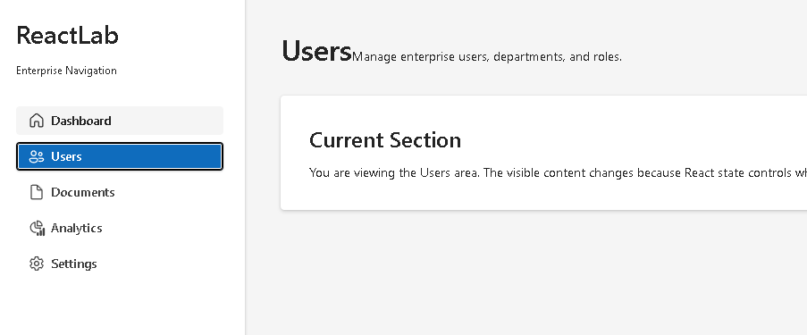
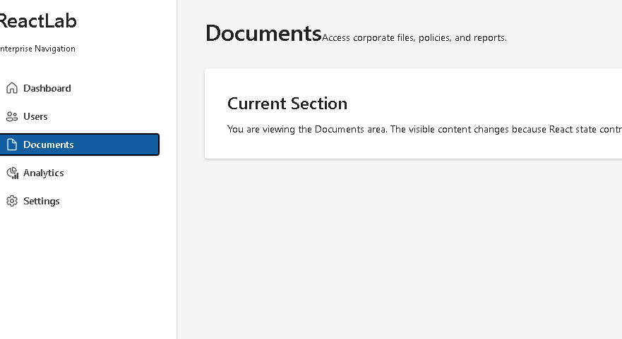
-----------------------------------| ReactLab || Enterprise Navigation || || Dashboard || Users || Documents || Analytics || Settings |-----------------------------------
11. Understanding map() Rendering
The navigation buttons are generated dynamically:
{items.map((item) => (
This is one of the most important React patterns.
React converts:
navigationItems[]
into:
<Button /><Button /><Button />
Conceptually:
data→ React rendering→ UI
Instead of manually creating every button, the UI derives from data.
Official documentation:
12. Why key={item.id} Matters
key={item.id}
React requires stable keys for lists.
Keys help React:
- identify elements
- update efficiently
- preserve correct rendering
Without keys:
- React shows warnings
- updates become less predictable
Keys are critical in enterprise rendering systems.
13. Understanding Navigation State
Inside App.tsx:
const [selectedId, setSelectedId] = useState("dashboard");
This is the heart of the application.
The selected menu item is stored in React state.
This means:
- React remembers the selected section
- the UI updates automatically
- rendering becomes predictable
Official documentation:
14. Understanding the Navigation Flow
The rendering flow is:
User clicks sidebar button→ onClick fires→ setSelectedId updates state→ React re-renders App→ selectedItem changes→ PageContent receives new props→ visible content updates
This is React’s declarative model.
We do NOT manually manipulate the DOM.
15. Understanding Derived Data
Inside App.tsx:
const selectedItem = navigationItems.find( (item) => item.id === selectedId ) ?? navigationItems[0];
This is derived data.
React calculates:
- which item matches the selected ID
Notice something important:
selectedItem is NOT stored in state.
It is derived from:
selectedIdnavigationItems
This follows official React guidance:
Avoid redundant state.
Official documentation:
16. Understanding Conditional Appearance
The sidebar highlights the selected item:
appearance={ selectedId === item.id ? "primary" : "subtle"}
This means:
- selected button = primary appearance
- unselected buttons = subtle appearance
This is conditional rendering.
The UI changes according to state.
17. Understanding PageContent.tsx
This component displays the selected section.
Props:
interface PageContentProps { selectedItem: NavigationItem;}
This means:
- the parent decides what page is active
PageContentsimply renders it
This is component composition.
React applications scale by passing data through props.
Official documentation:
18. Understanding the Main Layout
App.tsx uses:
display: "flex"
This creates the enterprise structure:
-----------------------------------------| Sidebar | Main Content || | || | |-----------------------------------------
The sidebar has fixed width:
width: "280px"
The content area uses:
flex: 1
meaning:
Take all remaining available space.
This is classic enterprise dashboard architecture.
19. Understanding main.tsx
The React entry point:
ReactDOM.createRoot( document.getElementById("root")!)
connects React to:
<div id="root"></div>
inside index.html.
Then:
<FluentProvider theme={webLightTheme}>
activates the Microsoft Fluent UI design system globally.
This provides:
- typography
- colors
- spacing
- accessibility
- enterprise visual consistency
20. Why There Is No useEffect
This app intentionally does NOT use useEffect.
Why?
Because:
- no API exists
- no timer exists
- no external synchronization exists
The UI is fully driven by local state.
Therefore:
useState is sufficient.
This follows React guidance:
You Might Not Need an Effect
Official documentation:
21. Running the Application
Development server:
npm run dev
Production validation:
npm run build
Production preview:
npm run preview
22. Complete Rendering Flow
main.tsx renders AppApp stores selectedId stateSidebar receives selectedId and setSelectedIdUser clicks a button setSelectedId updates stateReact re-rendersPageContent receives selectedItemUI updates automatically
This is the React mental model.
Technical Summary
| Concept | Explanation |
|---|---|
useState | Stores selected navigation item |
map() | Converts data into navigation buttons |
| Derived data | selectedItem calculated from state |
| Fluent UI Button | Enterprise navigation component |
| Flexbox | Sidebar + content layout |
| TypeScript interface | Predictable navigation structure |
.ts | Data/types only |
.tsx | JSX/React components |
| Conditional rendering | Active menu highlighting |
| Props | Send selected item into PageContent |
Concept Table
| Concept | File | Purpose |
|---|---|---|
| Navigation model | NavigationItem.ts | Defines navigation structure |
| Navigation data | navigationItems.ts | Stores sidebar items |
| Sidebar rendering | Sidebar.tsx | Renders menu buttons |
| Main content | PageContent.tsx | Shows selected section |
| State ownership | App.tsx | Controls selected navigation |
| React root | main.tsx | Connects React to HTML |
| Global CSS | index.css | Removes default browser margin |
Official Documentation
| Topic | Documentation |
|---|---|
| React Learn | https://react.dev/learn |
| Rendering Lists | https://react.dev/learn/rendering-lists |
| State: A Component’s Memory | https://react.dev/learn/state-a-components-memory |
| Passing Props to a Component | https://react.dev/learn/passing-props-to-a-component |
| Choosing the State Structure | https://react.dev/learn/choosing-the-state-structure |
| You Might Not Need an Effect | https://react.dev/learn/you-might-not-need-an-effect |
| Fluent UI React Components | https://developer.microsoft.com/en-us/fluentui#/controls/web |
| Fluent UI Button | https://developer.microsoft.com/en-us/fluentui#/controls/web/button |
| Vite Guide | https://vite.dev/guide/ |
| TypeScript Docs | https://www.typescriptlang.org/docs/ |
Final Architectural Insight
This app may appear visually simple, but architecturally it introduces one of the most common enterprise React patterns:
Sidebar Navigation→ Selected State→ Derived Content→ Enterprise Layout
This exact structure later evolves into:
- admin dashboards
- CRM systems
- SharePoint portals
- ERP systems
- analytics platforms
- Microsoft-style enterprise applications
Because in React:
Navigation is state.UI derives from state.React renders the result.
Current Project Progress
| Block | App | Name | Status |
|---|---|---|---|
| Block 3 | 41 | Microsoft Style Login | Completed |
| Block 3 | 42 | Corporate Form | Completed |
| Block 3 | 43 | Tabs Navigation | Completed |
| Block 3 | 44 | Dialog Manager | Completed |
| Block 3 | 45 | Executive Dashboard | Completed |
| Block 3 | 46 | DataGrid Catalog | Completed |
| Block 3 | 47 | Enterprise User List | Completed |
| Block 3 | 48 | Navigable Sidebar | Current |
| Block 3 | 49 | Corporate Header | Next |
 edvaldo b. guimarães filho