Technical Blog Article — App 49: Corporate Header with React, TypeScript, Vite, and Fluent UI
Introduction
In modern enterprise systems, one of the most important interface structures is the corporate header. Before users interact with dashboards, DataGrids, forms, reports, analytics, tickets, or SharePoint-style layouts, they almost always interact with a top navigation structure that organizes the application.
This type of UI appears everywhere inside the Microsoft ecosystem:
- Microsoft 365
- SharePoint
- Teams
- Azure Portal
- Power BI
- Power Platform
- Dynamics 365
- Admin Centers
In App 49 — Corporate Header, we officially continue the transition from “simple React applications” into true enterprise interface architecture. This app belongs to Block 3 — Professional Fluent UI Applications, where the main focus is learning how Microsoft-style enterprise interfaces are composed using:
- React
- TypeScript
- Fluent UI
- Vite
- component composition
- declarative rendering
- design systems
- enterprise layout organization
The goal of this application is much larger than creating a horizontal bar with buttons. Architecturally, this app teaches:
- enterprise UI composition
- top navigation systems
- reusable command structures
- data-driven rendering
- Fluent UI Toolbar patterns
- React component hierarchy
- responsive layout architecture
- Microsoft design system integration
This app reinforces one of the most important React mental models:
The UI is not manually built.The UI is derived from components and data.
Instead of imperatively manipulating HTML, React applications describe:
- what the interface should contain
- how components are composed
- how data maps into UI
React then handles rendering automatically.
This application follows the architecture philosophy defined in the ReactLab roadmap.
1. Why Enterprise Headers Matter
A professional enterprise header is responsible for much more than visual decoration.
In real systems, the header centralizes:
- navigation
- branding
- search
- notifications
- user identity
- quick actions
- settings access
- workflow shortcuts
A corporate header acts as the control center of the application.
Typical enterprise structure:
------------------------------------------------------------| Logo | Navigation | Search | Notifications | User Avatar |------------------------------------------------------------
This is one of the most reused patterns in enterprise UI engineering.
Without proper organization:
- applications become visually confusing
- actions become harder to discover
- UX becomes inconsistent
- layouts become harder to scale
Because of this, Microsoft applications heavily standardize top-level navigation structures.
2. React Mental Model Introduced in This App
This app introduces a very important architectural principle:
Navigation should be data-driven.
Instead of manually repeating buttons:
<ToolbarButton>Dashboard</ToolbarButton><ToolbarButton>Projects</ToolbarButton><ToolbarButton>Teams</ToolbarButton>
we store navigation information inside arrays and let React generate the UI.
This is one of the most important transitions from beginner frontend development into scalable React architecture.
React applications scale through:
- reusable components
- predictable data
- declarative rendering
- composition
not through manually duplicated HTML.
3. Creating the Project
The application starts with Vite and React TypeScript.
Why Vite?
Historically, React projects commonly used Create React App. Modern React development now heavily prefers Vite because Vite provides:
- faster startup
- instant Hot Module Replacement
- modern ES Module architecture
- faster builds
- simpler configuration
- better developer experience
Official documentation:
Create the Project
mkdir bloco03cd bloco03npm create vite@latest app49-corporate-header -- --template react-tscd app49-corporate-headernpm install
4. Installing Fluent UI
Install Fluent UI packages:
npm install @fluentui/react-components @fluentui/react-icons
These packages provide:
- Microsoft design system components
- enterprise icons
- typography
- accessibility
- theming
- layout primitives
Official documentation:
5. Creating the Folder Structure
Create folders:
New-Item src\components -ItemType DirectoryNew-Item src\models -ItemType DirectoryNew-Item src\data -ItemType DirectoryNew-Item src\styles -ItemType Directory
Create files:
New-Item src\models\HeaderAction.ts -ItemType FileNew-Item src\data\headerActions.ts -ItemType FileNew-Item src\components\CorporateHeader.tsx -ItemType FileNew-Item src\components\DashboardBody.tsx -ItemType FileNew-Item artigo.md -ItemType File
6. Final Project Structure
app49-corporate-header/ src/ components/ CorporateHeader.tsx DashboardBody.tsx models/ HeaderAction.ts data/ headerActions.ts styles/ App.tsx main.tsx index.css
This organization matters because enterprise React applications must separate responsibilities.
| Folder | Responsibility |
|---|---|
components | Reusable UI components |
models | TypeScript data structures |
data | Static or mock data |
styles | CSS organization |
App.tsx | Main composition |
main.tsx | React entry point |
7. Understanding the Model Layer
HeaderAction.ts
export interface HeaderAction { id: number; label: string;}
This file defines the shape of each navigation action.
Why is this important?
Because enterprise applications require predictable structures.
Without TypeScript:
data becomes inconsistentrefactoring becomes dangerouscomponents become harder to scale
With TypeScript:
every action has the same structure
This improves:
- maintainability
- scalability
- autocomplete
- architectural clarity
8. Understanding Data-Driven UI
headerActions.ts
export const headerActions: HeaderAction[] = [ { id: 1, label: "Dashboard", }, { id: 2, label: "Projects", }, { id: 3, label: "Teams", },];
This file introduces a critical React concept:
The UI should be generated from data.
Instead of manually creating buttons, we create structured data.
React transforms this data into UI through rendering.
9. Understanding Declarative Rendering
Inside CorporateHeader.tsx:
{headerActions.map((action) => ( <ToolbarButton key={action.id}> {action.label} </ToolbarButton>))}
This is declarative rendering.
You are not telling React:
- create button
- append button
- update DOM manually
Instead, you describe:
For each action, render a ToolbarButton.
React handles:
- DOM creation
- updates
- rendering optimization
This is the core React rendering model.
Official documentation:
10. Why map() Matters in React
map() transforms arrays.
Conceptually:
data item→ JSX→ rendered component
Example:
DashboardProjectsTeams
becomes:
ToolbarButtonToolbarButtonToolbarButton
This is one of the foundations of scalable React UI architecture.
11. Why key Matters
key={action.id}
React requires stable keys for lists.
Keys help React:
- identify elements
- optimize rendering
- correctly update the DOM
Without keys:
- warnings appear
- updates become less predictable
This becomes extremely important later in:
- DataGrid
- dashboards
- dynamic lists
- APIs
- filtering
- sorting
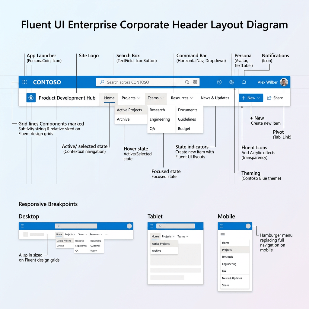
12. Understanding the Corporate Header Layout
The header layout uses Flexbox.
display: "flex"justifyContent: "space-between"alignItems: "center"
This creates:
Left section ↔Right section
The result:
--------------------------------------------------| Branding + Toolbar | Search + Avatar + Alerts |--------------------------------------------------
This is a classic Microsoft enterprise layout pattern.
13. Why Flexbox Is Important
Flexbox solves one of the hardest problems in UI engineering:
How do we align elements consistently?
Flexbox provides:
- horizontal alignment
- vertical alignment
- spacing distribution
- responsive behavior
Without Flexbox:
- layouts become harder to maintain
- responsive behavior becomes more difficult
Official documentation:
14. Understanding Fluent UI Toolbar
The application uses:
<Toolbar><ToolbarButton>
Fluent UI automatically provides:
- spacing
- hover states
- accessibility
- keyboard navigation
- Microsoft styling
- focus behavior
This is one of the major benefits of enterprise design systems.
Without Fluent UI, developers would need to manually implement:
- styling
- focus management
- accessibility behavior
- interaction consistency
15. Understanding Fluent UI Icons
The app imports:
Home24RegularDocument24RegularPeople24Regular
Fluent UI icons are:
- SVG-based
- scalable
- theme-aware
- optimized
- visually consistent
These icons follow Microsoft design guidelines.
Official documentation:
16. Understanding the Search Input
<Input contentBefore={<Search24Regular />} placeholder="Search"/>
This demonstrates Fluent UI slot composition.
The icon is injected directly into the component.
Benefits:
- cleaner code
- better alignment
- less CSS complexity
- reusable structure
17. Understanding Fluent UI Avatar
<Avatar name="Edvaldo Guimaraes" badge={{ status: "available" }}/>
The Avatar component represents the current user.
Features:
- initials generation
- presence indicators
- Microsoft-style identity rendering
The badge:
status: "available"
shows online presence.
This pattern appears heavily in:
- Teams
- Outlook
- Microsoft 365
Official documentation:
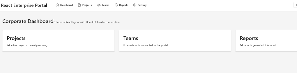
18. Understanding DashboardBody.tsx
The body component separates:
- navigation
- content
This is important because enterprise apps must separate:
- shell/layout
- business content
Architecture:
App Header Content
Later this evolves into:
App Header Sidebar Routes Dashboard Settings Reports
19. Understanding CSS Grid
The dashboard uses:
gridTemplateColumns: "repeat(auto-fit, minmax(260px, 1fr))"
Meaning:
Create responsive columns.Minimum width = 260px.Expand equally when possible.
This creates responsive enterprise cards automatically.
Official documentation:
20. Understanding App.tsx
<> <CorporateHeader /> <DashboardBody /></>
This demonstrates composition.
React applications scale by combining small components together.
This is one of the most important React principles.
Official documentation:
21. Understanding main.tsx
main.tsx connects React to the browser.
ReactDOM.createRoot( document.getElementById("root")!)
This line:
- finds the HTML root
- initializes React rendering
Then:
<FluentProvider theme={webLightTheme}>
activates:
- Microsoft theming
- Fluent UI design tokens
- typography
- spacing
- accessibility
22. Why There Is No State Yet
This app intentionally avoids:
useStateuseEffect- APIs
Why?
Because this app focuses on:
- composition
- rendering
- layout architecture
- design systems
According to React philosophy:
Do not add state until you actually need state.
This keeps the architecture simpler and cleaner.
Official documentation:
23. Running the Application
Development server:
npm run dev
Production validation:
npm run build
Production preview:
npm run preview
24. Complete Rendering Flow
Browser loads index.html→ main.tsx executes→ React mounts App→ App renders Header + Dashboard→ Header renders Toolbar→ Toolbar renders actions from data→ Fluent UI styles the components→ Browser displays enterprise layout
This is the React rendering pipeline.
25. Technical Summary
| Technology | Purpose |
|---|---|
| React | Declarative UI rendering |
| TypeScript | Strong typing |
| Vite | Development tooling |
| Fluent UI | Microsoft design system |
| Toolbar | Enterprise navigation |
| Avatar | User identity |
| Input | Search interface |
| CSS Grid | Responsive cards |
| Flexbox | Layout alignment |
| map() | Data-driven rendering |
26. Concept Table
| Concept | File | Why It Matters |
|---|---|---|
| TypeScript model | HeaderAction.ts | Predictable structure |
| Navigation data | headerActions.ts | Data-driven UI |
| Toolbar rendering | CorporateHeader.tsx | Declarative rendering |
| Avatar | CorporateHeader.tsx | Enterprise identity |
| Search UI | CorporateHeader.tsx | Microsoft layout pattern |
| Grid layout | DashboardBody.tsx | Responsive cards |
| Component composition | App.tsx | Scalable architecture |
| FluentProvider | main.tsx | Global theming |
27. Official Documentation
| Topic | Documentation |
|---|---|
| React Learn | React Learn |
| Describing the UI | Describing the UI |
| Rendering Lists | Rendering Lists |
| Keeping Components Pure | Keeping Components Pure |
| Fluent UI React Components | Fluent UI React Components |
| Fluent UI Toolbar | Fluent UI Toolbar |
| Fluent UI Avatar | Fluent UI Avatar |
| Vite Guide | Vite Guide |
| TypeScript Docs | TypeScript Documentation |
28. Final Architectural Insight
The most important lesson from App 49 is:
Enterprise React applications are composed from reusable layout systems.
The header is not:
- static HTML
- manually manipulated DOM
- duplicated UI
Instead, it is:
- componentized
- declarative
- data-driven
- reusable
- scalable
This architecture prepares the project for:
- routing
- admin centers
- dashboards
- SharePoint-style portals
- Microsoft 365-inspired layouts
- enterprise navigation systems
Because modern React architecture is fundamentally:
Data→ Components→ Rendering→ Enterprise UI
Current Project Progress
| Block | App | Name | Status |
|---|---|---|---|
| Block 1 | 01 | Hello React Fluent | Completed |
| Block 1 | 02 | Profile Card | Completed |
| Block 1 | 03 | Product List | Completed |
| Block 1 | 04 | Microsoft Style User Card | Completed |
| Block 1 | 05 | Static Dashboard | Completed |
| Block 1 | 06 | Corporate Sidebar Menu | Completed |
| Block 1 | 07 | Visual Task List | Completed |
| Block 1 | 08 | Timeline Events | Completed |
| Block 1 | 09 | Employee Table | Completed |
| Block 1 | 10 | Email List | Completed |
| Block 1 | 11 | Grid of Cards | Completed |
| Block 1 | 12 | Image Gallery | Completed |
| Block 1 | 13 | Movie Catalog | Completed |
| Block 1 | 14 | Football Teams | Completed |
| Block 1 | 15 | News Page | Completed |
| Block 1 | 16 | Financial Dashboard | Completed |
| Block 1 | 17 | SharePoint Style Layout | Completed |
| Block 1 | 18 | File Explorer | Completed |
| Block 1 | 19 | Corporate Portal | Completed |
| Block 1 | 20 | Microsoft Style Landing Page | Completed |
| Block 2 | 21 | Modern Counter | Completed |
| Block 2 | 22 | Toggle Theme | Completed |
| Block 2 | 23 | React Calculator | Completed |
| Block 2 | 24 | Login Form | Completed |
| Block 2 | 25 | User Registration | Completed |
| Block 2 | 26 | Complete ToDo List | Completed |
| Block 2 | 27 | Shopping List | Completed |
| Block 2 | 28 | Product Filter | Completed |
| Block 2 | 29 | Employee Search | Completed |
| Block 2 | 30 | Shopping Cart | Completed |
| Block 2 | 31 | Grade Simulator | Completed |
| Block 2 | 32 | Inventory Control | Completed |
| Block 2 | 33 | Contact Agenda | Completed |
| Block 2 | 34 | Currency Converter | Completed |
| Block 2 | 35 | BMI Calculator | Completed |
| Block 2 | 36 | Installment Simulator | Completed |
| Block 2 | 37 | Voting Panel | Completed |
| Block 2 | 38 | Interactive Quiz | Completed |
| Block 2 | 39 | Team Manager | Completed |
| Block 2 | 40 | Dynamic Dashboard | Completed |
| Block 3 | 41 | Microsoft Style Login | Completed |
| Block 3 | 42 | Corporate Form | Completed |
| Block 3 | 43 | Tabs Navigation | Completed |
| Block 3 | 44 | Dialog Manager | Completed |
| Block 3 | 45 | Executive Dashboard | Completed |
| Block 3 | 46 | DataGrid Catalog | Completed |
| Block 3 | 47 | Enterprise User List | Completed |
| Block 3 | 48 | Navigable Sidebar | Completed |
| Block 3 | 49 | Corporate Header | Current |
| Block 3 | 50 | Professional Toolbar | Next |
 edvaldo b. guimarães filho