
Technical Blog Article — App 50: Professional Toolbar with React, Fluent UI, TypeScript, and Vite
Introduction
In modern enterprise applications, one of the most important interface patterns is the toolbar. Toolbars organize commands, actions, workflows, navigation shortcuts, and contextual operations into a centralized command surface. Systems such as Microsoft 365 Admin Center, SharePoint portals, CRMs, ERPs, ticket systems, dashboards, and analytics platforms rely heavily on toolbars to create structured user experiences.
App 50 — Professional Toolbar belongs to Block 3 — Professional Fluent UI Applications in the ReactLab roadmap. This stage focuses on building Microsoft-style enterprise interfaces using:
- React
- TypeScript
- Vite
- Fluent UI
- component architecture
- declarative rendering
- enterprise composition patterns
According to the project roadmap, App 50 focuses specifically on:
- Toolbar systems
- Enterprise actions
- Fluent UI command components
- Action organization
- Reusable UI architecture
- Professional layouts
This application introduces a very important React architectural principle:
UI commands should be driven by data.
Instead of manually hardcoding buttons across the interface, the application defines structured action data and React renders the toolbar declaratively.
The application also reinforces the official React philosophy:
- components are reusable functions
- the UI is derived from data
- rendering is declarative
- React manages the DOM updates
Official references:
1. Creating the Project
The project starts with Vite using the React TypeScript template.
Vite is one of the fastest modern frontend development systems because it uses:
- native ES Modules
- instant development startup
- fast Hot Module Replacement
- optimized builds
- modern tooling architecture
Create the project:
cd C:\ReactAppsNew-Item bloco03 -ItemType Directorycd bloco03npm create vite@latest app50-professional-toolbar -- --template react-tscd app50-professional-toolbarnpm install
Install Fluent UI:
npm install @fluentui/react-components @fluentui/react-icons
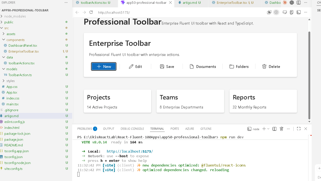
2. Creating the Folder Structure
Enterprise React applications should always separate responsibilities.
Create folders:
New-Item src\components -ItemType DirectoryNew-Item src\data -ItemType DirectoryNew-Item src\models -ItemType DirectoryNew-Item src\styles -ItemType Directory
Create files:
New-Item src\models\ToolbarAction.ts -ItemType FileNew-Item src\data\toolbarActions.ts -ItemType FileNew-Item src\components\EnterpriseToolbar.tsx -ItemType FileNew-Item src\components\DashboardPanel.tsx -ItemType FileNew-Item artigo.md -ItemType File
3. Final Project Structure
app50-professional-toolbar/ src/ components/ EnterpriseToolbar.tsx DashboardPanel.tsx data/ toolbarActions.ts models/ ToolbarAction.ts styles/ App.tsx main.tsx index.css artigo.md package.json vite.config.ts
This structure follows the ReactLab architectural standard.
Each folder has a responsibility:
| Folder | Purpose |
|---|---|
components/ | Reusable UI pieces |
models/ | TypeScript interfaces |
data/ | Static data |
styles/ | Future CSS organization |
4. Understanding the Toolbar Model
src\models\ToolbarAction.ts
import type { JSX } from "react";export interface ToolbarAction { id: number; title: string; icon: JSX.Element; appearance?: "primary" | "subtle" | "transparent";}
This interface defines the shape of each toolbar action.
Each action contains:
- an identifier
- a title
- an icon
- a Fluent UI appearance style
This introduces one of the most important enterprise React concepts:
UI structure should be predictable.
TypeScript guarantees:
- consistent structure
- type safety
- safer refactoring
- architectural clarity
Without TypeScript:
- toolbar actions could become inconsistent
- properties could be missing
- rendering bugs become more common
5. Creating Toolbar Data
src\data\toolbarActions.ts
import { Add24Regular, Delete24Regular, Edit24Regular, Save24Regular, Folder24Regular, Document24Regular,} from "@fluentui/react-icons";import type { ToolbarAction } from "../models/ToolbarAction";export const toolbarActions: ToolbarAction[] = [ { id: 1, title: "New", icon: <Add24Regular />, appearance: "primary", }, { id: 2, title: "Edit", icon: <Edit24Regular />, appearance: "subtle", }, { id: 3, title: "Save", icon: <Save24Regular />, appearance: "subtle", }, { id: 4, title: "Documents", icon: <Document24Regular />, appearance: "transparent", }, { id: 5, title: "Folders", icon: <Folder24Regular />, appearance: "transparent", }, { id: 6, title: "Delete", icon: <Delete24Regular />, appearance: "subtle", },];
Why Data-Driven Rendering Matters
This file represents one of the core React rendering patterns.
Instead of manually writing:
<Button>New</Button><Button>Edit</Button><Button>Save</Button>
we define:
ToolbarAction[]
Then React converts that data into UI.
This makes the application:
- scalable
- reusable
- easier to maintain
- easier to expand
- easier to refactor
This is declarative rendering.
Official documentation:
6. Creating the Enterprise Toolbar
src\components\EnterpriseToolbar.tsx
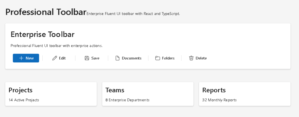
import { Card, Text, Title2, Toolbar, ToolbarButton, ToolbarDivider,} from "@fluentui/react-components";import { toolbarActions } from "../data/toolbarActions";export function EnterpriseToolbar() { return ( <Card style={{ padding: "20px", display: "flex", flexDirection: "column", gap: "16px", }} > <Title2>Enterprise Toolbar</Title2> <Text> Professional Fluent UI toolbar with enterprise actions. </Text> <Toolbar aria-label="Enterprise Toolbar"> {toolbarActions.map((action, index) => ( <div key={action.id} style={{ display: "flex", alignItems: "center", }} > <ToolbarButton appearance={action.appearance} icon={action.icon} > {action.title} </ToolbarButton> {index < toolbarActions.length - 1 && ( <ToolbarDivider /> )} </div> ))} </Toolbar> </Card> );}
Understanding the Toolbar Component
The Fluent UI Toolbar component organizes enterprise actions into a command surface.
Structure:
Toolbar ToolbarButton ToolbarDivider
This creates:
- action organization
- Microsoft visual consistency
- accessibility support
- enterprise spacing
- keyboard navigation behavior
Official documentation:
7. Understanding map()
One of the most important lines is:
toolbarActions.map(...)
React transforms data into UI.
Conceptually:
ToolbarAction[]→ ToolbarButton[]
This is declarative UI composition.
Instead of manually manipulating the DOM, React describes what the interface should look like.
8. Understanding React Keys
key={action.id}
Keys help React:
- identify elements
- update lists efficiently
- preserve rendering consistency
Without stable keys:
- React may render inefficiently
- warnings appear
- UI behavior becomes unpredictable
Official documentation:
9. Understanding Toolbar Appearances
Toolbar buttons use different appearance values.
| Appearance | Purpose |
|---|---|
primary | Main action |
subtle | Secondary action |
transparent | Minimal navigation-style action |
This creates visual hierarchy.
Example:
Newis primaryEditandSaveare secondaryDocumentsandFoldersare lightweight navigation actions
Enterprise UI design heavily depends on:
- hierarchy
- spacing
- visual emphasis
- predictable workflows
10. Creating the Dashboard Panel
src\components\DashboardPanel.tsx
import { Card, Text, Title3,} from "@fluentui/react-components";export function DashboardPanel() { return ( <div style={{ display: "grid", gridTemplateColumns: "repeat(auto-fit, minmax(240px, 1fr))", gap: "20px", marginTop: "24px", }} > <Card> <Title3>Projects</Title3> <Text> 14 Active Projects </Text> </Card> <Card> <Title3>Teams</Title3> <Text> 8 Enterprise Departments </Text> </Card> <Card> <Title3>Reports</Title3> <Text> 32 Monthly Reports </Text> </Card> </div> );}
Understanding CSS Grid
The layout uses:
gridTemplateColumns: "repeat(auto-fit, minmax(240px, 1fr))"
Meaning:
Create responsive columns.Each column must be at least 240px wide.Distribute remaining space evenly.
This pattern is common in:
- dashboards
- analytics portals
- admin systems
- enterprise applications
11. Creating the Root App
src\App.tsx
import { FluentProvider, webLightTheme, Text, Title1,} from "@fluentui/react-components";import { EnterpriseToolbar } from "./components/EnterpriseToolbar";import { DashboardPanel } from "./components/DashboardPanel";function App() { return ( <FluentProvider theme={webLightTheme}> <main style={{ minHeight: "100vh", backgroundColor: "#f5f5f5", padding: "40px", boxSizing: "border-box", }} > <section style={{ maxWidth: "1200px", margin: "0 auto", display: "flex", flexDirection: "column", gap: "24px", }} > <div> <Title1> Professional Toolbar </Title1> <Text> Enterprise Fluent UI toolbar built with React and TypeScript. </Text> </div> <EnterpriseToolbar /> <DashboardPanel /> </section> </main> </FluentProvider> );}export default App;
Understanding Composition
The architecture is:
App EnterpriseToolbar DashboardPanel
This is component composition.
Each component has a focused responsibility.
This keeps the architecture:
- modular
- scalable
- reusable
- maintainable
Official documentation:
12. Creating main.tsx
src\main.tsx
import React from "react";import ReactDOM from "react-dom/client";import App from "./App";import "./index.css";ReactDOM.createRoot( document.getElementById("root")!).render( <React.StrictMode> <App /> </React.StrictMode>);
This file connects React to the browser DOM.
Flow:
index.html→ main.tsx→ App.tsx→ EnterpriseToolbar→ DashboardPanel
13. Creating index.css
src\index.css
body { margin: 0; font-family: "Segoe UI", Arial, sans-serif;}* { box-sizing: border-box;}
This removes browser default spacing and applies Microsoft-style typography.
14. Running the Application
Development server:
npm run dev
Production validation:
npm run build
Production preview:
npm run preview
15. Why This App Matters
Even though the toolbar appears visually simple, architecturally it introduces:
- enterprise action systems
- command organization
- declarative rendering
- data-driven UI
- Fluent UI command patterns
- reusable action architecture
This same pattern scales into:
- SharePoint command bars
- CRM toolbars
- admin panels
- analytics systems
- document management systems
- enterprise dashboards
16. React Mental Model Reinforced
This app reinforces:
Data→ UI description→ React rendering
The toolbar is generated from:
- structured data
- component composition
- declarative rendering
React is not:
- manual DOM manipulation
- imperative UI programming
- jQuery-style updates
React is:
- declarative
- component-based
- state-driven
- predictable
17. Why No useState or useEffect
This app intentionally avoids:
useStateuseEffect
The toolbar is static.
There is:
- no dynamic interaction
- no API
- no external synchronization
This follows official React guidance:
Technical Summary
| Concept | Explanation |
|---|---|
| Toolbar | Enterprise command container |
| ToolbarButton | Microsoft-style action |
| ToolbarDivider | Visual action separation |
map() | Converts data into UI |
| Fluent UI | Microsoft design system |
| TypeScript Interface | Defines toolbar structure |
| JSX | Declarative UI syntax |
| CSS Grid | Responsive dashboard layout |
| Composition | Reusable component architecture |
| React Rendering | UI derived from data |
Concept Table
| Concept | File | Purpose |
|---|---|---|
| Toolbar model | ToolbarAction.ts | Defines action structure |
| Toolbar data | toolbarActions.ts | Stores enterprise actions |
| Enterprise toolbar | EnterpriseToolbar.tsx | Renders Fluent UI toolbar |
| Dashboard cards | DashboardPanel.tsx | Displays enterprise metrics |
| Composition | App.tsx | Combines the application |
| Rendering | main.tsx | Mounts React into HTML |
| Styling | index.css | Global CSS reset |
Official Documentation
| Topic | Documentation |
|---|---|
| React Learn | React Learn |
| Rendering Lists | Rendering Lists |
| Your First Component | Your First Component |
| Fluent UI Toolbar | Fluent UI Toolbar |
| Fluent UI Components | Fluent UI Components |
| Vite Guide | Vite Guide |
| TypeScript Docs | TypeScript Docs |
Current Project Progress
| Block | App | Name | Status |
|---|---|---|---|
| Block 1 | 01 | Hello React Fluent | Completed |
| Block 1 | 02 | Profile Card | Completed |
| Block 1 | 03 | Product List | Completed |
| Block 1 | 04 | Microsoft Style User Card | Completed |
| Block 1 | 05 | Static Dashboard | Completed |
| Block 1 | 06 | Corporate Sidebar Menu | Completed |
| Block 1 | 07 | Visual Task List | Completed |
| Block 1 | 08 | Timeline Events | Completed |
| Block 1 | 09 | Employee Table | Completed |
| Block 1 | 10 | Email List | Completed |
| Block 1 | 11 | Grid of Cards | Completed |
| Block 1 | 12 | Image Gallery | Completed |
| Block 1 | 13 | Movie Catalog | Completed |
| Block 1 | 14 | Football Teams | Completed |
| Block 1 | 15 | News Page | Completed |
| Block 1 | 16 | Financial Dashboard | Completed |
| Block 1 | 17 | SharePoint Style Layout | Completed |
| Block 1 | 18 | File Explorer | Completed |
| Block 1 | 19 | Corporate Portal | Completed |
| Block 1 | 20 | Microsoft Style Landing Page | Completed |
| Block 2 | 21 | Modern Counter | Completed |
| Block 2 | 22 | Toggle Theme | Completed |
| Block 2 | 23 | React Calculator | Completed |
| Block 2 | 24 | Login Form | Completed |
| Block 2 | 25 | User Registration | Completed |
| Block 2 | 26 | Complete ToDo List | Completed |
| Block 2 | 27 | Shopping List | Completed |
| Block 2 | 28 | Product Filter | Completed |
| Block 2 | 29 | Employee Search | Completed |
| Block 2 | 30 | Shopping Cart | Completed |
| Block 2 | 31 | Grade Simulator | Completed |
| Block 2 | 32 | Inventory Control | Completed |
| Block 2 | 33 | Contact Agenda | Completed |
| Block 2 | 34 | Currency Converter | Completed |
| Block 2 | 35 | BMI Calculator | Completed |
| Block 2 | 36 | Installment Simulator | Completed |
| Block 2 | 37 | Voting Panel | Completed |
| Block 2 | 38 | Interactive Quiz | Completed |
| Block 2 | 39 | Team Manager | Completed |
| Block 2 | 40 | Dynamic Dashboard | Completed |
| Block 3 | 41 | Microsoft Style Login | Completed |
| Block 3 | 42 | Corporate Form | Completed |
| Block 3 | 43 | Tabs Navigation | Completed |
| Block 3 | 44 | Dialog Manager | Completed |
| Block 3 | 45 | Executive Dashboard | Completed |
| Block 3 | 46 | DataGrid Catalog | Completed |
| Block 3 | 47 | Enterprise User List | Completed |
| Block 3 | 48 | Navigable Sidebar | Completed |
| Block 3 | 49 | Corporate Header | Completed |
| Block 3 | 50 | Professional Toolbar | Current |
 edvaldo b. guimarães filho