Technical Blog Article — App 51: Enterprise Notification Center with React, TypeScript, Fluent UI, and Vite
Introduction
Modern enterprise systems are heavily driven by notifications. Every corporate platform needs a way to communicate information to users:
- system alerts
- workflow approvals
- deployment updates
- security warnings
- ticket updates
- SharePoint events
- Microsoft Teams activities
- audit messages
- business alerts
- operational status
This is why notification systems are one of the most important UI patterns in enterprise frontend engineering.
In App 51 — Notification Center, we build a Microsoft-style enterprise notification system using:
- React
- TypeScript
- Vite
- Fluent UI
This application belongs to Block 3 — Professional Fluent UI Applications, where the focus evolves from basic React rendering into enterprise UI architecture and Microsoft design patterns.
The goal of this app is not just visual styling. The real objective is understanding how React transforms structured data into reusable enterprise interfaces.
This app introduces:
- data-driven rendering
- reusable card systems
- notification modeling
- conditional rendering
- Fluent UI enterprise components
- visual hierarchy
- Microsoft design system principles
- enterprise composition patterns
The React mental model reinforced here is:
Structured data→ component rendering→ enterprise UI
This is one of the most important ideas in React architecture.
Why Notification Systems Matter
Notification systems appear everywhere in modern enterprise software.
Examples:
- Microsoft 365
- SharePoint Online
- Teams
- Azure Portal
- Admin Centers
- CRM platforms
- ERP systems
- monitoring dashboards
- DevOps systems
- analytics platforms
A notification center is essentially:
- a structured collection of messages
- rendered dynamically
- visually categorized
- prioritized
- reusable
This makes notification systems perfect for learning React composition.
What This App Teaches
| Concept | Explanation |
|---|---|
| Data-driven rendering | UI generated from data |
| Reusable components | Notification cards reused multiple times |
| TypeScript models | Strongly typed enterprise data |
| Conditional rendering | Different visuals for different notification types |
| Fluent UI | Microsoft enterprise UI components |
| Declarative UI | React derives UI from data |
| Component composition | App → List → Card hierarchy |
| List rendering | map() converts arrays into UI |
1. Creating the Project
The project begins using Vite with React TypeScript.
Vite is one of the fastest modern frontend build tools and development servers available today.
Project creation:
mkdir bloco03cd bloco03npm create vite@latest app51-notification-center -- --template react-tscd app51-notification-centernpm installnpm install @fluentui/react-components @fluentui/react-icons
Why Vite Matters
Vite improves development speed significantly because it:
- uses native ES Modules
- provides instant startup
- supports Hot Module Replacement
- compiles TypeScript efficiently
- handles React JSX automatically
Official documentation:
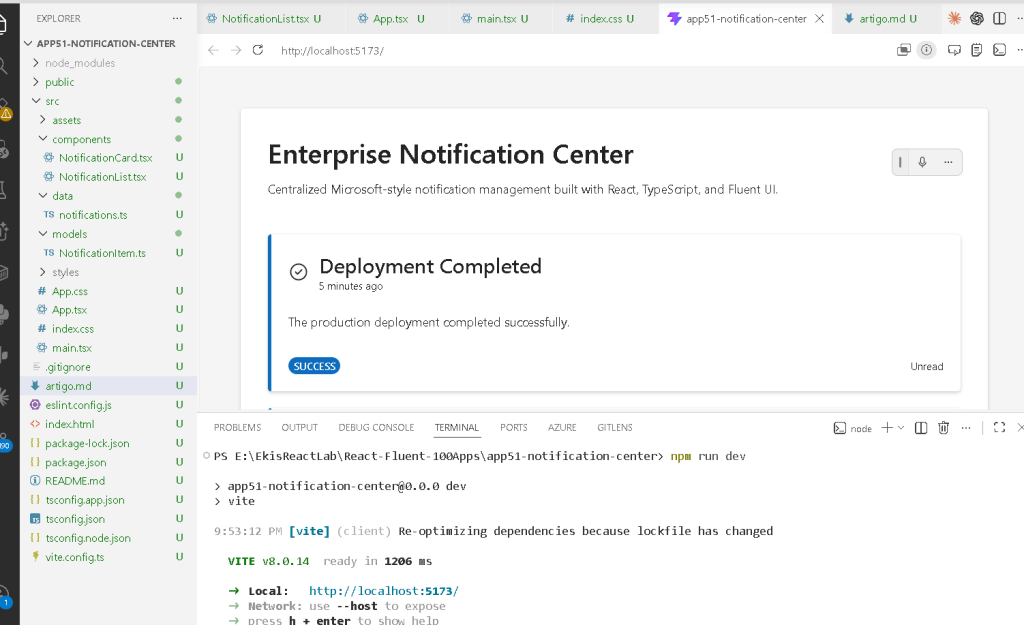
2. Creating the Folder Structure
Professional React applications should always separate responsibilities.
Create folders:
New-Item src\components -ItemType DirectoryNew-Item src\models -ItemType DirectoryNew-Item src\data -ItemType DirectoryNew-Item src\styles -ItemType Directory
Create files:
New-Item src\models\NotificationItem.ts -ItemType FileNew-Item src\data\notifications.ts -ItemType FileNew-Item src\components\NotificationCard.tsx -ItemType FileNew-Item src\components\NotificationList.tsx -ItemType FileNew-Item artigo.md -ItemType File
Final Project Structure
app51-notification-center/ src/ components/ NotificationCard.tsx NotificationList.tsx data/ notifications.ts models/ NotificationItem.ts styles/ App.tsx main.tsx index.css
Each file has one responsibility.
| File | Responsibility |
|---|---|
NotificationItem.ts | Defines the notification structure |
notifications.ts | Provides notification data |
NotificationCard.tsx | Renders one notification |
NotificationList.tsx | Renders all notifications |
App.tsx | Main enterprise layout |
main.tsx | React entry point |
index.css | Global CSS |
This separation becomes critical in enterprise React architecture.
3. Understanding the Notification Model
src\models\NotificationItem.ts
export type NotificationType = | "success" | "warning" | "error" | "info";export interface NotificationItem { id: number; title: string; message: string; type: NotificationType; createdAt: string; read: boolean;}
This file defines the shape of a notification.
The model guarantees every notification has:
- unique identifier
- title
- message
- type
- creation timestamp
- read/unread status
This is extremely important in TypeScript.
Without models:
- data becomes unpredictable
- rendering becomes unsafe
- refactoring becomes difficult
Enterprise React applications should always use typed models.
Why NotificationType Matters
This construction:
type NotificationType = | "success" | "warning" | "error" | "info";
creates a restricted union type.
This means the notification type can ONLY be:
- success
- warning
- error
- info
If you accidentally write:
type: "banana"
TypeScript immediately shows an error.
This is one of the biggest advantages of TypeScript in enterprise systems.
Official documentation:
4. Understanding the Data Layer
src\data\notifications.ts
This file stores static enterprise notification data.
export const notifications: NotificationItem[] = [...]
The important part is:
NotificationItem[]
This means:
- the variable is an array
- every item must follow the
NotificationItemstructure
This guarantees consistency across the application.
Why Static Data First?
This app intentionally uses static data because the focus is:
- rendering
- composition
- UI architecture
NOT:
- APIs
- async behavior
- useEffect
- backend integration
The React Learn philosophy encourages mastering rendering first before introducing external systems.
Official React documentation:
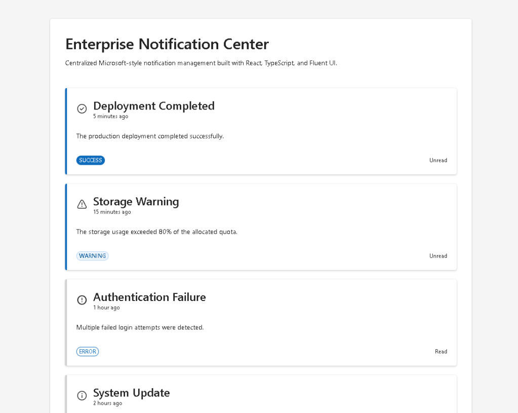
5. Understanding the Notification Card
src\components\NotificationCard.tsx
This component renders one notification.
This is the heart of reusable React architecture.
The component receives props:
interface NotificationCardProps { notification: NotificationItem;}
This means:
- the card is reusable
- the card does not own data
- the parent passes the notification
This is component composition.
Understanding React Props
Props are inputs for components.
Conceptually:
Parent component→ sends data through props→ child component renders UI
This is one of React’s most important ideas.
Official documentation:
6. Understanding Conditional Rendering
The app uses helper functions:
function getNotificationIcon(type)
and:
function getBadgeAppearance(type)
These functions change the UI depending on notification type.
Example:
success → success iconwarning → warning iconerror → error iconinfo → info icon
This is conditional rendering.
React allows the interface to adapt dynamically based on data.
Official documentation:
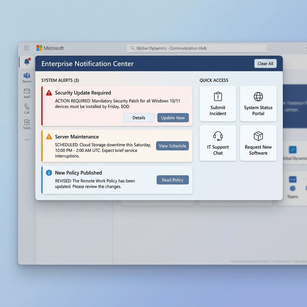
7. Understanding Fluent UI
The app uses:
- Card
- Badge
- Text
- Typography
- Fluent icons
Fluent UI provides:
- Microsoft design consistency
- accessibility
- keyboard navigation
- spacing system
- typography system
- enterprise layout behavior
Official documentation:
Why Card Matters
The Card component acts as the notification container.
It automatically provides:
- spacing
- border behavior
- visual hierarchy
- enterprise styling
Without Fluent UI, all this would require manual CSS.
Why Badge Matters
The Badge visually categorizes the notification.
Example:
- SUCCESS
- WARNING
- ERROR
- INFO
Enterprise applications rely heavily on visual categorization because users need to identify information quickly.
8. Understanding NotificationList.tsx
This component renders the collection of notifications.
The key section is:
notifications.map((notification) => ( <NotificationCard key={notification.id} notification={notification} />))
This is one of the most important React patterns.
Why map() Is Critical in React
map() transforms data into UI.
Conceptually:
notification 1 → NotificationCard 1notification 2 → NotificationCard 2notification 3 → NotificationCard 3
React applications are fundamentally:
- data
- transformed into UI
Official documentation:
Why key={notification.id} Matters
React requires stable keys for list rendering.
The key helps React:
- identify items
- optimize rendering
- update the correct DOM nodes
Without keys:
- React shows warnings
- rendering becomes less predictable
The key should always be:
- unique
- stable
9. Understanding the Root App
src\App.tsx
This file defines the enterprise layout.
The structure is:
App NotificationList NotificationCard
The root layout creates:
- centered container
- enterprise spacing
- dashboard-style composition
Why the Layout Uses maxWidth
maxWidth: "900px"
This prevents the notification center from stretching infinitely on large monitors.
Enterprise layouts usually use:
- content width constraints
- spacing systems
- readable line lengths
This improves UX significantly.
10. Understanding main.tsx
The file:
src/main.tsx
connects React to the browser.
Important section:
<FluentProvider theme={webLightTheme}>
This activates:
- Microsoft theme
- Fluent typography
- design tokens
- enterprise styling
Without FluentProvider, Fluent UI components lose their visual system.
11. Why There Is No useState
This app intentionally does NOT use:
useStateuseEffect
Why?
Because this app is focused on:
- rendering
- composition
- visual architecture
NOT interactivity.
This follows React Learn:
- first learn rendering
- then learn state
- then learn effects
Official documentation:
12. Why There Is No useEffect
There is no:
- API
- timer
- external synchronization
Therefore:
useEffectis unnecessary
This is extremely important.
React Learn strongly recommends avoiding unnecessary effects.
Official documentation:
13. Complete Rendering Flow
main.tsx renders AppApp renders NotificationListNotificationList loops through notification dataNotificationCard renders each enterprise notification
This is declarative rendering.
14. Enterprise UI Mental Model
The notification system reinforces the React mental model:
Data→ Components→ UI
NOT:
manually create DOM elementsmanually update HTMLmanually manipulate UI
React handles DOM synchronization automatically.
15. Technical Summary
| Concept | Explanation |
|---|---|
| TypeScript Model | Defines notification structure |
| Notification Data | Enterprise notification dataset |
| Reusable Card | Notification UI component |
map() Rendering | Converts data into UI |
| Fluent UI Card | Microsoft notification container |
| Fluent UI Badge | Visual notification categorization |
| Conditional Rendering | Dynamic icons and styles |
| Composition | App → List → Card |
| Declarative UI | UI derived from data |
| FluentProvider | Global Microsoft theme |
16. Concept Table
| Concept | File | Purpose |
|---|---|---|
| Notification model | NotificationItem.ts | Strong typing |
| Notification dataset | notifications.ts | Static enterprise data |
| Reusable component | NotificationCard.tsx | Notification rendering |
| List rendering | NotificationList.tsx | Dynamic UI generation |
| Root layout | App.tsx | Enterprise shell |
| React entry point | main.tsx | Browser mounting |
| Global CSS | index.css | Layout reset |
17. Official Documentation
React
- React Learn
- Describing the UI
- Rendering Lists
- Passing Props to a Component
- Conditional Rendering
- Keeping Components Pure
- You Might Not Need an Effect
Fluent UI
Vite
TypeScript
18. Final Architectural Insight
This application may look visually simple, but architecturally it introduces one of the most important frontend patterns in enterprise systems:
Structured enterprise data→ reusable components→ scalable UI architecture
This same pattern will later evolve into:
- live notifications
- API-driven dashboards
- Teams-like activity feeds
- SharePoint alert systems
- monitoring systems
- audit centers
- enterprise admin portals
Mastering this pattern is critical because large React applications are fundamentally:
- data
- rendered through reusable components
- composed into scalable UI systems
Current Project Progress
| Block | App | Name | Status |
|---|---|---|---|
| Block 1 | 01 | Hello React Fluent | Completed |
| Block 1 | 02 | Profile Card | Completed |
| Block 1 | 03 | Product List | Completed |
| Block 1 | 04 | Microsoft Style User Card | Completed |
| Block 1 | 05 | Static Dashboard | Completed |
| Block 1 | 06 | Corporate Sidebar Menu | Completed |
| Block 1 | 07 | Visual Task List | Completed |
| Block 1 | 08 | Timeline Events | Completed |
| Block 1 | 09 | Employee Table | Completed |
| Block 1 | 10 | Email List | Completed |
| Block 1 | 11 | Grid of Cards | Completed |
| Block 1 | 12 | Image Gallery | Completed |
| Block 1 | 13 | Movie Catalog | Completed |
| Block 1 | 14 | Football Teams | Completed |
| Block 1 | 15 | News Page | Completed |
| Block 1 | 16 | Financial Dashboard | Completed |
| Block 1 | 17 | SharePoint Style Layout | Completed |
| Block 1 | 18 | File Explorer | Completed |
| Block 1 | 19 | Corporate Portal | Completed |
| Block 1 | 20 | Microsoft Style Landing Page | Completed |
| Block 2 | 21 | Modern Counter | Completed |
| Block 2 | 22 | Toggle Theme | Completed |
| Block 2 | 23 | React Calculator | Completed |
| Block 2 | 24 | Login Form | Completed |
| Block 2 | 25 | User Registration | Completed |
| Block 2 | 26 | Complete ToDo List | Completed |
| Block 2 | 27 | Shopping List | Completed |
| Block 2 | 28 | Product Filter | Completed |
| Block 2 | 29 | Employee Search | Completed |
| Block 2 | 30 | Shopping Cart | Completed |
| Block 2 | 31 | Grade Simulator | Completed |
| Block 2 | 32 | Inventory Control | Completed |
| Block 2 | 33 | Contact Agenda | Completed |
| Block 2 | 34 | Currency Converter | Completed |
| Block 2 | 35 | BMI Calculator | Completed |
| Block 2 | 36 | Installment Simulator | Completed |
| Block 2 | 37 | Voting Panel | Completed |
| Block 2 | 38 | Interactive Quiz | Completed |
| Block 2 | 39 | Team Manager | Completed |
| Block 2 | 40 | Dynamic Dashboard | Completed |
| Block 3 | 41 | Microsoft Style Login | Completed |
| Block 3 | 42 | Corporate Form | Completed |
| Block 3 | 43 | Tabs Navigation | Completed |
| Block 3 | 44 | Dialog Manager | Completed |
| Block 3 | 45 | Executive Dashboard | Completed |
| Block 3 | 46 | DataGrid Catalog | Completed |
| Block 3 | 47 | Enterprise User List | Completed |
| Block 3 | 48 | Sidebar Navigation | Completed |
| Block 3 | 49 | Corporate Header | Completed |
| Block 3 | 50 | Professional Toolbar | Completed |
| Block 3 | 51 | Notification Center | Current |
| Block 3 | 52 | Administrative Panel | Next |
 edvaldo b. guimarães filho