
Technical Blog Article — App 52: Administrative Panel with React, TypeScript, Vite, and Fluent UI
Introduction
Enterprise applications rarely begin with complex business logic. Most professional systems first establish a strong administrative foundation. Before building CRMs, ERPs, analytics platforms, approval systems, SharePoint-style portals, or Microsoft 365 dashboards, developers usually create an administration layer responsible for navigation, metrics, monitoring, management, and operational visibility.
In App 52 — Administrative Panel, we build a Microsoft-style enterprise administration dashboard using:
- React
- TypeScript
- Vite
- Fluent UI
- Component composition
- Enterprise layouts
- Data-driven rendering
This application belongs to Block 3 — Professional Fluent UI Applications, where the roadmap transitions from basic React rendering into enterprise architecture patterns and Microsoft-style UI composition.
This app introduces several critical concepts:
| Concept | Purpose |
|---|---|
| Enterprise layout | Sidebar + dashboard architecture |
| Fluent UI cards | Professional Microsoft panels |
| Dashboard metrics | Data visualization patterns |
| Component composition | Splitting UI responsibilities |
| Data-driven rendering | UI generated from structured data |
| TypeScript models | Predictable architecture |
| Responsive grid layouts | Enterprise dashboard responsiveness |
The most important architectural idea introduced here is:
Enterprise UI is component composition driven by structured data.
React applications become scalable when:
- UI is separated into reusable pieces
- data drives rendering
- layout becomes composable
- components have focused responsibilities
1. Creating the Project
Create the application
cd C:\ReactAppsNew-Item bloco03 -ItemType Directory -Forcecd bloco03npm create vite@latest app52-administrative-panel -- --template react-tscd app52-administrative-panelnpm install
Install Fluent UI:
npm install @fluentui/react-components @fluentui/react-icons
2. Creating the Folder Structure
Enterprise React projects should never place all logic inside one file. Even small apps should establish scalable architecture from the beginning.
Create folders:
New-Item src\components -ItemType DirectoryNew-Item src\data -ItemType DirectoryNew-Item src\models -ItemType DirectoryNew-Item src\styles -ItemType Directory
Create files:
New-Item src\models\AdminMetric.ts -ItemType FileNew-Item src\data\adminMetrics.ts -ItemType FileNew-Item src\components\AdminSidebar.tsx -ItemType FileNew-Item src\components\AdminHeader.tsx -ItemType FileNew-Item src\components\AdminDashboard.tsx -ItemType FileNew-Item artigo.md -ItemType File
3. Final Project Structure
app52-administrative-panel/ src/ components/ AdminSidebar.tsx AdminHeader.tsx AdminDashboard.tsx data/ adminMetrics.ts models/ AdminMetric.ts styles/ App.tsx main.tsx index.css artigo.md package.json vite.config.ts
This structure matters because each file has a specific responsibility.
| File | Responsibility |
|---|---|
AdminMetric.ts | Defines dashboard metric structure |
adminMetrics.ts | Stores dashboard data |
AdminSidebar.tsx | Renders enterprise navigation |
AdminHeader.tsx | Displays dashboard header |
AdminDashboard.tsx | Displays KPI metric cards |
App.tsx | Composes the entire layout |
main.tsx | Mounts React into the browser |
index.css | Global CSS reset |
This is one of the core React architecture ideas:
Each component should own one responsibility.
4. Creating the Model Layer
src\models\AdminMetric.ts
export interface AdminMetric { id: number; title: string; value: string; description: string;}
This file defines the shape of dashboard metrics.
Every metric card must contain:
| Property | Meaning |
|---|---|
id | Unique identifier |
title | Metric title |
value | Metric value |
description | Additional information |
This introduces one of the most important enterprise React concepts:
UI structure should be typed and predictable.
TypeScript helps:
- prevent invalid data
- improve autocomplete
- improve refactoring
- improve maintainability
- improve scalability
Without typing, large React apps become harder to maintain safely.
Official documentation:
5. Creating the Data Layer
src\data\adminMetrics.ts
import type { AdminMetric } from "../models/AdminMetric";export const adminMetrics: AdminMetric[] = [ { id: 1, title: "Active Users", value: "1,248", description: "Users currently enabled in the system", }, { id: 2, title: "Open Tickets", value: "37", description: "Support tickets waiting for action", }, { id: 3, title: "Pending Approvals", value: "14", description: "Requests waiting for administrator approval", }, { id: 4, title: "Security Alerts", value: "5", description: "Important alerts requiring review", },];
This file introduces another important React architecture principle:
The UI should derive from data.
Instead of manually writing many dashboard cards directly inside JSX, we store structured data and render dynamically.
Benefits:
- easier scalability
- easier updates
- cleaner components
- reusable rendering logic
Later, this same architecture can evolve into:
- REST APIs
- database responses
- Graph API
- SharePoint APIs
- real analytics systems
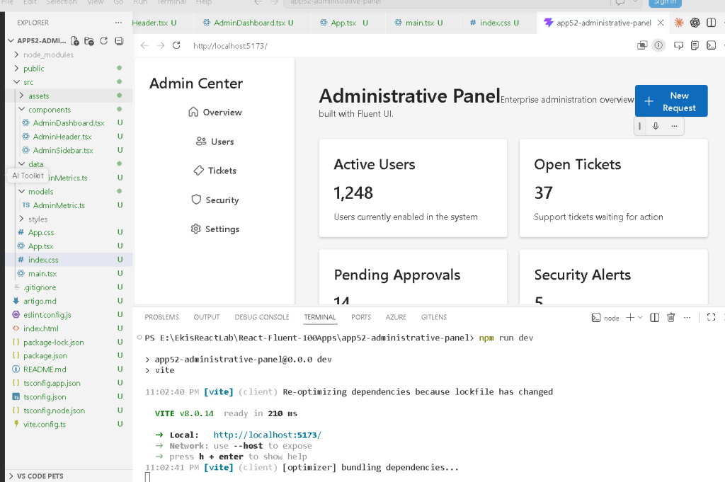
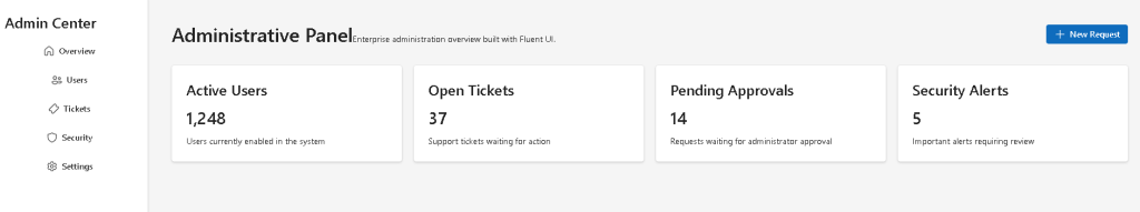
6. Building the Sidebar
src\components\AdminSidebar.tsx
import { Button, Card, Title3 } from "@fluentui/react-components";import { Home24Regular, People24Regular, TicketDiagonal24Regular, Shield24Regular, Settings24Regular,} from "@fluentui/react-icons";export function AdminSidebar() { return ( <Card style={{ width: "260px", minHeight: "100vh", borderRadius: 0, padding: "24px", display: "flex", flexDirection: "column", gap: "16px", }} > <Title3>Admin Center</Title3> <Button appearance="subtle" icon={<Home24Regular />}> Overview </Button> <Button appearance="subtle" icon={<People24Regular />}> Users </Button> <Button appearance="subtle" icon={<TicketDiagonal24Regular />}> Tickets </Button> <Button appearance="subtle" icon={<Shield24Regular />}> Security </Button> <Button appearance="subtle" icon={<Settings24Regular />}> Settings </Button> </Card> );}
7. Understanding the Sidebar Layout
The sidebar uses:
display: "flex"flexDirection: "column"
This creates vertical stacking.
The layout becomes:
Admin CenterOverviewUsersTicketsSecuritySettings
This is one of the most common enterprise navigation patterns.
The fixed width:
width: "260px"
creates stable navigation spacing.
The height:
minHeight: "100vh"
ensures the sidebar fills the browser height.
This is typical in:
- SharePoint-style portals
- Microsoft admin centers
- dashboard systems
- ERP applications
8. Understanding Fluent UI Buttons
Each menu item uses:
<Button appearance="subtle">
This is important.
Why not primary?
Because sidebar navigation should not visually compete with primary business actions.
subtle creates:
- softer visuals
- cleaner enterprise navigation
- better dashboard hierarchy
The icons come from:
@fluentui/react-icons
These are:
- SVG-based
- scalable
- Microsoft-style
- theme-aware
Official documentation:
9. Creating the Header
src\components\AdminHeader.tsx
import { Button, Text, Title1,} from "@fluentui/react-components";import { Add24Regular,} from "@fluentui/react-icons";export function AdminHeader() { return ( <header style={{ display: "flex", justifyContent: "space-between", alignItems: "center", marginBottom: "32px", }} > <div> <Title1>Administrative Panel</Title1> <Text> Enterprise administration overview built with Fluent UI. </Text> </div> <Button appearance="primary" icon={<Add24Regular />} > New Request </Button> </header> );}
10. Understanding the Header Layout
The header uses:
justifyContent: "space-between"
This separates:
- title/content
- action button
Result:
Administrative Panel [ New Request ]
This is a common enterprise pattern because:
- titles establish context
- actions stay visually accessible
- dashboards remain balanced
11. Why Fluent UI Typography Matters
Instead of raw HTML like:
<h1><p>
we use:
<Title1><Text>
This provides:
- Microsoft typography scaling
- accessibility
- consistent spacing
- enterprise visual standards
Typography consistency is extremely important in large dashboard systems.
12. Creating the Dashboard Grid
src\components\AdminDashboard.tsx
import { Card, Text, Title2, Title3,} from "@fluentui/react-components";import { adminMetrics } from "../data/adminMetrics";export function AdminDashboard() { return ( <section> <div style={{ display: "grid", gridTemplateColumns: "repeat(auto-fit, minmax(220px, 1fr))", gap: "20px", }} > {adminMetrics.map((metric) => ( <Card key={metric.id} style={{ padding: "24px", }} > <Title3>{metric.title}</Title3> <Title2>{metric.value}</Title2> <Text>{metric.description}</Text> </Card> ))} </div> </section> );}
13. Understanding map() Rendering
This line is extremely important:
adminMetrics.map((metric) => ...)
React transforms data into UI.
Conceptually:
Data→ React rendering→ Dashboard cards
This is declarative rendering.
We do NOT manually create cards one by one.
Instead, React receives data and generates the interface automatically.
Official documentation:
14. Why key={metric.id} Matters
Each rendered card uses:
key={metric.id}
React uses keys to identify list items.
Without keys:
- React shows warnings
- updates become less efficient
- DOM reconciliation becomes harder
Keys are critical for dynamic rendering.
15. Understanding CSS Grid
The dashboard uses:
display: "grid"
combined with:
gridTemplateColumns: "repeat(auto-fit, minmax(220px, 1fr))"
This creates a responsive enterprise dashboard.
Meaning:
Create as many columns as possible.Each card must be at least 220px.Extra space is distributed evenly.
This allows:
- responsive dashboards
- scalable layouts
- clean metric organization
16. Building the Root Layout
src\App.tsx
import { AdminDashboard } from "./components/AdminDashboard";import { AdminHeader } from "./components/AdminHeader";import { AdminSidebar } from "./components/AdminSidebar";function App() { return ( <div style={{ display: "flex", minHeight: "100vh", }} > <AdminSidebar /> <main style={{ flex: 1, padding: "40px", backgroundColor: "#f5f5f5", }} > <AdminHeader /> <AdminDashboard /> </main> </div> );}export default App;
17. Understanding the Main Layout
The root layout uses Flexbox:
display: "flex"
This creates:
Sidebar | Main Dashboard
The sidebar has fixed width.
The main area uses:
flex: 1
Meaning:
Take all remaining available space.
This is one of the most common enterprise application layouts.
18. Understanding main.tsx
src\main.tsx
import React from "react";import ReactDOM from "react-dom/client";import { FluentProvider, webLightTheme,} from "@fluentui/react-components";import App from "./App";import "./index.css";ReactDOM.createRoot( document.getElementById("root")!).render( <React.StrictMode> <FluentProvider theme={webLightTheme}> <App /> </FluentProvider> </React.StrictMode>);
This file connects:
- React
- ReactDOM
- Fluent UI
- the browser DOM
The most important part is:
<FluentProvider theme={webLightTheme}>
This activates:
- Microsoft theme tokens
- Fluent UI styling
- accessibility behavior
- typography system
- enterprise colors
19. Understanding Why There Is No State Yet
This app intentionally does NOT use:
useStateuseEffect
Why?
Because the dashboard is currently static.
React Learn strongly recommends avoiding unnecessary state and effects.
Official guidance:
The dashboard currently derives entirely from static data.
This keeps the architecture simpler and cleaner.
Later versions may introduce:
- API integration
- real-time updates
- filters
- notifications
- async data
- charts
- reducers
20. Running the Application
Development:
npm run dev
Production validation:
npm run build
Production preview:
npm run preview
21. Full Rendering Flow
main.tsx mounts AppApp composes Sidebar + Main LayoutAdminHeader renders enterprise title and actionsAdminDashboard renders dashboard gridadminMetrics.ts provides structured datamap() converts data into Fluent UI cardsReactDOM renders the final browser UI
22. Technical Summary
| Concept | Explanation |
|---|---|
| Fluent UI | Microsoft enterprise design system |
| Sidebar layout | Enterprise navigation structure |
| CSS Grid | Responsive dashboard layout |
map() rendering | Data-driven UI generation |
| TypeScript interface | Predictable metric structure |
| Flexbox | Main application layout |
| Dashboard cards | KPI visualization pattern |
FluentProvider | Global Microsoft theming |
| Declarative rendering | UI derived from data |
| Component composition | Modular React architecture |
23. Concept Table
| Concept | File | Why It Matters |
|---|---|---|
| Metric model | AdminMetric.ts | Defines predictable data |
| Data source | adminMetrics.ts | Centralizes dashboard data |
| Sidebar | AdminSidebar.tsx | Enterprise navigation |
| Header | AdminHeader.tsx | Dashboard context/actions |
| Dashboard grid | AdminDashboard.tsx | Data visualization |
| Layout composition | App.tsx | Organizes the full UI |
| React mounting | main.tsx | Connects React to HTML |
| Global CSS | index.css | Removes browser inconsistencies |
24. Official Documentation
React
Fluent UI
Vite
TypeScript
25. Final Architectural Insight
App 52 introduces one of the most important enterprise React patterns:
Structured Data→ Component Composition→ Dashboard Rendering→ Enterprise UI
This is the foundation for:
- admin portals
- analytics systems
- SharePoint-inspired dashboards
- Microsoft 365 interfaces
- CRM systems
- ERP applications
- enterprise management platforms
The key idea is:
React components compose the layout.Data drives the rendering.Fluent UI provides the enterprise visual system.
Current Project Progress
| Block | App | Name | Status |
|---|---|---|---|
| Block 3 | 41 | Microsoft Style Login | Completed |
| Block 3 | 42 | Corporate Form | Completed |
| Block 3 | 43 | Tabs Navigation | Completed |
| Block 3 | 44 | Dialog Manager | Completed |
| Block 3 | 45 | Executive Dashboard | Completed |
| Block 3 | 46 | DataGrid Catalog | Completed |
| Block 3 | 47 | Enterprise User List | Completed |
| Block 3 | 48 | Sidebar Navigation | Completed |
| Block 3 | 49 | Corporate Header | Completed |
| Block 3 | 50 | Professional Toolbar | Completed |
| Block 3 | 51 | Notification Center | Completed |
| Block 3 | 52 | Administrative Panel | Current |
| Block 3 | 53 | Ticket Manager | Next |
 edvaldo b. guimarães filho