Technical Blog Article — App 53: Enterprise Ticket Manager with React, Fluent UI, TypeScript, and Vite
Introduction
Do not manually manipulate the UI.
Update state.
Derive UI from state.
Let React render the result.
- IT support
- incident tracking
- infrastructure requests
- SharePoint permission requests
- Microsoft 365 issues
- onboarding workflows
- maintenance tracking
- internal approvals
- customer service operations
In App 53 — Enterprise Ticket Manager, we build a professional Microsoft-style ticket dashboard using:
- React
- TypeScript
- Vite
- Fluent UI
This app belongs to Block 3 — Professional Fluent UI Applications, where the ReactLab roadmap evolves from simple component rendering into enterprise-grade architecture and professional Microsoft design patterns.
The goal of this app is not backend integration yet. Instead, the focus is learning:
- enterprise UI composition
- Fluent UI dashboard patterns
- state-driven filtering
- reusable components
- derived rendering
- controlled search interfaces
- TypeScript modeling
- scalable React architecture
The most important architectural idea introduced in this app is:
Data→ React state→ derived filtering→ component rendering→ enterprise dashboard
This reflects the official React mental model:
- UI is a function of state
- components render declaratively
- React handles DOM updates automatically
Official references:
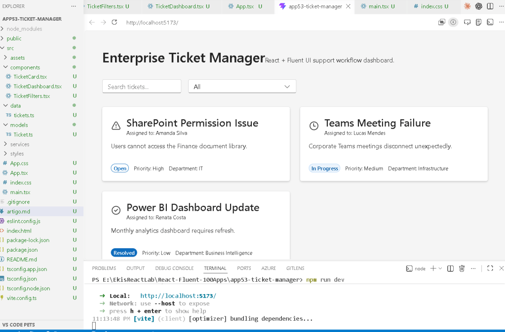
1. Creating the Project
The project starts using Vite with the React TypeScript template.
Why Vite?
Vite is one of the fastest modern frontend development environments because it uses:
- native ES Modules
- instant Hot Module Replacement
- optimized production builds
- lightweight configuration
- fast startup performance
Project creation:
mkdir bloco03cd bloco03npm create vite@latest app53-ticket-manager -- --template react-tscd app53-ticket-managernpm install
Install Fluent UI:
npm install @fluentui/react-components @fluentui/react-icons
2. Creating the Folder Structure
Enterprise React applications should separate responsibilities clearly.
Create folders:
mkdir src\componentsmkdir src\modelsmkdir src\datamkdir src\stylesmkdir src\services
Create files:
New-Item src\models\Ticket.ts -ItemType FileNew-Item src\data\tickets.ts -ItemType FileNew-Item src\components\TicketCard.tsx -ItemType FileNew-Item src\components\TicketDashboard.tsx -ItemType FileNew-Item src\components\TicketFilters.tsx -ItemType FileNew-Item artigo.md -ItemType File
3. Final Project Structure
app53-ticket-manager/ src/ components/ TicketCard.tsx TicketDashboard.tsx TicketFilters.tsx models/ Ticket.ts data/ tickets.ts services/ styles/ App.tsx main.tsx index.css
This structure matters because React applications scale quickly. Organizing the architecture early prevents technical debt later.
4. Creating the Ticket Model
src\models\Ticket.ts
export type TicketStatus = | "Open" | "In Progress" | "Resolved";export type TicketPriority = | "High" | "Medium" | "Low";export interface Ticket { id: number; title: string; description: string; assignedTo: string; department: string; status: TicketStatus; priority: TicketPriority;}
5. Why TypeScript Models Matter
This file defines the shape of the application data.
Each ticket must contain:
- id
- title
- description
- assigned user
- department
- status
- priority
TypeScript guarantees:
- predictable objects
- safer refactoring
- IDE autocomplete
- architecture consistency
- fewer runtime bugs
Without TypeScript, enterprise applications become difficult to maintain as complexity grows.
Official documentation:
6. Creating the Ticket Data Source
src\data\tickets.ts
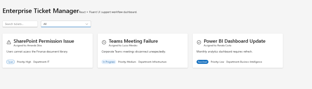
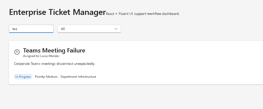
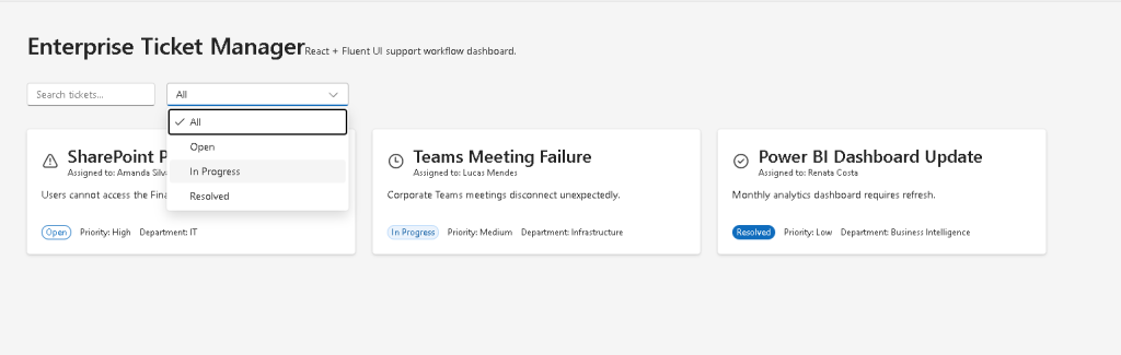
import type { Ticket } from "../models/Ticket";export const tickets: Ticket[] = [ { id: 1, title: "SharePoint Permission Issue", description: "Users cannot access the Finance document library.", assignedTo: "Amanda Silva", department: "IT", status: "Open", priority: "High", }, { id: 2, title: "Teams Meeting Failure", description: "Corporate Teams meetings disconnect unexpectedly.", assignedTo: "Lucas Mendes", department: "Infrastructure", status: "In Progress", priority: "Medium", }, { id: 3, title: "Power BI Dashboard Update", description: "Monthly analytics dashboard requires refresh.", assignedTo: "Renata Costa", department: "Business Intelligence", status: "Resolved", priority: "Low", },];
7. Understanding Data-Driven Rendering
This file introduces one of React’s most important ideas:
The UI should be generated from data.
Instead of manually creating multiple cards:
- the data array becomes the source of truth
- React transforms data into UI
This is declarative rendering.
Official documentation:
8. Creating the Ticket Card Component
src\components\TicketCard.tsx
import { Badge, Body1, Card, CardHeader, Caption1, Text, Title3,} from "@fluentui/react-components";import { CheckmarkCircle24Regular, Clock24Regular, Warning24Regular,} from "@fluentui/react-icons";import type { Ticket } from "../models/Ticket";interface TicketCardProps { ticket: Ticket;}function getStatusIcon(status: Ticket["status"]) { if (status === "Resolved") { return <CheckmarkCircle24Regular />; } if (status === "In Progress") { return <Clock24Regular />; } return <Warning24Regular />;}function getBadgeAppearance(status: Ticket["status"]) { if (status === "Resolved") { return "filled" as const; } if (status === "In Progress") { return "tint" as const; } return "outline" as const;}export function TicketCard({ ticket,}: TicketCardProps) { return ( <Card style={{ width: "100%", padding: "20px", }} > <CardHeader image={getStatusIcon(ticket.status)} header={<Title3>{ticket.title}</Title3>} description={ <Caption1> Assigned to: {ticket.assignedTo} </Caption1> } /> <Body1>{ticket.description}</Body1> <div style={{ display: "flex", gap: "12px", marginTop: "20px", alignItems: "center", flexWrap: "wrap", }} > <Badge appearance={getBadgeAppearance(ticket.status)}> {ticket.status} </Badge> <Text size={200}> Priority: {ticket.priority} </Text> <Text size={200}> Department: {ticket.department} </Text> </div> </Card> );}
9. Understanding Component Responsibility
The responsibility of TicketCard is simple:
Receive ticket data→ render the visual card
The component does not:
- fetch data
- own global state
- filter tickets
- manage workflows
This is extremely important in React architecture.
Good React components should:
- have one responsibility
- remain reusable
- receive props
- render UI predictably
Official documentation:
10. Understanding Fluent UI Cards
The Card component is heavily used in enterprise applications because it provides:
- consistent spacing
- shadows
- borders
- accessibility behavior
- Microsoft styling
Cards appear everywhere in:
- dashboards
- SharePoint portals
- Microsoft admin interfaces
- analytics systems
- CRM dashboards
Official documentation:
11. Understanding Badge Rendering
The ticket status uses Fluent UI Badge.
<Badge appearance={getBadgeAppearance(ticket.status)}>
This creates visual workflow indicators.
Examples:
- Open → outline
- In Progress → tint
- Resolved → filled
Enterprise dashboards often rely heavily on:
- colors
- badges
- status indicators
- icons
to communicate workflow state quickly.
12. Creating the Filters Component
src\components\TicketFilters.tsx
import { Dropdown, Input, Option,} from "@fluentui/react-components";interface TicketFiltersProps { searchText: string; statusFilter: string; onSearchChange: (value: string) => void; onStatusChange: (value: string) => void;}export function TicketFilters({ searchText, statusFilter, onSearchChange, onStatusChange,}: TicketFiltersProps) { return ( <div style={{ display: "flex", gap: "16px", marginBottom: "32px", flexWrap: "wrap", }} > <Input placeholder="Search tickets..." value={searchText} onChange={(_, data) => onSearchChange(data.value) } /> <Dropdown value={statusFilter} placeholder="Select status" onOptionSelect={(_, data) => onStatusChange(data.optionValue || "") } > <Option value="All">All</Option> <Option value="Open">Open</Option> <Option value="In Progress"> In Progress </Option> <Option value="Resolved"> Resolved </Option> </Dropdown> </div> );}
13. Controlled Components
The filters demonstrate controlled React inputs.
The parent component owns the state:
const [searchText, setSearchText]
and:
const [statusFilter, setStatusFilter]
The filter component only renders the controls and triggers callbacks.
The flow becomes:
User interaction→ callback executes→ parent state updates→ React re-renders→ dashboard updates
Official documentation:
14. Creating the Dashboard Component
src\components\TicketDashboard.tsx
import { TicketCard } from "./TicketCard";import type { Ticket } from "../models/Ticket";interface TicketDashboardProps { tickets: Ticket[];}export function TicketDashboard({ tickets,}: TicketDashboardProps) { return ( <div style={{ display: "grid", gridTemplateColumns: "repeat(auto-fit, minmax(320px, 1fr))", gap: "24px", }} > {tickets.map((ticket) => ( <TicketCard key={ticket.id} ticket={ticket} /> ))} </div> );}
15. Understanding Grid Layout
The dashboard uses CSS Grid:
gridTemplateColumns: "repeat(auto-fit, minmax(320px, 1fr))"
This creates:
- responsive columns
- automatic wrapping
- enterprise dashboard behavior
The layout automatically adapts to screen size.
This pattern appears constantly in:
- Microsoft dashboards
- SharePoint portals
- analytics systems
- admin centers
16. Why key={ticket.id} Matters
React lists require stable keys.
key={ticket.id}
helps React:
- identify list items
- optimize rendering
- update the correct elements
Without keys:
- React warns
- rendering becomes less predictable
Official documentation:
17. Creating the Root App
src\App.tsx
import { useState } from "react";import { FluentProvider, Text, Title1, webLightTheme,} from "@fluentui/react-components";import { tickets } from "./data/tickets";import { TicketDashboard } from "./components/TicketDashboard";import { TicketFilters } from "./components/TicketFilters";function App() { const [searchText, setSearchText] = useState(""); const [statusFilter, setStatusFilter] = useState("All"); const filteredTickets = tickets.filter( (ticket) => { const matchesSearch = ticket.title .toLowerCase() .includes(searchText.toLowerCase()); const matchesStatus = statusFilter === "All" || ticket.status === statusFilter; return matchesSearch && matchesStatus; } ); return ( <FluentProvider theme={webLightTheme}> <main style={{ minHeight: "100vh", backgroundColor: "#f5f5f5", padding: "40px", boxSizing: "border-box", }} > <section style={{ maxWidth: "1400px", margin: "0 auto", }} > <Title1> Enterprise Ticket Manager </Title1> <Text> React + Fluent UI support workflow dashboard. </Text> <div style={{ marginTop: "32px", }} > <TicketFilters searchText={searchText} statusFilter={statusFilter} onSearchChange={setSearchText} onStatusChange={setStatusFilter} /> <TicketDashboard tickets={filteredTickets} /> </div> </section> </main> </FluentProvider> );}export default App;
18. Understanding Derived State
This line is extremely important:
const filteredTickets = tickets.filter(...)
Notice:
- filtered tickets are NOT stored in state
- they are derived from existing state
This follows official React guidance:
Avoid redundant state.
Bad approach:
const [filteredTickets, setFilteredTickets]
Good approach:
const filteredTickets = tickets.filter(...)
Why?
- fewer synchronization bugs
- cleaner rendering
- simpler architecture
Official documentation:
19. Why There Is No useEffect
This app intentionally avoids useEffect.
There is:
- no API synchronization
- no timers
- no browser subscriptions
- no localStorage
The UI is purely derived from:
- state
- props
- filtering logic
Therefore:
useState is enough.
Official documentation:
20. Create main.tsx
src\main.tsx
import React from "react";import ReactDOM from "react-dom/client";import App from "./App";import "./index.css";ReactDOM.createRoot( document.getElementById("root")!).render( <React.StrictMode> <App /> </React.StrictMode>);
21. Create index.css
src\index.css
body { margin: 0; font-family: "Segoe UI", Arial, sans-serif;}* { box-sizing: border-box;}
22. Running the Application
Development server:
npm run dev
Production validation:
npm run build
Preview production build:
npm run preview
23. Complete Rendering Flow
main.tsx renders AppApp owns filter stateTicketFilters updates filter stateReact re-renders AppfilteredTickets recalculatesTicketDashboard receives filtered dataTicketDashboard maps data into TicketCard componentsReact updates the UI automatically
This is the React rendering model.
Technical Summary
| Concept | Explanation |
|---|---|
useState | Stores filter state |
| Derived State | Filtered tickets calculated dynamically |
| Controlled Inputs | Parent controls filter values |
map() | Converts arrays into UI |
filter() | Creates dynamic rendering |
| Fluent UI Card | Enterprise ticket visualization |
| Badge | Workflow status indicators |
| Grid Layout | Responsive dashboard rendering |
| TypeScript Models | Predictable architecture |
| Declarative UI | UI derived from state |
Concept Table
| Concept | File | Purpose |
|---|---|---|
| Ticket model | Ticket.ts | Defines ticket structure |
| Static data | tickets.ts | Provides dashboard data |
| Ticket card | TicketCard.tsx | Renders enterprise cards |
| Filters | TicketFilters.tsx | Controlled filtering |
| Dashboard | TicketDashboard.tsx | Grid rendering |
| Parent state | App.tsx | Owns filter state |
| Derived rendering | App.tsx | Dynamic UI updates |
| Fluent UI | All components | Microsoft design system |
Official Documentation
React
- React Learn
- Rendering Lists
- State: A Component’s Memory
- Reacting to Input with State
- Choosing the State Structure
- You Might Not Need an Effect
Fluent UI
Tooling
Final Architectural Insight
App 53 introduces one of the most important enterprise React patterns:
Data→ derived filtering→ component composition→ enterprise dashboard rendering
This architecture appears constantly in:
- ticket systems
- SharePoint portals
- Microsoft dashboards
- admin centers
- CRM systems
- ERP workflows
- analytics platforms
The key React lesson is:
Do not manually manipulate the UI.Update state.Derive UI from state.Let React render the result.
Current Project Progress
| Block | App | Name | Status |
|---|---|---|---|
| Block 1 | 01 | Hello React Fluent | Completed |
| Block 1 | 02 | Profile Card | Completed |
| Block 1 | 03 | Product List | Completed |
| Block 1 | 04 | Microsoft Style User Card | Completed |
| Block 1 | 05 | Static Dashboard | Completed |
| Block 1 | 06 | Corporate Sidebar Menu | Completed |
| Block 1 | 07 | Visual Task List | Completed |
| Block 1 | 08 | Timeline Events | Completed |
| Block 1 | 09 | Employee Table | Completed |
| Block 1 | 10 | Email List | Completed |
| Block 1 | 11 | Grid of Cards | Completed |
| Block 1 | 12 | Image Gallery | Completed |
| Block 1 | 13 | Movie Catalog | Completed |
| Block 1 | 14 | Football Teams | Completed |
| Block 1 | 15 | News Page | Completed |
| Block 1 | 16 | Financial Dashboard | Completed |
| Block 1 | 17 | SharePoint Style Layout | Completed |
| Block 1 | 18 | File Explorer | Completed |
| Block 1 | 19 | Corporate Portal | Completed |
| Block 1 | 20 | Microsoft Style Landing Page | Completed |
| Block 2 | 21 | Modern Counter | Completed |
| Block 2 | 22 | Toggle Theme | Completed |
| Block 2 | 23 | React Calculator | Completed |
| Block 2 | 24 | Login Form | Completed |
| Block 2 | 25 | User Registration | Completed |
| Block 2 | 26 | Complete ToDo List | Completed |
| Block 2 | 27 | Shopping List | Completed |
| Block 2 | 28 | Product Filter | Completed |
| Block 2 | 29 | Employee Search | Completed |
| Block 2 | 30 | Shopping Cart | Completed |
| Block 2 | 31 | Grade Simulator | Completed |
| Block 2 | 32 | Inventory Control | Completed |
| Block 2 | 33 | Contact Agenda | Completed |
| Block 2 | 34 | Currency Converter | Completed |
| Block 2 | 35 | BMI Calculator | Completed |
| Block 2 | 36 | Installment Simulator | Completed |
| Block 2 | 37 | Voting Panel | Completed |
| Block 2 | 38 | Interactive Quiz | Completed |
| Block 2 | 39 | Team Manager | Completed |
| Block 2 | 40 | Dynamic Dashboard | Completed |
| Block 3 | 41 | Microsoft Style Login | Completed |
| Block 3 | 42 | Corporate Form | Completed |
| Block 3 | 43 | Tabs Navigation | Completed |
| Block 3 | 44 | Dialog Manager | Completed |
| Block 3 | 45 | Executive Dashboard | Completed |
| Block 3 | 46 | DataGrid Catalog | Completed |
| Block 3 | 47 | Enterprise User List | Completed |
| Block 3 | 48 | Sidebar Navigation | Completed |
| Block 3 | 49 | Corporate Header | Completed |
| Block 3 | 50 | Professional Toolbar | Completed |
| Block 3 | 51 | Notification Center | Completed |
| Block 3 | 52 | Administrative Panel | Completed |
| Block 3 | 53 | Enterprise Ticket Manager | Current |
| Block 3 | 54 | Approval System | Next |
 edvaldo b. guimarães filho