
Technical Blog Article — App 54: Approval System with React, TypeScript, Fluent UI, and Enterprise Workflow Architecture
Introduction
In modern enterprise applications, approval workflows are everywhere. Before a purchase is finalized, before a document is published, before a ticket is escalated, or before a financial transaction is executed, there is usually an approval process controlling the flow.
This is exactly the focus of App 54 — Approval System.
Enterprise workflows are state machines.
Enterprise workflows are state machines.
Enterprise workflows are state machines.
- enterprise workflow state
- approval/rejection transitions
- conditional rendering
- immutable state updates
- dynamic card rendering
- derived UI
- Microsoft Fluent UI enterprise composition
- state-driven business interfaces
The central architectural idea is:
Workflow state changes→ React re-renders→ Enterprise UI updates automatically
This app simulates a corporate approval dashboard similar to what you might find in:
- SharePoint approval systems
- Microsoft Teams workflows
- ERP systems
- financial approval chains
- HR systems
- procurement portals
- administrative dashboards
- enterprise CRMs
Official references:
1. Creating the Project
Create the application with Vite
mkdir bloco03cd bloco03npm create vite@latest app54-approval-system -- --template react-tscd app54-approval-systemnpm install
Install Fluent UI:
npm install @fluentui/react-components @fluentui/react-icons
2. Creating the Folder Structure
Professional React applications should separate responsibilities from the beginning.
Create folders:
mkdir src\componentsmkdir src\modelsmkdir src\datamkdir src\styles
Create files:
New-Item src\models\ApprovalRequest.ts -ItemType FileNew-Item src\data\approvalRequests.ts -ItemType FileNew-Item src\components\ApprovalCard.tsx -ItemType FileNew-Item src\components\ApprovalBoard.tsx -ItemType FileNew-Item artigo.md -ItemType File
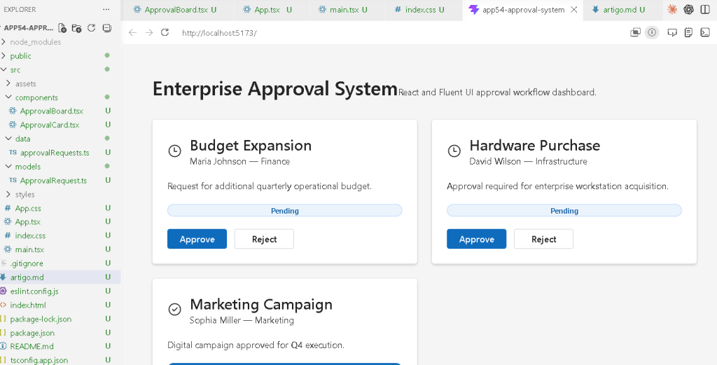
3. Final Project Structure
app54-approval-system/ src/ components/ ApprovalCard.tsx ApprovalBoard.tsx data/ approvalRequests.ts models/ ApprovalRequest.ts styles/ App.tsx main.tsx index.css
This structure follows the ReactLab architectural organization model.
4. Understanding the Enterprise Workflow
Before writing code, we must understand the business logic.
The application simulates approval requests.
Each request can be:
- Pending
- Approved
- Rejected
The user interacts with buttons:
ApproveReject
These buttons update React state.
React then automatically updates:
- badges
- icons
- actions
- card appearance
The architecture is completely declarative.
We never manually manipulate the DOM.
5. Create the Data Model
src\models\ApprovalRequest.ts
export type ApprovalStatus = | "Pending" | "Approved" | "Rejected";export interface ApprovalRequest { id: number; title: string; requester: string; department: string; status: ApprovalStatus; description: string;}
6. Why the Model Layer Matters
This interface defines the exact structure of enterprise approval requests.
Benefits:
- predictable architecture
- safer refactoring
- autocomplete
- enterprise consistency
- validation through TypeScript
Without models, enterprise applications become difficult to scale.
TypeScript ensures every request always contains:
- id
- title
- requester
- department
- status
- description
This is critical in professional React systems.
7. Create the Static Data Source
src\data\approvalRequests.ts
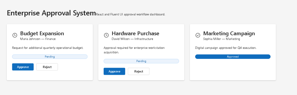
import type { ApprovalRequest } from "../models/ApprovalRequest";export const approvalRequests: ApprovalRequest[] = [ { id: 1, title: "Budget Expansion", requester: "Maria Johnson", department: "Finance", status: "Pending", description: "Request for additional quarterly operational budget.", }, { id: 2, title: "Hardware Purchase", requester: "David Wilson", department: "Infrastructure", status: "Pending", description: "Approval required for enterprise workstation acquisition.", }, { id: 3, title: "Marketing Campaign", requester: "Sophia Miller", department: "Marketing", status: "Approved", description: "Digital campaign approved for Q4 execution.", },];
8. Why Static Data Is Important First
At this stage, we intentionally avoid APIs.
Why?
Because the goal is learning:
- rendering
- state updates
- component composition
- enterprise workflow logic
without adding:
- async complexity
- loading states
- fetch logic
- effects
This follows the official React learning progression.
9. Create the Approval Card Component
src\components\ApprovalCard.tsx
import { Badge, Button, Card, CardHeader, Text, Title3,} from "@fluentui/react-components";import { CheckmarkCircle24Regular, DismissCircle24Regular, Clock24Regular,} from "@fluentui/react-icons";import type { ApprovalRequest, ApprovalStatus,} from "../models/ApprovalRequest";interface ApprovalCardProps { request: ApprovalRequest; onUpdateStatus: ( id: number, status: ApprovalStatus ) => void;}function getStatusIcon(status: ApprovalStatus) { if (status === "Approved") { return <CheckmarkCircle24Regular />; } if (status === "Rejected") { return <DismissCircle24Regular />; } return <Clock24Regular />;}function getBadgeAppearance(status: ApprovalStatus) { if (status === "Approved") { return "filled" as const; } if (status === "Rejected") { return "outline" as const; } return "tint" as const;}export function ApprovalCard({ request, onUpdateStatus,}: ApprovalCardProps) { return ( <Card style={{ padding: "24px", display: "flex", flexDirection: "column", gap: "20px", }} > <CardHeader image={getStatusIcon(request.status)} header={<Title3>{request.title}</Title3>} description={ <Text> {request.requester} — {request.department} </Text> } /> <Text>{request.description}</Text> <Badge appearance={getBadgeAppearance(request.status)}> {request.status} </Badge> {request.status === "Pending" && ( <div style={{ display: "flex", gap: "12px", }} > <Button appearance="primary" onClick={() => onUpdateStatus(request.id, "Approved") } > Approve </Button> <Button appearance="secondary" onClick={() => onUpdateStatus(request.id, "Rejected") } > Reject </Button> </div> )} </Card> );}
10. Understanding Enterprise Component Composition
This component is responsible only for rendering one request.
It does not:
- own global state
- manage arrays
- control the application
Its responsibility is:
Render one approval request.
This follows React component architecture principles.
11. Understanding Conditional Rendering
This section is fundamental:
{request.status === "Pending" && (
This means:
Only show the action buttonsif the request is still pending.
This is declarative rendering.
We do not manually hide elements.
Instead:
- state changes
- React re-renders
- UI updates automatically
Official documentation:
12. Understanding Derived UI
The icon and badge appearance are derived from state.
Example:
getBadgeAppearance(request.status)
The UI derives from data.
This is the core React philosophy.
We do not manually style elements after rendering.
Instead:
- state determines appearance
- React computes the UI
13. Create the Approval Board
src\components\ApprovalBoard.tsx
import { useState } from "react";import { Text, Title1,} from "@fluentui/react-components";import { approvalRequests } from "../data/approvalRequests";import { ApprovalCard } from "./ApprovalCard";import type { ApprovalRequest, ApprovalStatus,} from "../models/ApprovalRequest";export function ApprovalBoard() { const [requests, setRequests] = useState<ApprovalRequest[]>( approvalRequests ); function handleUpdateStatus( id: number, status: ApprovalStatus ) { setRequests((currentRequests) => currentRequests.map((request) => { if (request.id === id) { return { ...request, status, }; } return request; }) ); } return ( <section style={{ maxWidth: "1200px", margin: "0 auto", }} > <Title1>Enterprise Approval System</Title1> <Text> Enterprise approval workflow built with React and Fluent UI. </Text> <div style={{ display: "grid", gridTemplateColumns: "repeat(auto-fit, minmax(320px, 1fr))", gap: "24px", marginTop: "32px", }} > {requests.map((request) => ( <ApprovalCard key={request.id} request={request} onUpdateStatus={handleUpdateStatus} /> ))} </div> </section> );}
14. Understanding useState
This is the core of the application:
const [requests, setRequests]
React state stores the approval workflow.
The UI derives entirely from this array.
This means:
State changes→ React re-renders→ Workflow UI changes automatically
Official documentation:
15. Understanding Immutable Updates
This logic is critical:
return { ...request, status,};
We never mutate state directly.
Incorrect:
request.status = status;
Correct:
return { ...request, status,};
This creates:
- safer rendering
- predictable updates
- better debugging
- React-friendly architecture
Official documentation:
16. Why map() Is So Important
React heavily relies on arrays.
This section:
requests.map(...)
transforms:
- enterprise workflow data
into: - React UI components
Conceptually:
Data→ Components→ Rendered UI
This is one of the most important React patterns.
17. Create App.tsx
src\App.tsx
import { FluentProvider, webLightTheme,} from "@fluentui/react-components";import { ApprovalBoard } from "./components/ApprovalBoard";function App() { return ( <FluentProvider theme={webLightTheme}> <main style={{ minHeight: "100vh", backgroundColor: "#f5f5f5", padding: "48px", boxSizing: "border-box", }} > <ApprovalBoard /> </main> </FluentProvider> );}export default App;
18. Understanding FluentProvider
The provider activates the Microsoft Fluent UI design system globally.
Without it:
- components lose theme styling
- typography becomes inconsistent
- enterprise spacing disappears
This provider injects:
- colors
- typography
- accessibility
- spacing tokens
- Microsoft visual identity
19. Create main.tsx
src\main.tsx
import React from "react";import ReactDOM from "react-dom/client";import App from "./App";import "./index.css";ReactDOM.createRoot( document.getElementById("root")!).render( <React.StrictMode> <App /> </React.StrictMode>);
20. Create index.css
src\index.css
body { margin: 0; font-family: "Segoe UI", Arial, sans-serif;}* { box-sizing: border-box;}
21. Run the Application
Development server:
npm run dev
Production validation:
npm run build
Preview production build:
npm run preview
22. Complete Rendering Flow
User clicks Approve→ handleUpdateStatus executes→ requests state updates→ React re-renders→ ApprovalCard receives new status→ Badge changes→ Buttons disappear→ UI reflects workflow state
This is pure React architecture.
23. Why There Is No useEffect
This application intentionally avoids effects.
There is no:
- API synchronization
- external systems
- timers
- subscriptions
Everything is internal UI state.
Therefore:
useState is correct.useEffect would be unnecessary.
Official documentation:
24. Technical Summary
| Concept | Explanation |
|---|---|
useState | Stores approval requests |
| Immutable updates | Arrays updated safely |
map() rendering | Dynamic card rendering |
| Conditional rendering | Actions hidden after approval |
| Fluent UI Card | Enterprise request container |
| Derived UI | Badge/icon depends on status |
| TypeScript model | Predictable enterprise data |
| Callback props | Child triggers parent updates |
| React rendering | UI derived from state |
| FluentProvider | Global Microsoft theme |
25. Concept Table
| Concept | File | Purpose |
|---|---|---|
| Approval model | ApprovalRequest.ts | Defines enterprise workflow data |
| Static data | approvalRequests.ts | Initial request source |
| Approval card | ApprovalCard.tsx | Renders one approval item |
| Approval board | ApprovalBoard.tsx | Owns workflow state |
| Conditional rendering | ApprovalCard.tsx | Controls button visibility |
| Immutable updates | ApprovalBoard.tsx | Safe state updates |
| Enterprise layout | App.tsx | Main dashboard shell |
| Global styling | index.css | Removes browser defaults |
26. Official Documentation
| Topic | Documentation |
|---|---|
| React Learn | React Learn |
| Rendering Lists | Rendering Lists |
| Conditional Rendering | Conditional Rendering |
| Updating Arrays in State | Updating Arrays in State |
| State: A Component’s Memory | State: A Component’s Memory |
| Fluent UI Components | Fluent UI React Components |
| Fluent UI Card | Fluent UI Card |
| Fluent UI Badge | Fluent UI Badge |
| Vite Guide | Vite Guide |
| TypeScript Docs | TypeScript Docs |
27. Final Architectural Insight
The most important lesson from App 54 is:
Enterprise workflows are state machines.
Each request transitions between states:
- Pending
- Approved
- Rejected
React simply reflects the current workflow state visually.
This same architecture appears later in:
- SharePoint workflows
- ticket systems
- ERP dashboards
- approval chains
- CRM systems
- enterprise admin portals
- Microsoft ecosystem dashboards
Mastering this pattern is essential for enterprise React development.
Current Project Progress
| Block | App | Name | Status |
|---|---|---|---|
| Block 1 | 01 | Hello React Fluent | Completed |
| Block 1 | 02 | Profile Card | Completed |
| Block 1 | 03 | Product List | Completed |
| Block 1 | 04 | Microsoft Style User Card | Completed |
| Block 1 | 05 | Static Dashboard | Completed |
| Block 1 | 06 | Corporate Sidebar Menu | Completed |
| Block 1 | 07 | Visual Task List | Completed |
| Block 1 | 08 | Timeline Events | Completed |
| Block 1 | 09 | Employee Table | Completed |
| Block 1 | 10 | Email List | Completed |
| Block 1 | 11 | Grid of Cards | Completed |
| Block 1 | 12 | Image Gallery | Completed |
| Block 1 | 13 | Movie Catalog | Completed |
| Block 1 | 14 | Football Teams | Completed |
| Block 1 | 15 | News Page | Completed |
| Block 1 | 16 | Financial Dashboard | Completed |
| Block 1 | 17 | SharePoint Style Layout | Completed |
| Block 1 | 18 | File Explorer | Completed |
| Block 1 | 19 | Corporate Portal | Completed |
| Block 1 | 20 | Microsoft Style Landing Page | Completed |
| Block 2 | 21 | Modern Counter | Completed |
| Block 2 | 22 | Toggle Theme | Completed |
| Block 2 | 23 | React Calculator | Completed |
| Block 2 | 24 | Login Form | Completed |
| Block 2 | 25 | User Registration | Completed |
| Block 2 | 26 | Complete ToDo List | Completed |
| Block 2 | 27 | Shopping List | Completed |
| Block 2 | 28 | Product Filter | Completed |
| Block 2 | 29 | Employee Search | Completed |
| Block 2 | 30 | Shopping Cart | Completed |
| Block 2 | 31 | Grade Simulator | Completed |
| Block 2 | 32 | Inventory Control | Completed |
| Block 2 | 33 | Contact Agenda | Completed |
| Block 2 | 34 | Currency Converter | Completed |
| Block 2 | 35 | BMI Calculator | Completed |
| Block 2 | 36 | Installment Simulator | Completed |
| Block 2 | 37 | Voting Panel | Completed |
| Block 2 | 38 | Interactive Quiz | Completed |
| Block 2 | 39 | Team Manager | Completed |
| Block 2 | 40 | Dynamic Dashboard | Completed |
| Block 3 | 41 | Microsoft Style Login | Completed |
| Block 3 | 42 | Corporate Form | Completed |
| Block 3 | 43 | Tabs Navigation | Completed |
| Block 3 | 44 | Dialog Manager | Completed |
| Block 3 | 45 | Executive Dashboard | Completed |
| Block 3 | 46 | DataGrid Catalog | Completed |
| Block 3 | 47 | Enterprise User List | Completed |
| Block 3 | 48 | Sidebar Navigation | Completed |
| Block 3 | 49 | Corporate Header | Completed |
| Block 3 | 50 | Professional Toolbar | Completed |
| Block 3 | 51 | Notification Center | Completed |
| Block 3 | 52 | Administrative Panel | Completed |
| Block 3 | 53 | Ticket Manager | Completed |
| Block 3 | 54 | Approval System | Current |
| Block 3 | 55 | Corporate Agenda | Next |
 edvaldo b. guimarães filho