Technical Blog Article — App 55: Corporate Calendar with React, Fluent UI, TypeScript, and Vite
Introduction
Modern enterprise systems rely heavily on scheduling, meetings, event coordination, project timelines, approval sessions, operational planning, and collaborative workflows. Because of this, one of the most common interface patterns inside enterprise software is the corporate calendar dashboard.
Enterprise dashboards are data transformed into reusable UI.
- React
- TypeScript
- Vite
- Fluent UI
Enterprise dashboards are data transformed into reusable UI.
Enterprise dashboards are data transformed into reusable UI.
- enterprise dashboard composition
- reusable event cards
- responsive grid layouts
- typed data models
- Fluent UI visual systems
- badge-based status rendering
- component-driven architecture
- data-driven UI rendering
Although visually simple, this app introduces the architectural foundation behind:
- Outlook-style dashboards
- Microsoft Teams scheduling systems
- SharePoint event pages
- CRM scheduling panels
- ERP planning systems
- administrative calendar modules
The key React mental model remains:
Data→ React rendering→ Component composition→ Enterprise interface
React applications are not built by manually manipulating HTML elements. Instead, React transforms structured data into predictable UI through declarative rendering.
1. What This App Teaches
| Concept | Explanation |
|---|---|
| TypeScript interfaces | Predictable event structures |
| Static enterprise data | Data-driven rendering |
| Reusable components | Event cards reused dynamically |
| React props | Parent passes event data |
| List rendering | UI generated with map() |
| Fluent UI Cards | Microsoft-style enterprise containers |
| Badge appearance | Visual event state indicators |
| CSS Grid | Responsive enterprise layouts |
| Declarative UI | Interface derived from data |
This app is important because it reinforces one of the most critical React concepts:
UI should be generated from structured data.
2. Creating the Project
Create the project using Vite with the React TypeScript template.
mkdir bloco03cd bloco03npm create vite@latest app55-corporate-calendar -- --template react-tscd app55-corporate-calendarnpm install
Install Fluent UI:
npm install @fluentui/react-components @fluentui/react-icons
Why Vite?
Vite provides:
- instant startup
- fast Hot Module Replacement
- optimized production builds
- modern ES Module architecture
- simplified React development
Official documentation:
3. Creating the Folder Structure
Create the folders:
mkdir src\componentsmkdir src\datamkdir src\modelsmkdir src\styles
Create the files:
New-Item src\models\CalendarEvent.ts -ItemType FileNew-Item src\data\calendarEvents.ts -ItemType FileNew-Item src\components\EventCard.tsx -ItemType FileNew-Item src\components\CalendarBoard.tsx -ItemType FileNew-Item artigo.md -ItemType File
Final structure:
src/ components/ EventCard.tsx CalendarBoard.tsx data/ calendarEvents.ts models/ CalendarEvent.ts styles/ App.tsx main.tsx index.css
This structure follows the ReactLab architectural philosophy.
4. Understanding the Model Layer
src\models\CalendarEvent.ts
export type EventStatus = | "Confirmed" | "Pending" | "Canceled";export interface CalendarEvent { id: number; title: string; date: string; time: string; organizer: string; location: string; status: EventStatus;}
This file defines the shape of every event object.
Each event must contain:
- identifier
- title
- date
- time
- organizer
- location
- status
TypeScript interfaces are extremely important because they:
- improve maintainability
- prevent invalid data
- improve autocomplete
- make refactoring safer
- scale better in enterprise projects
Without interfaces, React applications become unpredictable as they grow.
Official TypeScript documentation:
5. Understanding Static Data Rendering
src\data\calendarEvents.ts
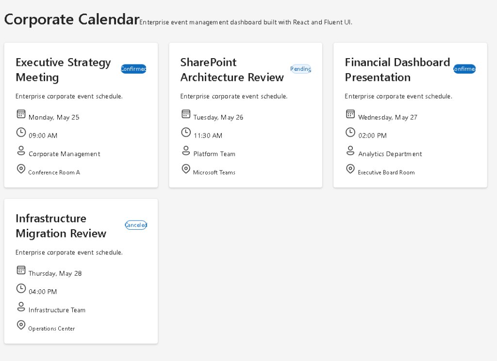
import type { CalendarEvent }from "../models/CalendarEvent";export const calendarEvents: CalendarEvent[] = [ { id: 1, title: "Executive Strategy Meeting", date: "Monday, May 25", time: "09:00 AM", organizer: "Corporate Management", location: "Conference Room A", status: "Confirmed", }, { id: 2, title: "SharePoint Architecture Review", date: "Tuesday, May 26", time: "11:30 AM", organizer: "Platform Team", location: "Microsoft Teams", status: "Pending", },];
This app intentionally uses static data.
Why?
Because the focus is:
- rendering architecture
- composition
- reusable UI
- declarative rendering
NOT:
- APIs
- effects
- backend synchronization
Those topics belong to later roadmap blocks.
6. Understanding React Rendering
One of the most important ideas in React is:
React transforms data into UI.
The calendar events are not manually written as HTML.
Instead:
- the data exists in an array
- React loops through the array
- components are generated dynamically
This is declarative rendering.
Official React documentation:
7. Creating the EventCard Component
src\components\EventCard.tsx
import { Badge, Body1, Card, Caption1, Text, Title3,} from "@fluentui/react-components";import type { CalendarEvent,} from "../models/CalendarEvent";interface EventCardProps { event: CalendarEvent;}export function EventCard({ event,}: EventCardProps) { return ( <Card style={{ padding: "24px", display: "flex", flexDirection: "column", gap: "16px", }} > <div style={{ display: "flex", justifyContent: "space-between", alignItems: "center", }} > <Title3>{event.title}</Title3> <Badge appearance="filled"> {event.status} </Badge> </div> <Body1> Enterprise scheduling event. </Body1> <Text>Date: {event.date}</Text> <Text>Time: {event.time}</Text> <Text>Organizer: {event.organizer}</Text> <Caption1> Location: {event.location} </Caption1> </Card> );}
8. Understanding Props
The component receives:
event: CalendarEvent;
through props.
This follows the React architecture model:
Parent component→ passes data→ child component renders UI
Props are the inputs of React components.
This allows:
- reusability
- composition
- predictable rendering
- isolated responsibilities
Official documentation:
9. Why Components Matter
EventCard has exactly one responsibility:
Render one event.
Good React architecture is built around responsibility separation.
A component should answer:
What UI am I responsible for?
This app uses:
EventCard→ one eventCalendarBoard→ event collectionApp→ page layout
This architecture scales much better than giant monolithic files.
10. Understanding Fluent UI Cards
The app uses Fluent UI cards:
<Card>
Fluent UI provides:
- Microsoft visual identity
- spacing systems
- accessibility
- typography consistency
- enterprise styling
- keyboard support
Official documentation:
11. Understanding Badge Rendering
The app uses:
<Badge>
to display event status.
Enterprise applications frequently use badges for:
- workflow state
- approvals
- priorities
- alerts
- progress
- scheduling state
This small UI pattern is extremely common in:
- SharePoint systems
- CRMs
- ticket systems
- admin portals
12. Creating the Calendar Grid
src\components\CalendarBoard.tsx
import { calendarEvents }from "../data/calendarEvents";import { EventCard }from "./EventCard";export function CalendarBoard() { return ( <section style={{ display: "grid", gridTemplateColumns: "repeat(auto-fit, minmax(320px, 1fr))", gap: "24px", marginTop: "32px", }} > {calendarEvents.map((event) => ( <EventCard key={event.id} event={event} /> ))} </section> );}
13. Understanding map()
This line is critical:
calendarEvents.map(...)
React transforms arrays into UI.
Conceptually:
event 1 → EventCardevent 2 → EventCardevent 3 → EventCard
This is one of the core React mental models.
You do not manually create HTML repeatedly.
You describe:
- how data should become UI
React handles:
- DOM generation
- updates
- reconciliation
14. Understanding React Keys
key={event.id}
Keys help React identify elements efficiently.
Without stable keys:
- rendering becomes inefficient
- React warnings appear
- updates become less predictable
Keys are mandatory in dynamic lists.
Official documentation:
15. Understanding CSS Grid
The layout uses:
display: "grid"
combined with:
gridTemplateColumns: "repeat(auto-fit, minmax(320px, 1fr))"
This creates a responsive enterprise layout.
Meaning:
- each card must be at least 320px
- the grid automatically adjusts columns
- extra space is distributed equally
This pattern is extremely common in:
- dashboards
- analytics portals
- SharePoint layouts
- admin systems
16. Creating the Root App
src\App.tsx
import { Text, Title1,} from "@fluentui/react-components";import { CalendarBoard }from "./components/CalendarBoard";function App() { return ( <main style={{ minHeight: "100vh", backgroundColor: "#f5f5f5", padding: "48px", }} > <section style={{ maxWidth: "1400px", margin: "0 auto", }} > <Title1> Corporate Calendar </Title1> <Text> Enterprise scheduling dashboard. </Text> <CalendarBoard /> </section> </main> );}export default App;
17. Understanding Layout Composition
This structure creates:
Page Header Description Event Grid
This composition style mirrors real enterprise systems.
Professional React applications are:
- composed
- modular
- hierarchical
NOT:
- giant files
- manually duplicated HTML
18. Understanding main.tsx
src\main.tsx
import React from "react";import ReactDOM from "react-dom/client";import { FluentProvider, webLightTheme,} from "@fluentui/react-components";import App from "./App";import "./index.css";ReactDOM.createRoot( document.getElementById("root")!).render( <React.StrictMode> <FluentProvider theme={webLightTheme} > <App /> </FluentProvider> </React.StrictMode>);
This file:
- connects React to HTML
- activates Fluent UI theming
- mounts the application
The critical line is:
<FluentProvider theme={webLightTheme}>
This enables:
- Microsoft styling
- typography
- spacing
- Fluent UI themes
- accessibility behavior
19. Understanding Why There Is No State
This app intentionally does NOT use:
useStateuseEffect
Why?
Because the UI is static.
According to React Learn:
Only introduce state when the UI must change dynamically.
Official documentation:
This is important because beginners often add unnecessary state.
Good React architecture avoids unnecessary complexity.
20. Running the App
Development:
npm run dev
Production validation:
npm run build
Preview production build:
npm run preview
21. Technical Summary
| Concept | Explanation |
|---|---|
| TypeScript Interface | Predictable event data |
| Props | Parent-to-child communication |
map() | Declarative list rendering |
| Fluent UI Card | Enterprise UI container |
| Badge | Event state visualization |
| CSS Grid | Responsive dashboard layout |
| Component Composition | UI split into responsibilities |
| Static Rendering | UI derived from fixed data |
| FluentProvider | Microsoft design system |
22. Concept Table
| Concept | File | Responsibility |
|---|---|---|
| Event model | CalendarEvent.ts | Defines event structure |
| Event data | calendarEvents.ts | Stores scheduling data |
| Reusable card | EventCard.tsx | Renders one event |
| Grid renderer | CalendarBoard.tsx | Organizes event cards |
| Root page | App.tsx | Main layout |
| React entry point | main.tsx | Mounts the app |
| Global CSS | index.css | Resets layout |
23. Official Documentation
React
Fluent UI
Tooling
Final Architectural Insight
The most important lesson from App 55 is:
Enterprise dashboards are data transformed into reusable UI.
Professional React applications scale because:
- components are isolated
- data is structured
- rendering is declarative
- UI is composed from reusable pieces
This same architecture later evolves into:
- Outlook dashboards
- SharePoint portals
- CRM systems
- scheduling platforms
- Microsoft 365 enterprise applications
Current Project Progress
| Block | App | Name | Status |
|---|---|---|---|
| Block 1 | 01 | Hello React Fluent | Completed |
| Block 1 | 02 | Profile Card | Completed |
| Block 1 | 03 | Product List | Completed |
| Block 1 | 04 | Microsoft Style User Card | Completed |
| Block 1 | 05 | Static Dashboard | Completed |
| Block 1 | 06 | Corporate Sidebar Menu | Completed |
| Block 1 | 07 | Visual Task List | Completed |
| Block 1 | 08 | Timeline Events | Completed |
| Block 1 | 09 | Employee Table | Completed |
| Block 1 | 10 | Email List | Completed |
| Block 1 | 11 | Grid of Cards | Completed |
| Block 1 | 12 | Image Gallery | Completed |
| Block 1 | 13 | Movie Catalog | Completed |
| Block 1 | 14 | Football Teams | Completed |
| Block 1 | 15 | News Page | Completed |
| Block 1 | 16 | Financial Dashboard | Completed |
| Block 1 | 17 | SharePoint Style Layout | Completed |
| Block 1 | 18 | File Explorer | Completed |
| Block 1 | 19 | Corporate Portal | Completed |
| Block 1 | 20 | Microsoft Style Landing Page | Completed |
| Block 2 | 21 | Modern Counter | Completed |
| Block 2 | 22 | Toggle Theme | Completed |
| Block 2 | 23 | React Calculator | Completed |
| Block 2 | 24 | Login Form | Completed |
| Block 2 | 25 | User Registration | Completed |
| Block 2 | 26 | Complete ToDo List | Completed |
| Block 2 | 27 | Shopping List | Completed |
| Block 2 | 28 | Product Filter | Completed |
| Block 2 | 29 | Employee Search | Completed |
| Block 2 | 30 | Shopping Cart | Completed |
| Block 2 | 31 | Grade Simulator | Completed |
| Block 2 | 32 | Inventory Control | Completed |
| Block 2 | 33 | Contact Agenda | Completed |
| Block 2 | 34 | Currency Converter | Completed |
| Block 2 | 35 | BMI Calculator | Completed |
| Block 2 | 36 | Installment Simulator | Completed |
| Block 2 | 37 | Voting Panel | Completed |
| Block 2 | 38 | Interactive Quiz | Completed |
| Block 2 | 39 | Team Manager | Completed |
| Block 2 | 40 | Dynamic Dashboard | Completed |
| Block 3 | 41 | Microsoft Style Login | Completed |
| Block 3 | 42 | Corporate Form | Completed |
| Block 3 | 43 | Tabs Navigation | Completed |
| Block 3 | 44 | Dialog Manager | Completed |
| Block 3 | 45 | Executive Dashboard | Completed |
| Block 3 | 46 | DataGrid Catalog | Completed |
| Block 3 | 47 | Enterprise User List | Completed |
| Block 3 | 48 | Sidebar Navigation | Completed |
| Block 3 | 49 | Corporate Header | Completed |
| Block 3 | 50 | Professional Toolbar | Completed |
| Block 3 | 51 | Notification Center | Completed |
| Block 3 | 52 | Administrative Panel | Completed |
| Block 3 | 53 | Ticket Manager | Completed |
| Block 3 | 54 | Approval System | Completed |
| Block 3 | 55 | Corporate Calendar | Current |
| Block 3 | 56 | SharePoint Inspired Dashboard | Next |
 edvaldo b. guimarães filho