Technical Blog Article — App 56: SharePoint Inspired Dashboard with React, Fluent UI, TypeScript, and Vite
Introduction
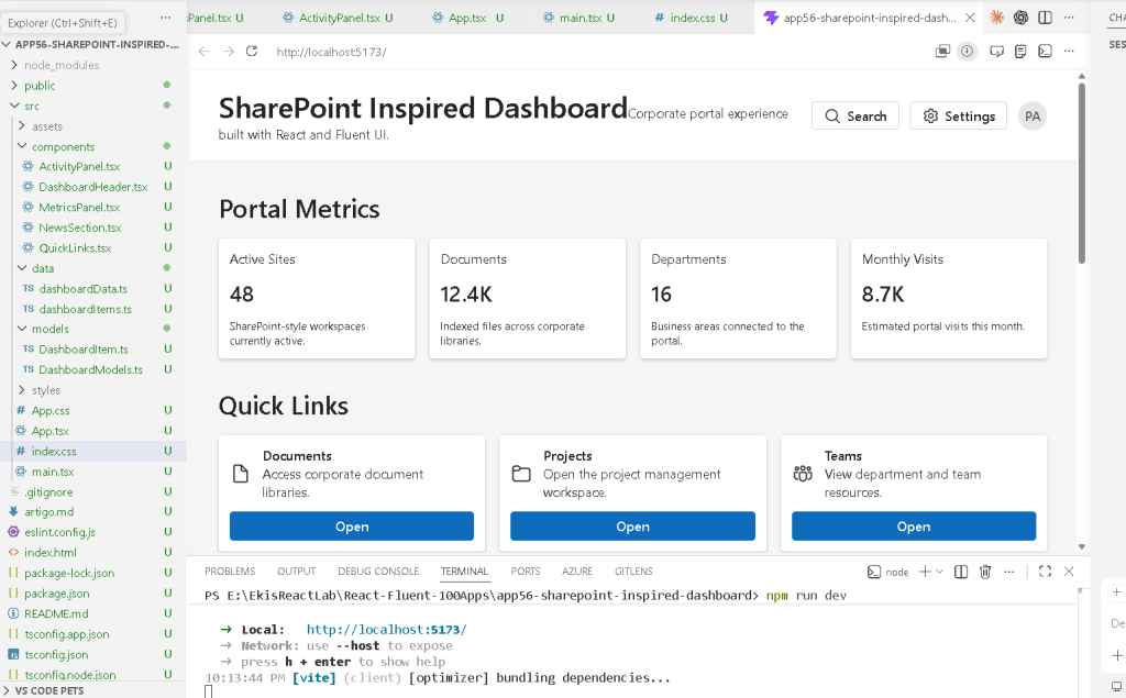
Modern enterprise applications are no longer simple pages with static content. Today, corporate platforms require dashboards capable of centralizing information, documents, analytics, activities, navigation, and communication inside a unified interface. One of the most influential enterprise UI patterns in the Microsoft ecosystem is the SharePoint-style dashboard experience.
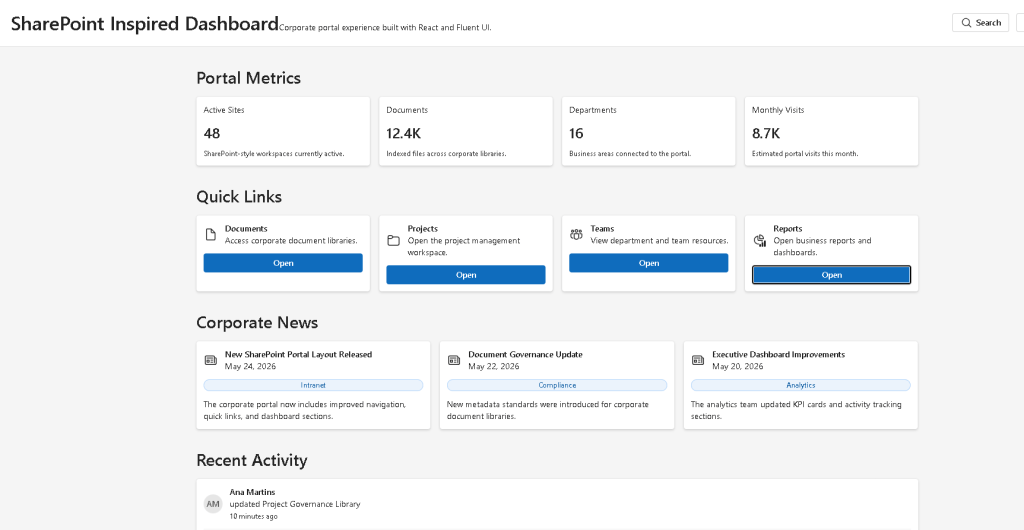
In App 56 — SharePoint Inspired Dashboard, we build a corporate portal interface inspired by SharePoint Online using:
- React
- TypeScript
- Vite
- Fluent UI
This application belongs to Block 3 — Professional Fluent UI Applications, where the project transitions from simple UI rendering into enterprise-level Microsoft-style architecture and professional component composition.
The goal of this app is not to recreate SharePoint itself, but to understand the architectural ideas behind enterprise dashboards:
- modular layouts
- reusable sections
- data-driven UI
- card-based design
- dashboard composition
- enterprise spacing systems
- Microsoft visual hierarchy
This app introduces a realistic corporate portal structure:
- dashboard header
- quick links
- portal metrics
- corporate news
- recent activity feed
The most important React lesson is:
Data→ Components→ Dashboard composition→ Enterprise UI
What This App Teaches
| Concept | Description |
|---|---|
| Component composition | Dashboard built from multiple reusable sections |
| Data-driven rendering | UI generated from typed data arrays |
| Fluent UI Cards | Enterprise Microsoft-style layout |
| Dashboard architecture | Header + sections + activity feed |
| TypeScript models | Predictable typed dashboard data |
| Grid layout | Responsive dashboard structure |
| Declarative UI | React renders from data |
| Enterprise spacing | Consistent professional layout |
Creating the Project
The application starts with Vite using the React TypeScript template.
cd C:\ReactAppsNew-Item bloco03 -ItemType Directorycd bloco03npm create vite@latest app56-sharepoint-inspired-dashboard -- --template react-tscd app56-sharepoint-inspired-dashboardnpm installnpm install @fluentui/react-components @fluentui/react-icons
Vite is important because it provides:
- instant startup
- Hot Module Replacement
- modern ES Module architecture
- fast development workflow
- optimized production builds
Official documentation:
Creating the Folder Structure
Enterprise React applications should always separate:
- components
- models
- data
- styles
PowerShell:
New-Item src\components -ItemType DirectoryNew-Item src\data -ItemType DirectoryNew-Item src\models -ItemType DirectoryNew-Item src\styles -ItemType DirectoryNew-Item src\models\DashboardModels.ts -ItemType FileNew-Item src\data\dashboardData.ts -ItemType FileNew-Item src\components\DashboardHeader.tsx -ItemType FileNew-Item src\components\QuickLinks.tsx -ItemType FileNew-Item src\components\NewsSection.tsx -ItemType FileNew-Item src\components\MetricsPanel.tsx -ItemType FileNew-Item src\components\ActivityPanel.tsx -ItemType FileNew-Item artigo.md -ItemType File
Final structure:
src/ components/ ActivityPanel.tsx DashboardHeader.tsx MetricsPanel.tsx NewsSection.tsx QuickLinks.tsx data/ dashboardData.ts models/ DashboardModels.ts styles/ App.tsx main.tsx index.css
This separation is extremely important because enterprise applications grow quickly. Organizing responsibilities early prevents architecture from becoming chaotic later.
Understanding the Model Layer
The file:
src/models/DashboardModels.ts
defines the shape of the dashboard data.
Example:
export interface QuickLinkItem { id: number; title: string; description: string; url: string;}
This is a TypeScript interface.
The interface guarantees:
- predictable data
- strong typing
- safer refactoring
- better autocomplete
- fewer runtime bugs
The application defines four data models:
- QuickLinkItem
- NewsItem
- MetricItem
- ActivityItem
This mirrors real enterprise systems where dashboards consume multiple data sources.
Why Typed Models Matter
Without TypeScript models:
Dashboard data becomes unpredictable.
With interfaces:
React components know exactly what data they receive.
This becomes critical in large enterprise applications involving:
- APIs
- dashboards
- analytics
- SharePoint portals
- Microsoft 365 integrations
Official documentation:
Understanding the Data Layer
The file:
src/data/dashboardData.ts
contains the dashboard information.
The application stores:
- quick links
- metrics
- news
- activities
Example:
export const metrics: MetricItem[] = [ { id: 1, label: "Active Sites", value: "48", description: "SharePoint-style workspaces currently active.", },];
This introduces one of the most important React ideas:
UI should be derived from data.
Instead of manually creating each card one by one, React transforms arrays into UI using:
.map(...)
This is declarative rendering.
Understanding the Dashboard Header
The file:
src/components/DashboardHeader.tsx
creates the portal header.
The header includes:
- title
- subtitle
- search button
- settings button
- user avatar
This mirrors real Microsoft enterprise layouts.
The component imports:
- Fluent UI buttons
- Fluent UI typography
- Fluent UI avatar
- Fluent UI icons
Example:
<Button icon={<Search24Regular />}>
This demonstrates enterprise component composition.
Instead of manually creating icons and styling, Fluent UI already provides:
- accessibility
- keyboard support
- Microsoft styling
- enterprise spacing
- consistent interactions
Official documentation:
Understanding the Header Layout
The header uses Flexbox:
display: "flex",justifyContent: "space-between",alignItems: "center",
This creates two aligned sections:
Left side: Title + descriptionRight side: Search + settings + avatar
This is one of the most common enterprise dashboard patterns.
Understanding Quick Links
The file:
src/components/QuickLinks.tsx
renders the dashboard shortcuts.
It transforms data into Fluent UI cards:
{quickLinks.map((item, index) => ( <Card key={item.id}>
This is one of the most important React patterns:
- arrays
- map()
- component rendering
- reusable UI
The dashboard does not manually create:
- Documents card
- Projects card
- Teams card
- Reports card
Instead:
Data defines the cards.React renders the cards.
Why key={item.id} Matters
Each rendered item uses:
key={item.id}
Keys help React identify list items efficiently.
Without keys:
- React shows warnings
- DOM updates become less efficient
- rendering behavior becomes unpredictable
Keys are fundamental in dynamic rendering.
Official documentation:
Understanding the News Section
The file:
src/components/NewsSection.tsx
creates a SharePoint-style news feed.
This section demonstrates:
- card composition
- badges
- typography hierarchy
- responsive grids
Each news item contains:
- title
- category
- summary
- publication date
This structure is extremely common in:
- intranet portals
- corporate communication hubs
- SharePoint home pages
- enterprise dashboards
Understanding Fluent UI Badge
The component:
<Badge appearance="tint">
creates a Microsoft-style category label.
Badges are frequently used in enterprise systems for:
- categories
- status indicators
- priorities
- tags
- workflow states
Fluent UI handles:
- spacing
- colors
- accessibility
- consistent styling
Understanding the Metrics Panel
The file:
src/components/MetricsPanel.tsx
creates KPI-style dashboard cards.
This pattern is heavily inspired by:
- SharePoint dashboards
- Microsoft admin centers
- Power BI-style layouts
- analytics portals
Each metric card displays:
- label
- numeric value
- description
This is a classic enterprise dashboard pattern.
Understanding Grid Layouts
The dashboard uses CSS Grid:
gridTemplateColumns: "repeat(auto-fit, minmax(180px, 1fr))"
This creates a responsive layout.
Meaning:
Create as many columns as fit.Each column must be at least 180px.Distribute extra space equally.
This allows the dashboard to adapt automatically to different screen sizes.
Official documentation:
Understanding the Activity Panel
The file:
src/components/ActivityPanel.tsx
creates a recent activity feed.
This pattern is extremely common in:
- SharePoint portals
- Microsoft Teams
- CRMs
- ERPs
- workflow systems
Each activity includes:
- avatar
- username
- action
- target
- timestamp
This creates a realistic enterprise collaboration interface.
Understanding Avatar Components
The component:
<Avatar name={activity.user} />
automatically generates:
- initials
- avatar styling
- accessibility behavior
This is significantly better than manually creating avatar circles with CSS.
Understanding App.tsx
The file:
src/App.tsx
composes the entire dashboard.
The hierarchy becomes:
App DashboardHeader MetricsPanel QuickLinks NewsSection ActivityPanel
This is React composition.
Instead of one giant file, the interface is divided into focused responsibilities.
Official documentation:
Why This App Uses No State
This dashboard intentionally does not use:
- useState
- useEffect
Why?
Because the dashboard is static.
According to React Learn:
“Effects should synchronize with external systems.”
There are:
- no APIs
- no timers
- no async requests
- no browser subscriptions
So state and effects are unnecessary.
This is an important React lesson:
Do not use state or effects when simple rendering is enough.
Official documentation:
Understanding main.tsx
The file:
src/main.tsx
mounts React into the browser.
It connects:
- ReactDOM
- FluentProvider
- App.tsx
- the HTML root
Critical section:
<FluentProvider theme={webLightTheme}>
This activates:
- Fluent UI theming
- Microsoft typography
- spacing tokens
- design system behavior
- accessibility standards
Without FluentProvider:
- Fluent UI components lose their enterprise styling system
Understanding index.css
The file:
src/index.css
contains global CSS:
body { margin: 0; font-family: "Segoe UI", Arial, sans-serif;}
This removes browser default margin and applies Microsoft-style typography.
Enterprise dashboards almost always:
- remove body margin
- define global typography
- standardize layout behavior
Running the Application
Development:
npm run dev
Production validation:
npm run build
Production preview:
npm run preview
Complete Rendering Flow
main.tsx renders AppApp renders dashboard sectionsEach section imports dashboard dataReact transforms arrays into cardsFluent UI styles enterprise componentsBrowser displays SharePoint-inspired dashboard
Technical Summary
| Concept | Explanation |
|---|---|
| React Composition | Dashboard built from reusable sections |
| TypeScript Interfaces | Typed enterprise dashboard data |
| Fluent UI | Microsoft design system |
| Cards | Enterprise content containers |
| CSS Grid | Responsive dashboard layout |
| map() | Transforming arrays into UI |
| Declarative Rendering | UI derived from data |
| Avatar | Enterprise user visualization |
| Badge | Category/status visualization |
| FluentProvider | Global Microsoft theme system |
Concept Table
| Concept | File | Purpose |
|---|---|---|
| Dashboard models | DashboardModels.ts | Defines typed dashboard structures |
| Dashboard data | dashboardData.ts | Centralized portal information |
| Header | DashboardHeader.tsx | Enterprise top navigation |
| Quick links | QuickLinks.tsx | Corporate navigation cards |
| News feed | NewsSection.tsx | SharePoint-style news area |
| Metrics | MetricsPanel.tsx | KPI dashboard cards |
| Activity feed | ActivityPanel.tsx | Collaboration/activity section |
| Root composition | App.tsx | Combines all dashboard sections |
| React mounting | main.tsx | Connects React to browser DOM |
Official Documentation
React
- React Learn
- Your First Component
- Rendering Lists
- Keeping Components Pure
- You Might Not Need an Effect
Fluent UI
CSS Layout
Tooling
Final Architectural Insight
This app introduces one of the most important enterprise frontend patterns:
Corporate data→ Typed models→ Dashboard sections→ Reusable cards→ Enterprise portal
The dashboard is not manually assembled with repeated HTML.
Instead:
- data drives the UI
- components encapsulate responsibility
- Fluent UI standardizes the visual system
- React composes the final portal
This architecture prepares you for:
- SharePoint-style portals
- admin dashboards
- Microsoft 365 interfaces
- analytics systems
- enterprise React applications
Because in modern React:
Enterprise UIis component compositiondriven by data.
Current Project Progress
| Block | App | Name | Status |
|---|---|---|---|
| Block 3 | 41 | Microsoft Style Login | Completed |
| Block 3 | 42 | Corporate Form | Completed |
| Block 3 | 43 | Tabs Navigation | Completed |
| Block 3 | 44 | Dialog Manager | Completed |
| Block 3 | 45 | Executive Dashboard | Completed |
| Block 3 | 46 | DataGrid Catalog | Completed |
| Block 3 | 47 | Enterprise User List | Completed |
| Block 3 | 48 | Navigable Sidebar | Completed |
| Block 3 | 49 | Corporate Header | Completed |
| Block 3 | 50 | Professional Toolbar | Completed |
| Block 3 | 51 | Notification System | Completed |
| Block 3 | 52 | Administrative Panel | Completed |
| Block 3 | 53 | Ticket Manager | Completed |
| Block 3 | 54 | Approval System | Completed |
| Block 3 | 55 | Corporate Calendar | Completed |
| Block 3 | 56 | SharePoint Inspired Dashboard | Current |
| Block 3 | 57 | Project Management | Next |


