Technical Blog Article — App 57: Enterprise Project Management Dashboard with React, Fluent UI, TypeScript, and Vite
Introduction
Modern enterprise systems are heavily centered around dashboards. Whether inside Microsoft ecosystems, CRMs, PMO portals, SharePoint intranets, analytics systems, or administrative panels, dashboards are the primary interface for monitoring information, visualizing metrics, tracking workflows, and organizing operational data.
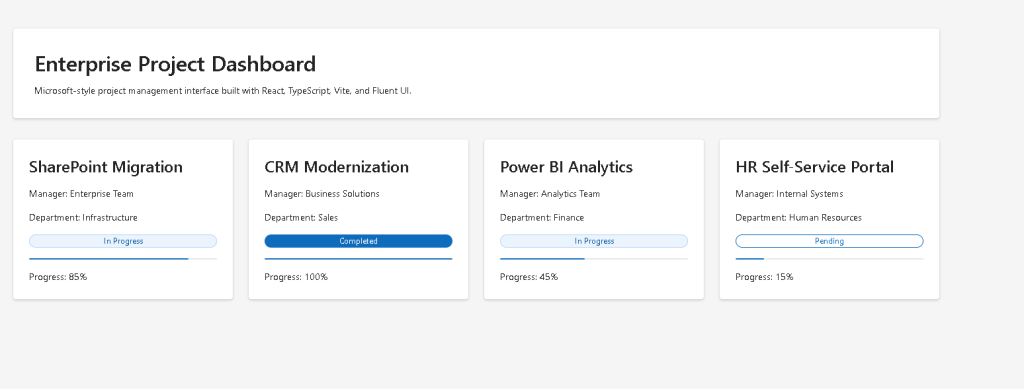
In App 57 — Project Management Dashboard, we build a Microsoft-style enterprise project dashboard using:
- React
- TypeScript
- Vite
- Fluent UI
This application belongs to Block 3 — Professional Fluent UI Applications, where the ReactLab roadmap transitions from basic rendering and state exercises into enterprise-grade UI composition and scalable architecture.
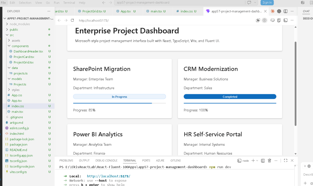
The main purpose of this app is to teach:
- dashboard architecture
- reusable enterprise components
- project visualization
- responsive card grids
- Fluent UI composition
- data-driven rendering
- component isolation
- Microsoft design system patterns
The most important architectural principle introduced is:
Enterprise UI should be composed from reusable data-driven components.
This app intentionally avoids:
- APIs
- authentication
- useEffect
- reducers
- async operations
The goal is mastering enterprise rendering architecture before introducing external systems in Block 4.
Understanding the Purpose of a Dashboard
A dashboard is not simply “a page with cards.”
In enterprise systems, dashboards are responsible for:
- organizing information hierarchically
- exposing operational status
- surfacing KPIs
- displaying workflow progress
- summarizing business operations
- improving decision visibility
Examples include:
- Azure DevOps boards
- Microsoft Planner
- Power BI dashboards
- SharePoint project portals
- Service management systems
- ticketing dashboards
- ERP project management modules
The dashboard pattern is one of the most repeated enterprise UI architectures in frontend engineering.
React Mental Model Introduced
This application reinforces the core React principle:
UI = function(data)
The dashboard is not manually constructed element-by-element.
Instead:
- project data exists
- React maps the data
- components render the UI
- Fluent UI styles the interface
This is declarative rendering.
React is NOT:
- manual DOM manipulation
- imperative UI programming
- jQuery-style updates
React IS:
- component composition
- declarative rendering
- predictable UI architecture
- state/data-driven interfaces
Official React guidance:
Creating the Project
PowerShell Commands
mkdir bloco03cd bloco03npm create vite@latest app57-project-management-dashboard -- --template react-tscd app57-project-management-dashboardnpm installnpm install @fluentui/react-components @fluentui/react-icons
Why Vite Is Used
The project uses Vite because modern React development requires:
- fast startup
- instant hot reload
- modern ES Modules
- optimized builds
- simplified tooling
Unlike older systems like Create React App, Vite serves files using native ES Modules during development.
Advantages:
- near-instant startup
- faster rebuilds
- lightweight configuration
- excellent TypeScript support
Official documentation:
Creating the Folder Structure
PowerShell
mkdir src\componentsmkdir src\datamkdir src\modelsmkdir src\styles
Create files:
New-Item src\models\Project.ts -ItemType FileNew-Item src\data\projects.ts -ItemType FileNew-Item src\components\DashboardHeader.tsx -ItemType FileNew-Item src\components\ProjectCard.tsx -ItemType FileNew-Item src\components\ProjectGrid.tsx -ItemType FileNew-Item artigo.md -ItemType File
Final Project Structure
app57-project-management-dashboard/ src/ components/ DashboardHeader.tsx ProjectCard.tsx ProjectGrid.tsx data/ projects.ts models/ Project.ts styles/ App.tsx main.tsx index.css
This structure follows the ReactLab architecture philosophy:
- separation of concerns
- reusable components
- scalable organization
- predictable growth
Understanding the Model Layer
src\models\Project.ts
export type ProjectStatus = | "Completed" | "In Progress" | "Pending";export interface Project { id: number; title: string; manager: string; department: string; progress: number; status: ProjectStatus;}
Why TypeScript Models Matter
This file defines the shape of the dashboard data.
Without models:
- objects become inconsistent
- refactoring becomes dangerous
- enterprise systems become harder to scale
TypeScript guarantees:
- all projects share the same structure
- invalid data is caught early
- autocomplete works correctly
- architecture becomes predictable
This is one of the reasons TypeScript dominates enterprise React ecosystems.
Official documentation:
Creating the Dashboard Data
src\data\projects.ts
import type { Project } from "../models/Project";export const projects: Project[] = [ { id: 1, title: "SharePoint Migration", manager: "Enterprise Team", department: "Infrastructure", progress: 85, status: "In Progress", }, { id: 2, title: "CRM Modernization", manager: "Business Solutions", department: "Sales", progress: 100, status: "Completed", }, { id: 3, title: "Power BI Analytics", manager: "Analytics Team", department: "Finance", progress: 45, status: "In Progress", }, { id: 4, title: "HR Self-Service Portal", manager: "Internal Systems", department: "Human Resources", progress: 15, status: "Pending", },];
Why Static Data Is Important First
This application intentionally uses static data.
Why?
Because React rendering must be understood BEFORE introducing:
- APIs
- fetch
- async loading
- useEffect
- server synchronization
The rendering pipeline becomes:
Data→ React components→ Dashboard UI
This is foundational React architecture.
Creating the Dashboard Header
src\components\DashboardHeader.tsx
import { Card, Text, Title1,} from "@fluentui/react-components";export function DashboardHeader() { return ( <Card style={{ padding: "32px", marginBottom: "32px", }} > <Title1> Enterprise Project Dashboard </Title1> <Text> Microsoft-style project management dashboard built with React, TypeScript, Vite, and Fluent UI. </Text> </Card> );}
Why Enterprise Headers Matter
Large applications should never place everything in one file.
The header becomes:
- reusable
- isolated
- maintainable
- independently scalable
This is React composition.
Instead of:
- giant monolithic pages
React encourages:
- small focused components
Official React documentation:
Creating the Project Card
src\components\ProjectCard.tsx
import { Badge, Card, ProgressBar, Text, Title3,} from "@fluentui/react-components";import type { Project } from "../models/Project";interface ProjectCardProps { project: Project;}function getBadgeAppearance(status: Project["status"]) { if (status === "Completed") { return "filled" as const; } if (status === "In Progress") { return "tint" as const; } return "outline" as const;}export function ProjectCard({ project,}: ProjectCardProps) { return ( <Card style={{ padding: "24px", display: "flex", flexDirection: "column", gap: "16px", }} > <Title3>{project.title}</Title3> <Text> Manager: {project.manager} </Text> <Text> Department: {project.department} </Text> <Badge appearance={getBadgeAppearance(project.status)}> {project.status} </Badge> <ProgressBar value={project.progress / 100} /> <Text> Progress: {project.progress}% </Text> </Card> );}
Understanding Derived UI
This section is extremely important:
getBadgeAppearance(project.status)
The UI appearance derives from project data.
This is declarative rendering.
We are NOT manually changing colors with imperative DOM logic.
Instead:
- status changes
- React re-renders
- UI updates automatically
This is one of React’s most important concepts.
Understanding the ProgressBar
<ProgressBar value={project.progress / 100} />
The Fluent UI ProgressBar expects values between:
- 0
- 1
So:
85%
becomes:
0.85
This is normalized rendering.
Official Fluent UI docs:
Creating the Dashboard Grid
src\components\ProjectGrid.tsx
import { projects } from "../data/projects";import { ProjectCard } from "./ProjectCard";export function ProjectGrid() { return ( <div style={{ display: "grid", gridTemplateColumns: "repeat(auto-fit, minmax(320px, 1fr))", gap: "24px", }} > {projects.map((project) => ( <ProjectCard key={project.id} project={project} /> ))} </div> );}
Why map() Is Fundamental in React
This line is one of the most important lines in the entire application:
projects.map((project) => (
React converts arrays into UI.
Conceptually:
Project object→ React component→ Dashboard card
This is declarative rendering.
Official documentation:
Why key={project.id} Matters
key={project.id}
Keys help React identify list elements efficiently.
Without stable keys:
- rendering becomes inefficient
- DOM updates become unpredictable
- React warnings appear
Keys are essential in dynamic rendering.
Creating the Root App
src\App.tsx
import { FluentProvider, webLightTheme,} from "@fluentui/react-components";import { DashboardHeader } from "./components/DashboardHeader";import { ProjectGrid } from "./components/ProjectGrid";function App() { return ( <FluentProvider theme={webLightTheme}> <main style={{ minHeight: "100vh", backgroundColor: "#f5f5f5", padding: "48px", boxSizing: "border-box", }} > <section style={{ maxWidth: "1400px", margin: "0 auto", }} > <DashboardHeader /> <ProjectGrid /> </section> </main> </FluentProvider> );}export default App;
Why FluentProvider Is Critical
<FluentProvider theme={webLightTheme}>
This activates:
- Microsoft design tokens
- Fluent UI typography
- spacing system
- accessibility behavior
- theme consistency
Without it:
- Fluent UI components lose correct styling
Official documentation:
Creating main.tsx
src\main.tsx
import React from "react";import ReactDOM from "react-dom/client";import App from "./App";import "./index.css";ReactDOM.createRoot( document.getElementById("root")!).render( <React.StrictMode> <App /> </React.StrictMode>);
Creating index.css
src\index.css
body { margin: 0; font-family: "Segoe UI", Arial, sans-serif;}* { box-sizing: border-box;}
Running the Application
Development server:
npm run dev
Production validation:
npm run build
Preview production build:
npm run preview
Complete Rendering Flow
main.tsx→ renders AppApp→ renders DashboardHeader→ renders ProjectGridProjectGrid→ loops through project dataprojects.map(...)→ renders ProjectCard componentsProjectCard→ renders Fluent UI enterprise cards
This is enterprise React architecture.
Why There Is No useEffect
This app intentionally avoids:
- APIs
- timers
- subscriptions
- browser synchronization
According to:
Effects should synchronize with external systems.
This dashboard is purely derived from local data.
Therefore:
useEffectwould be unnecessary- direct rendering is correct
Enterprise Architecture Introduced
This app introduces the architecture used in real enterprise dashboards:
Dashboard Header Grid Cards Metrics Status Progress
This later evolves into:
- PMO systems
- analytics dashboards
- SharePoint portals
- admin systems
- workflow dashboards
- reporting platforms
Technical Summary
| Concept | Explanation |
|---|---|
| TypeScript model | Predictable project structure |
| Static data | Dashboard source |
map() rendering | Data transformed into UI |
| Fluent UI Card | Enterprise visual container |
| ProgressBar | Progress visualization |
| Badge | Status representation |
| CSS Grid | Responsive layout |
| Component composition | Small reusable UI pieces |
| Declarative rendering | UI derived from data |
| Pure components | Stateless enterprise rendering |
Concept Table
| Concept | File | Purpose |
|---|---|---|
| Project model | Project.ts | Defines project structure |
| Dashboard data | projects.ts | Provides UI content |
| Header component | DashboardHeader.tsx | Enterprise dashboard header |
| Project card | ProjectCard.tsx | Reusable project visualization |
| Grid component | ProjectGrid.tsx | Responsive dashboard layout |
| FluentProvider | App.tsx | Global Fluent UI theme |
| ProgressBar | ProjectCard.tsx | Project progress visualization |
| Badge rendering | ProjectCard.tsx | Status UI |
Official Documentation
React
Fluent UI
Tooling
Final Architectural Insight
The most important lesson from App 57 is:
Enterprise dashboards are reusable component trees driven by data.
Professional React applications should never be:
- giant pages
- duplicated HTML
- manually manipulated UI
Instead:
Data→ reusable components→ declarative rendering→ enterprise architecture
This is the foundation of:
- Microsoft dashboards
- SharePoint-style portals
- PMO systems
- analytics applications
- enterprise React ecosystems
Current Project Progress
| Block | App | Name | Status |
|---|---|---|---|
| Block 1 | 01–20 | Fundamentals and UI | Completed |
| Block 2 | 21–40 | Interactivity and State | Completed |
| Block 3 | 41 | Microsoft Style Login | Completed |
| Block 3 | 42 | Corporate Form | Completed |
| Block 3 | 43 | Tabs Navigation | Completed |
| Block 3 | 44 | Dialog Manager | Completed |
| Block 3 | 45 | Executive Dashboard | Completed |
| Block 3 | 46 | DataGrid Catalog | Completed |
| Block 3 | 47 | Enterprise User List | Completed |
| Block 3 | 48 | Navigable Sidebar | Completed |
| Block 3 | 49 | Corporate Header | Completed |
| Block 3 | 50 | Professional Toolbar | Completed |
| Block 3 | 51 | Notification System | Completed |
| Block 3 | 52 | Administrative Panel | Completed |
| Block 3 | 53 | Ticket Manager | Completed |
| Block 3 | 54 | Approval System | Completed |
| Block 3 | 55 | Corporate Calendar | Completed |
| Block 3 | 56 | SharePoint Inspired Dashboard | Completed |
| Block 3 | 57 | Enterprise Project Management Dashboard | Current |
| Block 3 | 58 | Support Ticket Control | Next |


