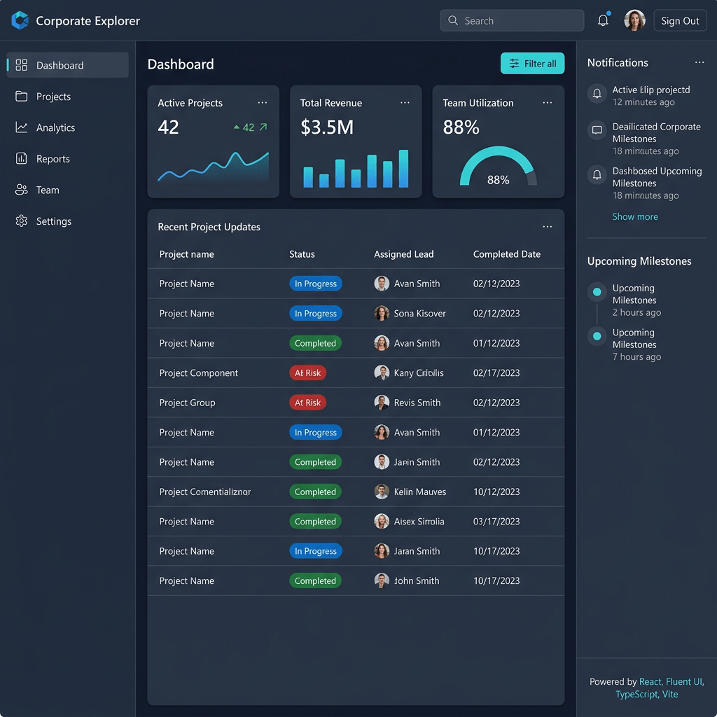
Technical Blog Article — App 60: Corporate Explorer with React, Fluent UI, TypeScript, and Vite
Introduction
In App 60 — Corporate Explorer, we complete Block 3 — Professional Fluent UI Applications of the ReactLab roadmap. This application represents an important milestone because it combines many enterprise UI concepts introduced throughout Block 3 into a single Microsoft-style explorer interface.
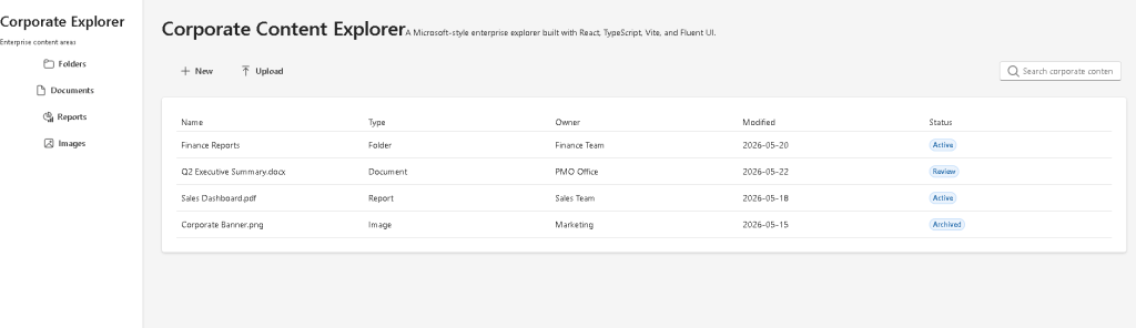
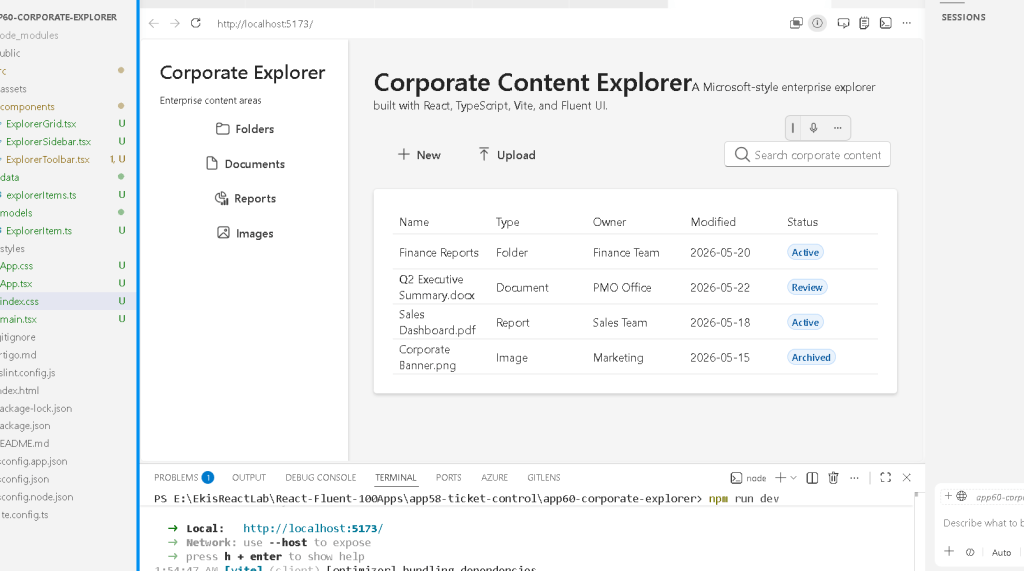
The objective of this app is to simulate a corporate file and content management environment inspired by:
- Microsoft 365
- SharePoint document libraries
- Teams file systems
- enterprise dashboards
- administrative portals
- intranet platforms
The application introduces a layout pattern extremely common in enterprise software:
Sidebar Navigation+ Toolbar+ Search Area+ Data Table/Grid+ Content Management UI
This structure appears in:
- SharePoint
- OneDrive
- Microsoft Teams
- CRM systems
- ERP platforms
- internal portals
- analytics systems
- administrative dashboards
The main architectural lesson is understanding how React applications are composed from small reusable components that together form large enterprise interfaces.
This app reinforces several critical React concepts:
- component composition
- declarative rendering
- rendering lists from data
- layout architecture
- reusable UI systems
- Fluent UI enterprise patterns
- TypeScript data modeling
- separation of concerns
The project continues following the official React mental model from:
1. What This App Teaches
| Concept | Purpose |
|---|---|
| Sidebar architecture | Enterprise navigation layout |
| Toolbar composition | Microsoft-style command areas |
| Data-driven UI | Render interface from structured data |
| Fluent UI Table | Enterprise tabular rendering |
| Reusable components | Split UI into focused parts |
| TypeScript models | Strongly typed data |
| Layout composition | Combining multiple UI regions |
| Declarative rendering | UI derived from data |
| Fluent UI design system | Microsoft visual standards |
| React composition | App → Sidebar → Toolbar → Grid |
The most important idea is:
Enterprise React apps are compositions of reusable UI sections.
2. Create the Project
Use PowerShell:
cd C:\ReactAppsNew-Item bloco03 -ItemType Directorycd bloco03npm create vite@latest app60-corporate-explorer -- --template react-tscd app60-corporate-explorernpm installnpm install @fluentui/react-components @fluentui/react-icons
3. Create the Folder Structure
New-Item src\components -ItemType DirectoryNew-Item src\models -ItemType DirectoryNew-Item src\data -ItemType DirectoryNew-Item src\styles -ItemType Directory
Create files:
New-Item src\models\ExplorerItem.ts -ItemType FileNew-Item src\data\explorerItems.ts -ItemType FileNew-Item src\components\ExplorerSidebar.tsx -ItemType FileNew-Item src\components\ExplorerToolbar.tsx -ItemType FileNew-Item src\components\ExplorerGrid.tsx -ItemType FileNew-Item artigo.md -ItemType File
4. Final Folder Structure
app60-corporate-explorer/ src/ components/ ExplorerSidebar.tsx ExplorerToolbar.tsx ExplorerGrid.tsx models/ ExplorerItem.ts data/ explorerItems.ts styles/ App.tsx main.tsx index.css artigo.md package.json vite.config.ts
This architecture is important because each component has one responsibility.
| File | Responsibility |
|---|---|
ExplorerItem.ts | Defines the data model |
explorerItems.ts | Provides enterprise content data |
ExplorerSidebar.tsx | Renders navigation |
ExplorerToolbar.tsx | Renders actions and search |
ExplorerGrid.tsx | Renders the enterprise table |
App.tsx | Composes the entire application |
main.tsx | Mounts React into HTML |
index.css | Global styling |
This separation is critical for scalable React applications.
5. Create the Data Model
src\models\ExplorerItem.ts
export type ExplorerItemType = | "Folder" | "Document" | "Report" | "Image";export interface ExplorerItem { id: number; name: string; type: ExplorerItemType; owner: string; modified: string; status: "Active" | "Archived" | "Review";}
6. Why TypeScript Models Matter
This model defines the shape of the enterprise content data.
Every explorer item must contain:
- id
- name
- type
- owner
- modified date
- status
Without models:
- data becomes unpredictable
- refactoring becomes dangerous
- bugs increase
- enterprise scaling becomes difficult
TypeScript helps guarantee architectural consistency.
For example:
type: "Folder"
is valid.
But:
type: "Video"
would generate a TypeScript error because "Video" is not part of the allowed union type.
This improves:
- reliability
- maintainability
- autocomplete
- enterprise safety
7. Create the Data Source
src\data\explorerItems.ts
import type { ExplorerItem } from "../models/ExplorerItem";export const explorerItems: ExplorerItem[] = [ { id: 1, name: "Finance Reports", type: "Folder", owner: "Finance Team", modified: "2026-05-20", status: "Active", }, { id: 2, name: "Q2 Executive Summary.docx", type: "Document", owner: "PMO Office", modified: "2026-05-22", status: "Review", }, { id: 3, name: "Sales Dashboard.pdf", type: "Report", owner: "Sales Team", modified: "2026-05-18", status: "Active", },];
8. Data-Driven Rendering
This app reinforces one of the most important React principles:
The UI should be generated from data.
Instead of manually writing:
- table row 1
- table row 2
- table row 3
React renders dynamically from arrays using:
explorerItems.map(...)
This is declarative rendering.
You describe:
- what should appear
React handles:
- DOM creation
- updates
- synchronization
Official documentation:
9. Create the Sidebar
src\components\ExplorerSidebar.tsx
The sidebar introduces the classic enterprise navigation pattern.
Important Fluent UI concepts:
- Card
- Button
- Icons
- Typography
- Vertical layout
The layout uses:
display: "flex"flexDirection: "column"
This creates:
TitleSubtitleNavigation Buttons
The sidebar width:
width: "260px"
creates stable enterprise navigation.
This is extremely common in:
- SharePoint
- Teams
- admin portals
- CRM systems
10. Fluent UI Icons
The sidebar imports icons like:
Folder24RegularDocument24Regular
Fluent UI icons are:
- SVG-based
- scalable
- theme-aware
- Microsoft-styled
This is better than:
- manually importing random SVGs
- inconsistent icon packs
- inaccessible graphics
11. Create the Toolbar
src\components\ExplorerToolbar.tsx
The toolbar simulates enterprise actions:
- create content
- upload files
- search content
This is heavily inspired by:
- SharePoint command bars
- Microsoft 365 toolbars
- Teams file actions
The toolbar layout:
display: "flex"justifyContent: "space-between"
creates:
Left Actions Right Search
This is a classic enterprise UI pattern.
12. Why Search Inputs Matter
The search input demonstrates:
<Input contentBefore={<Search24Regular />}/>
Fluent UI allows composition through props.
contentBefore inserts UI inside the input container.
This creates:
- cleaner UX
- integrated search visuals
- enterprise consistency
13. Create the Grid
src\components\ExplorerGrid.tsx
The grid uses Fluent UI Table components.
Structure:
Table TableHeader TableRow TableHeaderCell TableBody TableRow TableCell
This structure mirrors real HTML table semantics while applying Fluent UI styling and accessibility.
14. Why Enterprise Tables Matter
Enterprise applications heavily depend on:
- tabular data
- reports
- analytics
- document lists
- administrative records
The explorer table simulates:
- SharePoint libraries
- OneDrive file listings
- CRM records
- ERP grids
This prepares you for:
- DataGrid systems
- API data rendering
- large datasets
- enterprise dashboards
15. Rendering Table Rows
The table body uses:
explorerItems.map((item) => (
This converts data into UI rows.
Conceptually:
ExplorerItem[]→ React rows→ Browser table
This is the essence of React rendering.
16. Why key={item.id} Matters
Each row uses:
key={item.id}
React uses keys to:
- identify items
- optimize rendering
- track updates
- preserve element identity
Without keys:
- React warns
- rendering becomes less efficient
- updates become harder to predict
Official documentation:
17. The Root Layout
src\App.tsx
The root app composes:
Sidebar+ Main Content + Toolbar + Grid
This is enterprise composition.
The main container uses:
display: "flex"
This creates the horizontal layout:
-------------------------------------| Sidebar | Main Enterprise Content |-------------------------------------
18. Why flex: 1 Matters
The content area uses:
flex: 1
Meaning:
Occupy all remaining space after the sidebar.
This creates responsive enterprise layouts.
19. Why This App Uses No State
Notice something important:
This app intentionally uses:
- no
useState - no
useEffect
Why?
Because the app is currently:
- static
- presentational
- focused on layout architecture
According to React Learn:
“You Might Not Need an Effect.”
Effects should synchronize with external systems.
This app only renders static enterprise UI.
Therefore:
- effects are unnecessary
- adding them would create poor habits
Official documentation:
20. Understanding main.tsx
src\main.tsx
<FluentProvider theme={webLightTheme}>
This activates:
- Microsoft design tokens
- typography
- spacing
- accessibility
- Fluent UI themes
Without FluentProvider, Fluent UI components lose their styling system.
21. Enterprise Composition Pattern
This app introduces a very important architectural pattern:
App Sidebar Toolbar Grid
Each section is isolated.
This improves:
- readability
- maintainability
- scalability
- testing
- reuse
Professional React applications are built through composition.
22. Run the Application
Development server:
npm run dev
Production validation:
npm run build
Preview production build:
npm run preview
23. Complete Rendering Flow
index.html loads main.tsxmain.tsx renders AppApp renders Sidebar renders Toolbar renders GridGrid maps explorerItemsReact builds virtual UI treeReactDOM updates browser DOMBrowser displays enterprise explorer
24. Technical Summary
| Concept | Explanation |
|---|---|
| Sidebar Layout | Enterprise navigation |
| Toolbar | Microsoft-style actions |
| Fluent UI Table | Enterprise data rendering |
| TypeScript Model | Strongly typed explorer data |
| Data-Driven Rendering | UI generated from arrays |
map() | Converts data into components |
key | Stable list identity |
| Flexbox | Sidebar/content layout |
| FluentProvider | Microsoft theme system |
| Component Composition | Small reusable UI sections |
25. Concept Table
| Concept | File | Purpose |
|---|---|---|
| Data model | ExplorerItem.ts | Defines explorer structure |
| Static data | explorerItems.ts | Provides enterprise content |
| Sidebar | ExplorerSidebar.tsx | Navigation UI |
| Toolbar | ExplorerToolbar.tsx | Enterprise commands |
| Grid | ExplorerGrid.tsx | Tabular rendering |
| App composition | App.tsx | Combines all components |
| React mounting | main.tsx | Connects React to browser |
| Global CSS | index.css | Resets browser defaults |
26. Official Documentation
| Topic | Documentation |
|---|---|
| React Learn | https://react.dev/learn |
| Describing the UI | https://react.dev/learn/describing-the-ui |
| Rendering Lists | https://react.dev/learn/rendering-lists |
| Keeping Components Pure | https://react.dev/learn/keeping-components-pure |
| Fluent UI React Components | https://developer.microsoft.com/en-us/fluentui#/controls/web |
| Fluent UI Table | https://developer.microsoft.com/en-us/fluentui#/controls/web/table |
| Fluent UI Toolbar | https://developer.microsoft.com/en-us/fluentui#/controls/web/toolbar |
| Vite Guide | https://vite.dev/guide/ |
| TypeScript Docs | https://www.typescriptlang.org/docs/ |
27. Final Architectural Insight
App 60 represents the conclusion of the Fluent UI enterprise block.
This app combines:
- enterprise navigation
- command areas
- Microsoft visual language
- data rendering
- React composition
- Fluent UI architecture
The most important lesson is:
Large React applications are not giant files.They are compositions of focused reusable components.
This prepares the transition into Block 4 — Effects and Architecture, where the applications will evolve from static enterprise UI into:
- API integrations
- async rendering
- custom hooks
- effects
- data synchronization
- architecture layers
- enterprise services
Because modern React evolves like this:
Static UI→ Component Composition→ State→ Enterprise Layouts→ APIs→ Effects→ Architecture→ Complete Systems
Current Project Progress
| Block | App | Name | Status |
|---|---|---|---|
| Block 3 | 41 | Microsoft Style Login | Completed |
| Block 3 | 42 | Corporate Form | Completed |
| Block 3 | 43 | Tabs Navigation | Completed |
| Block 3 | 44 | Dialog Manager | Completed |
| Block 3 | 45 | Executive Dashboard | Completed |
| Block 3 | 46 | DataGrid Catalog | Completed |
| Block 3 | 47 | Enterprise User List | Completed |
| Block 3 | 48 | Navigable Sidebar | Completed |
| Block 3 | 49 | Corporate Header | Completed |
| Block 3 | 50 | Professional Toolbar | Completed |
| Block 3 | 51 | Notification Center | Completed |
| Block 3 | 52 | Administrative Panel | Completed |
| Block 3 | 53 | Ticket Manager | Completed |
| Block 3 | 54 | Approval System | Completed |
| Block 3 | 55 | Corporate Calendar | Completed |
| Block 3 | 56 | SharePoint Inspired Dashboard | Completed |
| Block 3 | 57 | Project Dashboard | Completed |
| Block 3 | 58 | Ticket Control | Completed |
| Block 3 | 59 | CRM Visual | Completed |
| Block 3 | 60 | Corporate Explorer | Current |
| Block 4 | 61 | REST API Consumption | Next |


