Technical Blog Article — App 59: CRM Visual with React, Fluent UI, TypeScript, and Vite
Introduction
Modern enterprise systems rely heavily on CRM interfaces. CRM stands for:
Customer Relationship Management
These systems are used to manage:
- customers
- leads
- sales opportunities
- contracts
- support relationships
- account history
- business workflows
Applications such as:
- Microsoft Dynamics
- Salesforce
- SAP
- HubSpot
- ServiceNow
all depend on enterprise dashboard architecture and visual information organization.
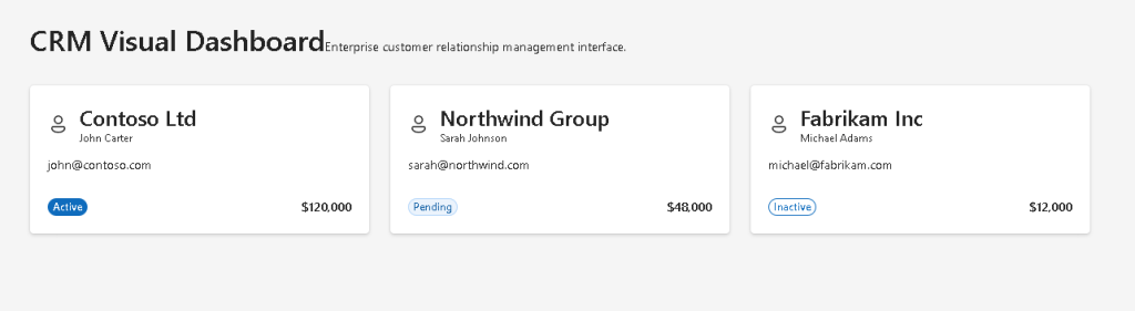
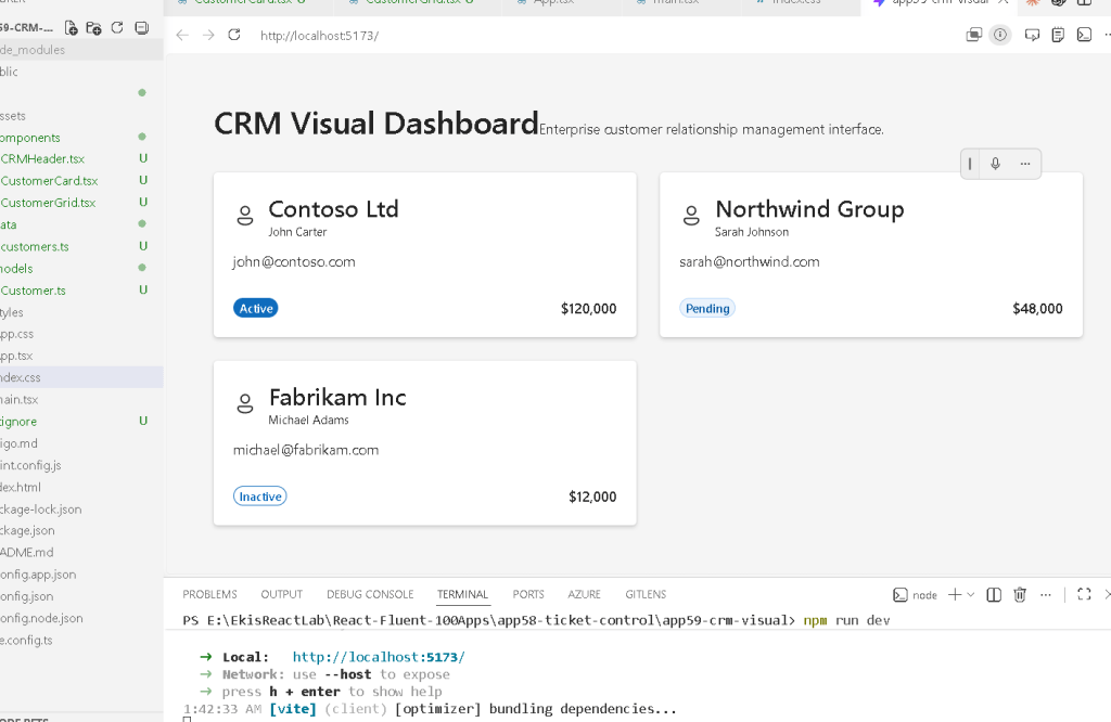
In App 59 — CRM Visual, we create a professional Microsoft-style CRM interface using:
- React
- TypeScript
- Vite
- Fluent UI
This application belongs to Block 3 — Professional Fluent UI Applications, where the ReactLab roadmap evolves into enterprise-level component architecture and Microsoft-inspired UI systems.
The main objective of this app is understanding how React components compose together to build:
- enterprise dashboards
- CRM interfaces
- reusable business cards
- data-driven layouts
- professional Fluent UI systems
This app intentionally focuses on:
- architecture
- composition
- visual organization
- declarative rendering
without introducing:
- APIs
- reducers
- authentication
- backend systems
- effects
because mastering visual architecture first is extremely important before moving into complex enterprise data systems.
Understanding the React Mental Model
This app reinforces one of the most important React ideas:
UI = function(data)
The interface is not manually manipulated.
Instead:
- data exists
- React renders components
- components derive UI from data
- React updates the browser DOM automatically
The CRM dashboard becomes:
Customer data→ React components→ Enterprise CRM interface
This is declarative UI rendering.
Official documentation:
Why CRM Interfaces Matter
CRM interfaces are ideal for React learning because they naturally require:
- reusable components
- list rendering
- enterprise layouts
- visual status indicators
- dashboard composition
- responsive grids
- consistent design systems
This makes CRM systems one of the best real-world examples of component architecture.
In this app, we introduce:
- customer cards
- enterprise dashboard spacing
- Fluent UI enterprise components
- responsive layout composition
- typed business models
Creating the Project
Create the app
cd C:\ReactAppsNew-Item bloco03 -ItemType Directorycd bloco03npm create vite@latest app59-crm-visual -- --template react-tscd app59-crm-visualnpm install
Installing Fluent UI
npm install @fluentui/react-components @fluentui/react-icons
Fluent UI is the official Microsoft design system for enterprise applications.
It provides:
- accessible UI controls
- enterprise spacing
- Microsoft typography
- keyboard navigation
- professional visual consistency
Official documentation:
Creating the Folder Structure
New-Item src\components -ItemType DirectoryNew-Item src\data -ItemType DirectoryNew-Item src\models -ItemType DirectoryNew-Item src\styles -ItemType Directory
Create files:
New-Item src\models\Customer.ts -ItemType FileNew-Item src\data\customers.ts -ItemType FileNew-Item src\components\CRMHeader.tsx -ItemType FileNew-Item src\components\CustomerCard.tsx -ItemType FileNew-Item src\components\CustomerGrid.tsx -ItemType FileNew-Item artigo.md -ItemType File
Final Project Structure
app59-crm-visual/ src/ components/ CRMHeader.tsx CustomerCard.tsx CustomerGrid.tsx data/ customers.ts models/ Customer.ts styles/ App.tsx main.tsx index.css
This separation is critical in enterprise React development because:
- models define business structure
- data provides rendering sources
- components render UI
- styles centralize visual behavior
Creating the Customer Model
src\models\Customer.ts
export type CustomerStatus = | "Active" | "Pending" | "Inactive";export interface Customer { id: number; company: string; contact: string; email: string; status: CustomerStatus; revenue: string;}
Why TypeScript Models Matter
This interface guarantees that every customer object has a predictable structure.
Benefits:
- autocomplete
- safer refactoring
- maintainability
- scalability
- type safety
- enterprise consistency
Without TypeScript:
- objects become unpredictable
- rendering bugs become easier to create
- large React apps become difficult to maintain
Official documentation:
Creating CRM Data
src\data\customers.ts
import type { Customer } from "../models/Customer";export const customers: Customer[] = [ { id: 1, company: "Contoso Ltd", contact: "John Carter", email: "john@contoso.com", status: "Active", revenue: "$120,000", }, { id: 2, company: "Northwind Group", contact: "Sarah Johnson", email: "sarah@northwind.com", status: "Pending", revenue: "$48,000", }, { id: 3, company: "Fabrikam Inc", contact: "Michael Adams", email: "michael@fabrikam.com", status: "Inactive", revenue: "$12,000", },];
Why Static Data Is Important
At this stage of the roadmap, the goal is mastering:
- rendering
- composition
- layout architecture
- reusable UI
before introducing:
- APIs
- effects
- async workflows
Learning progression matters.
The ReactLab roadmap evolves gradually:
Static UI→ Composition→ State→ Effects→ APIs→ Enterprise systems
Creating the Header Component
src\components\CRMHeader.tsx
import { Text, Title1,} from "@fluentui/react-components";export function CRMHeader() { return ( <header style={{ marginBottom: "32px", }} > <Title1> CRM Visual Dashboard </Title1> <Text> Enterprise customer relationship management interface. </Text> </header> );}
Understanding Component Responsibility
A React component should answer:
What part of the UI am I responsible for?
This component is responsible only for:
- dashboard identity
- title
- subtitle
Small focused components improve:
- reuse
- maintainability
- readability
Official documentation:
Creating the Customer Card
src\components\CustomerCard.tsx
import { Badge, Body1, Card, CardHeader, Caption1, Text, Title3,} from "@fluentui/react-components";import { Person24Regular,} from "@fluentui/react-icons";import type { Customer } from "../models/Customer";interface CustomerCardProps { customer: Customer;}function getBadgeAppearance( status: Customer["status"]) { if (status === "Active") { return "filled" as const; } if (status === "Pending") { return "tint" as const; } return "outline" as const;}export function CustomerCard({ customer,}: CustomerCardProps) { return ( <Card style={{ padding: "20px", }} > <CardHeader image={<Person24Regular />} header={ <Title3> {customer.company} </Title3> } description={ <Caption1> {customer.contact} </Caption1> } /> <Body1> {customer.email} </Body1> <div style={{ marginTop: "16px", display: "flex", justifyContent: "space-between", alignItems: "center", }} > <Badge appearance={getBadgeAppearance( customer.status )} > {customer.status} </Badge> <Text weight="semibold"> {customer.revenue} </Text> </div> </Card> );}
Understanding Props
The component receives:
customer: Customer
through props.
Props are inputs passed into components.
This allows:
- reuse
- configurability
- composition
The same component renders different results depending on the data received.
Official documentation:
Why Fluent UI Card Matters
<Card>
The Fluent UI Card component provides:
- enterprise spacing
- Microsoft styling
- accessible structure
- professional visual hierarchy
Cards are heavily used in:
- dashboards
- CRM systems
- admin panels
- analytics systems
- SharePoint-style interfaces
Official documentation:
Understanding Badge Appearance
This function:
getBadgeAppearance(status)
maps business status into visual representation.
Conceptually:
Business state→ visual appearance
This is declarative UI.
React encourages:
- deriving UI from data
- avoiding duplicated logic
- predictable rendering
Creating the Grid Component
src\components\CustomerGrid.tsx
import { customers } from "../data/customers";import { CustomerCard } from "./CustomerCard";export function CustomerGrid() { return ( <div style={{ display: "grid", gridTemplateColumns: "repeat(auto-fit, minmax(320px, 1fr))", gap: "24px", }} > {customers.map((customer) => ( <CustomerCard key={customer.id} customer={customer} /> ))} </div> );}
Understanding map() Rendering
The key React rendering pattern is:
customers.map(...)
React transforms arrays into UI.
Conceptually:
Customer data→ React components→ rendered dashboard
This is one of the core React patterns.
Official documentation:
Why Keys Matter
key={customer.id}
Keys help React:
- identify elements
- optimize rendering
- update lists efficiently
Without keys:
- React shows warnings
- rendering becomes less predictable
Creating App.tsx
src\App.tsx
import { FluentProvider, webLightTheme,} from "@fluentui/react-components";import { CRMHeader } from "./components/CRMHeader";import { CustomerGrid } from "./components/CustomerGrid";function App() { return ( <FluentProvider theme={webLightTheme}> <main style={{ minHeight: "100vh", backgroundColor: "#f5f5f5", padding: "48px", boxSizing: "border-box", }} > <section style={{ maxWidth: "1200px", margin: "0 auto", }} > <CRMHeader /> <CustomerGrid /> </section> </main> </FluentProvider> );}export default App;
Understanding FluentProvider
<FluentProvider theme={webLightTheme}>
This activates the Microsoft Fluent UI design system globally.
It provides:
- colors
- typography
- spacing
- accessibility
- visual consistency
Without FluentProvider, Fluent UI components lose their enterprise theme behavior.
Creating main.tsx
src\main.tsx
import React from "react";import ReactDOM from "react-dom/client";import App from "./App";import "./index.css";ReactDOM.createRoot( document.getElementById("root")!).render( <React.StrictMode> <App /> </React.StrictMode>);
Creating index.css
src\index.css
body { margin: 0; font-family: "Segoe UI", Arial, sans-serif;}* { box-sizing: border-box;}
Running the Application
Development
npm run dev
Production Validation
npm run build
Preview Production Build
npm run preview
Complete Rendering Flow
main.tsx renders AppApp renders CRMHeader and CustomerGridCustomerGrid loops through customersCustomerCard renders one enterprise CRM cardReactDOM updates the browser DOM
This is modern component architecture.
Why This App Matters
This app introduces the architecture used in:
- CRM systems
- enterprise dashboards
- Microsoft admin panels
- SharePoint portals
- business analytics systems
The same patterns later scale into:
- APIs
- reducers
- routing
- authentication
- DataGrid systems
- enterprise workflows
Technical Summary
| Concept | Explanation |
|---|---|
| TypeScript Interface | Predictable CRM data structure |
| Props | Data passed into reusable cards |
map() | Array-to-UI rendering |
| Fluent UI Card | Enterprise visual container |
| Badge | Business status indicator |
| Grid Layout | Responsive dashboard composition |
| FluentProvider | Microsoft design system provider |
| Declarative Rendering | UI derived from data |
| Composition | Small reusable components |
| Responsive Layout | Grid-based enterprise structure |
Concept Table
| Concept | File | Purpose |
|---|---|---|
| Customer model | Customer.ts | Defines CRM business structure |
| CRM data | customers.ts | Provides rendering source |
| Customer card | CustomerCard.tsx | Renders customer information |
| Dashboard grid | CustomerGrid.tsx | Organizes enterprise cards |
| Header | CRMHeader.tsx | Dashboard identity |
| Root app | App.tsx | Composes application layout |
| ReactDOM | main.tsx | Connects React to HTML |
| Global CSS | index.css | Resets browser styling |
Official Documentation
React
Fluent UI
Tooling
Final Architectural Insight
The most important lesson from App 59 is:
Enterprise applications are component systems driven by business data.
The CRM dashboard is not manually constructed item by item.
Instead:
Data→ Components→ Declarative Rendering→ Enterprise UI
This same architecture appears in:
- CRM systems
- Microsoft dashboards
- SharePoint portals
- admin systems
- analytics applications
- enterprise business platforms
Mastering this pattern prepares you for large-scale React enterprise development.
Current Project Progress
| Block | App | Name | Status |
|---|---|---|---|
| Block 1 | 01 | Hello React Fluent | Completed |
| Block 1 | 02 | Profile Card | Completed |
| Block 1 | 03 | Product List | Completed |
| Block 1 | 04 | Microsoft Style User Card | Completed |
| Block 1 | 05 | Static Dashboard | Completed |
| Block 1 | 06 | Corporate Sidebar Menu | Completed |
| Block 1 | 07 | Visual Task List | Completed |
| Block 1 | 08 | Timeline Events | Completed |
| Block 1 | 09 | Employee Table | Completed |
| Block 1 | 10 | Email List | Completed |
| Block 1 | 11 | Grid of Cards | Completed |
| Block 1 | 12 | Image Gallery | Completed |
| Block 1 | 13 | Movie Catalog | Completed |
| Block 1 | 14 | Football Teams | Completed |
| Block 1 | 15 | News Page | Completed |
| Block 1 | 16 | Financial Dashboard | Completed |
| Block 1 | 17 | SharePoint Style Layout | Completed |
| Block 1 | 18 | File Explorer | Completed |
| Block 1 | 19 | Corporate Portal | Completed |
| Block 1 | 20 | Microsoft Style Landing Page | Completed |
| Block 2 | 21 | Modern Counter | Completed |
| Block 2 | 22 | Toggle Theme | Completed |
| Block 2 | 23 | React Calculator | Completed |
| Block 2 | 24 | Login Form | Completed |
| Block 2 | 25 | User Registration | Completed |
| Block 2 | 26 | Complete ToDo List | Completed |
| Block 2 | 27 | Shopping List | Completed |
| Block 2 | 28 | Product Filter | Completed |
| Block 2 | 29 | Employee Search | Completed |
| Block 2 | 30 | Shopping Cart | Completed |
| Block 2 | 31 | Grade Simulator | Completed |
| Block 2 | 32 | Inventory Control | Completed |
| Block 2 | 33 | Contact Agenda | Completed |
| Block 2 | 34 | Currency Converter | Completed |
| Block 2 | 35 | BMI Calculator | Completed |
| Block 2 | 36 | Installment Simulator | Completed |
| Block 2 | 37 | Voting Panel | Completed |
| Block 2 | 38 | Interactive Quiz | Completed |
| Block 2 | 39 | Team Manager | Completed |
| Block 2 | 40 | Dynamic Dashboard | Completed |
| Block 3 | 41 | Microsoft Style Login | Completed |
| Block 3 | 42 | Corporate Form | Completed |
| Block 3 | 43 | Tabs Navigation | Completed |
| Block 3 | 44 | Dialog Manager | Completed |
| Block 3 | 45 | Executive Dashboard | Completed |
| Block 3 | 46 | DataGrid Catalog | Completed |
| Block 3 | 47 | Enterprise User List | Completed |
| Block 3 | 48 | Sidebar Navigation | Completed |
| Block 3 | 49 | Corporate Header | Completed |
| Block 3 | 50 | Professional Toolbar | Completed |
| Block 3 | 51 | Notification Center | Completed |
| Block 3 | 52 | Administrative Panel | Completed |
| Block 3 | 53 | Ticket Manager | Completed |
| Block 3 | 54 | Approval System | Completed |
| Block 3 | 55 | Corporate Calendar | Completed |
| Block 3 | 56 | SharePoint Inspired Dashboard | Completed |
| Block 3 | 57 | Project Dashboard | Completed |
| Block 3 | 58 | Ticket Control | Completed |
| Block 3 | 59 | CRM Visual | Current |
| Block 3 | 60 | Enterprise Explorer | Next |


