Building an Enterprise Administrative Portal with React, TypeScript, React Router, Vite, and Fluent UI
Introduction
Modern enterprise applications rarely consist of a single screen. Administrative systems typically contain dashboards, user management modules, configuration areas, reporting sections, audit panels, and navigation systems that allow users to move between different business functions.
In App 88 — Administrative Portal, we build the first complete administrative shell of the ReactLab journey. This application represents a significant milestone because it combines many concepts introduced throughout the previous apps into a unified enterprise architecture.
The portal includes:
- Enterprise sidebar navigation
- Dashboard area
- User management page
- Settings page
- Route-based navigation
- Reusable components
- Fluent UI integration
- TypeScript models
- Mock business data
- Microsoft-style layouts
This application belongs to Block 5 — Complete Applications, where the focus shifts from learning isolated React concepts to assembling complete enterprise-ready systems.
The most important concept introduced in this application is that navigation itself becomes part of the React component tree.
Instead of multiple HTML pages, React applications typically use routing systems that dynamically render different components based on the current URL.
The architecture becomes:
Browser URL→ React Router→ Selected Page Component→ Rendered UI
This is the foundation of virtually every modern enterprise React application.
Why Administrative Portals Matter
Administrative portals appear everywhere in enterprise software.
Examples include:
- Microsoft 365 Admin Center
- SharePoint Admin Center
- Power Platform Admin Center
- Azure Portal
- CRM Systems
- ERP Platforms
- Internal Corporate Applications
Although these systems vary in functionality, they usually share a common architectural pattern:
Sidebar Navigation+Top Header+Content Area+Multiple Functional Modules
Our application follows exactly this structure.
Enterprise Layout Architecture
The application is composed of four major sections:
Administrative Portal│├── Sidebar│├── Header│└── Content Area │ ├── Dashboard ├── Users └── Settings
Each section has a clear responsibility.
React applications scale best when components have focused responsibilities.
React Router and Single Page Applications
One of the most important additions in this application is React Router.
Installation:
npm install react-router-dom
React Router allows React applications to simulate multiple pages while remaining inside a single browser application.
Without React Router:
DashboardUsersSettings
would require separate HTML pages.
With React Router:
/→ Dashboard/users→ Users Page/settings→ Settings Page
Each route renders a different React component.
The browser URL changes, but React remains active.
This creates a smooth user experience without full page reloads.
Understanding BrowserRouter
At the root of the application we find:
<BrowserRouter>
This component enables routing capabilities.
BrowserRouter listens for URL changes and determines which component should be displayed.
Conceptually:
URL changes→ Router detects change→ Route matches path→ Component renders
This is one of the most important enterprise React patterns.
Understanding Routes
The application defines:
<Routes> <Route path="/" element={<DashboardPage />} /> <Route path="/users" element={<UsersPage />} /> <Route path="/settings" element={<SettingsPage />} /></Routes>
Each route maps a URL to a React component.
| URL | Component |
|---|---|
| / | DashboardPage |
| /users | UsersPage |
| /settings | SettingsPage |
React Router automatically renders the correct page.
Sidebar Navigation
The sidebar acts as the application’s navigation hub.
Enterprise users expect navigation to remain visible regardless of the page they are viewing.
The sidebar remains mounted while only the content area changes.
This architecture is extremely common in:
- Microsoft Admin Centers
- SharePoint Portals
- CRM Applications
- ERP Systems
The navigation items are implemented using Fluent UI buttons combined with React Router links.
Conceptually:
Sidebar Button→ Route Change→ New Page Rendered
No page refresh occurs.
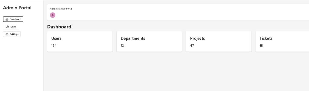
Dashboard Page
The Dashboard page acts as the landing page.
Its purpose is to provide:
- KPIs
- Metrics
- Business summaries
- Operational status
The MetricCard component is intentionally reusable.
Instead of hardcoding dashboard boxes, we create a reusable card component.
This follows the React principle:
Build reusable UI pieces.
The same component could later display:
- revenue
- users
- projects
- tickets
- alerts
- approvals
without modification.
Only props change.
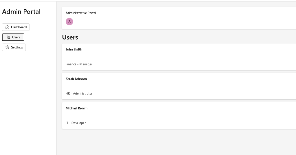
User Management Page
The Users page introduces data-driven rendering.
The page receives data from:
users.ts
and transforms data into UI.
This reinforces one of React’s most important concepts:
UI is derived from data.
Instead of manually creating three cards:
User AUser BUser C
React uses:
users.map(...)
to generate the interface.
This pattern scales to thousands of records.
Settings Page
The Settings page demonstrates another important architectural principle.
Even though the page is currently simple, the route already exists.
Enterprise applications often evolve incrementally.
Today’s simple page may become tomorrow’s:
- security settings
- theme management
- notification preferences
- system configuration
React architecture allows growth without redesigning the application shell.
Fluent UI and Enterprise Design
This application continues using Fluent UI as the primary design system.
Benefits include:
- Accessibility
- Keyboard navigation
- Consistent spacing
- Microsoft visual standards
- Theme support
- Enterprise-ready controls
Key Fluent UI components used:
| Component | Purpose |
|---|---|
| Card | Layout containers |
| Button | Navigation actions |
| Avatar | User representation |
| Text | Typography |
| FluentProvider | Theme provider |
Using Fluent UI eliminates much of the manual CSS work required in traditional applications.
Why TypeScript Matters
The User model:
export interface User { id: number; name: string; department: string; role: string;}
ensures consistent data structures.
Benefits:
- Strong typing
- IntelliSense
- Refactoring safety
- Reduced runtime errors
Enterprise applications become difficult to maintain without type safety.
This is why React and TypeScript are commonly paired together.
React Mental Model Reinforced
This application reinforces several React principles:
Components
Everything is a component.
SidebarHeaderMetricCardDashboardUsersSettings
Each component has one responsibility.
Props
Components receive configuration through props.
Example:
<MetricCard title="Users" value="124"/>
The component remains reusable.
Declarative Rendering
React does not manually manipulate the DOM.
Instead:
State/Data→ Component Render→ UI Output
The UI is always derived from data.
Why There Is No useEffect
This application intentionally avoids unnecessary effects.
There are:
- no API calls
- no timers
- no subscriptions
- no external synchronization
According to React Learn:
You Might Not Need an Effect.
The portal uses static business data.
Therefore:
No external system→ No useEffect required
This is the correct React mental model.
Production Validation
Development:
npm run dev
Production build:
npm run build
Preview production build:
npm run preview
Production validation should always be executed before considering an app complete.
Technical Summary
| Concept | Purpose |
|---|---|
| React Router | Multi-page navigation |
| BrowserRouter | Route management |
| Routes | Page mapping |
| Sidebar | Enterprise navigation |
| Dashboard | KPI visualization |
| Users Page | Data-driven rendering |
| Settings Page | Configuration module |
| Fluent UI | Microsoft design system |
| TypeScript | Type safety |
| Vite | Build system |
| Props | Component configuration |
| map() | Dynamic rendering |
| Component Composition | Architecture scalability |
Official Documentation
React:
- https://react.dev/learn
- https://react.dev/learn/describing-the-ui
- https://react.dev/learn/passing-props-to-a-component
- https://react.dev/learn/rendering-lists
- https://react.dev/learn/thinking-in-react
React Router:
Fluent UI:
Vite:
TypeScript:
Final Architectural Insight
This application introduces one of the most important transitions in React development.
Previous apps focused primarily on isolated features.
App 88 introduces the idea of an application shell:
Layout→ Navigation→ Routes→ Pages→ Business Modules
This is the same architectural pattern used in:
- Microsoft 365
- SharePoint Admin Center
- Azure Portal
- Power Platform
- Enterprise CRM Systems
- Corporate Dashboards
By mastering this structure, you are no longer building isolated React examples.
You are building complete enterprise applications.
Current Progress
| Block | App | Name | Status |
|---|---|---|---|
| Block 5 | 81 | Complete CRUD System | Completed |
| Block 5 | 82 | Employee Management | Completed |
| Block 5 | 83 | Financial Dashboard | Completed |
| Block 5 | 84 | Inventory System | Completed |
| Block 5 | 85 | Kanban Board | Completed |
| Block 5 | 86 | Enterprise Task Manager | Completed |
| Block 5 | 87 | User Management System | Completed |
| Block 5 | 88 | Administrative Portal | Current |
| Block 5 | 89 | Ticket System | Next |
| Block 5 | 90 | Power BI Style Dashboard | Upcoming |
Current Position: App 88 of 100
Next App: App 89 — Ticket System
 edvaldo b. guimarães filho