Building an Enterprise Financial Dashboard with React, TypeScript, Fluent UI, and Vite
Introduction
Modern business applications depend heavily on dashboards. Executives, managers, financial analysts, and operations teams rely on dashboards to transform raw business data into meaningful insights that support decision-making.
In ReactLab, App 83 — Financial Dashboard represents an important milestone because it is one of the first complete enterprise-style applications in Block 5. By this point, we have already learned components, props, state, forms, effects, services, architecture, and Fluent UI. Now we combine those concepts into a practical business solution.
This application demonstrates how to build a professional financial dashboard using:
- React
- TypeScript
- Vite
- Fluent UI
- Service Layer Architecture
- Reusable Components
- Enterprise Dashboard Design
The goal is not merely displaying numbers. The goal is understanding how React applications are structured when they begin to resemble real corporate software.
Why Financial Dashboards Matter
Almost every organization tracks financial metrics.
Examples include:
- Revenue
- Expenses
- Profit
- Operational Costs
- Monthly Growth
- Budget Consumption
- Financial Forecasts
Without dashboards, these numbers remain isolated inside spreadsheets and databases.
A dashboard transforms data into visual information.
The dashboard answers questions such as:
- Are we profitable?
- Are expenses increasing?
- Which month performed best?
- Is revenue growing?
- Are we meeting financial goals?
Enterprise dashboards exist because humans understand trends much faster when information is organized visually.
React Mental Model Applied
One of the most important React principles remains unchanged:
UI = Function(Data)
The dashboard does not manually manipulate the DOM.
Instead:
Financial Data→ React Components→ Rendered Dashboard
Whenever the data changes, React automatically updates the interface.
This is the essence of declarative programming.
Application Architecture
The project follows a layered structure:
src/│├── components/│ ├── KpiCard.tsx│ ├── FinancialSummary.tsx│ └── FinancialGrid.tsx│├── models/│ └── FinancialRecord.ts│├── services/│ └── financialService.ts│├── App.tsx├── main.tsx└── index.css
Each layer has a single responsibility.
This separation is critical in enterprise applications because systems become easier to maintain, test, and extend.
The Model Layer
The model defines the structure of the business data.
export interface FinancialRecord { id: number; month: string; revenue: number; expenses: number;}
This interface creates a contract.
Every financial record must contain:
- Identifier
- Month
- Revenue
- Expenses
TypeScript guarantees consistency throughout the application.
Without models, data structures become unpredictable and error-prone.
Service Layer
The service layer provides financial data.
export const financialData: FinancialRecord[] = [...]
At this stage the data is static.
In future enterprise applications this layer can evolve into:
REST APIsGraphQLAzure FunctionsSharePoint ListsDatabasesERP SystemsFinancial Platforms
The important lesson is:
The UI does not own the data.
The service layer owns the data.
This separation improves maintainability.
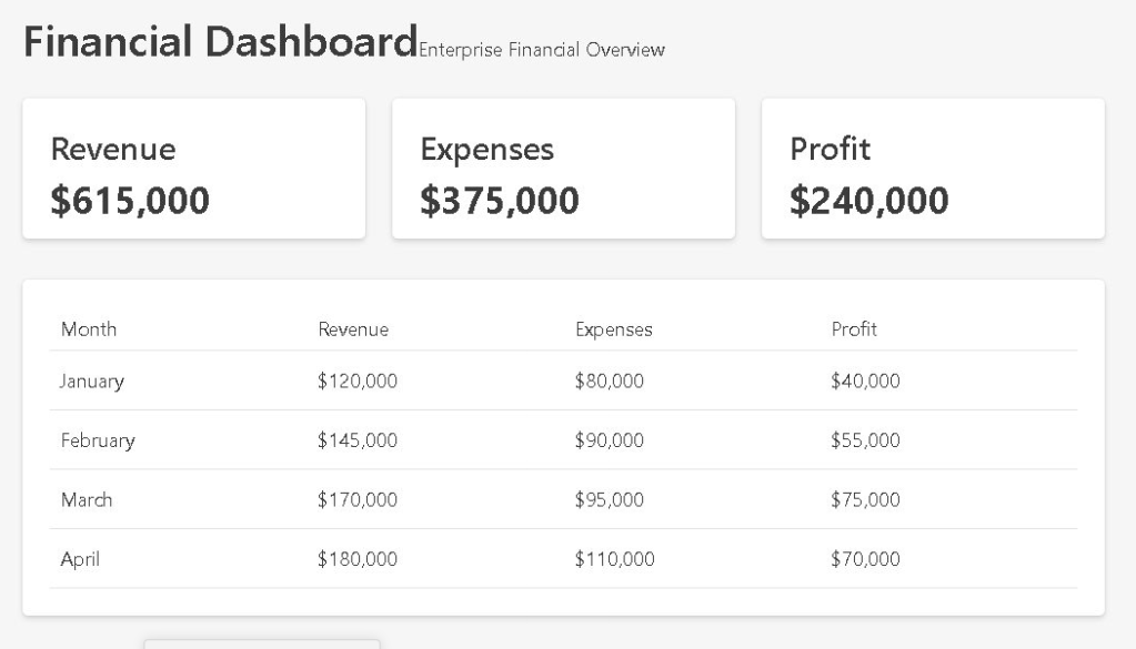
KPI Cards
One of the most recognizable dashboard elements is the KPI card.
KPI stands for:
Key Performance Indicator
Examples:
- Total Revenue
- Total Expenses
- Total Profit
The reusable component:
<KpiCard />
allows us to display metrics consistently.
Instead of repeating the same code three times, we create a reusable component and provide different values through props.
This follows one of React’s most important principles:
Build once.Reuse everywhere.
Derived Financial Metrics
Notice that profit is not stored directly.
Instead:
const profit = revenue - expenses;
This is called derived data.
React Learn strongly recommends deriving values whenever possible rather than duplicating state.
Bad approach:
const [profit, setProfit] = useState(...)
Good approach:
const profit = revenue - expenses;
Derived values are:
- Simpler
- More reliable
- Easier to maintain
- Less prone to synchronization bugs
Dashboard Composition
The dashboard is built from multiple specialized components:
App│├── FinancialSummary│ ├── Revenue KPI│ ├── Expense KPI│ └── Profit KPI│└── FinancialGrid
This structure illustrates component composition.
Large React applications are not built as giant files.
Instead:
Small Components→ Combined Together→ Large Applications
This approach improves:
- Readability
- Reusability
- Maintainability
- Testing
Financial Tables
The FinancialGrid component displays detailed information.
The table shows:
| Month | Revenue | Expenses | Profit |
|---|
This provides both:
- High-level summary
- Detailed breakdown
Decision-makers often need both perspectives.
KPIs answer:
What is happening?
Tables answer:
Why is it happening?
Fluent UI in Enterprise Dashboards
This project uses Fluent UI as the visual foundation.
Fluent UI provides:
- Accessibility
- Enterprise styling
- Microsoft design language
- Consistent spacing
- Professional typography
Without Fluent UI, we would need to implement:
- Button styles
- Card styles
- Table styles
- Typography systems
- Accessibility features
Using Fluent UI allows us to focus on business functionality.
Why There Is No useEffect
Many developers immediately add useEffect to every application.
This dashboard intentionally avoids that.
Why?
Because the data is already available locally.
There is no:
- API call
- External synchronization
- Browser subscription
- Timer
React Learn teaches:
You Might Not Need an Effect.
Adding unnecessary effects creates complexity.
This application demonstrates that many dashboards can be built using simple data and rendering logic.
Enterprise Design Patterns
Several professional patterns appear in this project:
Layered Architecture
ModelsServicesComponentsPages
Reusable Components
KpiCardFinancialSummaryFinancialGrid
Derived Values
Profit = Revenue - Expenses
Separation of Concerns
Data LayerPresentation LayerRendering Layer
These patterns are common in:
- SharePoint Framework
- Microsoft 365 Solutions
- Power Platform Extensions
- React Enterprise Applications
- Internal Corporate Portals
Future Improvements
This dashboard could evolve significantly.
Possible additions include:
- REST API Integration
- Charts
- Trend Analysis
- Forecasting
- Currency Conversion
- Multi-Year Reports
- Export to Excel
- Export to PDF
- Power BI Integration
- SharePoint Integration
The current architecture already supports these future enhancements.
Technical Summary
| Concept | Purpose |
|---|---|
| React | UI rendering |
| TypeScript | Strong typing |
| Fluent UI | Enterprise design system |
| Vite | Development tooling |
| Models | Data contracts |
| Services | Data source abstraction |
| Components | Reusable UI blocks |
| KPI Cards | Business metrics |
| Tables | Detailed reporting |
| Derived Data | Calculated business values |
| Composition | Building large UIs from small parts |
Key Lessons Learned
This application teaches that enterprise dashboards are not complicated because of their visuals.
They are successful because of their architecture.
The combination of:
- Models
- Services
- Components
- Derived Metrics
- Reusable UI
creates applications that scale over time.
React excels in this environment because it allows developers to focus on describing the UI while React handles rendering efficiently.
By completing App 83, you now understand how modern React dashboards organize business information into reusable, maintainable, enterprise-grade interfaces.
Official Documentation
- React Learn
- Thinking in React
- Managing State
- Fluent UI React Components
- TypeScript Documentation
- Vite Guide
Current Progress
| Block | App | Name | Status |
|---|---|---|---|
| Block 5 | 81 | Complete CRUD System | Completed |
| Block 5 | 82 | Employee Management | Completed |
| Block 5 | 83 | Financial Dashboard | Completed |
| Block 5 | 84 | Inventory System | Next |
Current Position: App 83 / 100 ✅
Next Application: App 84 — Inventory System.
