Building a Power BI Style Dashboard with React, TypeScript, Fluent UI, and Vite
Introduction
Modern enterprise applications are increasingly driven by data. Executives, managers, analysts, and operational teams rely on dashboards to transform raw information into actionable insights. Whether in finance, sales, operations, logistics, customer service, or project management, dashboards have become one of the most important interface patterns in business software.
One of the most recognized dashboard experiences in the Microsoft ecosystem is Power BI. Power BI popularized the concept of KPI-driven interfaces, interactive reports, executive scorecards, and data-driven decision making.
In App 90 — Power BI Style Dashboard, we build a modern analytical dashboard using React, TypeScript, Vite, and Fluent UI. The goal is not to recreate Power BI itself, but rather to learn how React applications can present analytical information using reusable components, enterprise layouts, and Microsoft-inspired visual patterns.
This application belongs to Block 5 of the ReactLab roadmap, where all previous concepts are combined into complete enterprise applications.
The application demonstrates:
- Dashboard architecture
- KPI visualization
- DataGrid integration
- Component composition
- Enterprise layouts
- Fluent UI components
- TypeScript models
- Data-driven rendering
- Microsoft-inspired design principles
Why Dashboards Matter
Enterprise software is not only about forms and CRUD operations.
A business application must answer questions such as:
- How is the company performing?
- Which region is generating the most revenue?
- Which departments are underperforming?
- Are targets being achieved?
- What requires immediate attention?
Dashboards solve these problems by transforming data into visual information.
Instead of reading spreadsheets, users can immediately identify trends, risks, opportunities, and performance indicators.
A dashboard should provide:
- Fast information access
- Clear visual hierarchy
- Executive summaries
- Actionable metrics
- Consistent layout
This application introduces these concepts using React and Fluent UI.
Project Architecture
The project follows the ReactLab enterprise structure:
src/ components/ DashboardSummary.tsx KpiCard.tsx RegionPanel.tsx SalesTable.tsx data/ dashboardData.ts models/ DashboardMetric.ts SalesRecord.ts styles/ App.tsx main.tsx index.css
Each folder has a specific responsibility.
Components
Contains reusable UI elements.
Examples:
- KPI cards
- Data tables
- Summary panels
- Dashboard widgets
Models
Defines the shape of the data.
TypeScript interfaces ensure:
- type safety
- predictable structures
- easier maintenance
- safer refactoring
Data
Stores dashboard information.
In a future version, this folder could be replaced by:
services/api/repositories/
for real API integration.
Understanding the Dashboard Data Model
The first model is:
export interface DashboardMetric { id: number; title: string; value: string; variation: string; status: "positive" | "negative" | "neutral";}
This interface represents KPI cards.
Examples:
- Revenue
- Customers
- Costs
- Orders
Instead of creating four different card components, we create one reusable component and feed it data.
This is one of React’s greatest strengths:
Data→ Components→ UI
The second model:
export interface SalesRecord { id: number; region: string; revenue: number; target: number; customers: number; status: "Above Target" | "Below Target";}
represents regional performance data.
This structure powers:
- tables
- progress bars
- regional analytics
Thinking in React
One of the most important concepts from React Learn is:
UI = Function(State
In this app there is no state yet because the dashboard is static.
That is intentional.
A common mistake is adding state everywhere.
According to React Learn:
If data never changes, it does not need state.
Our dashboard data is currently static.
Therefore:
No useStateNo useEffectNo reducersNo context
The dashboard simply renders information.
This is clean React architecture.
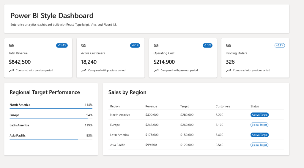
KPI Cards
The KPI section is inspired by Power BI scorecards.
Examples:
- Revenue
- Active Customers
- Operating Costs
- Pending Orders
Each card displays:
- Title
- Value
- Trend indicator
- Status badge
The component receives:
<KpiCard metric={metric} />
This is component composition.
The component does not care where the data comes from.
It only knows how to render it.
This makes it reusable.
Tomorrow the same component could display:
- HR metrics
- IT metrics
- Financial metrics
- Manufacturing metrics
without modification.
Why Reusable Components Matter
Without reusable components:
Revenue CardCustomer CardCost CardOrders Card
would all need separate implementations.
With React:
One componentMany data objects
This reduces:
- duplication
- bugs
- maintenance effort
and improves scalability.
Fluent UI and Enterprise Design
The dashboard uses Fluent UI because Fluent UI is Microsoft’s official design system.
Benefits include:
- Accessibility
- Enterprise styling
- Keyboard navigation
- Consistent spacing
- Typography standards
- Theme support
Instead of manually creating cards, badges, tables, and layouts, Fluent UI provides enterprise-ready building blocks.
Examples used:
- Card
- Badge
- Text
- Title
- ProgressBar
- DataGrid
This allows developers to focus on business logic instead of low-level UI implementation.
Dashboard Summary Section
The summary area uses CSS Grid:
gridTemplateColumns: "repeat(auto-fit, minmax(220px, 1fr))"
This creates a responsive KPI layout.
The advantages:
- Adapts automatically
- Supports different screen sizes
- Requires minimal code
- Creates Power BI-like responsiveness
The grid receives KPI data and renders cards dynamically.
React maps:
metrics.map(...)
into visual components.
This is declarative rendering.
Regional Performance Panel
The Region Panel introduces another important dashboard concept:
Progress against target
Each region displays:
- Name
- Percentage achieved
- Progress bar
The progress is calculated using:
revenue / target
This is a derived value.
Notice:
We do not store the percentage.
We calculate it.
This follows React guidance:
Do not store redundant state.
The UI derives information from existing data.
DataGrid Analytics
One of the most important enterprise components is:
DataGrid
DataGrid is the foundation of:
- CRMs
- ERPs
- Ticket systems
- Administrative portals
- SharePoint solutions
- Power BI-style detail tables
The grid displays:
- Region
- Revenue
- Target
- Customers
- Status
Using:
createTableColumn()
allows strongly typed columns.
TypeScript validates:
- column definitions
- row structure
- render functions
This reduces runtime errors.
Why TypeScript Matters
Dashboards often consume large amounts of data.
Without TypeScript:
RevenueCustomerTargetStatus
might contain unexpected values.
TypeScript provides:
- compile-time validation
- autocomplete
- safer refactoring
- clearer architecture
If someone changes:
revenue: number
to
revenue: string
the compiler immediately reports the issue.
This is essential in enterprise applications.
Layout Architecture
The dashboard follows a typical enterprise layout:
HeaderKPI SummaryRegion Panel | Sales Table
This hierarchy mirrors real-world analytical applications.
The layout uses:
Flexbox+CSS Grid
which are the two most important CSS layout systems in modern frontend development.
Understanding main.tsx
The application entry point remains:
main.tsx
This file:
- Finds the HTML root
- Creates the React root
- Loads Fluent UI
- Renders App
The structure is:
<FluentProvider theme={webLightTheme}> <App /></FluentProvider>
The FluentProvider enables:
- Microsoft colors
- Typography
- Spacing tokens
- Accessibility behavior
Without it, Fluent UI components would lose their enterprise styling.
Why There Is No useEffect
Many developers immediately reach for:
useEffect()
when building dashboards.
But React Learn teaches:
Effects synchronize with external systems.
This dashboard currently has:
- no API
- no database
- no timer
- no browser subscriptions
Therefore:
No useEffect required.
Future versions may connect to:
- REST APIs
- Power BI APIs
- Graph APIs
- CRM systems
- ERP systems
At that point, useEffect becomes appropriate.
Future Evolution
This dashboard could evolve into:
App 91
Report Generator
App 92
Audit Dashboard
App 93
SharePoint Analytics Portal
App 98
Advanced Analytics Platform
Future enhancements may include:
- Charts
- Filters
- Sorting
- Pagination
- Drill-down reports
- Live APIs
- Export functionality
- Dark mode
- User personalization
React Mental Model Reinforced
This application reinforces a core React principle:
Data→ Components→ UI
Not:
DOM manipulation→ manual updates→ imperative rendering
React developers describe the interface.
React performs the rendering.
Technical Summary
| Concept | Purpose |
|---|---|
| React | UI architecture |
| TypeScript | Strong typing |
| Fluent UI | Microsoft design system |
| Vite | Build and development tooling |
| DashboardMetric | KPI model |
| SalesRecord | Analytics model |
| KpiCard | Reusable KPI component |
| RegionPanel | Target performance visualization |
| SalesTable | Enterprise DataGrid |
| CSS Grid | Responsive KPI layout |
| Flexbox | Dashboard structure |
| Declarative Rendering | Data-driven UI |
| Component Composition | Reusable architecture |
| FluentProvider | Global theme provider |
Official Documentation
React
- https://react.dev/learn
- https://react.dev/learn/thinking-in-react
- https://react.dev/learn/rendering-lists
- https://react.dev/learn/describing-the-ui
Fluent UI
Microsoft Power BI
- https://learn.microsoft.com/en-us/power-bi/
- https://learn.microsoft.com/en-us/training/powerplatform/power-bi/
Vite
TypeScript
Conclusion
App 90 marks an important milestone in the ReactLab journey.
For the first time, we build a complete analytical dashboard inspired by enterprise reporting platforms. The application demonstrates how React components can transform structured business data into meaningful visual information while maintaining clean architecture, strong typing, and Microsoft-style user experiences.
Although visually simple compared to a full Power BI solution, the architectural principles introduced here are the same ones used in professional dashboards:
Data → Components → Insights.
Mastering this pattern prepares you for advanced reporting systems, analytics portals, administrative dashboards, SharePoint-style applications, and enterprise React architectures.
Current Progress
| Block | App | Name | Status |
|---|---|---|---|
| Block 5 | 81 | Complete CRUD System | Completed |
| Block 5 | 82 | Employee Management | Completed |
| Block 5 | 83 | Financial Dashboard | Completed |
| Block 5 | 84 | Inventory System | Completed |
| Block 5 | 85 | Kanban Board | Completed |
| Block 5 | 86 | Enterprise Task Manager | Completed |
| Block 5 | 87 | User Management System | Completed |
| Block 5 | 88 | Administrative Portal | Completed |
| Block 5 | 89 | Ticket System | Completed |
| Block 5 | 90 | Power BI Style Dashboard | Completed |
| Block 5 | 91 | Report Generator | Next |
Current Position: App 90/100 completed. Next app: App 91 — Report Generator.
