App 100 — React Enterprise Final Platform with React, TypeScript, Vite, and Fluent UI
Introduction
App 100 is the final application of the ReactLab journey. It represents the complete consolidation of everything learned across the previous 99 React applications: component composition, props, state, hooks, services, TypeScript models, enterprise layouts, Fluent UI, dashboard design, reusable components, and scalable project organization.
The goal of this app is to build a Microsoft-style enterprise platform with:
- enterprise shell layout
- sidebar navigation
- top header
- KPI summary cards
- module cards
- activity feed
- mock service layer
- custom hook
- typed data models
- Fluent UI visual system
This is not just another dashboard. It is the final architectural exercise of the React + Fluent UI learning path.
1. Create the Project
cd E:\EkisReactLab\React-Fluent-100AppsNew-Item bloco05 -ItemType Directorycd bloco05npm create vite@latest app100-react-enterprise-final-platform -- --template react-tscd app100-react-enterprise-final-platformnpm installnpm install @fluentui/react-componentsnpm install @fluentui/react-icons
2. Create Folders
New-Item src\components -ItemType DirectoryNew-Item src\pages -ItemType DirectoryNew-Item src\models -ItemType DirectoryNew-Item src\data -ItemType DirectoryNew-Item src\services -ItemType DirectoryNew-Item src\hooks -ItemType DirectoryNew-Item src\styles -ItemType Directory
3. Create Files
New-Item src\models\AdminModule.ts -ItemType FileNew-Item src\models\ActivityItem.ts -ItemType FileNew-Item src\data\modules.ts -ItemType FileNew-Item src\data\activities.ts -ItemType FileNew-Item src\services\dashboardService.ts -ItemType FileNew-Item src\hooks\useDashboardSummary.ts -ItemType FileNew-Item src\components\AppHeader.tsx -ItemType FileNew-Item src\components\EnterpriseSidebar.tsx -ItemType FileNew-Item src\components\SummaryCard.tsx -ItemType FileNew-Item src\components\ModuleCard.tsx -ItemType FileNew-Item src\components\ActivityFeed.tsx -ItemType FileNew-Item src\pages\DashboardPage.tsx -ItemType FileNew-Item src\App.tsx -ItemType FileNew-Item src\main.tsx -ItemType FileNew-Item src\index.css -ItemType FileNew-Item artigo.md -ItemType File
4. Final Folder Structure
app100-react-enterprise-final-platform/ src/ components/ ActivityFeed.tsx AppHeader.tsx EnterpriseSidebar.tsx ModuleCard.tsx SummaryCard.tsx data/ activities.ts modules.ts hooks/ useDashboardSummary.ts models/ ActivityItem.ts AdminModule.ts pages/ DashboardPage.tsx services/ dashboardService.ts styles/ App.tsx main.tsx index.css artigo.md package.json vite.config.ts tsconfig.json
5. Model — Admin Module
src\models\AdminModule.ts
export type ModuleStatus = "Healthy" | "Warning" | "Critical";export interface AdminModule { id: number; title: string; description: string; owner: string; activeUsers: number; openItems: number; status: ModuleStatus;}
This model defines the enterprise modules displayed on the dashboard.
Each module has:
| Property | Purpose |
|---|---|
id | Stable React key |
title | Module name |
description | Business explanation |
owner | Responsible team |
activeUsers | Usage metric |
openItems | Pending work |
status | Health state |
6. Model — Activity Item
src\models\ActivityItem.ts
export type ActivityType = | "Info" | "Success" | "Warning";export interface ActivityItem { id: number; title: string; description: string; type: ActivityType; time: string;}
This model represents recent enterprise events shown in the activity feed.
7. Data — Modules
src\data\modules.ts
import type { AdminModule } from "../models/AdminModule";export const modules: AdminModule[] = [ { id: 1, title: "User Management", description: "Manage enterprise users, roles, permissions, and access policies.", owner: "Identity Team", activeUsers: 1240, openItems: 18, status: "Healthy", }, { id: 2, title: "Product Catalog", description: "Maintain corporate products, pricing rules, and catalog metadata.", owner: "Operations Team", activeUsers: 480, openItems: 9, status: "Healthy", }, { id: 3, title: "Analytics Center", description: "Monitor KPIs, usage metrics, business trends, and executive insights.", owner: "BI Team", activeUsers: 760, openItems: 14, status: "Warning", }, { id: 4, title: "Reports Center", description: "Generate operational, financial, audit, and compliance reports.", owner: "Reporting Team", activeUsers: 390, openItems: 22, status: "Warning", }, { id: 5, title: "Settings", description: "Configure platform preferences, integrations, and global parameters.", owner: "Platform Team", activeUsers: 95, openItems: 5, status: "Healthy", }, { id: 6, title: "Security Monitor", description: "Review security alerts, audit events, and administrative activity.", owner: "Security Team", activeUsers: 210, openItems: 31, status: "Critical", },];
8. Data — Activities
src\data\activities.ts
import type { ActivityItem } from "../models/ActivityItem";export const activities: ActivityItem[] = [ { id: 1, title: "User role updated", description: "The Identity Team updated access permissions for 12 users.", type: "Success", time: "Today, 09:15", }, { id: 2, title: "Analytics warning", description: "The Analytics Center detected unusual growth in report processing time.", type: "Warning", time: "Today, 10:40", }, { id: 3, title: "Catalog synchronization completed", description: "The Product Catalog was synchronized with the enterprise data source.", type: "Success", time: "Today, 11:05", }, { id: 4, title: "Security review required", description: "The Security Monitor has pending administrative events for review.", type: "Warning", time: "Today, 12:20", },];
9. Service Layer
src\services\dashboardService.ts
import { modules } from "../data/modules";import { activities } from "../data/activities";export function getEnterpriseModules() { return modules;}export function getRecentActivities() { return activities;}
This service layer is simple, but very important architecturally.
Instead of importing data directly everywhere, the page calls a service.
Later, this file could evolve into:
fetch("/api/modules")fetch("/api/activities")
The component architecture would remain stable.
10. Custom Hook
src\hooks\useDashboardSummary.ts
import { useMemo } from "react";import type { AdminModule } from "../models/AdminModule";export function useDashboardSummary(modules: AdminModule[]) { return useMemo(() => { const totalUsers = modules.reduce( (sum, module) => sum + module.activeUsers, 0 ); const totalOpenItems = modules.reduce( (sum, module) => sum + module.openItems, 0 ); const healthyModules = modules.filter( (module) => module.status === "Healthy" ).length; const criticalModules = modules.filter( (module) => module.status === "Critical" ).length; return { totalUsers, totalOpenItems, healthyModules, criticalModules, totalModules: modules.length, }; }, [modules]);}
This hook calculates derived dashboard values.
Important React lesson:
The summary is not stored as duplicated state.It is derived from the modules array.
That follows the React mental model: avoid redundant state.
11. Header Component
src\components\AppHeader.tsx
import { Avatar, Text, Toolbar, ToolbarButton, Title3,} from "@fluentui/react-components";import { Alert24Regular, Settings24Regular,} from "@fluentui/react-icons";export function AppHeader() { return ( <header style={{ borderBottom: "1px solid #ddd", backgroundColor: "#ffffff", padding: "8px 24px", }} > <Toolbar> <Title3 style={{ marginRight: "auto" }}> React Enterprise Final Platform </Title3> <ToolbarButton icon={<Alert24Regular />}> Alerts </ToolbarButton> <ToolbarButton icon={<Settings24Regular />}> Settings </ToolbarButton> <Avatar name="Enterprise Admin" /> <Text weight="semibold"> Admin </Text> </Toolbar> </header> );}
12. Sidebar Component
src\components\EnterpriseSidebar.tsx
import { Button, Card, Text, Title2,} from "@fluentui/react-components";import { Apps24Regular, ChartMultiple24Regular, DocumentBulletList24Regular, Home24Regular, People24Regular, Settings24Regular, Shield24Regular,} from "@fluentui/react-icons";const navigationItems = [ { id: 1, label: "Dashboard", icon: <Home24Regular />, }, { id: 2, label: "Users", icon: <People24Regular />, }, { id: 3, label: "Catalog", icon: <Apps24Regular />, }, { id: 4, label: "Analytics", icon: <ChartMultiple24Regular />, }, { id: 5, label: "Reports", icon: <DocumentBulletList24Regular />, }, { id: 6, label: "Security", icon: <Shield24Regular />, }, { id: 7, label: "Settings", icon: <Settings24Regular />, },];export function EnterpriseSidebar() { return ( <aside style={{ width: "280px", minHeight: "100vh", backgroundColor: "#ffffff", borderRight: "1px solid #ddd", padding: "20px", boxSizing: "border-box", }} > <Card style={{ boxShadow: "none", border: "none", padding: 0, }} > <Title2> Enterprise </Title2> <Text> Final React Platform </Text> <nav style={{ display: "flex", flexDirection: "column", gap: "8px", marginTop: "24px", }} > {navigationItems.map((item) => ( <Button key={item.id} appearance="subtle" icon={item.icon} style={{ justifyContent: "flex-start", }} > {item.label} </Button> ))} </nav> </Card> </aside> );}
13. Summary Card Component
src\components\SummaryCard.tsx
import { Card, Text, Title2,} from "@fluentui/react-components";interface SummaryCardProps { title: string; value: string | number; description: string;}export function SummaryCard({ title, value, description,}: SummaryCardProps) { return ( <Card style={{ padding: "20px", }} > <Text size={300}> {title} </Text> <Title2> {value} </Title2> <Text size={200}> {description} </Text> </Card> );}
14. Module Card Component
src\components\ModuleCard.tsx
import { Badge, Body1, Button, Card, CardFooter, CardHeader, Text, Title3,} from "@fluentui/react-components";import type { AdminModule, ModuleStatus,} from "../models/AdminModule";interface ModuleCardProps { module: AdminModule;}function getBadgeAppearance(status: ModuleStatus) { if (status === "Healthy") { return "filled" as const; } if (status === "Warning") { return "tint" as const; } return "outline" as const;}export function ModuleCard({ module,}: ModuleCardProps) { return ( <Card style={{ padding: "20px", }} > <CardHeader header={<Title3>{module.title}</Title3>} description={<Text>{module.owner}</Text>} /> <Body1> {module.description} </Body1> <div style={{ display: "flex", gap: "12px", marginTop: "16px", flexWrap: "wrap", }} > <Badge appearance={getBadgeAppearance(module.status)}> {module.status} </Badge> <Text size={200}> Active users: {module.activeUsers} </Text> <Text size={200}> Open items: {module.openItems} </Text> </div> <CardFooter> <Button appearance="primary"> Open Module </Button> </CardFooter> </Card> );}
15. Activity Feed Component
src\components\ActivityFeed.tsx
import { Badge, Card, Text, Title3,} from "@fluentui/react-components";import type { ActivityItem, ActivityType,} from "../models/ActivityItem";interface ActivityFeedProps { activities: ActivityItem[];}function getActivityBadgeAppearance(type: ActivityType) { if (type === "Success") { return "filled" as const; } if (type === "Warning") { return "tint" as const; } return "outline" as const;}export function ActivityFeed({ activities,}: ActivityFeedProps) { return ( <Card style={{ padding: "24px", }} > <Title3> Recent Enterprise Activity </Title3> <div style={{ display: "flex", flexDirection: "column", gap: "16px", marginTop: "16px", }} > {activities.map((activity) => ( <div key={activity.id} style={{ borderBottom: "1px solid #eee", paddingBottom: "12px", }} > <div style={{ display: "flex", justifyContent: "space-between", gap: "12px", }} > <Text weight="semibold"> {activity.title} </Text> <Badge appearance={getActivityBadgeAppearance(activity.type)}> {activity.type} </Badge> </div> <Text size={200}> {activity.description} </Text> <br /> <Text size={100}> {activity.time} </Text> </div> ))} </div> </Card> );}
16. Dashboard Page
src\pages\DashboardPage.tsx
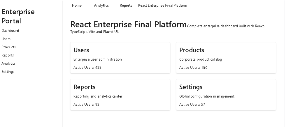
import { Text, Title1,} from "@fluentui/react-components";import { ActivityFeed } from "../components/ActivityFeed";import { ModuleCard } from "../components/ModuleCard";import { SummaryCard } from "../components/SummaryCard";import { useDashboardSummary } from "../hooks/useDashboardSummary";import { getEnterpriseModules, getRecentActivities,} from "../services/dashboardService";export function DashboardPage() { const modules = getEnterpriseModules(); const activities = getRecentActivities(); const summary = useDashboardSummary(modules); return ( <main style={{ padding: "32px", backgroundColor: "#f5f5f5", minHeight: "calc(100vh - 57px)", boxSizing: "border-box", }} > <Title1> Enterprise Dashboard </Title1> <Text> Final React platform combining Fluent UI, TypeScript models, services, hooks, reusable components, and enterprise layout. </Text> <section style={{ display: "grid", gridTemplateColumns: "repeat(auto-fit, minmax(220px, 1fr))", gap: "20px", marginTop: "32px", }} > <SummaryCard title="Total Modules" value={summary.totalModules} description="Enterprise areas available" /> <SummaryCard title="Active Users" value={summary.totalUsers} description="Users across all modules" /> <SummaryCard title="Open Items" value={summary.totalOpenItems} description="Pending operational work" /> <SummaryCard title="Critical Modules" value={summary.criticalModules} description="Modules requiring attention" /> </section> <section style={{ display: "grid", gridTemplateColumns: "2fr 1fr", gap: "24px", marginTop: "32px", alignItems: "start", }} > <div> <Title1> Platform Modules </Title1> <div style={{ display: "grid", gridTemplateColumns: "repeat(auto-fit, minmax(280px, 1fr))", gap: "20px", marginTop: "20px", }} > {modules.map((module) => ( <ModuleCard key={module.id} module={module} /> ))} </div> </div> <ActivityFeed activities={activities} /> </section> </main> );}
17. Root App
src\App.tsx
import { AppHeader } from "./components/AppHeader";import { EnterpriseSidebar } from "./components/EnterpriseSidebar";import { DashboardPage } from "./pages/DashboardPage";function App() { return ( <div style={{ display: "flex", minHeight: "100vh", }} > <EnterpriseSidebar /> <div style={{ flex: 1, minWidth: 0, }} > <AppHeader /> <DashboardPage /> </div> </div> );}export default App;
18. Main Entry Point
src\main.tsx
import React from "react";import ReactDOM from "react-dom/client";import { FluentProvider, webLightTheme,} from "@fluentui/react-components";import App from "./App";import "./index.css";ReactDOM.createRoot( document.getElementById("root")!).render( <React.StrictMode> <FluentProvider theme={webLightTheme}> <App /> </FluentProvider> </React.StrictMode>);
19. Global CSS
src\index.css
body { margin: 0; font-family: "Segoe UI", Arial, sans-serif; background-color: #f5f5f5;}* { box-sizing: border-box;}
20. Run the Application
npm run dev
21. Validate the Production Build
npm run build
22. Preview the Build
npm run preview
23. How the Application Renders
The rendering flow is:
index.html contains div#rootmain.tsx finds div#root creates React root wraps App with FluentProviderApp.tsx creates the enterprise shellEnterpriseSidebar renders navigationAppHeader renders top toolbarDashboardPage loads modules and activities calculates summary with custom hook renders KPI cards, modules, and activity feed
The final component tree is:
FluentProvider App EnterpriseSidebar AppHeader DashboardPage SummaryCard ModuleCard ActivityFeed
24. React Mental Model Used
This app reinforces several important React principles.
UI is a function of data
The module cards are not manually repeated.
They are rendered from:
modules.map(...)
That means the UI is derived from structured data.
Derived data should not be duplicated
The dashboard summary is not stored manually.
It is calculated by:
useDashboardSummary(modules)
This avoids duplicated state and keeps the app predictable.
Components should have one responsibility
Each component has a clear role:
| Component | Responsibility |
|---|---|
EnterpriseSidebar | Navigation |
AppHeader | Top command area |
SummaryCard | KPI display |
ModuleCard | Module display |
ActivityFeed | Recent activity |
DashboardPage | Page composition |
App | Application shell |
25. Why This App Matters
App 100 is important because it simulates a real enterprise React architecture.
It includes:
- models
- data
- services
- hooks
- pages
- components
- Fluent UI
- layout shell
- dashboard composition
- derived metrics
- reusable cards
- TypeScript contracts
This is the type of structure that can evolve into:
- SharePoint-style portals
- Microsoft 365 admin panels
- CRM systems
- ERP systems
- audit dashboards
- reporting platforms
- enterprise management systems
26. Technical Summary
| Concept | Implementation |
|---|---|
| React | Component-based UI |
| TypeScript | Strong model contracts |
| Vite | Fast development and build system |
| Fluent UI | Microsoft enterprise design system |
| Models | AdminModule, ActivityItem |
| Data | Mock enterprise data |
| Services | Central access to application data |
| Hooks | useDashboardSummary |
| Composition | App shell and reusable components |
| Lists | map() rendering |
| Keys | Stable key={id} values |
| Derived Data | Summary calculated from modules |
| Layout | Sidebar + header + dashboard |
| CSS | Global reset and Microsoft font |
27. Concept Table
| Concept | File | Why It Matters |
|---|---|---|
| Application shell | App.tsx | Defines the enterprise layout |
| Fluent provider | main.tsx | Applies Microsoft theme globally |
| Sidebar | EnterpriseSidebar.tsx | Creates navigation structure |
| Header | AppHeader.tsx | Adds top command area |
| KPI cards | SummaryCard.tsx | Reusable metric component |
| Module cards | ModuleCard.tsx | Reusable business module display |
| Activity feed | ActivityFeed.tsx | Shows recent operational events |
| Data models | models/ | Creates strong TypeScript contracts |
| Data layer | data/ | Stores mock enterprise data |
| Service layer | dashboardService.ts | Prepares the app for API evolution |
| Custom hook | useDashboardSummary.ts | Encapsulates derived dashboard logic |
| Dashboard page | DashboardPage.tsx | Composes the main experience |
28. Official Documentation
| Topic | Link |
|---|---|
| React Learn | https://react.dev/learn |
| Thinking in React | https://react.dev/learn/thinking-in-react |
| Rendering Lists | https://react.dev/learn/rendering-lists |
| Passing Props | https://react.dev/learn/passing-props-to-a-component |
| State Structure | https://react.dev/learn/choosing-the-state-structure |
| useMemo | https://react.dev/reference/react/useMemo |
| Fluent UI React Components | https://developer.microsoft.com/en-us/fluentui#/controls/web |
| Fluent UI Card | https://developer.microsoft.com/en-us/fluentui#/controls/web/card |
| Fluent UI Button | https://developer.microsoft.com/en-us/fluentui#/controls/web/button |
| Fluent UI Toolbar | https://developer.microsoft.com/en-us/fluentui#/controls/web/toolbar |
| Vite Guide | https://vite.dev/guide/ |
| TypeScript Documentation | https://www.typescriptlang.org/docs/ |
29. Final Architectural Insight
The final lesson of App 100 is that React applications become powerful when the architecture is clean.
A professional React application is not only a collection of components.
It is a structured system:
Models define the shape of dataData and services provide informationHooks calculate reusable logicComponents render focused UI blocksPages compose complete screensApp defines the shellmain.tsx mounts everything into the browser
This is the professional React development flow.
30. Current Project Progress
| Block | Apps | Status |
|---|---|---|
| Block 1 | 01–20 | Completed |
| Block 2 | 21–40 | Completed |
| Block 3 | 41–60 | Completed |
| Block 4 | 61–80 | Completed |
| Block 5 | 81–100 | Completed |
31. Final App Status
| App | Name | Status |
|---|---|---|
| 100 | React Enterprise Final Platform | Completed |
32. Final Conclusion
App 100 completes the ReactLab journey.
Across the full project, you practiced:
- React fundamentals
- JSX
- props
- component composition
- list rendering
- state
- forms
- hooks
- effects
- service layers
- custom hooks
- Fluent UI
- dashboard design
- enterprise layouts
- TypeScript models
- reusable components
- scalable architecture
The final platform is not the end of the learning path. It is the foundation for real enterprise applications.
From here, this architecture can evolve into:
- authentication
- routing
- API integration
- Microsoft Graph
- SharePoint integration
- Power BI embedded dashboards
- audit systems
- admin centers
- CRM systems
- ERP platforms
This is the final idea:
React is not just about building screens.React is about building predictable, reusable, scalable UI systems.
App 100 proves that journey.
Where we are: App 100 completed. ReactLab 100 Apps finished.
 edvaldo b. guimarães filho