Technical Blog Article — App 91: Report Generator with React, TypeScript, Vite, and Fluent UI
Introduction
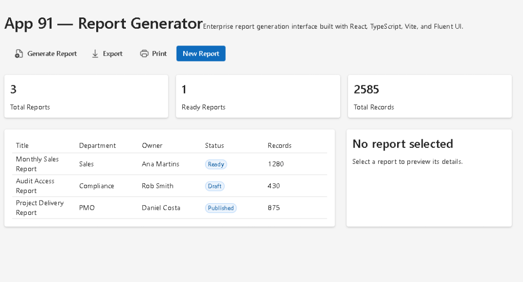
In App 91 — Report Generator, we build an enterprise-style report generation interface using React, TypeScript, Vite, and Fluent UI.
This app belongs to Block 5 — Complete Applications, where the project moves into more realistic business scenarios. At this stage, the goal is no longer only to understand isolated React concepts, but to combine multiple concepts into a professional application structure.
A report generator is a very common feature in enterprise systems. You can find similar interfaces in:
- administrative portals
- audit systems
- SharePoint dashboards
- CRM platforms
- ERP systems
- compliance tools
- project management systems
- analytics applications
The purpose of this app is to simulate a corporate report management screen where the user can view reports, inspect summary metrics, select a report, preview details, and trigger report actions such as generate, export, or print.
The application uses:
- React for declarative UI
- TypeScript for typed models
- Vite for modern development tooling
- Fluent UI for Microsoft-style enterprise components
- a service layer for derived calculations
- component composition for clean architecture
The most important React idea in this app is:
UI = function of state
The selected report is stored in React state. When the user clicks a row in the report table, React updates the selected report and re-renders the preview panel automatically.
1. Create the Project
Use PowerShell:
cd E:\EkisReactLab\React-Fluent-100Appsnpm create vite@latest app91-report-generator -- --template react-tscd app91-report-generatornpm installnpm install @fluentui/react-components @fluentui/react-icons
Create the folders:
New-Item src\components -ItemType DirectoryNew-Item src\models -ItemType DirectoryNew-Item src\data -ItemType DirectoryNew-Item src\services -ItemType DirectoryNew-Item src\utils -ItemType Directory
Create the files:
New-Item src\models\Report.ts -ItemType FileNew-Item src\data\reports.ts -ItemType FileNew-Item src\services\reportService.ts -ItemType FileNew-Item src\components\ReportSummary.tsx -ItemType FileNew-Item src\components\ReportList.tsx -ItemType FileNew-Item src\components\ReportPreview.tsx -ItemType FileNew-Item src\components\ReportToolbar.tsx -ItemType FileNew-Item artigo.md -ItemType File
2. Final Folder Structure
app91-report-generator/ src/ components/ ReportList.tsx ReportPreview.tsx ReportSummary.tsx ReportToolbar.tsx data/ reports.ts models/ Report.ts services/ reportService.ts utils/ App.tsx main.tsx index.css artigo.md package.json vite.config.ts tsconfig.json
Each folder has a clear responsibility:
| Folder | Responsibility |
|---|---|
components | Reusable UI components |
models | TypeScript data contracts |
data | Static mock data |
services | Business logic and calculations |
utils | Future reusable helper functions |
App.tsx | Main application composition |
main.tsx | React browser entry point |
index.css | Global CSS reset |
3. Report Model
src\models\Report.ts
export type ReportStatus = "Draft" | "Ready" | "Published";export interface Report { id: number; title: string; department: string; owner: string; status: ReportStatus; createdAt: string; records: number;}
This file defines the report data model.
The ReportStatus type restricts the status to only three valid values:
DraftReadyPublished
This is useful because TypeScript prevents invalid report statuses.
For example, this would be invalid:
status: "Finished"
because "Finished" is not part of the allowed union type.
This is one of the reasons TypeScript is so valuable in enterprise React applications. It prevents many bugs before the application even runs in the browser.
4. Static Report Data
src\data\reports.ts
import type { Report } from "../models/Report";export const reports: Report[] = [ { id: 1, title: "Monthly Sales Report", department: "Sales", owner: "Ana Martins", status: "Ready", createdAt: "2026-06-01", records: 1280, }, { id: 2, title: "Audit Access Report", department: "Compliance", owner: "Rob Smith", status: "Draft", createdAt: "2026-06-02", records: 430, }, { id: 3, title: "Project Delivery Report", department: "PMO", owner: "Daniel Costa", status: "Published", createdAt: "2026-06-03", records: 875, },];
This file simulates report data.
In a real enterprise application, this data would usually come from:
- a REST API
- Microsoft Graph
- SharePoint lists
- SQL Server
- Dataverse
- Azure Functions
- an internal reporting service
For learning purposes, static data is useful because it allows us to focus on React architecture before introducing asynchronous API calls.
5. Report Service Layer
src\services\reportService.ts
import { reports } from "../data/reports";import type { Report } from "../models/Report";export function getReports(): Report[] { return reports;}export function getTotalRecords(items: Report[]): number { return items.reduce((total, report) => total + report.records, 0);}export function getReadyReports(items: Report[]): number { return items.filter((report) => report.status === "Ready").length;}
The service layer contains business logic.
This is a better architecture than placing all calculations directly inside React components.
The function:
getTotalRecords()
calculates the total number of records across all reports.
The function:
getReadyReports()
counts only reports with status "Ready".
This keeps React components cleaner because components should focus mainly on rendering UI.
6. Report Summary Component
src\components\ReportSummary.tsx
import { Card, Text, Title3 } from "@fluentui/react-components";import type { Report } from "../models/Report";import { getReadyReports, getTotalRecords } from "../services/reportService";interface ReportSummaryProps { reports: Report[];}export function ReportSummary({ reports }: ReportSummaryProps) { return ( <div style={{ display: "grid", gridTemplateColumns: "repeat(3, 1fr)", gap: "16px", }} > <Card> <Title3>{reports.length}</Title3> <Text>Total Reports</Text> </Card> <Card> <Title3>{getReadyReports(reports)}</Title3> <Text>Ready Reports</Text> </Card> <Card> <Title3>{getTotalRecords(reports)}</Title3> <Text>Total Records</Text> </Card> </div> );}
This component displays three metric cards:
| Metric | Meaning |
|---|---|
| Total Reports | Number of reports in the system |
| Ready Reports | Reports ready for publishing or export |
| Total Records | Combined number of records represented by all reports |
The component receives data through props:
reports: Report[];
This is a clean React pattern.
The parent component owns the data. The child component receives the data and renders the UI.
7. Corrected Report List Component
src\components\ReportList.tsx
The original implementation used DataGrid, but the direct usage of several DataGridCell elements inside DataGridRow caused a TypeScript error. Fluent UI DataGridRow expects a render function pattern in that scenario.
For this app, the cleanest and most stable correction is to use Fluent UI Table, because this screen does not need advanced grid behavior yet.
import { Badge, Card, Table, TableBody, TableCell, TableHeader, TableHeaderCell, TableRow,} from "@fluentui/react-components";import type { Report } from "../models/Report";interface ReportListProps { reports: Report[]; selectedReportId: number | null; onSelectReport: (report: Report) => void;}export function ReportList({ reports, selectedReportId, onSelectReport,}: ReportListProps) { return ( <Card style={{ padding: "16px" }}> <Table aria-label="Reports Table"> <TableHeader> <TableRow> <TableHeaderCell>Title</TableHeaderCell> <TableHeaderCell>Department</TableHeaderCell> <TableHeaderCell>Owner</TableHeaderCell> <TableHeaderCell>Status</TableHeaderCell> <TableHeaderCell>Records</TableHeaderCell> </TableRow> </TableHeader> <TableBody> {reports.map((report) => ( <TableRow key={report.id} onClick={() => onSelectReport(report)} style={{ cursor: "pointer", backgroundColor: selectedReportId === report.id ? "#eef6ff" : "transparent", }} > <TableCell>{report.title}</TableCell> <TableCell>{report.department}</TableCell> <TableCell>{report.owner}</TableCell> <TableCell> <Badge appearance="tint">{report.status}</Badge> </TableCell> <TableCell>{report.records}</TableCell> </TableRow> ))} </TableBody> </Table> </Card> );}
This component renders a clickable report table.
When the user clicks a row, this function runs:
onClick={() => onSelectReport(report)}
That sends the selected report back to the parent component.
The selected row receives a different background color:
selectedReportId === report.id ? "#eef6ff" : "transparent"
This is conditional rendering through inline style.
The UI changes based on state.
8. Why Table Was Better Than DataGrid Here
Fluent UI DataGrid is powerful, but it is more strict because it supports advanced behavior such as:
- keyboard navigation
- column definitions
- cell render functions
- selectable rows
- sortable columns
- accessibility patterns
- complex grid behavior
For a simple report list, Table is enough.
The difference is:
| Component | Best For |
|---|---|
Table | Simple tabular layouts |
DataGrid | Advanced enterprise grids |
In App 91, we only need a simple selectable table, so Table is the correct choice.
Later apps can reintroduce DataGrid when the app needs sorting, column configuration, selection mode, keyboard navigation, or advanced grid features.
9. Report Preview Component
src\components\ReportPreview.tsx
import { Card, Text, Title2, Title3 } from "@fluentui/react-components";import type { Report } from "../models/Report";interface ReportPreviewProps { report: Report | null;}export function ReportPreview({ report }: ReportPreviewProps) { if (!report) { return ( <Card> <Title3>No report selected</Title3> <Text>Select a report to preview its details.</Text> </Card> ); } return ( <Card style={{ padding: "24px" }}> <Title2>{report.title}</Title2> <Text>Department: {report.department}</Text> <Text>Owner: {report.owner}</Text> <Text>Status: {report.status}</Text> <Text>Created at: {report.createdAt}</Text> <Text>Records: {report.records}</Text> </Card> );}
This component demonstrates conditional rendering.
If there is no selected report, it renders:
No report selected
If a report exists, it renders the report details.
The key TypeScript type is:
report: Report | null
This means the component must handle two possibilities:
- There is a selected report.
- There is no selected report yet.
This is a realistic pattern in enterprise applications.
10. Report Toolbar Component
src\components\ReportToolbar.tsx
import { Button, Toolbar, ToolbarButton } from "@fluentui/react-components";import { ArrowDownload24Regular, DocumentAdd24Regular, Print24Regular,} from "@fluentui/react-icons";interface ReportToolbarProps { onGenerate: () => void;}export function ReportToolbar({ onGenerate }: ReportToolbarProps) { return ( <Toolbar> <ToolbarButton icon={<DocumentAdd24Regular />} onClick={onGenerate}> Generate Report </ToolbarButton> <ToolbarButton icon={<ArrowDownload24Regular />}> Export </ToolbarButton> <ToolbarButton icon={<Print24Regular />}> Print </ToolbarButton> <Button appearance="primary" onClick={onGenerate}> New Report </Button> </Toolbar> );}
The toolbar simulates enterprise report actions.
In real systems, these buttons could trigger:
- report generation
- PDF export
- Excel export
- print preview
- Power BI integration
- SharePoint document generation
- audit log export
The component receives a callback:
onGenerate: () => void;
This means the toolbar does not decide what report generation means. It only notifies the parent component that the user requested an action.
11. Root Application Component
src\App.tsx
import { useState } from "react";import { Text, Title1 } from "@fluentui/react-components";import { ReportSummary } from "./components/ReportSummary";import { ReportList } from "./components/ReportList";import { ReportPreview } from "./components/ReportPreview";import { ReportToolbar } from "./components/ReportToolbar";import { getReports } from "./services/reportService";import type { Report } from "./models/Report";function App() { const [reports] = useState<Report[]>(getReports()); const [selectedReport, setSelectedReport] = useState<Report | null>(null); function handleGenerateReport() { alert("Report generation simulated successfully."); } return ( <main style={{ minHeight: "100vh", padding: "40px", backgroundColor: "#f5f5f5", boxSizing: "border-box", }} > <section style={{ maxWidth: "1200px", margin: "0 auto" }}> <Title1>App 91 — Report Generator</Title1> <Text> Enterprise report generation interface built with React, TypeScript, Vite, and Fluent UI. </Text> <div style={{ marginTop: "24px" }}> <ReportToolbar onGenerate={handleGenerateReport} /> </div> <div style={{ marginTop: "24px" }}> <ReportSummary reports={reports} /> </div> <div style={{ display: "grid", gridTemplateColumns: "2fr 1fr", gap: "24px", marginTop: "24px", }} > <ReportList reports={reports} selectedReportId={selectedReport?.id ?? null} onSelectReport={setSelectedReport} /> <ReportPreview report={selectedReport} /> </div> </section> </main> );}export default App;
This is the main composition file.
It owns:
reportsselectedReport
The selected report state is created here:
const [selectedReport, setSelectedReport] = useState<Report | null>(null);
At first, no report is selected, so the value is null.
When the user clicks a report row, this runs:
onSelectReport={setSelectedReport}
Then React updates the state and the preview panel changes.
The rendering flow is:
User clicks report row→ setSelectedReport(report)→ React re-renders App→ ReportPreview receives selected report→ UI displays report details
This is the React mental model in action.
12. React Entry Point
src\main.tsx
import React from "react";import ReactDOM from "react-dom/client";import { FluentProvider, webLightTheme,} from "@fluentui/react-components";import App from "./App";import "./index.css";ReactDOM.createRoot(document.getElementById("root")!).render( <React.StrictMode> <FluentProvider theme={webLightTheme}> <App /> </FluentProvider> </React.StrictMode>);
This file connects React to the browser.
The rendering flow is:
index.html→ loads main.tsx→ main.tsx finds div#root→ ReactDOM.createRoot creates the React root→ FluentProvider applies Fluent UI theme→ App renders the application
The FluentProvider is important because it applies the Microsoft design system globally.
13. Global CSS
src\index.css
body { margin: 0; font-family: "Segoe UI", Arial, sans-serif;}* { box-sizing: border-box;}
This removes default browser margin and applies a Microsoft-style font.
The rule:
box-sizing: border-box;
makes layout calculations more predictable.
14. Running the Application
Run the development server:
npm run dev
Validate the production build:
npm run build
Preview the production build:
npm run preview
15. The Data Flow
The application data flow is:
reports.ts stores static report datareportService.ts exposes reports and calculationsApp.tsx owns reports and selectedReport stateReportSummary.tsx receives reports and shows metricsReportList.tsx receives reports and lets user select oneReportPreview.tsx receives selectedReport and displays detailsReportToolbar.tsx receives action callbacks
This is clean component composition.
No component does everything.
Each component has a focused responsibility.
16. Why There Is No useEffect
This app intentionally does not use useEffect.
There is no external synchronization yet.
The data is static and loaded synchronously from a local file.
The calculations are derived from data.
The selected report changes from user interaction.
Therefore, useState and props are enough.
A common React mistake is using useEffect too early. In React, effects are for synchronization with external systems such as:
- APIs
- browser APIs
- timers
- subscriptions
- localStorage
- WebSocket
- DOM integrations
This app does not need any of those yet.
17. Technical Summary
| Concept | Explanation |
|---|---|
| React | Builds the UI declaratively |
| TypeScript | Defines safe report models |
| Vite | Provides fast development tooling |
| Fluent UI | Provides Microsoft-style components |
useState | Stores selected report |
| Props | Pass data into child components |
| Callback props | Child components communicate with parent |
| Table | Displays report rows |
| Conditional rendering | Preview changes based on selected report |
| Service layer | Keeps calculations outside UI components |
| Derived data | Metrics are calculated from reports |
| Component composition | App is split into focused pieces |
18. Concept Table
| Concept | File | Why It Matters |
|---|---|---|
| Report model | Report.ts | Defines the shape of enterprise data |
| Static data | reports.ts | Simulates API data |
| Service layer | reportService.ts | Keeps business logic separate |
| Summary cards | ReportSummary.tsx | Shows derived metrics |
| Corrected table | ReportList.tsx | Displays selectable report rows |
| Conditional preview | ReportPreview.tsx | Shows selected report details |
| Toolbar actions | ReportToolbar.tsx | Simulates enterprise commands |
| State owner | App.tsx | Controls selected report |
| Fluent theme | main.tsx | Applies Microsoft visual system |
| Global CSS | index.css | Resets browser defaults |
19. Official Documentation
| Topic | Documentation |
|---|---|
| React Learn | https://react.dev/learn |
| State: A Component’s Memory | https://react.dev/learn/state-a-components-memory |
| Passing Props to a Component | https://react.dev/learn/passing-props-to-a-component |
| Sharing State Between Components | https://react.dev/learn/sharing-state-between-components |
| Choosing the State Structure | https://react.dev/learn/choosing-the-state-structure |
| You Might Not Need an Effect | https://react.dev/learn/you-might-not-need-an-effect |
| Fluent UI React Components | https://react.fluentui.dev |
| Fluent UI Table | https://react.fluentui.dev/?path=/docs/components-table–docs |
| Fluent UI Toolbar | https://react.fluentui.dev/?path=/docs/components-toolbar–docs |
| Fluent UI Badge | https://react.fluentui.dev/?path=/docs/components-badge–docs |
| Vite Guide | https://vite.dev/guide/ |
| TypeScript Docs | https://www.typescriptlang.org/docs/ |
20. Final Technical Insight
The most important lesson of App 91 is that enterprise interfaces are built by combining small, focused components around a clear state model.
The report table does not own the selected report.
The preview does not search for data.
The toolbar does not own the business process.
The root application coordinates the flow.
The architecture is:
Data→ Services→ State→ Components→ User interaction→ State update→ Re-render
This is exactly how larger enterprise React applications grow.
App 91 prepares the foundation for App 92, where we move naturally into an audit system, a scenario very close to SharePoint, Microsoft 365, Purview, compliance dashboards, and enterprise governance.
Current Project Progress
| Block | App | Name | Status |
|---|---|---|---|
| Block 1 | 01 | Hello React Fluent | Completed |
| Block 1 | 02 | Profile Card | Completed |
| Block 1 | 03 | Product List | Completed |
| Block 1 | 04 | Microsoft Style User Card | Completed |
| Block 1 | 05 | Static Dashboard | Completed |
| Block 1 | 06 | Corporate Sidebar Menu | Completed |
| Block 1 | 07 | Visual Task List | Completed |
| Block 1 | 08 | Timeline Events | Completed |
| Block 1 | 09 | Employee Table | Completed |
| Block 1 | 10 | Email List | Completed |
| Block 1 | 11 | Grid of Cards | Completed |
| Block 1 | 12 | Image Gallery | Completed |
| Block 1 | 13 | Movie Catalog | Completed |
| Block 1 | 14 | Football Teams | Completed |
| Block 1 | 15 | News Page | Completed |
| Block 1 | 16 | Financial Dashboard | Completed |
| Block 1 | 17 | SharePoint Style Layout | Completed |
| Block 1 | 18 | File Explorer | Completed |
| Block 1 | 19 | Corporate Portal | Completed |
| Block 1 | 20 | Microsoft Style Landing Page | Completed |
| Block 2 | 21 | Modern Counter | Completed |
| Block 2 | 22 | Toggle Theme | Completed |
| Block 2 | 23 | React Calculator | Completed |
| Block 2 | 24 | Login Form | Completed |
| Block 2 | 25 | User Registration | Completed |
| Block 2 | 26 | Complete ToDo List | Completed |
| Block 2 | 27 | Shopping List | Completed |
| Block 2 | 28 | Product Filter | Completed |
| Block 2 | 29 | Employee Search | Completed |
| Block 2 | 30 | Shopping Cart | Completed |
| Block 2 | 31 | Grade Simulator | Completed |
| Block 2 | 32 | Inventory Control | Completed |
| Block 2 | 33 | Contact Agenda | Completed |
| Block 2 | 34 | Currency Converter | Completed |
| Block 2 | 35 | BMI Calculator | Completed |
| Block 2 | 36 | Installment Simulator | Completed |
| Block 2 | 37 | Voting Panel | Completed |
| Block 2 | 38 | Interactive Quiz | Completed |
| Block 2 | 39 | Team Manager | Completed |
| Block 2 | 40 | Dynamic Dashboard | Completed |
| Block 3 | 41 | Microsoft Style Login | Completed |
| Block 3 | 42 | Corporate Form | Completed |
| Block 3 | 43 | Tabs Navigation | Completed |
| Block 3 | 44 | Dialog Manager | Completed |
| Block 3 | 45 | Executive Dashboard | Completed |
| Block 3 | 46 | Catalog with DataGrid | Completed |
| Block 3 | 47 | Enterprise User List | Completed |
| Block 3 | 48 | Navigable Sidebar | Completed |
| Block 3 | 49 | Corporate Header | Completed |
| Block 3 | 50 | Professional Toolbar | Completed |
| Block 3 | 51 | Notification System | Completed |
| Block 3 | 52 | Administrative Panel | Completed |
| Block 3 | 53 | Ticket Manager | Completed |
| Block 3 | 54 | Approval System | Completed |
| Block 3 | 55 | Corporate Agenda | Completed |
| Block 3 | 56 | SharePoint Inspired Dashboard | Completed |
| Block 3 | 57 | Project Management | Completed |
| Block 3 | 58 | Support Ticket Control | Completed |
| Block 3 | 59 | Visual CRM | Completed |
| Block 3 | 60 | Corporate Explorer | Completed |
| Block 4 | 61 | REST API Consumption | Completed |
| Block 4 | 62 | API Dashboard | Completed |
| Block 4 | 63 | Async Search | Completed |
| Block 4 | 64 | GitHub User Explorer | Completed |
| Block 4 | 65 | Weather App | Completed |
| Block 4 | 66 | Pagination System | Completed |
| Block 4 | 67 | Infinite Scroll | Completed |
| Block 4 | 68 | Data Cache | Completed |
| Block 4 | 69 | Custom Fetch Hook | Completed |
| Block 4 | 70 | Global Context Control | Completed |
| Block 4 | 71 | Favorites System | Completed |
| Block 4 | 72 | DataGrid with API | Completed |
| Block 4 | 73 | Analytical Dashboard | Completed |
| Block 4 | 74 | Cryptocurrency Monitor | Completed |
| Block 4 | 75 | Repository Explorer | Completed |
| Block 4 | 76 | Log Panel | Completed |
| Block 4 | 77 | Reporting System | Completed |
| Block 4 | 78 | Performance Simulator | Completed |
| Block 4 | 79 | Layered Architecture | Completed |
| Block 4 | 80 | Mini React Enterprise Framework | Completed |
| Block 5 | 81 | Complete CRUD System | Completed |
| Block 5 | 82 | Employee Management | Completed |
| Block 5 | 83 | Financial Dashboard | Completed |
| Block 5 | 84 | Inventory System | Completed |
| Block 5 | 85 | Kanban Board | Completed |
| Block 5 | 86 | Enterprise Task Manager | Completed |
| Block 5 | 87 | User System | Completed |
| Block 5 | 88 | Administrative Portal | Completed |
| Block 5 | 89 | Ticket System | Completed |
| Block 5 | 90 | Power BI Style Dashboard | Completed |
| Block 5 | 91 | Report Generator | Completed |
| Block 5 | 92 | Audit System | Next |
| Block 5 | 93 | SharePoint Inspired Portal | Upcoming |
| Block 5 | 94 | Corporate Catalog | Upcoming |
| Block 5 | 95 | Reservation System | Upcoming |
| Block 5 | 96 | Mini Enterprise ERP | Upcoming |
| Block 5 | 97 | Complete CRM | Upcoming |
| Block 5 | 98 | Analytics System | Upcoming |
| Block 5 | 99 | Microsoft Style Admin Center | Upcoming |
| Block 5 | 100 | Final React Enterprise Platform | Upcoming |
 edvaldo b. guimarães filho