App 99 — Admin Center Microsoft Style with React, TypeScript, Vite, and Fluent UI
Introduction
As the ReactLab journey approaches its conclusion, App 99 introduces a realistic enterprise administration portal inspired by the Microsoft 365 Admin Center. This project consolidates the knowledge acquired throughout the previous applications and focuses on building a professional dashboard using React, TypeScript, Vite, and Fluent UI.
The objective is not to reproduce the full Microsoft Admin Center but rather to implement the architectural patterns commonly found in enterprise applications:
- Administrative navigation
- Dashboard layouts
- Reusable components
- TypeScript models
- Fluent UI design system
- Data-driven rendering
- Enterprise information panels
- Governance notifications
This application represents a bridge between learning React concepts and applying them in real-world business scenarios.
Why an Admin Center?
Enterprise systems often require a centralized interface where administrators can manage users, groups, devices, reports, licenses, permissions, and governance controls.
Examples include:
- Microsoft 365 Admin Center
- SharePoint Administration
- Teams Administration
- Power Platform Administration
- CRM Portals
- ERP Systems
- Corporate Intranets
These systems usually share a common architecture:
Sidebar Navigation+Top Header+Dashboard Widgets+Alerts & Notifications+Management Modules
App 99 reproduces this architecture using modern React practices.
Project Architecture
The application follows a modular structure:
src/├── components/│ ├── AdminHeader.tsx│ ├── AdminSidebar.tsx│ ├── AdminDashboard.tsx│ ├── AdminModuleCard.tsx│ └── AlertsPanel.tsx│├── models/│ ├── AdminModule.ts│ └── AdminAlert.ts│├── data/│ ├── modules.ts│ └── alerts.ts│├── App.tsx├── main.tsx└── index.css
Each layer has a single responsibility.
TypeScript Models
AdminModule
export interface AdminModule { id: number; name: string; description: string; records: number;}
This interface defines the structure of administrative modules.
Examples:
- Users
- Groups
- Devices
- Reports
The benefit of TypeScript is that every module follows the same contract.
AdminAlert
export interface AdminAlert { id: number; title: string; severity: "High" | "Medium" | "Low";}
This model represents governance notifications displayed inside the alert panel.
Examples:
- Expiring licenses
- Security warnings
- Inactive users
- Compliance issues
Strong typing helps prevent inconsistencies across the application.
Static Data Layer
Instead of hardcoding values directly inside components, data is isolated in dedicated files.
modules.ts
export const modules: AdminModule[] = [...]
alerts.ts
export const alerts: AdminAlert[] = [...]
Benefits:
- Easier maintenance
- Better separation of concerns
- Easier future API integration
- Cleaner component code
This follows React’s principle that the UI should be derived from data.
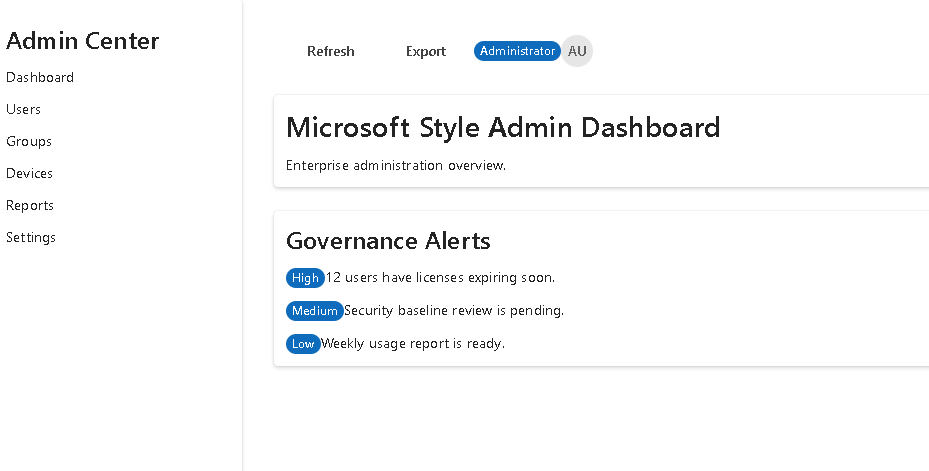
Sidebar Navigation
The sidebar is one of the most recognizable enterprise UI patterns.
Responsibilities:
- Display navigation options
- Organize administration areas
- Provide a consistent application structure
Implemented using:
<Card><Button /><Button /><Button /></Card>
Fluent UI provides accessibility, keyboard support, and Microsoft-style visuals out of the box.
Header Toolbar
The header represents the global administration area.
Features:
- Refresh actions
- Export actions
- Administrator badge
- User avatar
Implemented using:
<Toolbar><ToolbarButton /><Badge /><Avatar /></Toolbar>
This pattern appears in most Microsoft administrative products.
Dashboard Architecture
The dashboard serves as the landing page of the portal.
It provides:
- Administrative overview
- Quick statistics
- Access to management modules
The dashboard itself does not contain business logic.
Instead:
Data→ Components→ Rendered Dashboard
This separation makes the system easier to maintain.
Reusable Module Cards
The AdminModuleCard component demonstrates one of React’s most important concepts:
Component Reusability.
Instead of creating four different cards:
<UserCard /><GroupCard /><DeviceCard /><ReportCard />
we create a single generic component:
<AdminModuleCard />
and pass different data through props.
Benefits:
- Less code
- Easier maintenance
- Better scalability
- Consistent UI
Alerts Panel
Enterprise applications must communicate important information to administrators.
The Alerts Panel demonstrates dynamic rendering using:
alerts.map(...)
React transforms the data collection into visual elements.
The flow becomes:
Alert Data→ map()→ JSX→ Rendered UI
This is one of the most fundamental React patterns.
App.tsx Composition
The root component combines all major sections.
Structure:
App├── AdminSidebar└── Main Content ├── AdminHeader ├── AdminDashboard └── AlertsPanel
This composition pattern appears throughout modern React applications.
Each component owns a single responsibility.
main.tsx and React Bootstrapping
The application starts in:
src/main.tsx
Responsibilities:
- Connect React to the DOM
- Configure Fluent UI
- Render App.tsx
Example:
ReactDOM.createRoot(...)
The rendering flow becomes:
index.html→ main.tsx→ App.tsx→ Components→ Browser UI
Fluent UI Integration
Fluent UI is Microsoft’s official React component library.
The application uses:
- Card
- Button
- Toolbar
- Badge
- Avatar
- Text
- Typography Components
Benefits:
- Accessibility
- Consistent styling
- Enterprise appearance
- Microsoft design language
Why There Is No useEffect
This application intentionally avoids useEffect.
Reason:
No APINo TimerNo SubscriptionNo Browser Synchronization
React recommends avoiding Effects when rendering can be derived directly from existing data.
The UI is fully generated from static models and collections.
Therefore:
State is unnecessary.Effects are unnecessary.Rendering is sufficient.
This follows the official React guidance.
Enterprise Lessons Learned
App 99 reinforces several critical React concepts:
| Concept | Purpose |
|---|---|
| Components | UI organization |
| Props | Data flow |
| Models | Type safety |
| Fluent UI | Enterprise design |
| Composition | Building complex UIs |
| map() | Dynamic rendering |
| TypeScript | Strong contracts |
| Dashboard Architecture | Real-world structure |
| Data-driven UI | React philosophy |
Technical Summary
| Technology | Role |
|---|---|
| React | Declarative UI |
| TypeScript | Static typing |
| Fluent UI | Microsoft design system |
| Vite | Build system |
| JSX | UI definition |
| Components | Reusability |
| Models | Data contracts |
| Dashboard | Enterprise interface |
| Sidebar | Navigation |
| Toolbar | Global actions |
Official Documentation
React
- https://react.dev/learn
- https://react.dev/learn/describing-the-ui
- https://react.dev/learn/passing-props-to-a-component
- https://react.dev/learn/rendering-lists
- https://react.dev/learn/thinking-in-react
Fluent UI
Vite
TypeScript
Conclusion
App 99 demonstrates how modern React applications are structured in enterprise environments.
The application combines:
- Component composition
- Strong typing
- Data-driven rendering
- Fluent UI enterprise controls
- Dashboard architecture
Most importantly, it reinforces the React mental model:
Data→ Components→ Rendering→ User Interface
This mindset prepares developers for the final challenge of the ReactLab journey: App 100, the complete Enterprise React Platform.
PowerShell Commands Used
npm create vite@latest app99-admin-center-microsoft-style -- --template react-tscd app99-admin-center-microsoft-stylenpm installnpm install @fluentui/react-components @fluentui/react-iconsNew-Item src\components -ItemType DirectoryNew-Item src\models -ItemType DirectoryNew-Item src\data -ItemType DirectoryNew-Item src\styles -ItemType DirectoryNew-Item src\models\AdminModule.ts -ItemType FileNew-Item src\models\AdminAlert.ts -ItemType FileNew-Item src\data\modules.ts -ItemType FileNew-Item src\data\alerts.ts -ItemType FileNew-Item src\components\AdminHeader.tsx -ItemType FileNew-Item src\components\AdminSidebar.tsx -ItemType FileNew-Item src\components\AdminModuleCard.tsx -ItemType FileNew-Item src\components\AdminDashboard.tsx -ItemType FileNew-Item src\components\AlertsPanel.tsx -ItemType FileNew-Item src\App.tsx -ItemType FileNew-Item src\main.tsx -ItemType FileNew-Item src\index.css -ItemType FileNew-Item artigo.md -ItemType File
Current Project Progress
| Block | Range | Status |
|---|---|---|
| Block 1 | App 01–20 | Completed |
| Block 2 | App 21–40 | Completed |
| Block 3 | App 41–60 | Completed |
| Block 4 | App 61–80 | Completed |
| Block 5 | App 81–98 | Completed |
| App 99 | Admin Center Microsoft Style | Completed |
| App 100 | React Enterprise Platform Final | Next |
Progress: 99 / 100 Apps (99%) 🚀
 edvaldo b. guimarães filho