Building a SharePoint Inspired Portal with React, TypeScript, Fluent UI, and Vite
Introduction
Modern organizations rely heavily on centralized portals to provide employees with access to documents, news, applications, reports, workflows, and collaboration tools. One of the most recognizable examples is Microsoft SharePoint, which has become a standard platform for intranets, communication sites, document management, and enterprise collaboration.
In App 93 — SharePoint Inspired Portal, we build a modern portal experience using React, TypeScript, Fluent UI, and Vite. The objective is not to recreate SharePoint itself, but rather to learn how enterprise portals are structured and how React component architecture can be used to create scalable business applications.
This application belongs to Block 5 — Complete Applications, where the focus is no longer on isolated concepts but on combining everything learned throughout the ReactLab journey into larger, production-style solutions.
The application demonstrates:
- Enterprise layout architecture
- Sidebar navigation
- Corporate header design
- Dashboard KPI cards
- Quick Links section
- Corporate news feed
- Document library preview
- Fluent UI DataGrid integration
- TypeScript models
- Component composition
- Data-driven rendering
Most importantly, it reinforces the React mental model:
UI = Function(State + Data)
Rather than manually manipulating the DOM, React derives the entire portal interface from structured data and reusable components.
Why SharePoint-Inspired Architecture Matters
Many enterprise applications share a similar structure:
- Navigation panel
- Header
- Search
- Dashboard metrics
- Business news
- Document libraries
- Team resources
Learning how to build these layouts is valuable because the same architectural principles apply to:
- SharePoint Framework (SPFx)
- Microsoft Teams applications
- Internal portals
- CRM systems
- ERP dashboards
- Administrative portals
- Knowledge management systems
The goal of this application is to teach these patterns using pure React.
Creating the Project
The project starts with Vite.
npm create vite@latest app93-sharepoint-inspired-portal -- --template react-tscd app93-sharepoint-inspired-portalnpm installnpm install @fluentui/react-components @fluentui/react-icons
Vite provides:
- Fast startup
- Hot Module Replacement
- TypeScript support
- Modern build pipeline
This makes it ideal for enterprise React development.
Creating the Architecture
New-Item src\components -ItemType DirectoryNew-Item src\models -ItemType DirectoryNew-Item src\data -ItemType DirectoryNew-Item src\styles -ItemType Directory
The project follows a layered architecture:
src/ components/ models/ data/ styles/
Each layer has a clear responsibility.
Components
Responsible for rendering UI.
Examples:
- PortalHeader
- PortalSidebar
- DashboardCards
- QuickLinks
- NewsSection
- DocumentsGrid
Models
Responsible for defining TypeScript contracts.
Examples:
- QuickLink
- NewsItem
- DocumentItem
Data
Contains the application’s mock business data.
Styles
Reserved for custom styling and future theme expansion.
React Component Composition
The root component is App.tsx.
The application structure is:
PortalHeaderPortalSidebarMain Content ├─ DashboardCards ├─ QuickLinks ├─ NewsSection └─ DocumentsGrid
This demonstrates one of React’s most important principles:
Build large interfaces by composing smaller components.
Instead of creating a huge file with thousands of lines, each section becomes an isolated reusable component.
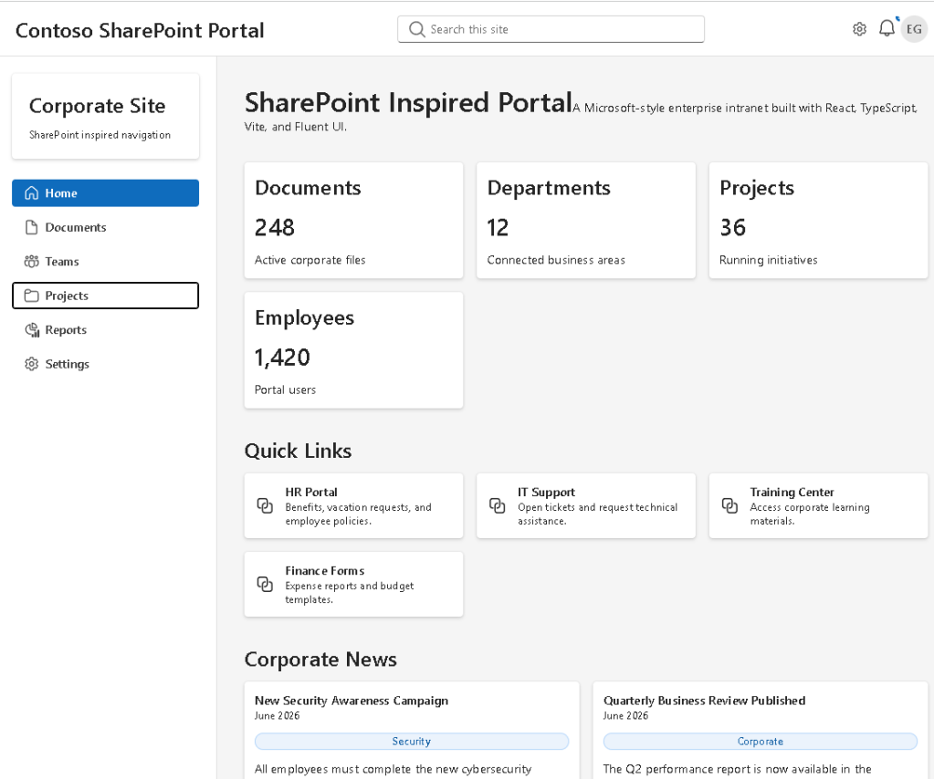
The Header Component
The PortalHeader component simulates a Microsoft-style top navigation bar.
It contains:
- Portal title
- Search box
- Notification indicator
- User avatar
Fluent UI components used:
- Input
- Avatar
- Toolbar
- Button
- Badge
The header demonstrates how enterprise applications provide quick access to search and user-related actions.
Sidebar Navigation
The sidebar is inspired by modern SharePoint and Microsoft 365 layouts.
Navigation items include:
- Home
- Documents
- Teams
- Projects
- Reports
- Settings
Instead of hardcoding navigation directly into JSX, navigation items are stored in a data structure and rendered using:
navigationItems.map(...)
This follows React’s declarative rendering philosophy.
The UI is derived from data.
Dashboard KPI Cards
Enterprise portals often provide summary information at the top of the page.
Examples:
- Total Documents
- Active Projects
- Departments
- Employees
The DashboardCards component demonstrates:
- Card composition
- Grid layouts
- Reusable UI patterns
- Data-driven rendering
Each card is generated from structured data rather than manually duplicated.
This makes the dashboard scalable and maintainable.
Quick Links Section
One of the most common SharePoint features is Quick Links.
Typical examples include:
- HR Portal
- IT Support
- Expense Reports
- Training Center
The QuickLinks component renders cards dynamically from the quickLinks data source.
This reinforces an important React principle:
Data should drive the UI.
Whenever possible, avoid duplicating markup.
Use arrays and map() instead.
Corporate News Feed
The NewsSection component simulates a SharePoint News web part.
Each news article contains:
- Title
- Category
- Summary
- Publication date
This demonstrates:
- Card layouts
- List rendering
- Badge usage
- Content composition
Because the component is data-driven, adding new articles only requires updating the news array.
No UI code changes are necessary.
Document Library Preview
The DocumentsGrid component represents a simplified SharePoint document library.
Columns include:
- Document Name
- Department
- Modified Date
- Status
Fluent UI DataGrid is used to provide an enterprise-grade table experience.
Document status values include:
- Current
- Draft
- Archived
Each status is displayed using Fluent UI Badge components.
This demonstrates how business data can be visually categorized using reusable UI controls.
TypeScript Models
The application uses TypeScript interfaces extensively.
Example:
export interface DocumentItem { id: number; name: string; department: string; modified: string; status: DocumentStatus;}
Benefits include:
- Strong typing
- Better autocomplete
- Safer refactoring
- Predictable architecture
Enterprise React applications should always use TypeScript.
Why There Is No useEffect
This application intentionally avoids useEffect.
There are:
- No API calls
- No timers
- No subscriptions
- No external synchronization
Everything is derived from static data.
According to React Learn:
“You Might Not Need an Effect.”
Many beginners use useEffect unnecessarily.
This application demonstrates that simple rendering should be handled through components and props rather than effects.
React Mental Model
This application reinforces a critical React concept:
Data→ Components→ JSX→ React Rendering→ Browser UI
Not:
Find DOM element→ Modify DOM→ Update HTML manually
React encourages declarative programming.
You describe the UI.
React handles the rendering.
Enterprise Architecture Lessons
This app introduces several enterprise development practices:
Separation of Concerns
Data, models, and UI are separated.
Reusability
Components can be reused across pages.
Scalability
Adding new sections requires minimal changes.
Maintainability
Small focused components are easier to understand.
Type Safety
TypeScript protects the application from invalid data structures.
Technical Summary
| Technology | Purpose |
|---|---|
| React | Declarative UI rendering |
| TypeScript | Strong typing |
| Vite | Development tooling |
| Fluent UI | Microsoft design system |
| DataGrid | Enterprise table rendering |
| Card | Dashboard composition |
| Badge | Business status indicators |
| Avatar | User representation |
| Flexbox | Layout management |
| CSS Grid | Responsive sections |
Official Documentation
React
Fluent UI
Vite
TypeScript
Final Thoughts
App 93 demonstrates how modern enterprise portals can be built using React and Fluent UI.
Although visually inspired by SharePoint, the most important lesson is architectural:
Large business applications are simply collections of small focused components working together.
By combining:
- TypeScript models
- Component composition
- Fluent UI controls
- Data-driven rendering
we create an application that is scalable, maintainable, and aligned with modern React best practices.
This application serves as a bridge between educational React examples and real-world enterprise portal development.
Technical Concept Table
| Concept | Implementation |
|---|---|
| Component Composition | App → Header → Sidebar → Sections |
| Data Rendering | map() over arrays |
| Enterprise Layout | Header + Sidebar + Content |
| Fluent UI | Cards, Badge, Avatar, DataGrid |
| TypeScript Models | QuickLink, NewsItem, DocumentItem |
| React Learn | Thinking in React |
| Responsive Design | Grid + Flexbox |
| SharePoint Pattern | News, Links, Documents |
Current Progress
| App | Name | Status |
|---|---|---|
| 91 | Report Generator | Completed |
| 92 | Audit System | Completed |
| 93 | SharePoint Inspired Portal | Current |
| 94 | Corporate Catalog | Next |
Roadmap source: App 93 is defined as Portal SharePoint Inspired in the ReactLab 100 Apps project structure.
 edvaldo b. guimarães filho