Building a SharePoint Framework (SPFx) Carousel Web Part with PnP React Controls
Introduction
SharePoint Framework (SPFx) is the modern development model for extending SharePoint Online and Microsoft 365. Introduced to replace older technologies such as Farm Solutions and SharePoint Add-ins, SPFx provides a secure, client-side architecture based on modern web standards and development practices.
SPFx allows developers to build solutions using TypeScript, React, Fluent UI, and modern JavaScript tooling while maintaining full integration with SharePoint Online. Because SPFx executes within the SharePoint page context, solutions automatically inherit the tenant’s security model, authentication mechanisms, theming, and user experience standards.
Although SPFx provides a powerful foundation, developers often need reusable controls to accelerate development and reduce the amount of custom code required. This is where the PnP SPFx React Controls library becomes extremely valuable.
The PnP SPFx React Controls project is an open-source initiative maintained by the Microsoft 365 community. The library contains dozens of production-ready controls that simplify common SharePoint development scenarios such as people pickers, taxonomy controls, dashboards, file pickers, breadcrumbs, charts, accordions, adaptive cards, and carousels.
In this article we will explore the Carousel control and build a complete SharePoint Framework Web Part that displays rotating slides containing images and descriptive content.
Understanding the Carousel Control
A carousel is a user interface component that displays multiple pieces of content in a rotating sequence.
Instead of showing a single static image or message, a carousel allows users to navigate through a collection of slides.
Common SharePoint use cases include:
- Corporate announcements
- News highlights
- Featured content
- Home page banners
- Marketing campaigns
- Product showcases
- Department communications
- Employee engagement portals
- Event promotions
- Training portals
Because communication sites often need visually engaging content, carousels are frequently used on SharePoint landing pages.
The PnP Carousel control provides this functionality with a simple API and full React integration.
Solution Architecture
The solution consists of the following components:
src└── webparts └── carouselDemo ├── CarouselDemoWebPart.ts └── components ├── CarouselDemo.tsx └── ICarouselDemoProps.ts
The architecture follows the standard SPFx React pattern:
- The Web Part acts as the SharePoint entry point.
- React renders the UI.
- The Carousel control displays the slides.
- Images and metadata are stored in an array.
Creating the Project
Create the SPFx project using Yeoman.
yo @microsoft/sharepoint
Select:
Which type of client-side component to create?WebPartWhat is your Web part name?CarouselDemoWhat is your Web part description?PnP Carousel Control Demo
Installing the PnP Control Library
Install the React Controls package.
npm install @pnp/spfx-controls-react --save
Install remaining dependencies.
npm install
Start the local development server.
heft start
Creating the React Component
The React component is responsible for rendering the Carousel.
The component imports:
- Carousel
- CarouselButtonsLocation
- CarouselButtonsDisplay
- ICarouselImageProps
import { Carousel, CarouselButtonsLocation, CarouselButtonsDisplay, ICarouselImageProps} from '@pnp/spfx-controls-react/lib/Carousel';
These objects define both the behavior and the appearance of the control.
Understanding ICarouselImageProps
Each slide is represented by an object implementing the ICarouselImageProps interface.
Example:
{ imageSrc: 'image.jpg', title: 'Welcome', description: 'Corporate Portal'}
Properties include:
| Property | Description |
|---|---|
| imageSrc | Image URL |
| title | Slide title |
| description | Slide description |
| imageFit | Image rendering mode |
Multiple slide objects are stored inside an array.
const carouselElements: ICarouselImageProps[] = [];
The Carousel component iterates through this collection and generates the slideshow.
Building the Slide Collection
Example:
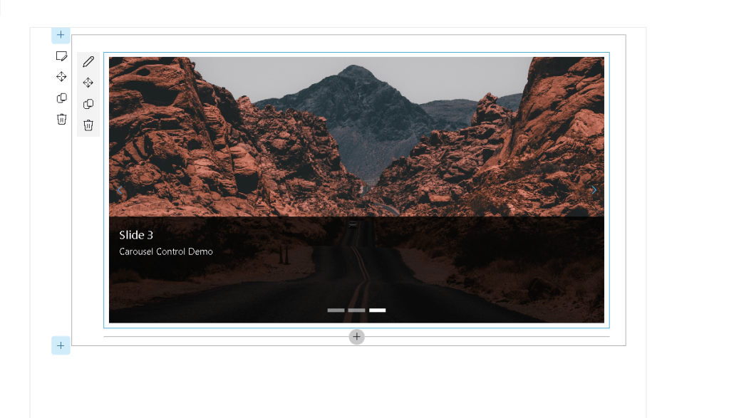
const carouselElements: ICarouselImageProps[] = [ { imageSrc: 'https://site/image1.jpg', title: 'Slide 1', description: 'Corporate News' }, { imageSrc: 'https://site/image2.jpg', title: 'Slide 2', description: 'Training Portal' }, { imageSrc: 'https://site/image3.jpg', title: 'Slide 3', description: 'Events' }];
Every object becomes a carousel slide.
Rendering the Carousel
The control is rendered inside the React component.
<Carousel buttonsLocation={CarouselButtonsLocation.center} buttonsDisplay={CarouselButtonsDisplay.buttonsOnly} contentHeight={400} isInfinite={true} element={carouselElements}/>
This single block of code creates the entire slideshow experience.
Understanding Carousel Properties
buttonsLocation
Controls where navigation buttons appear.
Example:
buttonsLocation={CarouselButtonsLocation.center}
Possible values:
- top
- bottom
- center
buttonsDisplay
Controls button visibility.
buttonsDisplay={CarouselButtonsDisplay.buttonsOnly}
Options include:
- buttonsOnly
- buttonsAndPaging
- pagingOnly
contentHeight
Defines carousel height.
contentHeight={400}
Increasing this value produces larger slides.
isInfinite
Controls endless navigation.
isInfinite={true}
When enabled, the last slide automatically loops back to the first slide.
element
Represents the collection of slides.
element={carouselElements}
Without this property the Carousel has no content to display.
TypeScript Issue Encountered
During development the following errors occurred:
Type 'string' is not assignable to type'CarouselButtonsLocation'Type 'string' is not assignable to type'CarouselButtonsDisplay'Type 'string' is not assignable to type'boolean'
The issue happened because string literals were being supplied where strongly typed enums were expected.
Incorrect:
buttonsLocation="content"buttonsDisplay="buttonsOnly"isInfinite="true"
Correct:
buttonsLocation={CarouselButtonsLocation.center}buttonsDisplay={CarouselButtonsDisplay.buttonsOnly}isInfinite={true}
This demonstrates one of the major benefits of TypeScript: compile-time validation that prevents invalid property values from reaching production.
Why TypeScript Matters in SPFx
SharePoint Framework relies heavily on TypeScript.
Benefits include:
- Strong typing
- Compile-time validation
- Better IntelliSense
- Reduced runtime errors
- Easier maintenance
- Improved refactoring
The Carousel compilation error was detected immediately before deployment, preventing a potential production issue.
User Experience Benefits
The Carousel control provides several advantages:
Better Visual Impact
Users are naturally drawn to rotating content.
Space Optimization
Multiple announcements can occupy the same page area.
Mobile Friendly
The control adapts to responsive layouts.
Reduced Development Time
Developers avoid building slideshow logic manually.
Consistent User Interface
The control follows Fluent UI and Microsoft 365 design standards.
Enterprise Scenarios
The Carousel control is particularly useful in:
Human Resources
- Employee announcements
- Benefits information
- Internal campaigns
Corporate Communications
- News
- Executive messages
- Strategic initiatives
Learning Portals
- Featured courses
- Certifications
- Training programs
IT Portals
- Service announcements
- Maintenance windows
- Security alerts
Project Management Offices
- Program updates
- Roadmaps
- KPI dashboards
Performance Considerations
When using the Carousel control:
- Optimize image sizes.
- Avoid extremely large image files.
- Use modern formats such as WebP when possible.
- Limit the number of slides displayed simultaneously.
- Host images in SharePoint document libraries or a CDN.
Proper optimization improves page load times and user experience.
Conclusion
The PnP Carousel control is an excellent example of how the PnP SPFx React Controls library accelerates SharePoint development. With only a few lines of code, developers can create professional, responsive, and visually appealing slideshow experiences that integrate seamlessly into SharePoint Online.
Combined with SPFx, React, and TypeScript, the Carousel control provides a production-ready solution for showcasing announcements, news, promotions, training content, and other important business information. It significantly reduces development effort while maintaining consistency with Microsoft 365 design standards.
As organizations continue to modernize their intranet experiences, controls such as Carousel become valuable building blocks for creating engaging and informative SharePoint portals.
 edvaldo b. guimarães filho