Diagram showing SPFx PnP controls portfolio with People Picker, Terms Selector, Dynamic Forms, Grid & Charts and benefits like accelerated development and community driven

PnP SPFx React Controls – Complete Control Catalog and Documentation Reference

Introduction

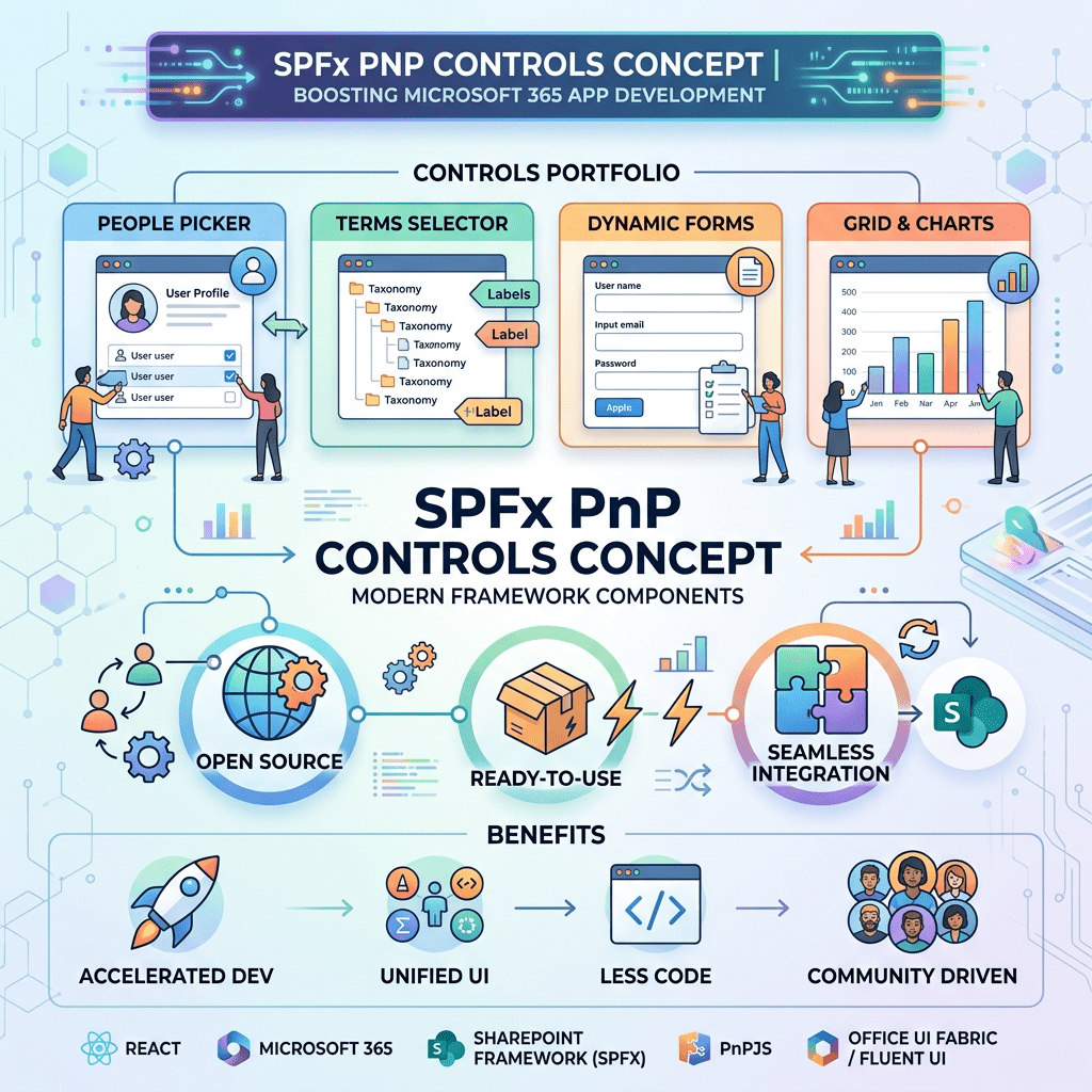
The PnP SPFx React Controls library is one of the most important community-driven projects available for SharePoint Framework (SPFx) development. It provides a large collection of reusable React controls designed to accelerate SharePoint Online and Microsoft 365 solution development while reducing the amount of custom code required in enterprise projects.

The library includes controls for user selection, taxonomy management, document handling, dashboards, charts, forms, navigation, mapping, file management, and many other common SharePoint scenarios.

For developers building a learning laboratory, creating technical articles, or maintaining a reusable reference repository, having a centralized catalog of controls and documentation links is extremely valuable.

The following table provides a complete reference of the controls identified in the official documentation navigation menu at the time of review.

PnP SPFx React Controls Catalog

#ControlDocumentation URL
1AccessibleAccordionhttps://pnp.github.io/sp-dev-fx-controls-react/controls/AccessibleAccordion/
2Accordionhttps://pnp.github.io/sp-dev-fx-controls-react/controls/Accordion/
3AdaptiveCardHosthttps://pnp.github.io/sp-dev-fx-controls-react/controls/AdaptiveCardHost/
4AdaptiveCardDesignerHosthttps://pnp.github.io/sp-dev-fx-controls-react/controls/AdaptiveCardDesignerHost/
5AnimatedDialoghttps://pnp.github.io/sp-dev-fx-controls-react/controls/AnimatedDialog/
6Calendarhttps://pnp.github.io/sp-dev-fx-controls-react/controls/Calendar/
7Carouselhttps://pnp.github.io/sp-dev-fx-controls-react/controls/Carousel/
8ChartControlhttps://pnp.github.io/sp-dev-fx-controls-react/controls/ChartControl/
9ComboBoxListItemPickerhttps://pnp.github.io/sp-dev-fx-controls-react/controls/ComboBoxListItemPicker/
10ContentTypePickerhttps://pnp.github.io/sp-dev-fx-controls-react/controls/ContentTypePicker/
11Dashboardhttps://pnp.github.io/sp-dev-fx-controls-react/controls/Dashboard/
12DateTimePickerhttps://pnp.github.io/sp-dev-fx-controls-react/controls/DateTimePicker/
13DragDropFileshttps://pnp.github.io/sp-dev-fx-controls-react/controls/DragDropFiles/
14DynamicFormhttps://pnp.github.io/sp-dev-fx-controls-react/controls/DynamicForm/
15EnhancedThemeProviderhttps://pnp.github.io/sp-dev-fx-controls-react/controls/EnhancedThemeProvider/
16FieldCollectionDatahttps://pnp.github.io/sp-dev-fx-controls-react/controls/FieldCollectionData/
17FieldPickerhttps://pnp.github.io/sp-dev-fx-controls-react/controls/FieldPicker/
18FilePickerhttps://pnp.github.io/sp-dev-fx-controls-react/controls/FilePicker/
19FileTypeIconhttps://pnp.github.io/sp-dev-fx-controls-react/controls/FileTypeIcon/
20FilterBarhttps://pnp.github.io/sp-dev-fx-controls-react/controls/FilterBar/
21FolderExplorerhttps://pnp.github.io/sp-dev-fx-controls-react/controls/FolderExplorer/
22FolderPickerhttps://pnp.github.io/sp-dev-fx-controls-react/controls/FolderPicker/
23GridLayouthttps://pnp.github.io/sp-dev-fx-controls-react/controls/GridLayout/
24HoverReactionsBarhttps://pnp.github.io/sp-dev-fx-controls-react/controls/HoverReactionsBar/
25IconPickerhttps://pnp.github.io/sp-dev-fx-controls-react/controls/IconPicker/
26IFrameDialoghttps://pnp.github.io/sp-dev-fx-controls-react/controls/IFrameDialog/
27IFramePanelhttps://pnp.github.io/sp-dev-fx-controls-react/controls/IFramePanel/
28ImagePickerhttps://pnp.github.io/sp-dev-fx-controls-react/controls/ImagePicker/
29ListItemAttachmentshttps://pnp.github.io/sp-dev-fx-controls-react/controls/ListItemAttachments/
30ListItemCommentshttps://pnp.github.io/sp-dev-fx-controls-react/controls/ListItemComments/
31ListItemPickerhttps://pnp.github.io/sp-dev-fx-controls-react/controls/ListItemPicker/
32ListPickerhttps://pnp.github.io/sp-dev-fx-controls-react/controls/ListPicker/
33ListViewhttps://pnp.github.io/sp-dev-fx-controls-react/controls/ListView/
34LivePersonahttps://pnp.github.io/sp-dev-fx-controls-react/controls/LivePersona/
35LocationPickerhttps://pnp.github.io/sp-dev-fx-controls-react/controls/LocationPicker/
36Maphttps://pnp.github.io/sp-dev-fx-controls-react/controls/Map/
37ModernAudiohttps://pnp.github.io/sp-dev-fx-controls-react/controls/ModernAudio/
38ModernTaxonomyPickerhttps://pnp.github.io/sp-dev-fx-controls-react/controls/ModernTaxonomyPicker/
39MonacoEditorhttps://pnp.github.io/sp-dev-fx-controls-react/controls/MonacoEditor/
40MyTeamshttps://pnp.github.io/sp-dev-fx-controls-react/controls/MyTeams/
41Paginationhttps://pnp.github.io/sp-dev-fx-controls-react/controls/Pagination/
42PeoplePickerhttps://pnp.github.io/sp-dev-fx-controls-react/controls/PeoplePicker/
43Placeholderhttps://pnp.github.io/sp-dev-fx-controls-react/controls/Placeholder/
44Progresshttps://pnp.github.io/sp-dev-fx-controls-react/controls/Progress/
45ProgressStepsIndicatorhttps://pnp.github.io/sp-dev-fx-controls-react/controls/ProgressStepsIndicator/
46RichTexthttps://pnp.github.io/sp-dev-fx-controls-react/controls/RichText/
47SecurityTrimmedControlhttps://pnp.github.io/sp-dev-fx-controls-react/controls/SecurityTrimmedControl/
48ShareDialoghttps://pnp.github.io/sp-dev-fx-controls-react/controls/ShareDialog/
49SiteBreadcrumbhttps://pnp.github.io/sp-dev-fx-controls-react/controls/SiteBreadcrumb/
50SitePickerhttps://pnp.github.io/sp-dev-fx-controls-react/controls/SitePicker/
51TaxonomyPickerhttps://pnp.github.io/sp-dev-fx-controls-react/controls/TaxonomyPicker/
52TeamChannelPickerhttps://pnp.github.io/sp-dev-fx-controls-react/controls/TeamChannelPicker/
53TeamPickerhttps://pnp.github.io/sp-dev-fx-controls-react/controls/TeamPicker/
54TermSetNavigationhttps://pnp.github.io/sp-dev-fx-controls-react/controls/TermSetNavigation/
55Toolbarhttps://pnp.github.io/sp-dev-fx-controls-react/controls/Toolbar/
56TreeViewhttps://pnp.github.io/sp-dev-fx-controls-react/controls/TreeView/
57UploadFileshttps://pnp.github.io/sp-dev-fx-controls-react/controls/UploadFiles/
58UserPickerhttps://pnp.github.io/sp-dev-fx-controls-react/controls/UserPicker/
59VariantThemeProviderhttps://pnp.github.io/sp-dev-fx-controls-react/controls/VariantThemeProvider/
60ViewPickerhttps://pnp.github.io/sp-dev-fx-controls-react/controls/ViewPicker/
61WebPartTitlehttps://pnp.github.io/sp-dev-fx-controls-react/controls/WebPartTitle/
62WorldMaphttps://pnp.github.io/sp-dev-fx-controls-react/controls/WorldMap/

Official Documentation

Main documentation portal:

Controls catalog:

Conclusion

The PnP SPFx React Controls library offers a comprehensive collection of reusable controls for SharePoint Framework development. This catalog can serve as a roadmap for learning, documentation, technical blogging, code samples, and enterprise solution development. By following the controls sequentially, developers can gradually progress from simple UI components to advanced Microsoft 365 and SharePoint integrations while maintaining consistency with the official documentation.

Edvaldo Guimrães Filho Avatar

Published by