SPFx DateTimePicker Control (WP09)
Introduction
Modern SharePoint solutions often require users to enter both dates and times in a consistent and user-friendly way. Typical business scenarios include scheduling meetings, defining publishing dates, creating project milestones, registering service requests, and managing deadlines.
In SharePoint Framework (SPFx), developers can build rich client-side experiences using React and Microsoft 365 technologies. The PnP SPFx React Controls library extends SPFx by providing reusable components that reduce development time and deliver a consistent user experience.
One of these controls is the DateTimePicker, which combines date and time selection into a single component. The control supports both 12-hour (AM/PM) and 24-hour formats, can be used in uncontrolled mode for simple scenarios, or controlled mode when React state management is required.
Official documentation:
PnP DateTimePicker Control Documentation
What is the DateTimePicker Control?
The DateTimePicker control allows users to:
- Select a date from a calendar
- Select hours and minutes
- Work with 12-hour format (AM/PM)
- Work with 24-hour format
- Integrate directly with React state
- Receive change notifications through events
Common use cases include:
- Event scheduling
- Task deadlines
- Approval expiration dates
- Booking systems
- Project planning
- Content publishing dates
Demo Overview
This example demonstrates two implementations:
Example 1 – Uncontrolled DateTimePicker
Uses a standard DateTimePicker configured for:
- Date and time selection
- 12-hour clock
- No React state management
<DateTimePicker label="DateTime Picker - 12h" dateConvention={DateConvention.DateTime} timeConvention={TimeConvention.Hours12}/>
Example 2 – Controlled DateTimePicker
Uses React state to:
- Store the selected date
- React to changes
- Update the component automatically
<DateTimePicker label="DateTime Picker - 24h" dateConvention={DateConvention.DateTime} timeConvention={TimeConvention.Hours24} value={date} onChange={handleChange}/>
Complete React Component
import * as React from 'react';import { DateTimePicker, DateConvention, TimeConvention} from '@pnp/spfx-controls-react/lib/DateTimePicker';const DateTimeEd: React.FC<{}> = () => { const [date, setDate] = React.useState<Date | undefined>( new Date() ); const handleChange = ( newDate: Date | undefined ) => { console.log("Nova data:", newDate); setDate(newDate); }; return ( <div> <DateTimePicker label="DateTime Picker - 12h" dateConvention={DateConvention.DateTime} timeConvention={TimeConvention.Hours12} /> {/* Controlled */} <DateTimePicker label="DateTime Picker - 24h" dateConvention={DateConvention.DateTime} timeConvention={TimeConvention.Hours24} value={date} onChange={handleChange} /> </div> );};export default DateTimeEd;
Understanding the Main Properties
dateConvention
Defines what the control should display.
dateConvention={DateConvention.DateTime}
Options include:
DateConvention.DateDateConvention.TimeDateConvention.DateTime
timeConvention
Defines the time format.
12-hour format:
timeConvention={TimeConvention.Hours12}
Result:
12:00 AM1:30 PM8:45 PM
24-hour format:
timeConvention={TimeConvention.Hours24}
Result:
00:0013:3020:45
value
Used in controlled mode.
value={date}
The control always displays the value stored in React state.
onChange
Executed whenever the user changes the date or time.
onChange={handleChange}
Example:
const handleChange = ( newDate: Date | undefined) => { console.log(newDate); setDate(newDate);};
React State Integration
The controlled example uses React Hooks.
State declaration:
const [date, setDate] = React.useState<Date | undefined>( new Date() );
State update:
setDate(newDate);
This pattern is recommended for:
- Forms
- Dynamic validation
- Saving data to SharePoint
- API integrations
- Business workflows
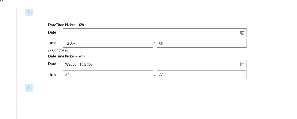
Visual Result
The page displays:
- DateTime Picker configured in 12-hour mode.
- DateTime Picker configured in 24-hour mode.
- Calendar selector.
- Hour selector.
- Minute selector.
- React state synchronization.
The interface is similar to the screenshot provided, showing both time conventions side-by-side.
Advantages of Using DateTimePicker
Faster Development
No need to combine:
DatePicker+Dropdown Hours+Dropdown Minutes
into a custom solution.
Better User Experience
Users interact with a single integrated control.
SPFx Ready
Works naturally inside:
- SharePoint Online
- SPFx Web Parts
- Microsoft 365 solutions
React Friendly
Supports:
- Hooks
- State management
- Event handling
- Form integration
Conclusion
The PnP DateTimePicker control is an excellent option for SPFx developers who need reliable date and time selection capabilities. It provides support for both 12-hour and 24-hour formats, integrates seamlessly with React state management, and significantly reduces the amount of custom code required when building scheduling and data-entry experiences in SharePoint.
For business applications such as event management, project tracking, workflow deadlines, and publishing schedules, DateTimePicker offers a professional and production-ready solution while keeping the implementation simple and maintainable.
References
PnP Controls Roadmap Progress
| WP | Control | Status |
|---|---|---|
| WP01 | AccessibleAccordion | ✅ |
| WP02 | Accordion | ✅ |
| WP03 | AdaptiveCardHost | ✅ |
| WP04 | AnimatedDialog | ✅ |
| WP05 | Carousel | ✅ |
| WP06 | ChartControl | ✅ |
| WP07 | Dashboard | ✅ |
| WP08 | DragDropFiles | ✅ |
| WP09 | DateTimePicker | ✅ |
| WP10 | EnhancedThemeProvider | ⬜ |
 edvaldo b. guimarães filho