SPFx WP03 – AdaptiveCardHost Control with PnP React Controls
Introduction to SharePoint Framework (SPFx)
SharePoint Framework (SPFx) is the modern extensibility model for SharePoint Online and Microsoft 365. Introduced by Microsoft to replace legacy development approaches such as Full Trust Solutions and SharePoint Add-ins, SPFx enables developers to create client-side solutions using modern web technologies including TypeScript, React, Fluent UI and Microsoft Graph.
SPFx solutions execute directly in the browser, providing a responsive user experience and seamless integration with SharePoint Online, Microsoft Teams, Viva Connections and other Microsoft 365 workloads. Because SPFx is based on standard web technologies, developers can leverage the entire JavaScript ecosystem while maintaining compatibility with Microsoft’s cloud platform.
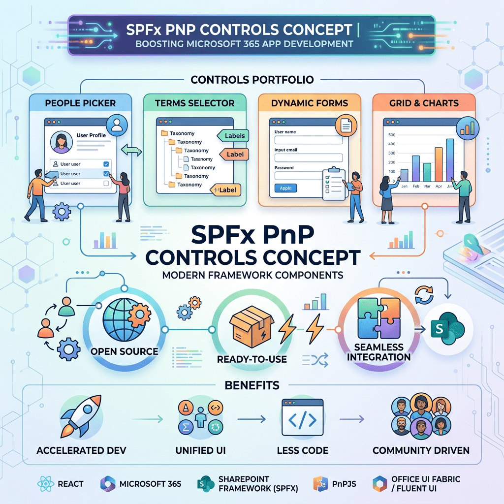
One of the most valuable resources available to SPFx developers is the PnP SPFx React Controls library, a community-driven collection of reusable controls that accelerate development and reduce the amount of custom code required in enterprise projects.
Understanding Adaptive Cards
Adaptive Cards are a cross-platform UI framework developed by Microsoft that allows interfaces to be described declaratively using JSON. Instead of manually creating HTML and React components, developers define the user interface through a structured JSON schema.
Adaptive Cards are used throughout the Microsoft ecosystem, including:
- Microsoft Teams
- Microsoft Outlook
- Power Automate
- Viva Connections
- Copilot experiences
- Custom Microsoft 365 applications
A card can contain text blocks, images, actions, input controls, containers and rich formatting options. Because the definition is data-driven, the same card can be rendered consistently across multiple Microsoft products.
The AdaptiveCardHost Control
The AdaptiveCardHost control from the PnP SPFx React Controls library provides a simple mechanism for rendering Adaptive Cards inside SharePoint Framework web parts.
Instead of manually integrating the Adaptive Cards SDK, developers can use a single React component capable of hosting and rendering Adaptive Card JSON definitions.
Typical use cases include:
- Employee portals
- Approval workflows
- HR solutions
- Task dashboards
- Microsoft Teams integrations
- Microsoft Graph driven applications
Solution Overview
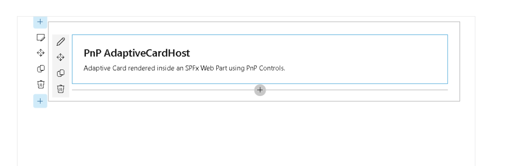
In this sample we create a SharePoint Framework web part that renders an Adaptive Card using the AdaptiveCardHost control.
The card displays a title and a descriptive message and demonstrates how Adaptive Cards can be hosted directly inside SharePoint pages.
Prerequisites
- SharePoint Framework 1.23.x
- Node.js compatible with SPFx 1.23
- Yeoman SharePoint Generator
- PnP SPFx React Controls
Creating the Web Part
Yeoman Generator
yo @microsoft/sharepoint
Select:
Which type of client-side component to create?WebPartWhat is your Web part name?AdaptiveCardHostDemoWhat is your Web part description?PnP AdaptiveCardHost Control Demo
Installing Dependencies
npm install @pnp/spfx-controls-react --savenpm install
Interface Definition
IAdaptiveCardHostDemoProps.ts
export interface IAdaptiveCardHostDemoProps {}
React Component
AdaptiveCardHostDemo.tsx
import * as React from 'react';import { AdaptiveCardHost } from '@pnp/spfx-controls-react/lib/AdaptiveCardHost';import { IAdaptiveCardHostDemoProps } from './IAdaptiveCardHostDemoProps';const AdaptiveCardHostDemo: React.FC<IAdaptiveCardHostDemoProps> = () => { const card = { type: "AdaptiveCard", version: "1.5", body: [ { type: "TextBlock", size: "Large", weight: "Bolder", text: "PnP AdaptiveCardHost" }, { type: "TextBlock", text: "Adaptive Card rendered inside an SPFx Web Part using PnP Controls.", wrap: true } ] }; return ( <AdaptiveCardHost card={card} onInvokeAction={() => { console.log('Adaptive Card action invoked'); }} onError={(error: Error) => { console.error(error); }} /> );};export default AdaptiveCardHostDemo;
Web Part Implementation
AdaptiveCardHostDemoWebPart.ts
import * as React from 'react';import * as ReactDom from 'react-dom';import { Version } from '@microsoft/sp-core-library';import { BaseClientSideWebPart } from '@microsoft/sp-webpart-base';import AdaptiveCardHostDemo from './components/AdaptiveCardHostDemo';export interface IAdaptiveCardHostDemoWebPartProps {}export default class AdaptiveCardHostDemoWebPart extends BaseClientSideWebPart<IAdaptiveCardHostDemoWebPartProps> { public render(): void { const element: React.ReactElement = React.createElement( AdaptiveCardHostDemo, {} ); ReactDom.render(element, this.domElement); } protected onDispose(): void { ReactDom.unmountComponentAtNode(this.domElement); } protected get dataVersion(): Version { return Version.parse('1.0'); }}
Running the Solution
heft start
Open the SharePoint Workbench:
https://YOURTENANT.sharepoint.com/sites/dev/_layouts/workbench.aspx
Add the AdaptiveCardHostDemo web part to the page.
Expected Result
After adding the web part, SharePoint will render an Adaptive Card containing:
- A large bold title
- A descriptive text block
- Rendering provided by the AdaptiveCardHost control
- Full integration with the SharePoint Framework page
This demonstrates how Adaptive Cards can be incorporated into SPFx solutions using a lightweight and reusable implementation.
Benefits of AdaptiveCardHost
The AdaptiveCardHost control provides several advantages:
- Simplified Adaptive Card rendering
- Reusable JSON-based UI definitions
- Integration with Microsoft 365 services
- Reduced React development effort
- Consistent rendering across Microsoft products
- Faster implementation of business solutions
Conclusion
The AdaptiveCardHost control is an excellent addition to the SharePoint Framework developer toolkit. By combining SPFx, React and Adaptive Cards, developers can create highly dynamic user experiences while keeping presentation logic separate from application code.
This approach becomes particularly valuable in enterprise environments where Adaptive Cards are already being used in Teams, Outlook, Power Automate and Copilot solutions, allowing organizations to reuse the same card definitions across multiple Microsoft 365 workloads.
References
PnP SPFx React Controls – AdaptiveCardHost
 edvaldo b. guimarães filho