The SharePoint Framework (SPFx) ecosystem provides a large collection of reusable controls through the PnP SPFx React Controls library. These controls accelerate development by providing ready-to-use components that follow Microsoft 365 design principles and accessibility guidelines.
WP01 – AccessibleAccordion with PnP SPFx React Controls
Introduction
gulp package-solution –ship
gulp package-solution –ship
This example was created using SharePoint Framework 1.23.0 and the latest version of the PnP SPFx React Controls library available at the time of writing.
Why Use AccessibleAccordion?
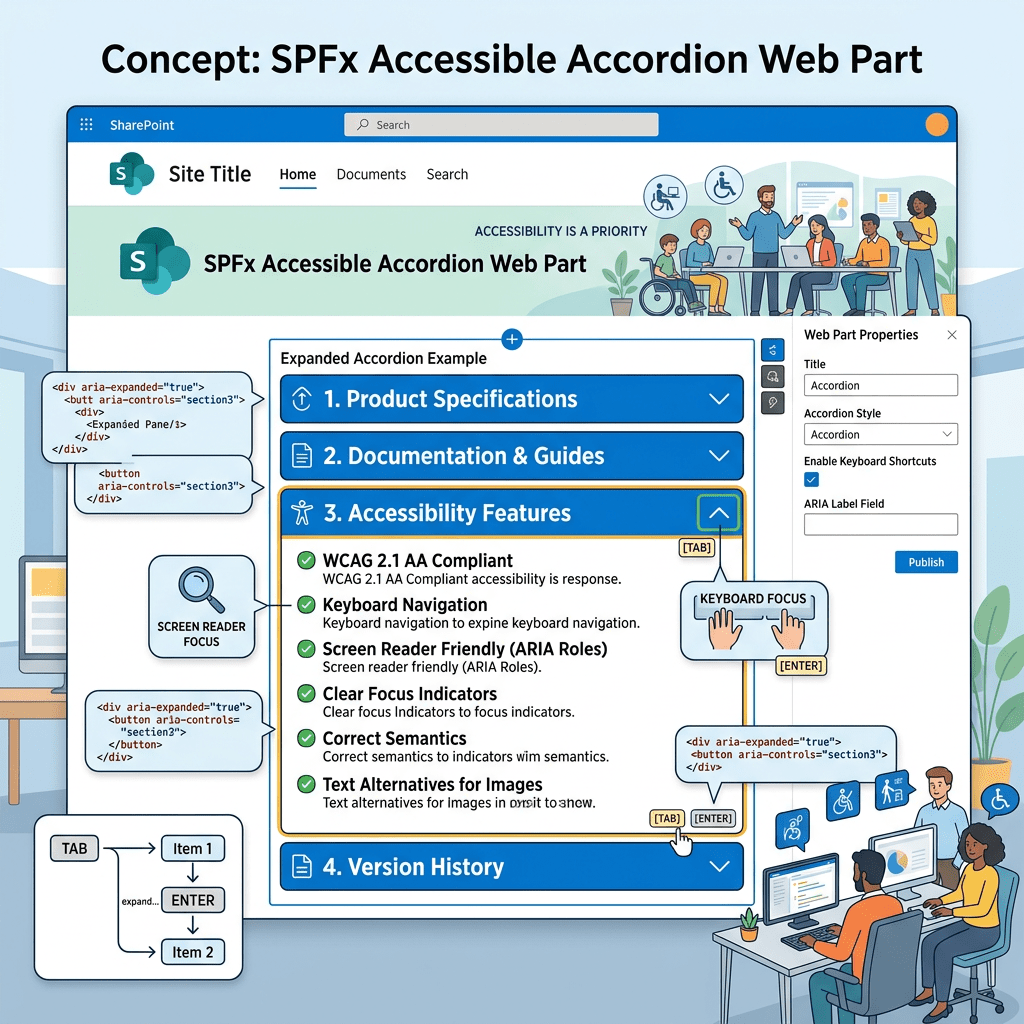
Accessibility is an essential requirement for modern web applications. Users may navigate content using keyboards, screen readers, assistive technologies, or alternative input devices.
The AccessibleAccordion control was designed to provide:
- Keyboard navigation support
- Screen reader compatibility
- Expand and collapse behavior
- Improved usability
- Faster implementation compared to building a custom accordion
Using the control allows developers to focus on business requirements instead of recreating accessibility patterns from scratch.
Solution Architecture
The solution contains three main files:
IAccessibleAccordionProps.ts
Defines the component properties interface.
AccessibleAccordion.tsx
Implements the React component and renders the accordion.
AccessibleAccordionWebPart.ts
Acts as the SPFx entry point and renders the React component into the SharePoint page.
Creating the Web Part
Start the SharePoint Framework generator:
yo @microsoft/sharepoint
Select the following options:
Which type of client-side component to create? WebPartWhat is your Web part name?AccessibleAccordionWhat is your Web part description?PnP AccessibleAccordion Control Demo
Installing Dependencies
Install the PnP SPFx React Controls package:
npm install @pnp/spfx-controls-react --savenpm install
Create the documentation folder:
New-Item -Path ".\docs\wp01-accessibleaccordion.md" -ItemType File -Force
Component Implementation
The React component defines a collection of accordion sections.
Each item contains:
- Title
- Content
When rendered, users can expand or collapse individual sections.
Example sections:
- Section 1
- Section 2
- Section 3
This approach can easily be extended to display:
- FAQs
- Policies
- Knowledge base articles
- Project documentation
- Training materials
Web Part Implementation
The SPFx web part is responsible for:
- Creating the React element.
- Rendering the component.
- Cleaning resources when disposed.
- Managing the data version.
This follows the standard SharePoint Framework architecture used by most React-based web parts.
Build and Run
Start the local development server:
heft start
Package the solution for deployment:
gulp bundle --ship
gulp package-solution --ship
Expected Result
After adding the web part to a SharePoint page, users will see an accordion interface containing three sections.
Each section can be expanded and collapsed independently, providing a clean and accessible user experience.
Lessons Learned
This exercise demonstrates several important SPFx concepts:
- Using third-party PnP controls
- React component composition
- SPFx web part structure
- Dependency management
- Accessibility-first development
Even though the example is intentionally simple, the same pattern can be used for enterprise solutions containing large amounts of content.
Troubleshooting
During implementation, a TypeScript error may occur:
TS2305: Module '@pnp/spfx-controls-react/lib/AccessibleAccordion'has no exported member 'AccessibleAccordion'
If this happens, verify:
- The installed version of the PnP library.
- The official documentation.
- The exported component names available in the installed package.
- Compatibility between the SPFx version and the PnP Controls version.
Always validate the sample against the official documentation before publishing production code.
Conclusion
The AccessibleAccordion control is a useful starting point for developers who want to create accessible SharePoint experiences quickly.
By leveraging the PnP SPFx React Controls library, developers can reduce implementation effort while maintaining consistency with Microsoft 365 user experience guidelines.
This lab serves as the foundation for the remaining controls in the PnP Controls Lab series.
Happy coding!
References
PnP SPFx React Controls – AccessibleAccordion Documentation
Status do Laboratório
| WP | Controle | Status |
|---|---|---|
| WP01 | AccessibleAccordion | ✅ Concluído |
| WP02 | Accordion | ⏳ Próximo |
 edvaldo b. guimarães filho